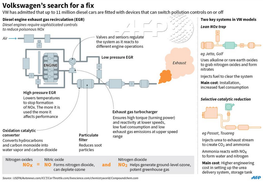
For a little while now I have been wondering about just how the emission cheating system worked for Volkswagen. Thankfully the AFP put together a graphic illustrating how their diesel engine process works. It gets me partially to the level of understanding for which I am looking. But even though I now understand how the diesel engine works, I am confused about where the cheating device fits into the process.
How the diesel engine works
Credit for the piece goes to the AFP graphics team.
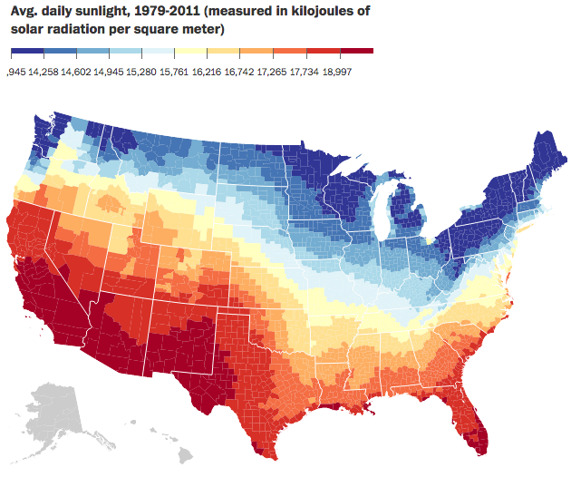
I was talking with someone the other day about how I dislike warm weather. Give me nice, cool, crisp weather any day of the week. And also how I am okay without sunshine—a cool, misty, grey day is lovely. Much of weather, of course, is determined by sunlight, energy, hitting the Earth. Well, just a few weeks ago the Washington Post published a piece looking at daily sunlight. At the end of the piece it has a nice small multiple graphic too.
Average daily sunlight
Credit for the piece goes to the Washington Post graphics department.
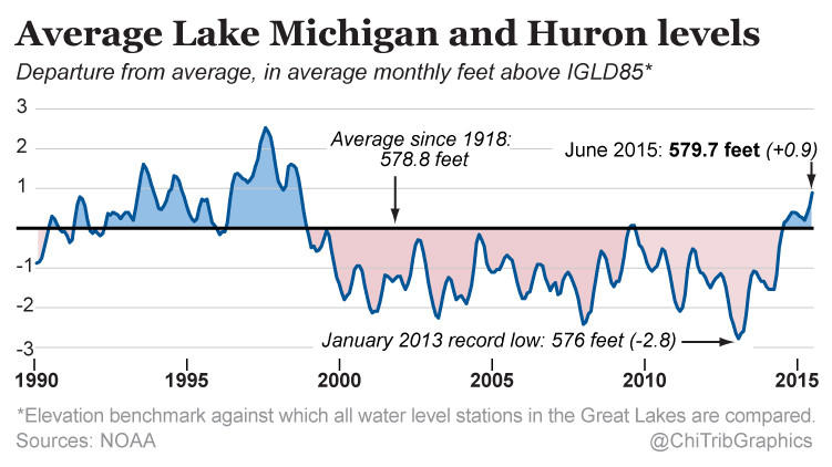
Today’s a little piece for those of you who follow me from the Chicago area. It turns out that in the last 30 months, the water level of Lake Michigan has risen three feet. Despite what some people think, Lake Michigan is not an ocean—I have overheard conversations in my neighbourhood about people who went “swimming in the ocean today” and want to show them a map that points out the Atlantic is almost a thousand miles away—and is not under the same threat as the coast via melting icecaps. The Great Lakes are instead impacted by other regional and cyclical patterns, e.g. El Niño. This article by the Chicago Tribune makes use of this small but clear line chart in its discussion of those very factors.
Water levels for Lakes Michigan and Huron
Credit for the piece goes to the Chicago Tribune’s graphics department.
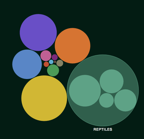
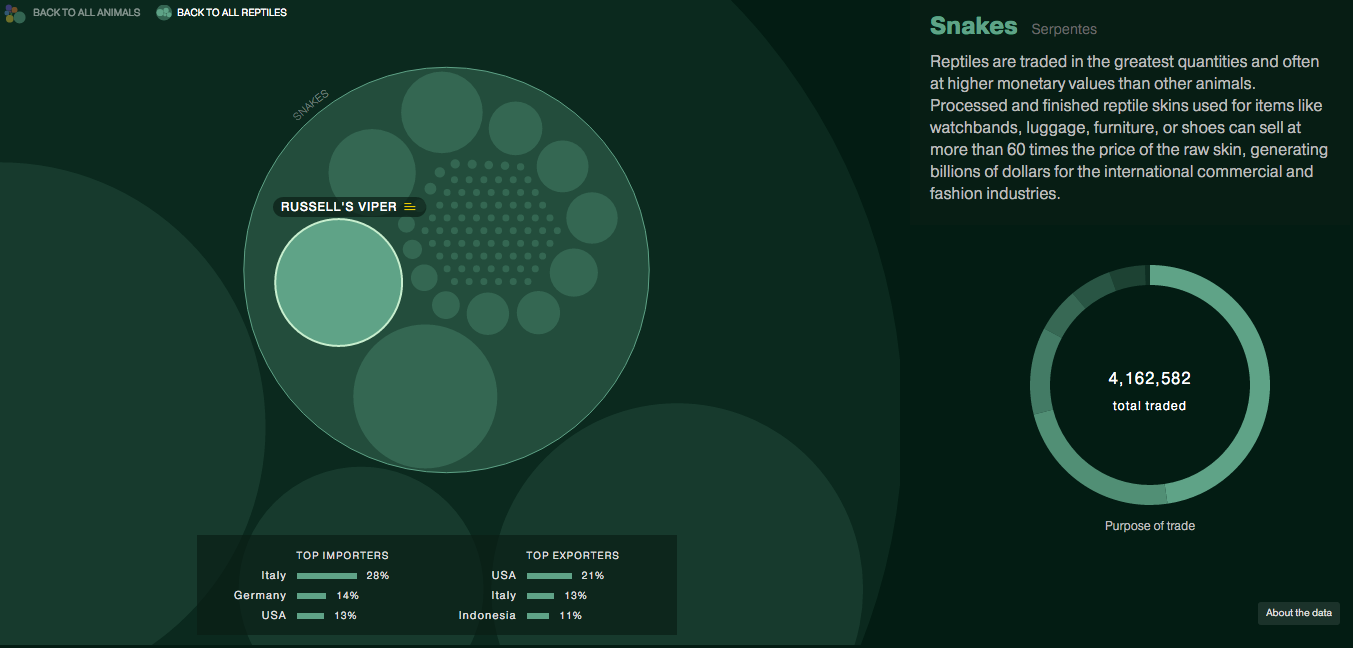
The story and data behind today’s graphic are worth telling. But, the execution leaves me feeling a bit empty. The piece kicks off a new series called Data Points from National Geographic. But, here in this piece we are looking for clear communication of data. So what do we get? Circles. Circles within circles within circles. My problem?
The overview view
Well you can see from the first screenshot that we are missing the gap space, i.e. the space between the container circle and the data circle. The gap makes the container look larger than it really is. Granted, area is not a great way of comparing data points, but that aside, something like a tree map would probably be more accurate and still allow for the nesting that occurs, see below.
A nested view looking at snakes
The overall display includes nice ancillary data about top importers and exporters along with how the animals in question are used. Some animals even have trade notes that offer more context on how particular animals are used.
On the plus side, the piece’s title is great: Space Monkeys and Tiger Wine. I mean, how can you not read that? While they missed lots of the moles popping out of circles on this one, they did nail the title.
Credit for the piece goes to Katilin Yarnall and Fathom Information Design.
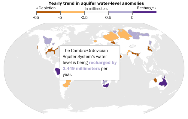
It has rained quite a bit in the south the last couple of days, thanks to tropical weather systems. But, as some new data from NASA shows us, the world is running out of water. That is largely because we drain large underground water systems called aquifers faster than the natural environment replenishes them. The Washington Post has a small interactive map that looks at the world’s largest aquifers and respective trend towards either being recharged or drained.
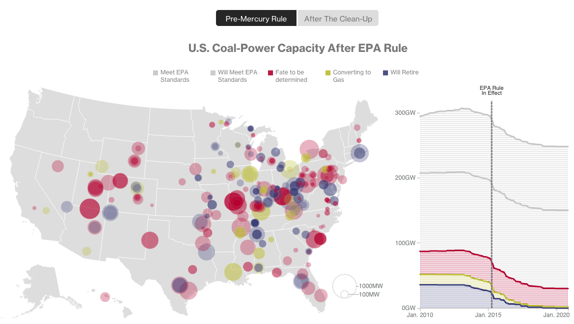
The other day I misread a poster on the road that “The Cool Century” for “The Coal Century”. That is the origin of today’s title. The origin of today’s piece, however, is Bloomberg, which looked at the impact of some new environmental regulations on the coal industry vis-a-vis dozens of coal power plants.
Coal plants
Basically, you have a map with plant size indicated by the dot size, and the type of plant by the colour of the dot. The line chart to the right shows total coal capacity. Overall, it’s a nice, clear, concise graphic. Two buttons give the user immediate access to the story: the pre-regulated environment—see what I did there?—and then then post-regulated one.
Credit for the piece goes to Eric Roston and Blacki Migliozzi.
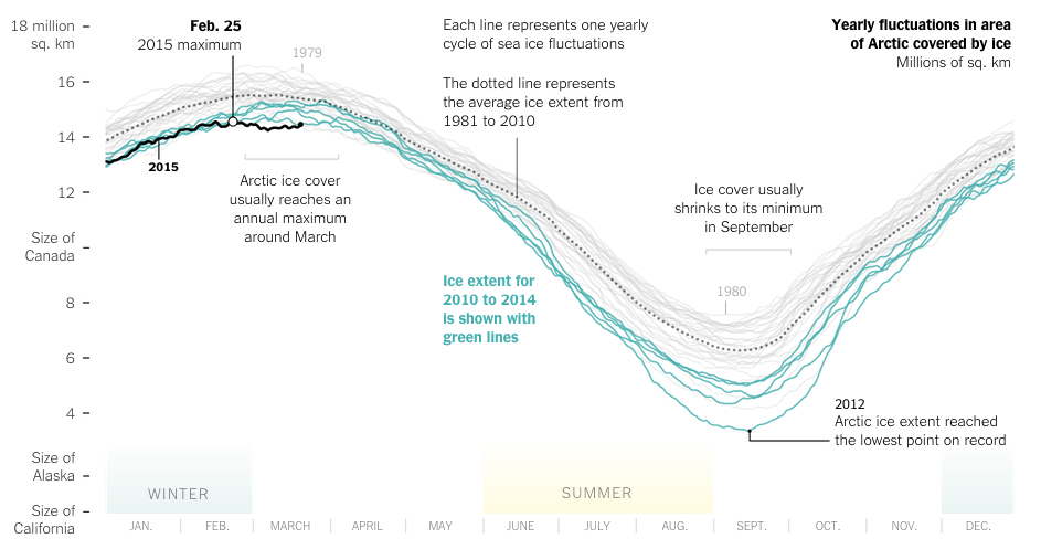
Spring has finally arrived. And that means that far to your humble author’s north, the sea ice in the Arctic is beginning to recede from its annual maximum coverage. However, this year’s coverage was the smallest since satellite records began in 1979. The New York Times covers the story in a nice article with two big data pieces. The first is a really nice map—not shown—that looks at this year’s coverage compared to average extents.
The really nice part, however, is a line chart of historical ice coverage from 1979 through to the current date. While the piece is not interactive, the annotations in the graphic do a nice job explaining the different lines and outliers. Overall, a solid piece.
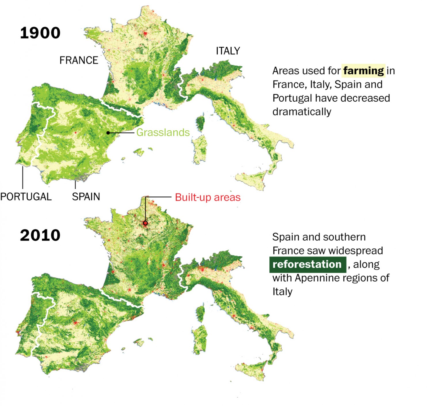
We hear a lot about deforestation around the world. But, in this piece from the Washington Post, we see how over the last century, Europe has actually managed to reverse that trend and reforest parts of the continent.
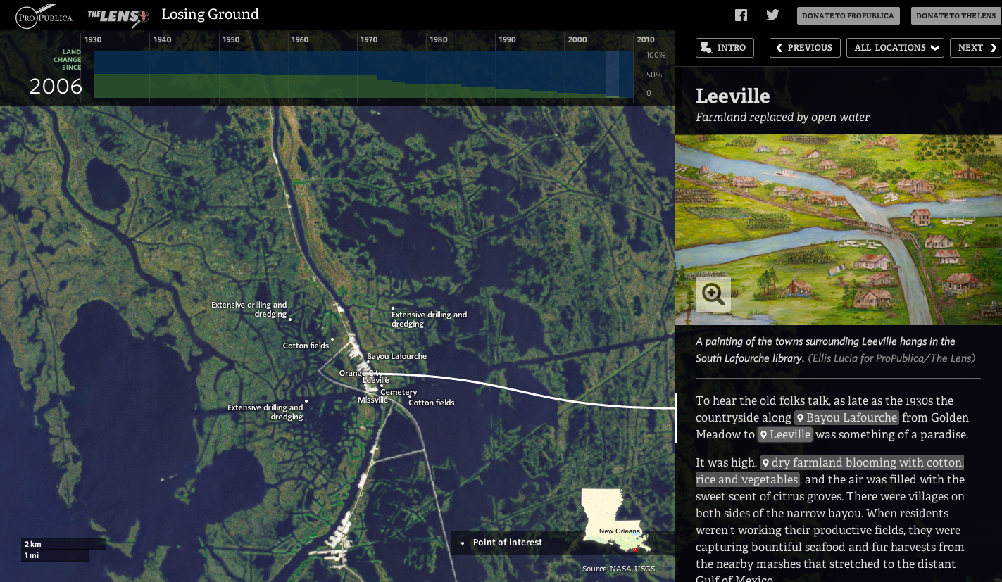
If you want a better understanding of the difficulties facing Louisiana in the coming years and decades, you should start with Losing Ground. It’s a very nice experience that integrates data and narrative along with maps and written word and spoken word to show how badly the wetlands have degraded.
A look at Leeville, LA
Credit for the piece goes to Bob Marshall, Al Shaw, Brian Jacobs, Della Hasselle, Ellis Lucia. Edmund Fountain.
Not here in Chicago at least. But across swaths of the Southwest, people are experiencing droughts. But the New York Times is on it, with a tracker updated weekly.
Nary a drop to spare in Southwest.
Credit for the piece goes to Mike Bostock and Kevin Quealy.