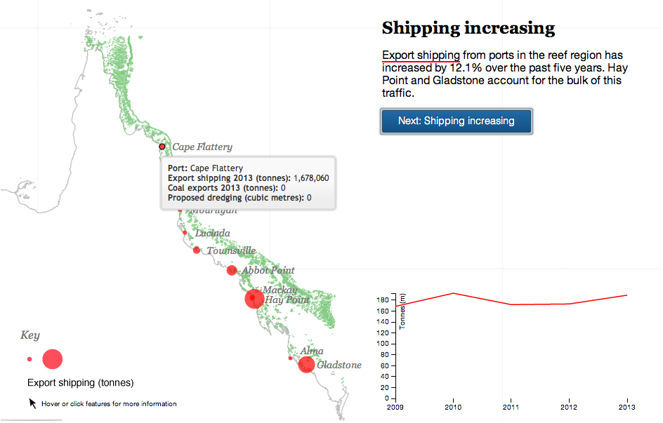
Your humble author is away this week. But the Great Barrier Reef in Australia is still here. For now. The Guardian takes a look at the growing threat to the World Heritage site from the coal industry in Queensland, Australia. The author takes you through the narrative in a chapter format, using charts and maps to illustrate the points in the brief bit of text. A really nice job altogether.
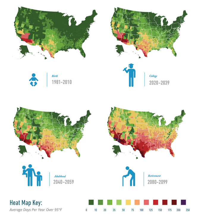
As someone who likes cooler weather, climate change sucks. Because that generally means warmer weather. Yes, yes, I know it means equally good chances for extreme cold temperatures and in general more extreme weather, but mostly I hate hot weather. So a new report by Risky Business Project, a group led by former New York mayor Michael Bloomberg, Henry Paulson, and Tom Steyer, looks to quantify some of the impact.
But in short, nothing good is going to happen. And basically, I will never move to the South.
Impact of climate change
Credit for the piece goes to the graphics team behind Risky Business.
Last week President Obama announced a task force to investigate the disappearance of honeybees. While that might sound like something out of a Doctor Who episode—it is—the problem is real since bees pollinate the flowers that become the fruit and vegetables we consume. The Washington Post took a look at what might be responsible for the decline in bees through this illustrated graphic.
Different reasons for honeybee population collapse
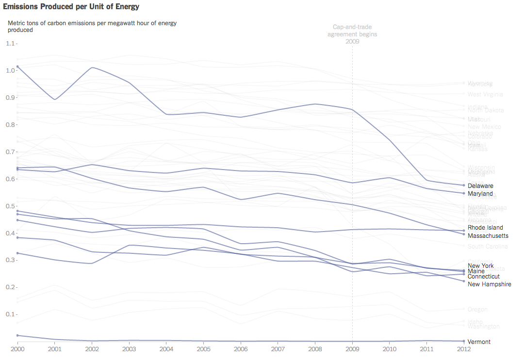
President Obama announced new regulations to be enforced by the EPA that aim to reduce carbon emissions. Principally, the expected reduction will come through state-by-state measures to meet new federally mandated targets. Each state will have the ability to find different means of achieving the cuts, e.g. building more solar plants or nuclear plants or implementing cap-and-trade schemes.
Consequently, the New York Times published this interactive graphic that examines the carbon emissions and energy prices of states. The charts default to a highlight of several Northeast states already participating in a cap-and-trade scheme. The top component charts emissions on a per unit of energy over time while the bottom charts the price of energy.
Carbon emissions over time
Credit for the piece goes to Hannah Fairfield and Derek Watkins.
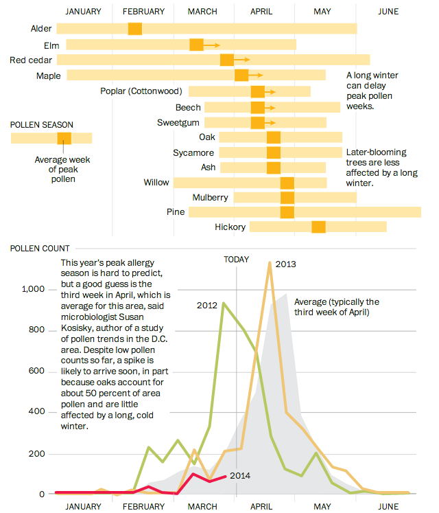
Good news and bad news, folks. The good news is that this chart does not apply to people living in Chicago, Philadelphia, or elsewhere. Unless—here’s the bad news—you live in Washington, D.C. In that case, well, prepare to die. You know, if you have allergies. The Washington Post has a nice graphic that outlines the arrival and peak seasons for different pollen allergens.
Allergens of DC
Credit for the piece goes to Bonnie Berkowitz and Patterson Clark.
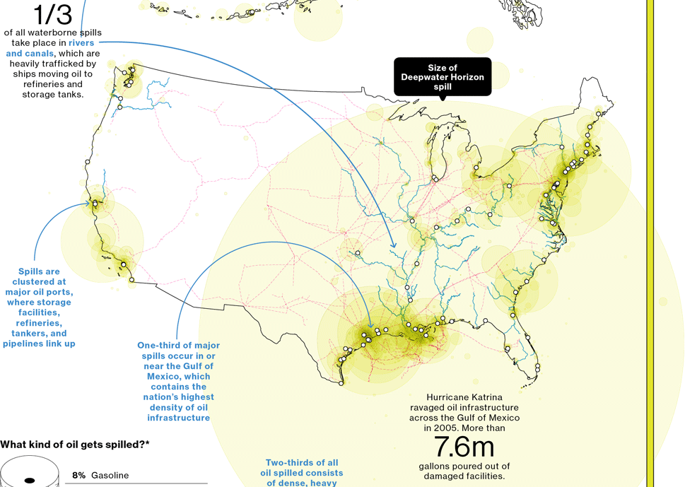
A few weeks ago, Bloomberg Businessweek published a nice graphic that summarised the last 25 years of oil spills. I’m finally getting around to posting it. But what it does really well is show just how bad the Deepwater Horizon spill was compared to the other big name disaster: Exxon Valdez. Of particular note is the bar chart at the bottom right comparing the millions of gallons of oil spilled.
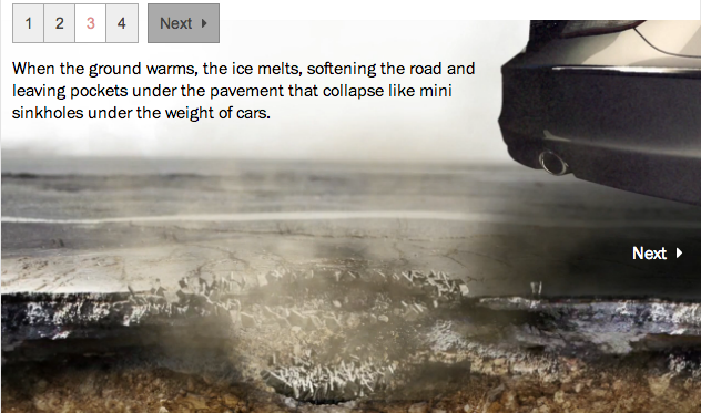
Today’s piece is from the Washington Post. However, it is less data visualisation and more of a neat little motion graphic explaining the formation of pot holes. Since it seems to be about that time of year when roads are destroyed by the things.
Potholes
Credit for the piece goes to Sohail Al-Jamea and Bonnie Berkowitz.
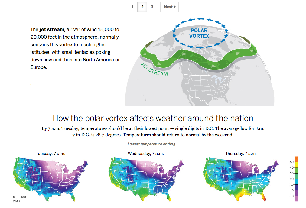
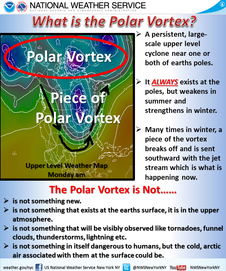
If you live in the United States, you probably have heard the term polar vortex by now. People have been using the term to describe the bitterly cold temperatures affecting the eastern two-thirds of the country. But the term polar vortex is a meteorological term that means a specific phenomenon. In other words, it’s more than a hashtag along the lines of snowmageddon. The Washington Post explains what the polar vortex is.
The Post explains the polar vortex
My caveat for this piece is that from my understanding, it’s not entirely correct. Or perhaps not detailed enough. In brief, we turn to the National Weather Service out of New York for a more technically correct, but more poorly designed graphic.
National Weather Service explanation
Poor type, poor colours, poor hierarchy. Those are abundantly clear, but the important part is that the NWS wants to correct many of the popular misconceptions. Somewhere between the well-intended but less-than-entirely-clear Post piece and the accurate-but-also-unclear National Weather Service piece is an opportunity to explain the concept to the public.
Credit for the Washington Post piece goes to Bonnie Berkowitz, Richard Johnson, Katie Park, and Gene Thorp.
Credit for the National Weather Service goes to the graphics team at the National Weather Service of New York.
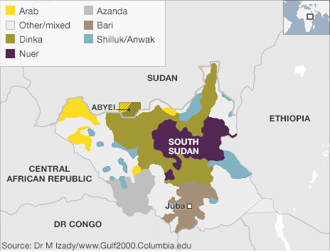
I’ve been away for over two weeks on holiday. So to spread good cheer to all, today I am sharing an image from a series of maps the BBC put together to try and explain the civil war in South Sudan.
Ethnic groups and tribes of South Sudan
Credit for the piece goes to BBC graphics department.