All Fracked Up

Last week a new study revealed that the injection of wastewater from oil drilling and fracking may contribute to earthquakes. Put simply, the theory is that the wastewater injected into the ground lubricates fault lines. And when sufficiently lubricated, the resistance between sides of the fault vanishes and an earthquake is triggered to release the tension in the fault line.

Mother Jones used an animated .gif to explain just how the process of fracking works, specifically to show the wasterwater portion. I chose this piece because it is the first .gif that I have seen attempting to use the looping animation to convey information or a story, especially as an infographic. Make sure to click the image to go the Mother Jones’ article for the animated version.
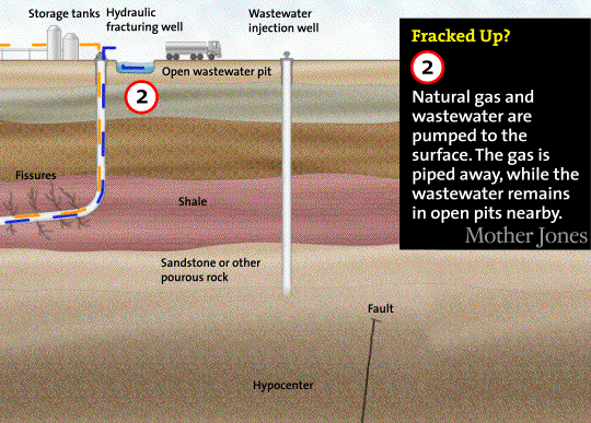
Step 2 of the graphic

Credit for the piece goes to Leanne Kroll and Brett Brownell.

Sandy’s Winds

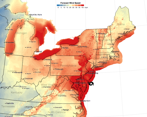
Hurricane Sandy also brought quite a lot of wind. Before the storm landed just south of Atlantic City I was travelling east on the Pennsylvania Turnpike. And as the map below from the New York Times illustrates, I was driving through not insignificant winds (with quite a few more powerful gusts). In the first few hours after landfall, the winds within 100 miles of Sandy’s centre—which was due to pass within miles of my hometown—continued to whip everything exposed to the environment. Thankfully after those first few hours, things began to calm very quickly.

Sandy's Forecast Wind Speeds

The link through the image above is an animation of sorts of the timeline of wind forecasts.

Credit for the piece goes to Mike Bostock and Shan Carter.

Electrical Outages from Sandy

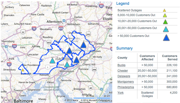
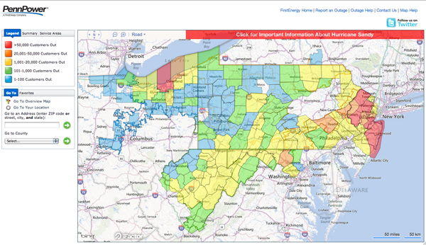
Hurricane Sandy hit the Jersey shore before moving northwest through southeastern Pennsylvania. These were two maps from two different electric utility companies providing information on the number of outages. This first and smaller graphic is from PECO. The second and larger is from FirstEnergy. The graphic from FirstEnergy breaks into the township level when zoomed in sufficiently. Clearly from being able to post this, I am among the fortunate with my electricity still up and running.

PECO Outages on Tuesday
First Energy Outages on Tuesday

Clearly these are not all outages, only the outages reported by these two electrical utilities. At the time of writing some 1.3 million people were without electricity in Pennsylvania and over 7 million in the Northeast while Sandy—now an extra-tropical low pressure system—continues to dump rain and snow on the interior reaches of the area.

Frack You, Gas Hole.

And not in the polite Galactica way, but more in the let’s drill you, rocks, and split you open. I could go in further detail about the injection of fracking fluids, but let’s leave the double entendre alone and talk about Marcellus Shale. It’s a layer of rocks in the dirt that contain natural gas. It’s a pain in the gas production industry (sorry) and thus is only economically viable when fuel prices are high.

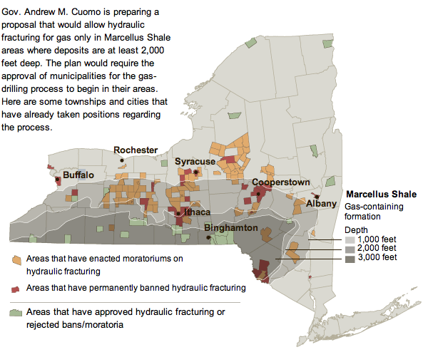
So in the 21st century with high fuel prices, energy companies are hydraulically fracturing (fracking) the rock to suck out all the natural gas. But this might be (probably is) causing environmental problems and thus human health problems. Ergo the controversy. This has now reached New York and so the New York Times created a simple map with some key layers of information to explain the controversy there.

NY Marcellus
NY Marcellus

Note the useful layers of depth of the shale and where those intersect (or do not) with areas that have banned or endorsed fracking.

Western Pennsylvania has had similar problems, and the Philadelphia Inquirer has had an interactive special on their website up for a little while now. And by interactive infographic I mean largely just a play-through of static images. Unfortunately, the online content is not of the best resolution and leaves much to be desired. Fortunately the graphics would appear to be quite informative especially as part of a series. A pity they are not entirely legible.

Location
Location

Credit for the Inquirer piece goes to John Tierno.

A Nine-story Log Cabin

It’s like a log cabin. But taller. A lot taller. The New York Times reports with an infographic on a nine-story block of flats (apartment building for us Americans) in London called the Graphite Apartments that was built almost entirely of timber.

Log cabin
Log cabin

Credit for the piece goes to Mika Gröndahl.

New York Times Lies About Science

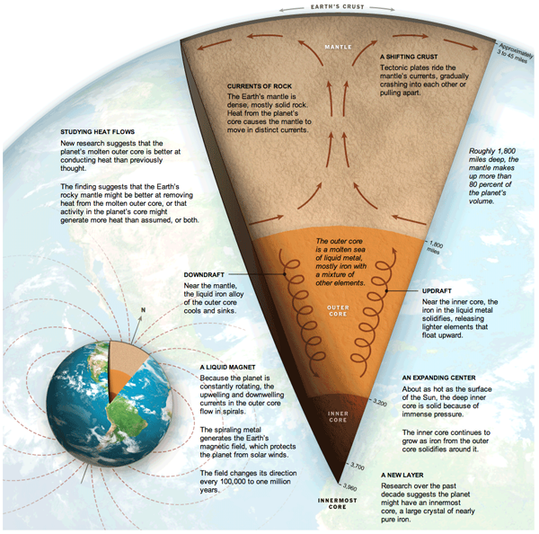
In a rare infographic misstep, the New York Times published an incorrect diagram detailing the centre of the Earth.

Centre of the Earth
Centre of the Earth

Clearly, anyone who knows anything about science knows that it is not a solid core of iron at the centre of the Earth, but dinosaurs. And I see no dinosaurs in this diagram.

Credit for the piece goes to Jonathan Corum, Ritchie S. King, and Frank O’Connell.

Visualising Panda Mating

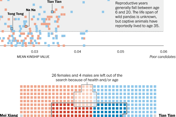
Animals need to reproduce. Well, except perhaps some of our own species…and so today’s infographic from the Washington Post looks at the birds and the bees. Or rather the pandas and the pandas. Or is that the pandas on pandas? Regardless, the reader can see that panda mating is not easy.

Visualising panda mating

Credit for the piece goes to Cristina Rivero.

Canada Invades the Land of the Mole People

Subways. Home of the mole people. And in the United States an unwanted recipient of government money to build things. Along with being generally unwanted. By those who do not live in cities. Probably because of said mole people. Or something.

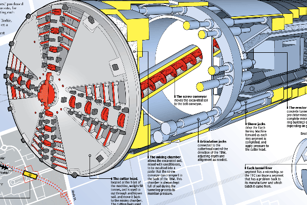
But in Canada, they like subways. At least enough that Toronto is building an extension to a university and from there to a suburb. But the invasion of the mole people homeland is a complex process that, fortunately, the National Post explains in an illustrative infographic, a cropping of which is below.

One of four sibling boring machines: Holey, Moley, Yorkie, and Torkie.

Credit for the piece goes to Mike Faille and Peter Kuitenbrouwer.

Nope, It’s Just Clouds in the Shapes of Birds and Planes.

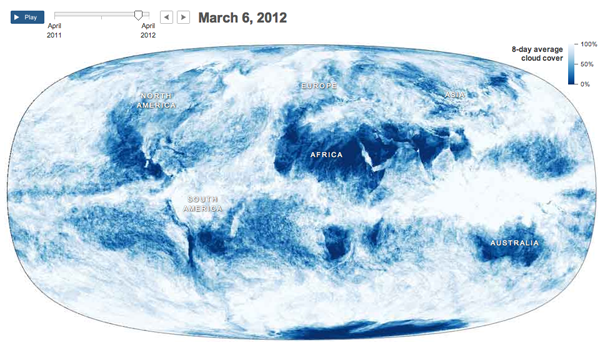
Supporting an article about how the clouds are the last great hope for the climate change skeptics, the New York Times published an interesting infographic that looks at cloud cover and insolation, the amount of solar energy that irradiates the planet.

The main feature is an animation of a year’s worth of cloud cover. The mapped data begins to clearly show the difference between air circulation over the oceans and over land, with the interface between the two creating the rough outlines of the continents.

Cloud map
Cloud map

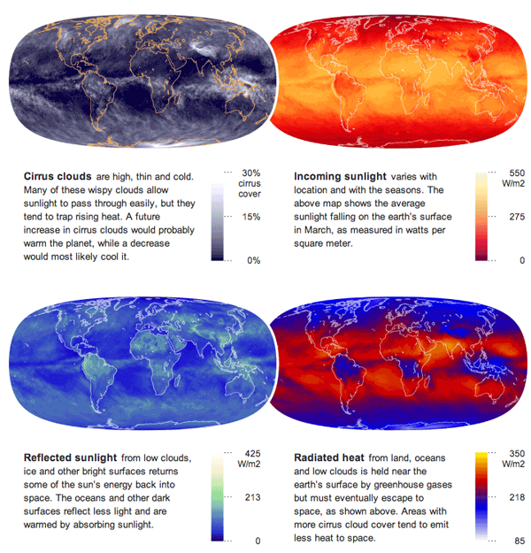
Supplementing the animation are four small multiples of different measures that look at energy and its conservation across the planet.

Energy maps
Energy maps

Credit for the piece goes to Jonathan Corum.