Europe’s Far-right Parties

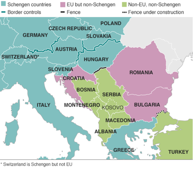
Yesterday we looked at the rise of the far-right in Sweden based on their electoral gains in this past weekend’s election. Today, the Economist has a piece detailing their strength throughout Europe and they claim that this type of nationalist party may have peaked.

The tile map, though

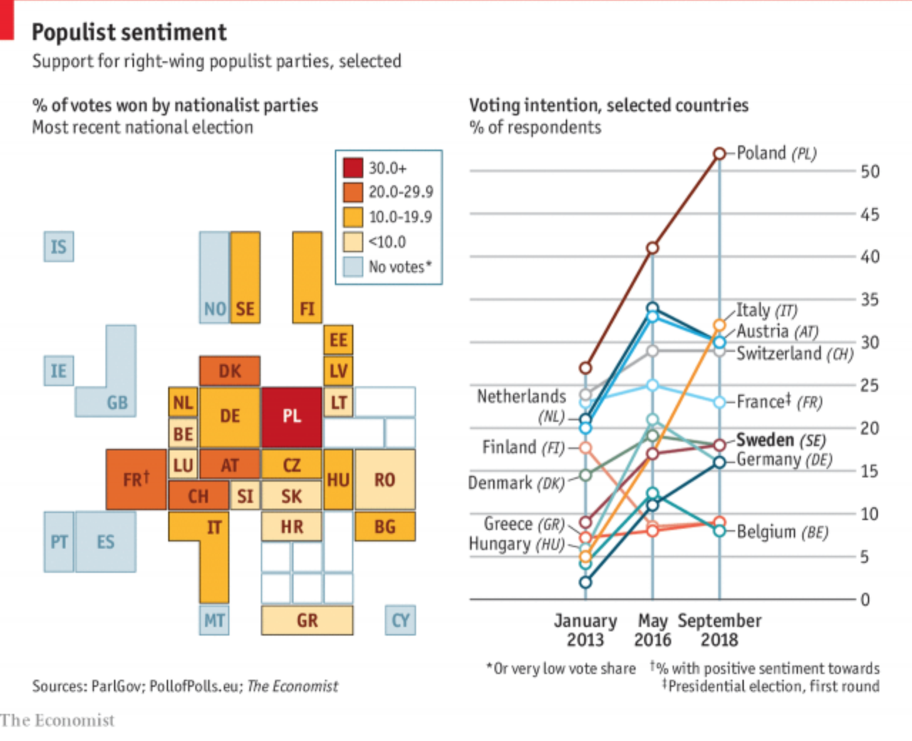
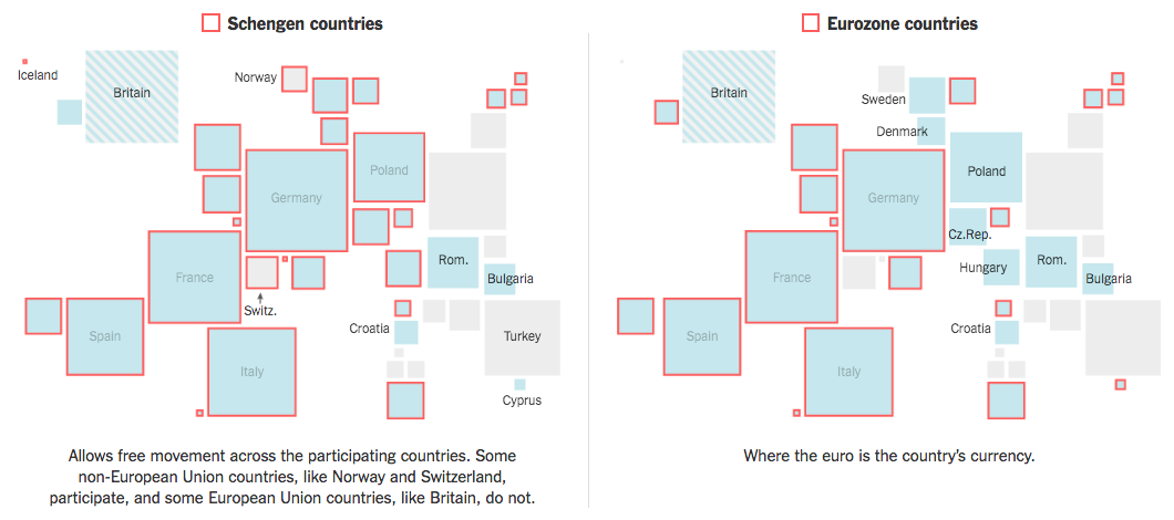
The graphic fascinates me because it appears to be a twist on the box or tile map, which is often used to eliminate or reduce the discrepancies in geographic size so that countries, states, or whatevers, can be examined more easily and more equitably.

I am guessing that the ultimate sizes, which appear to be one to four units, are determined by population size. The biggest hitters of Germany, the UK, France, and Spain are all four squares or boxes whereas the smaller states like Malta are just one. (But again, hey, we can all see Malta this time.)

I think this kind of abstraction will grow on me over time. It is a clever solution to the age-old problem of how do we show important data in both Germany and Malta on a map when Malta is so geographically small it probably renders as only a few pixels.

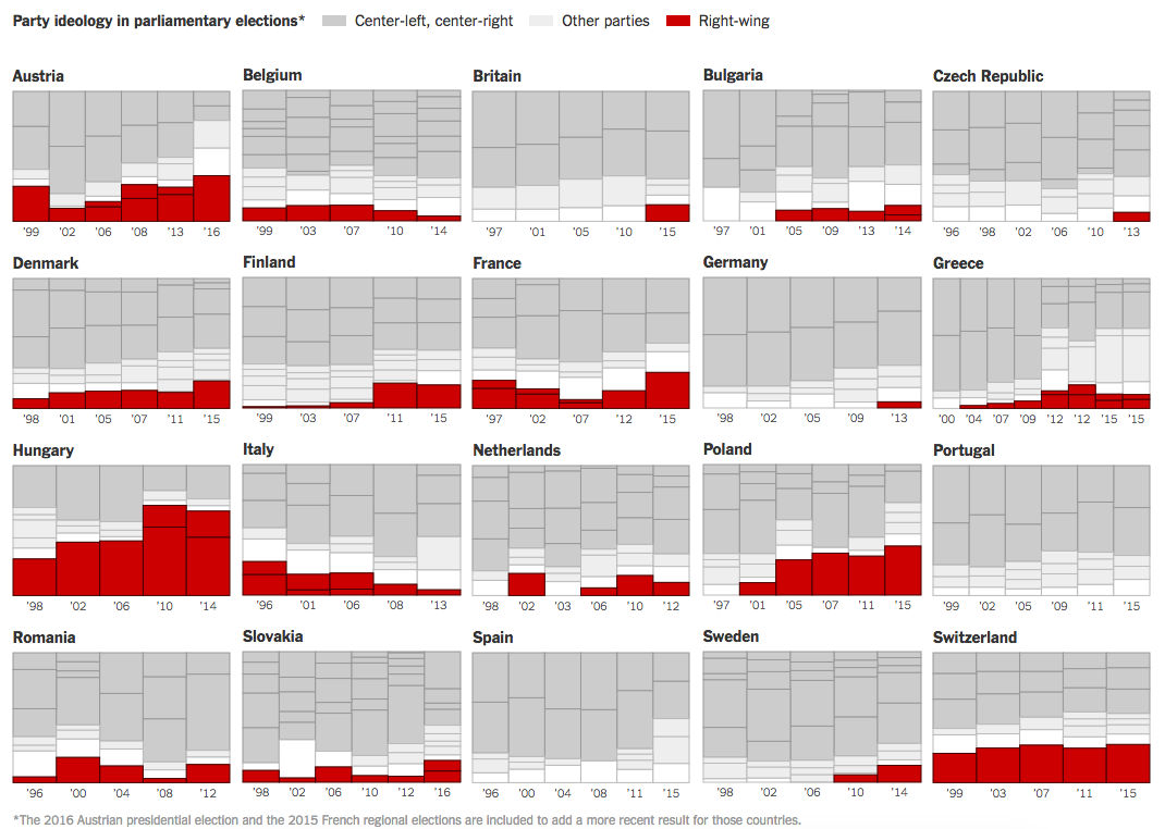
On the other hand, I am not loving the line chart to the right. I understand what it is doing and why. And even conceptually it works well to show the peaks of the parties. However, there are just a few too many lines and we get into the spaghettification of the chart. I might have labelled a far fewer number and let most sit at some neutral grey. Or, space permitting, a series of small multiples could have been used.

Credit for the piece goes to the Economist Data Team.

The Meaning of Macron and Le Pen.

Well there you have it. Macron and Le Pen are moving on to round two of the French presidential election. Now, I have two things I want to address regarding the election. Today’s post looks at the meaning of the result and tomorrow’s will be about how that result was displayed.

Quartz did a really nice job outlining the likeliest outcomes, where the candidates stand, and then the initial polling for a round two head-to-head. And they did it all in one graphic.

What do the outcomes mean?

I might not like the style of the icons—a a dollar sign emoji for a country that uses the Euro?—but the concept works well. But the best part is the brief synopsis to the right that describes the meaning of that particular outcome.

Credit for the piece goes to the Quartz graphics department.

Populism Marches on in Europe

By just a hair under 20 percentage points, Italian voters—with a 70% turnout rate—voted down the reform package of soon-to-be-former Prime Minister Matteo Renzi. While the election was focused narrowly on a set of political reforms for Italian government, e.g. reducing the number of senators, the vote was unofficially seen by many as a test of the strength of anti-establishment populists in Europe. Note wins by such groups in Brexit and Donald Trump. In Europe this is a particularly important barometer reading because of 2017 elections in the Netherlands, France, and then Germany.

I had been looking for some online results trackers, in English, last night but found little. There was, however, this page from Bloomberg. The key thing for me is the link between the regions on the map and the section on the bar chart.

The datasets in the map and bar chart are linked, a nice touch

Credit for the piece goes to Bloomberg’s graphics department.

European Interconnectedness

The United Kingdom voted to leave the European Union. Kind of a big deal, right? After the vote, the New York Times put together a piece on just how connected Europe remains. For example, European defence can largely be considered guaranteed through NATO, to which the United Kingdom remains. The screenshot below details which European countries participate in the Schengen Zone and the Eurozone, the former creates a common border the latter a common currency.

I personally dislike the use of squares to represent European countries, with the size determined by the population. Granted the piece opens with a large map labelling every country, but it does require a user to have the ability to abstract the geography of Europe. Adding a degree of interactivity over each square would partially resolve the issue.

Travel and currency connectivity throughout Europe

Credit for the piece goes to James Kanter and Iaryna Mykhyalyshyn.

Europe’s Far-right Parties

On Sunday, Austria narrowly elected a former Green Party leader as president over the leader of the Freedom Party, a far-right party that surged in part because of the impact of Europe’s migrant and refugee crisis. The New York Times took a look at just how often and by how much far-right parties have succeeded in European countries in recent years.

There's more red than there used to be
There’s more red than there used to be

What I really like about this piece is that while they could have stopped at the above graphic, they opted to not. Some of the graphics above then introduce a section specific to the politics of the particular country, e.g. France and the rise of the National Front and Marine Le Pen.

France in detail
France in detail

Credit for the piece goes to Gregor Aisch, Adam Pearce, and Bryant Rousseau.

The EU’s Migrant Problem

Last week we looked at a map produced by the Washington Post, which detailed the routes chosen by migrants and refugees desiring to reach the European Union. This week, I want to compare that to one from the BBC—there are others, even from the BBC, but we will examine them later—that details the differences in countries along the route.

EU border map
EU border map

The previous map simply highlighted countries in the Schengen Area, which allows for Passport-free travel between participating EU members. This map uses colour to denote which countries participate and whether they belong in the EU. But it also uses white lines to indicate border, so that Schengen Area countries seem more contiguous. This allows them to use colour to add the layer of recent news: recently imposed border controls and newly constructed fences. My concern in this particular piece is that those pink and green countries should probably have some sort of line indicating that they do have border controls.

Credit for the piece goes to the BBC graphics department.

Greek Referendum Results

So when I initially planned to do this post for today, I thought the results would be a lot closer and the data display more interesting. But, I was wrong. It turns out the Greeks voted overwhelmingly against the European Union’s offer in a greater than 60–40 result. But, here we go anyways, a whole lot of no in this piece from the Guardian.

Turns out Greeks don't want austerity
Turns out Greeks don’t want austerity

Credit for the piece goes to the Guardian’s graphics team.

The Perception vs Reality of Islam in Europe

Last week’s terror attacks in Paris highlight the tension in Europe between secular Europe and those believing in Islamist values. The Economist looked at some of the available data and noted the gap between Europe’s perception of Islam and its reality. A quick figure called out for France, French respondents thought 31% of the French population to be Muslim. The reality is a mere 8%.

Perception vs reality

Credit for the piece goes to the Economist Data Team.

The Reforestation of Europe

We hear a lot about deforestation around the world. But, in this piece from the Washington Post, we see how over the last century, Europe has actually managed to reverse that trend and reforest parts of the continent.

A look at the western Mediterranean

Credit for the piece goes to Rock Noack.

Europe Votes

Sunday (and a few days preceding it) was election day in the European Union for the European Parliament. Unfortunately it was also a banner day for the far-right parties. In France the National Front (FN) took the top slot and in the United Kingdom that went to the UK Independence Party (UKIP). This graphic from the Economist looks at the results, highlighting the right-wing or eurosceptic parties.

Europe Tilts Right
Europe Tilts Right

Credit for the piece goes to K.N.C. and P.K.