Datagraphics as Marketing Materials

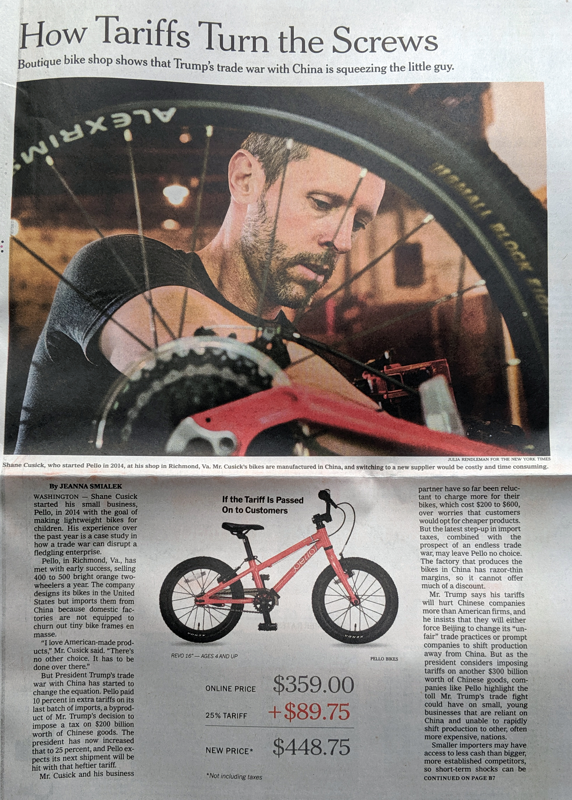
I spent the last two weeks out of town, and my post for the Friday before didn’t happen because there was a fire at my building—I and my unit are fine—that knocked out internet for about 24 hours. But now I have returned.

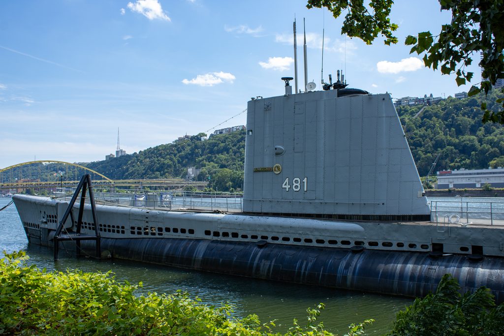
One of the things I did was visit the city of Pittsburgh in western Pennsylvania. There I discovered the city has a World War II era submarine, the USS Reqin, a Tench-class submarine that launched at the end of the war and saw no active combat. She was later preserved and arrived at the Carnegie Science Centre in Pittsburgh where she serves as a museum ship.

USS Requin moored in the Ohio River

As I waited for the self-guided tour to begin, I spotted a small poster with some big numbers. Naturally I investigated and found it to be a marketing piece by PPG, a Pittsburgh-based paint and coatings company. The poster detailed the work that went in the preservation of the submarine’s exterior using PPG’s own paints and coatings.

The Requin as a poster

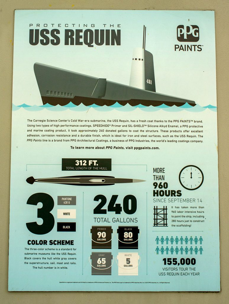
We can see the large numbers clearly and to the piece’s credit the hierarchy works. What are we talking about? Three paints applied to the submarine in these quantities in this amount of time. The only factette not totally relevant is how many tourists annually visit the submarine.

Design wise, the poster does a nice job of dividing up its space into an attention-grabbing upper-half. After all, it grabbed my attention. The lower half then subdivides into three columns that speak to the aforementioned subjects. The last column then divides again into halves.

As marketing design does, it’s not the most offensive. For example, we don’t have the gallon buckets sized or scaled differently. The designers used a restrained palette and kept a consistent typographic treatment.

Admittedly, I was a bit disappointed because I had thought it would be some facts or data about the submarine itself. But for what the piece is, I thought it did a nice job.

Credit for the piece goes to PPG’s graphics department.

Russo-Ukrainian War Refugees: 12 April

Another week, more combat and refugees in Ukraine. I’m going to try and hold the war update until tomorrow pending some news that hasn’t been confirmed yet: the fall of Mariupol. Instead, we’re going to again look briefly at the refugee situation in Ukraine—technically outside. I haven’t seen a recent number on the internally displaced, though we have begun to see some people return to Ukraine especially in the north and around Kyiv. It’s unclear to me if the data includes those people returning.

Regardless, we are at over 4.6 million Ukrainians who have fled Ukraine.

Slowing down of late.

The question now is as Russia refocuses its effort now on the Donbas—though fierce fighting has been waged in the area for eight years now—will these numbers begin to see a notable change.

Credit for the piece is mine.

Russo-Ukrainian War Refugees: 5 April

Just a quick update as I try to update my battle map. Today we’re taking another look at the refugee crisis Putin created in eastern and central Europe. Over four million Ukrainians have left Ukraine and millions more have been displaced internally within Ukraine.

Whilst we may hope they will eventually return home, the photos and videos we are seeing of Ukrainian areas that had been captured by Russian forces show that many Ukrainians no longer have homes or even villages to which they can return.

This problem will persist for years as Ukraine tries to rebuild. And that doesn’t include the fact that much of southern and parts of eastern Ukraine remain under Russian control. And some of those areas continue to see fierce fighting.

Credit for the piece is mine.

Trump’s White Wall

I meant to publish this yesterday, but this piece also offers a reminder that the hardest part of a data-driven story is usually finding the data. I was unable to find a single source of data for all the numbers I needed by the time I switched on for work. And so this had to wait until last night when I found what I needed.

And of course upon waking up this morning I found a few new articles with the data and more recent figures.

Since 2016, Trump has made building a great, big, beautiful wall on the US-Mexican border his signature policy. Of course, most illegal immigrants cross the border legally at checkpoints and normal ports of entry. A significant number are people who overstay the limits on their visas. So the efficacy of a great, big, beautiful wall is really not that great.

He also claimed that he would make Mexico pay for it.

So as he prepares to leave office, Trump this week is going on something of a victory tour and touting up his administration’s successes. The first stop? Alamo, Texas to highlight his wall.

Let’s look at that wall and how much the administration has accomplished.

For context, the US border with Mexico is nearly 2000 miles long. As of 18 December, the administration had built 452 miles, less than a quarter of the border’s total length.

Crucially, most of that construction merely replaced sections of existing wall and fence scheduled for replacement. The total amount of new wall built, as of 18 December, totals about 40 miles.

The cost of that 452 miles? More than $15 billion.

How much has Mexico paid? $0.

Credit for the piece is mine.

Pence’s Jobs Claim: Fact Checked

I watched Vice President Prence’s convention speech last night. He made several claims, including one about the Trump administration creating 9.3 million jobs over the last three months.

That’s a lot of jobs. So I wanted to check and see if that was true.

It is. over the last three months, the administration has created 9.3 million jobs.

But in the two months before that?

They lost 22.2 million jobs.

They have another 12.9 million jobs to create just to get back to where we were, and that doesn’t include the jobs required for the natural increase in population and immigration.

Credit for the piece is mine.

Tariffs Are a Tax

This piece from the New York Times isn’t really even a graphic. It’s a factette, or small fact. The article is about how tariffs are raising the price of certain goods, in this case a bicycle. Tariffs do not add money to the US Treasury, they are instead an additional price paid by US consumers on goods—not services—originating from outside the US.

Thankfully I can't ride a bike
Thankfully I can’t ride a bike

Sometimes a big chart is not as impactful as one big number. And here, in the context of this story, a graphic showing trade flows between the US and Mexico may have been useful. But the real gut punch is showing how the tariffs on Mexico, for this one particular bike, could cost the US consumer an additional $90. A tariff is just another word for a tax paid by the American consumer.

Credit for the piece goes to the New York Times graphics department.

Pages of Polls and Forecasts

We are now one week away from the midterm elections here in the United States. Surprisingly, we are going to be looking at election-y things over the course of the next week or so. But before we delve into that, I wanted to focus on the homepage for FiveThirtyEight, the below screenshot is from my laptop.

The homepage as of 30 October

The reason I wanted to call attention to it is that right-most column of content. The site does a great job of succinctly providing the latest forecasts and polling number on the two main midterm results, federal representation in the House and Senate, along with polling numbers for President Trump.

Starting from the bottom, the polling numbers chart works really well. It clearly and effectively shows the latest approval/disapproval numbers and their longer term trend whilst providing a link to a page of deeper data. It’s very effective.

Moving up we have the House forecasts. These are tricker to see because so many of the more urban and suburban districts are inherently small geographically ergo very difficult to see in a small map. But the map does the job of at least providing some data along with the key takeaway of the odds of the Democrats flipping or Republicans retaining the House. Again, not surprisingly, it offers a link into the data.

The Senate map is the one where I have the most difficulty. Now when we get to the actual page—hopefully later this week—the map shown makes perfect sense because it exists in a large space. That space is needed to show two hexagons that represent each state’s two senators. But, similar to the problem with the House districts, the Northeast is so geographically cramped that it is difficult to show the senators from Maine through Maryland clearly. I wonder if some of the other visualisations on their Senate forecast page would have been a better choice. However, they do at least provide those odds at the top of the graphic.

Credit for the piece goes to the FiveThirtyEight design department.

Philly Rules

Yo. C’mon, bro. This jawn is getting tired. Just stop already.

If you did not catch it this week, the most important news was Donald Trump disinviting the Super Bowl champions Eagles to the White House to celebrate their victory over the Patriots. He then lied about Eagles players kneeling during the US anthem—no player did during the 2017 season. He then claimed that the Eagles abandoned their fans. Yeah, good luck convincing the city of that.

So naturally we have a Friday graphic for youse.

That's 25,304.
That’s 25,304.

Full disclosure: I root for the Patriots. But I mean, seriously, can’t youse guys do the math?

Traffic Accidents in Philadelphia

I’m working on a set of stories and in the course of that research I came across this article from Philly.com exploring traffic accident in Philadelphia.

Lots of red there…
Lots of red there…

The big draw for the piece is the heat map for Philadelphia. Of course at this scale the map is pretty much meaningless. Consequently you need to zoom in for any significant insights. This view is of the downtown part of the city and the western neighbourhoods.

A more granular view


As you can see there are obvious stretches of red. As a new resident of the city, I can tell you that you can connect the dots along a few key routes: I-76, I-676, and I-95. That and a few arterial streets.

Now while I do not love the colour palette, the form of the visualisation works. The same cannot be said for other parts of the piece. Yes, there are too many factettes. But…pie charts.


This is the bad kind of pie

From a design standpoint, first is the layout. The legend needs to be closer to the actual chart. Two, well, we all know my dislike of pie charts, in particular those with lots of data points, which this piece has. But that gets me to point three. Note that there are so many pieces the pie chart loops round its palette and begins recycling colours. Automotives and unicycles are the same blue. Yep, unicycles. (Also bi- and tricycles, but c’mon, I just want to picture some an accident with a unicycle.)

If you are going to have so many data points in the pie chart, they should be encoded in different colours. Of course, with so many data points, it would be difficult to find so many distinguishable but also not garish colours. But when you get to that point, you might also be at the point where a pie chart is a bad form for the visualisation. If I had the time this morning I would create a quick bar chart to show how it would perform better, but I do not. Trust me, though, it would.

Credit for the piece goes to Michele Tranquilli.