
National Geographic recently published a piece designed and built for them by Fathom Information Group. Content-wise, they looked at the historic consumption of food by several different countries. What do individual food groups contribute to the overall nutritional breakdown? For the piece this basically amounted to morphing donut charts. I get the reference, but do not care for the result.
Instead more interesting is the second main view of the piece: meat consumption. Using stacked line charts, National Geographic explores changes in consumption patterns over the last 50 years. Some countries change a bit, others not so much. But as always the best examples are called out with an explanation as to why the changes. Mexico, for example, has the story about slashes in government subsidies and economic problems as to a decline in pork consumption.
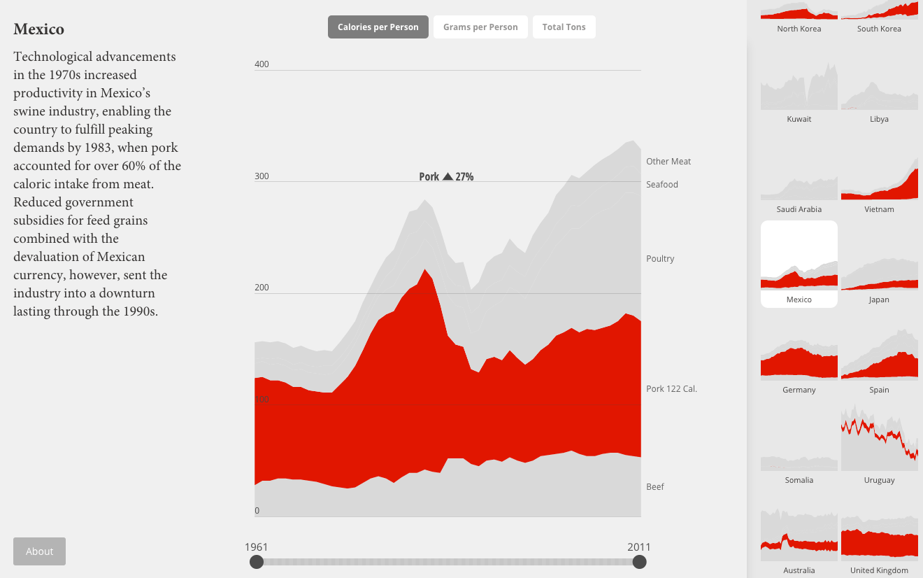
Clearly I still have issues with the data visualisation. I would much rather see the selected view isolate the selection off the common baseline. But a nice touch is the small multiples from the country selection mechanism appearing to the right.
Credit for the piece goes to Fathom Information Design.