This is an older piece that I’ve been thinking of posting. It comes from FiveThirtyEight and explores some of the data about Russian trolling in the lead up to, and shortly after, the US presidential election in 2016.
They’re all just ugly trolls. Nobody loves them.
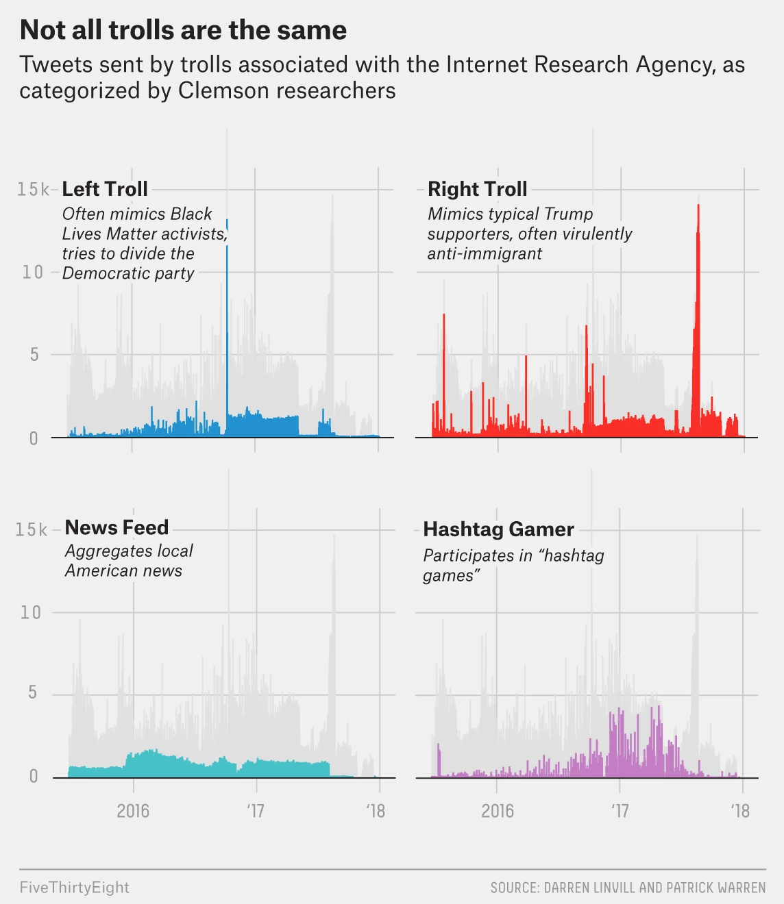
The graphic makes a really nice use of small multiples. The screenshot above focuses on four types of trolling and fits that into the greyed out larger narrative of the overall timeline. You can see that graphic elsewhere in the article in its total glory.
From a design standpoint this is just one of those solid pieces that does things really well. I might have swapped the axes lines for a dotted pattern instead of the solid grey, though I know that seems to be FiveThirtyEight’s house style. Here it conflicts with the grey timeline. But that is far from a dealbreaker here.
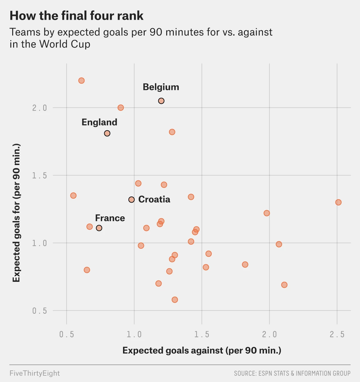
Today is the semifinal match between England and Croatia. I could have posted this yesterday, but the US Supreme Court selection seemed more important. But today’s post is a simple scatter plot from FiveThirtyEight. It is part of a broader article comparing the four semifinalists of the World Cup. (Spoiler alert, France won its match.)
No drama today, please
In terms of design, we can contrast this to yesterday’s dot plot about Kavanaugh. There the highlighted dot was orange with a black outline. Here, same deal. But yesterday, the other justices were shown with black dots and an empty dot for retiring Justice Kennedy. Here all the other countries in the World Cup are orange dots.
I wonder, given the orangeness of the other countries, maybe a solid black dot would have worked a little better for the four semifinalists. Or to keep the orange with black outline dots, maybe a lighter orange or grey dots for the other World Cup teams. (I think black would probably be too strong in this case.)
Overall, it shows that today’s match between England and Croatia will be tough. And should England advance, a match against France will be even tougher.
Last night President Trump nominated Merrick Garland to fill the seat left by Anthony Kennedy. Just kidding. But he is up for a vote in the Senate. Also just kidding.
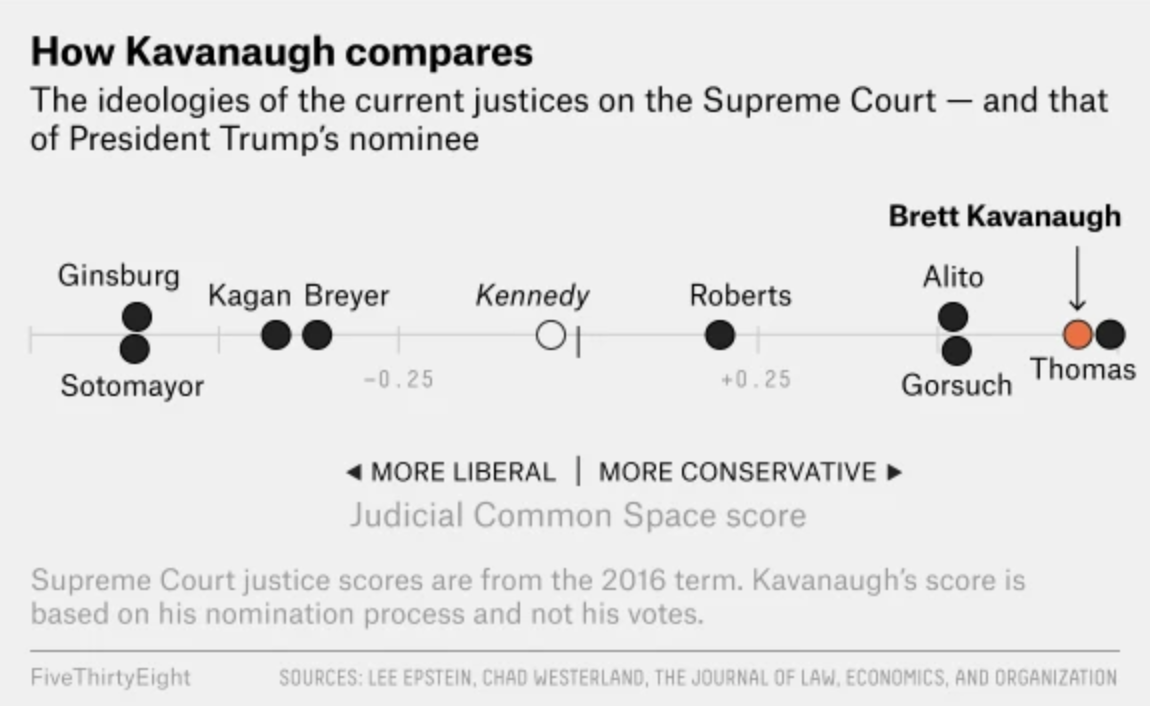
No, instead, President Trump nominated a very conservative judge for the Supreme Court, Brett Kavanaugh. How conservative? Well, FiveThirtyEight explained in a piece that plotted the judge against his probably peers on the bench, based upon one measure of judicial ideology. And it turns out, spoiler, Kavanaugh sits just to the left of Clarence Thomas. And he sits pretty well to the right.
To the right, to the right, to the right goes the Court
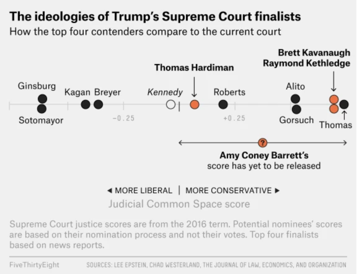
The graphic itself is an evolution of a piece from last Friday that looked at what were thought to be the four main candidates on Trump’s shortlist.
A definite lean to the right
The final piece, with only Kavanaugh plotted, removes the other potential candidates. And it functions well, using the brighter orange to draw attention from the black dots of the sitting bench and the open dot of the vacant seat. My slight issue is with the predecessor graphic that shows the four candidates.
I probably would have just left off Barrett as she did not have a score. While I have no doubt that she would score to the right based upon all the reading I have done over the past several days, it feels a bit odd to place her on the graphic at all. Instead, I probably would have used an asterisk or a footnote to say that she did not have a score and thus was not placed.
Credit for the piece goes to Oliver Roeder and Amelia Thomson-DeVeaux.
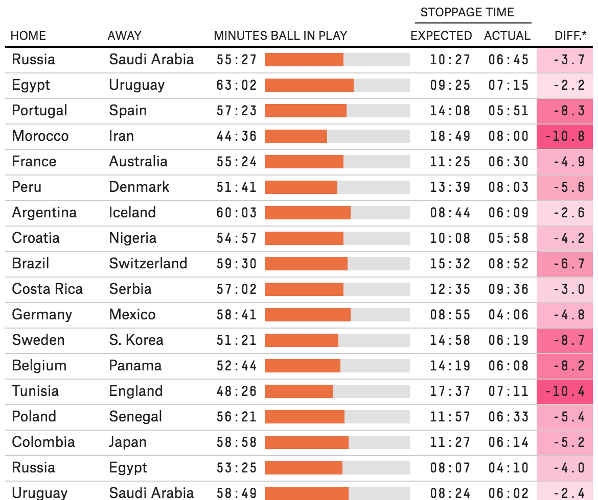
Late last week I was explaining to someone in the pub why the World Cup matches are played beyond their 90 minute booking. For those among you that do not know, basically the referees add up all the stoppage time, i.e. when play stops for things like injuries or people dilly dallying, and then tack that on to the end of the match.
But it turns out that after I explained this, FiveThirtyEight published an article exploring just how accurate this stoppage time was compared to the amount of stopped time. Spoiler: not very.
In design terms, the big takeaway was the dataset of recorded minutes of actual play in all the matches theretofore. It captured everything but the activity totals where they broke down stoppage time into categories, e.g. injuries, video review, free kicks, &c. (How those broke out across an average game are a later graphic.)
Through 27 June
The setup is straightforward: a table organises the data for every match. The little spark chart in the centre of the table is a nice touch that shows how much of the 90 minutes the ball was actually in play. The right side of the table might be a bit too crowded, and I probably would have given a bit more space particularly between the expected and actual stoppage times. On the whole, however, the table does its job in organising the data very well.
Now I just wonder how this would apply to a baseball or American football broadcast…
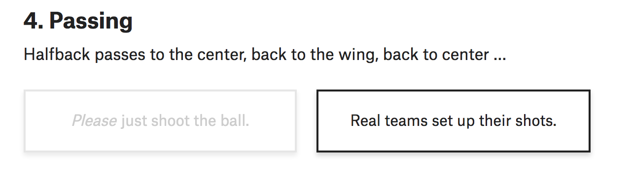
The World Cup continues. Well for a few teams. Some have already been eliminated from the Round of 16. But for those Americans rooting for Team America, well, if you have not yet figured it out, you got knocked out well before the World Cup even started by…Panama. And so you are stuck in the question of who’s next? Thankfully FiveThirtyEight, in addition to their fantastic live probabilities that we looked at the other day, put together a little quiz to help you find your new team.
You answer seven questions and you are told your new allegiance. Questions like this:
How would you answer?
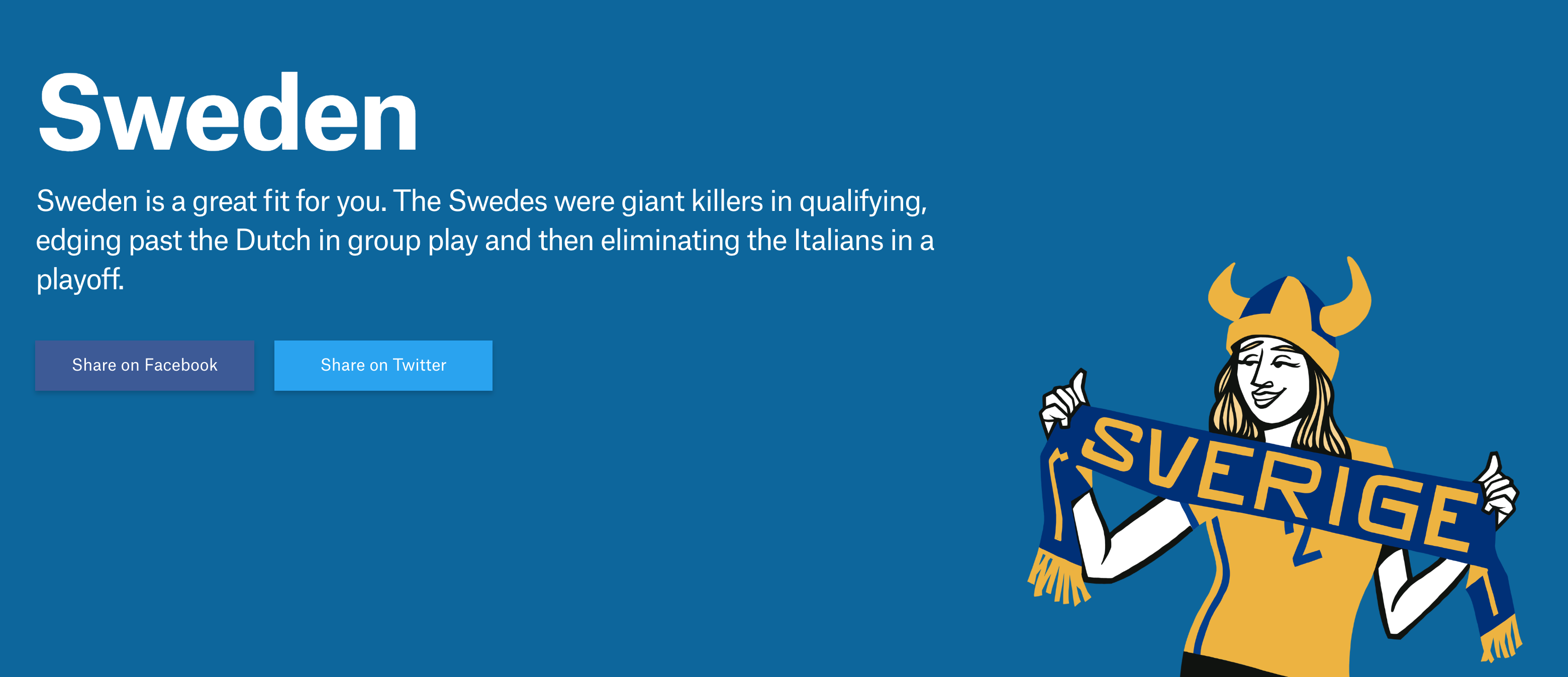
Naturally I took the quiz and discovered that in addition to England, I am cheering for…
Goal? Make that skål!
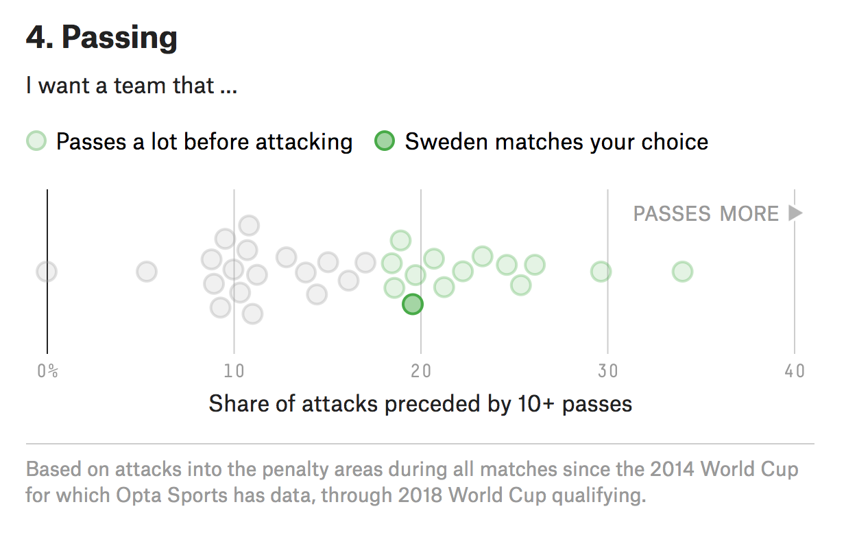
Yep. Fantastic since I was just there in December and happened to love Stockholm. But what I love about this piece is how it uses data to create the newfound bond I have with Sweden. Often times you take a quiz and are given an answer without any sense of why the answer was correct. Here, FiveThirtyEight plots the seven different variables used to create your newfound personality and then shows you how you scored.
Right in the middle there
It’s Friday, it’s the World Cup. Have a great weekend. And in addition to England on Sunday, I’ll now be cheering for Sweden against Germany on Saturday.
Credit for the piece goes to Michael Caley, Rachael Dottle, Geoff Foster, Gus Wezerek, Daniel Levitt, Emily Scherer, and Jorge Lawerta.
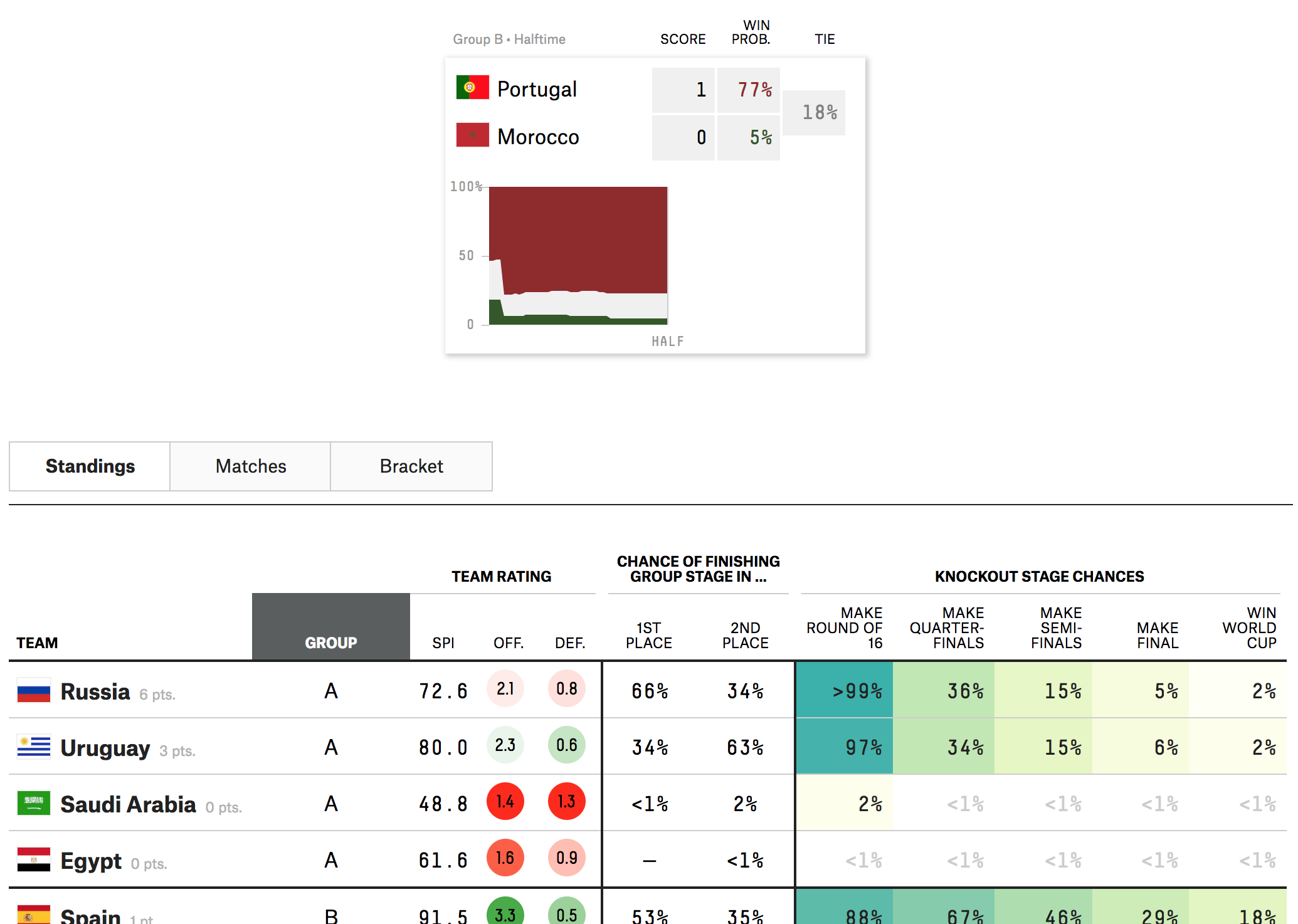
The World Cup has had some impressive matches and some stunners. (And the two are not mutually exclusive.) But if you are like me and have to work during most of the broadcasts, how can you follow along? Well thankfully FiveThirtyEight put together a nice statistical model that provides the probability of a team winning—or drawing—in real time.
Looking pretty good for Portugal this morning…
The design is fairly simple: a small table with the score and probability followed by a chart drawn as the match goes on. (Clearly I took this image at the half.)
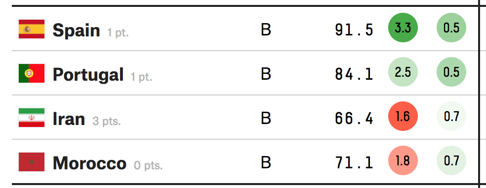
I included a snippet of the table below to show the other work the FiveThirtyEight team put out there. You can explore the standings, the screenshot above, as well as the matches and then the brackets later in the competition.
The table makes nice use of the heat map approach to show is likely to make easy of the different stages of the competition. Like I said the other day, they are high on Brazil, because Brazil. But a little lower on Germany. But never count Germany out.
Shouldn’t Iran be in the top slot?
The only unclear thing to me in the table? The sorting mechanism. In Group B, at least whilst the Portugal match is ongoing, should probably have Iran at the top. After all, as of writing, it is the only team in the group to have won a match. The only thing I can guess is that it has to do with an overall likelihood to advance to the next round. I highly doubt that Iran will defeat either Spain or Portugal. But as with many knockout-style championships, anything can happen in a single match sample size.
Credit for the piece goes to Jay Boice, Rachael Dottle,Andrei Scheinkman, Gus Wezerek, and Julia Wolfe.
Here in Philadelphia, I think yesterday was the first day it had not rained in over a week. Not that everyday was a drenching storm, but at least showers passed through along with some downpours and definitely grey skies. But what about my old home, Chicago?
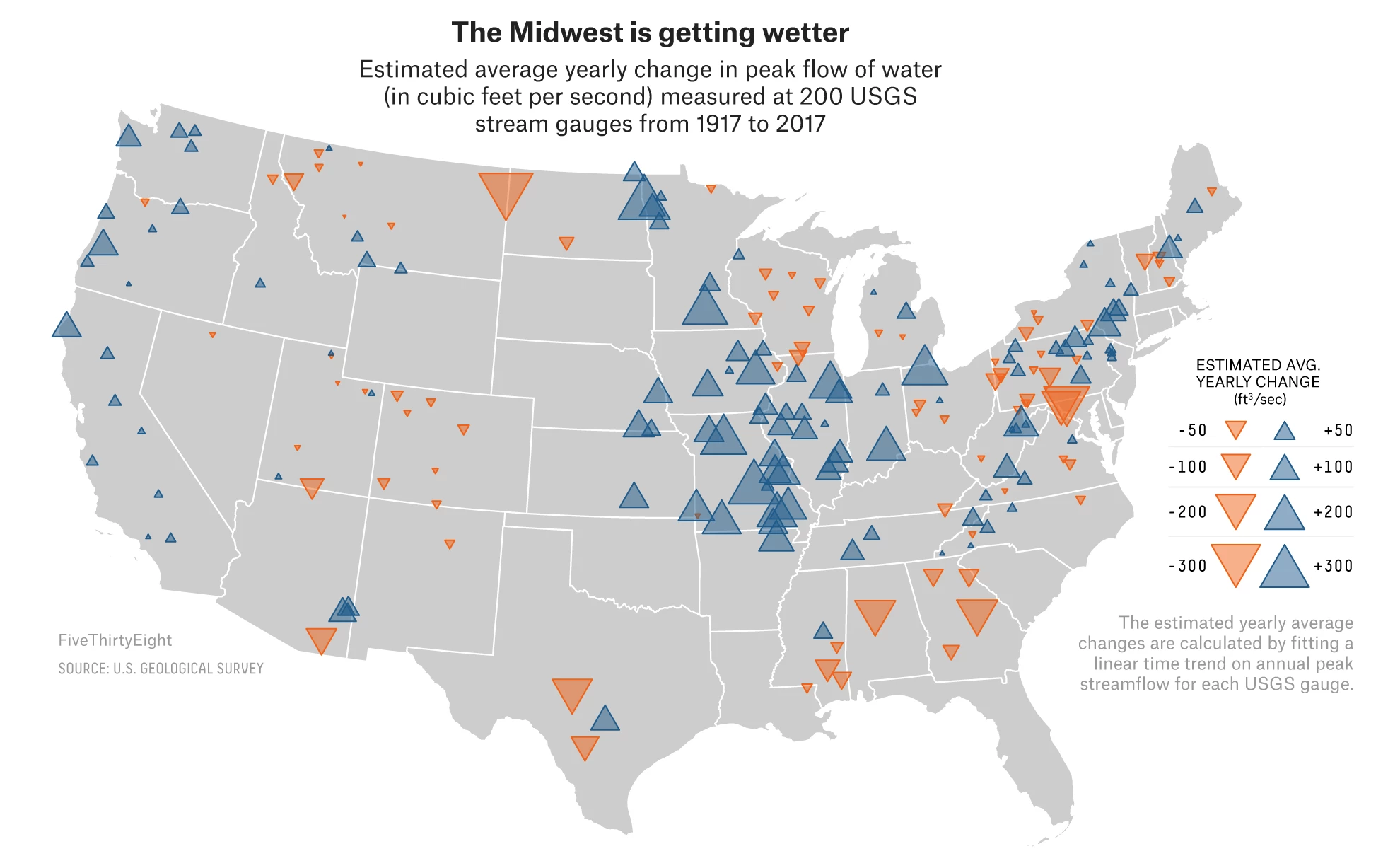
Well, FiveThirtyEight turned to a longer-term look and examined how over the century the amount of rainfall in the upper Midwest has been increasing. We are actually looking at the same places the Post looked at a few days ago. But instead of political maps, we have rainfall maps.
This one in particular is weird.
Water water everywhere
I get why they have the map, to show the geographic distribution of the rain gauges that collect the data. And those are site specific, not statewide. But did the designer have to choose area?
We know that area is a less than ideal way of allowing users to compare data points. And as I just noted, a choropleth, even at say the county level, is out of the question. But what about little squares? Or circles? Could colour have been used to encode the same data instead of size? And then we would likely have fewer overlapping triangles.
I suppose the argument is that the big triangles make a bigger visual impact. But they do so at the cost of comparable data points across the Midwest. Maybe the designer chose the area of triangles because there were too few gauges across the country. I am not sure, but for me the triangles are not quite on point.
That said, the graphics throughout the rest of the article are quite good, especially the opening scatterplots. They are not the sexiest of charts, but they clearly show a trends towards a wetter climate.
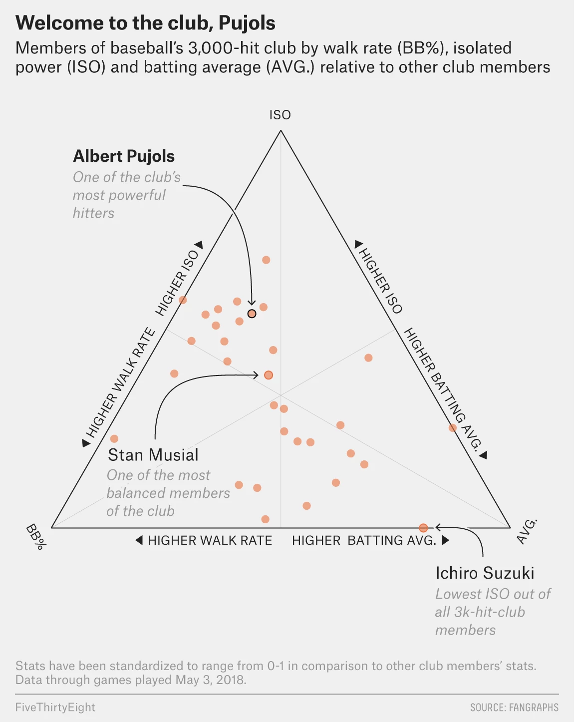
On Friday Albert Pujols joined the very elite club of baseball players who have managed 3000 hits in their career. Thankfully FiveThirtyEight covered it with a few graphics in an article that pointed out just how hard it is to do. Especially because, and I did not know this, Pujols did it in a not terribly common fashion. (Funny story, I had to explain this past weekend how Randy Johnson was a ridiculous pitcher, in the lots-of-strikeouts-and-also-exploded-a-bird way.)
My video game version of me would probably be on there if only those games lasted more than one season…
The piece uses a ternary plot, which we can also just call a triangle chart because it is, you know, in the shape of an equilateral triangle, to look at three components of Pujols’ hit skill.
There are different types of hitters in baseball. The guys who crush home runs all the time, the guys who hit singles all the time, guys who walk a lot. (Technically a walk is not a hit, but they are still getting on base.) There are fancy metrics that can be used to tease out just how much power is in a person’s game, and when you compare that to the batting average and to their walk rate, you can see clusters of players.
These kind of charts can be difficult to read—what does it mean for a player in a certain area of the chart? But what the designer did real well here is label an example of the type of player. Ichiro, called out for being a singles machine, is notable because he just sort-of-retired last week. He also has something like another 1500 hits back in Japan. That guy can hit.
Credit for the piece goes to Neil Paine and Rachael Dottle.
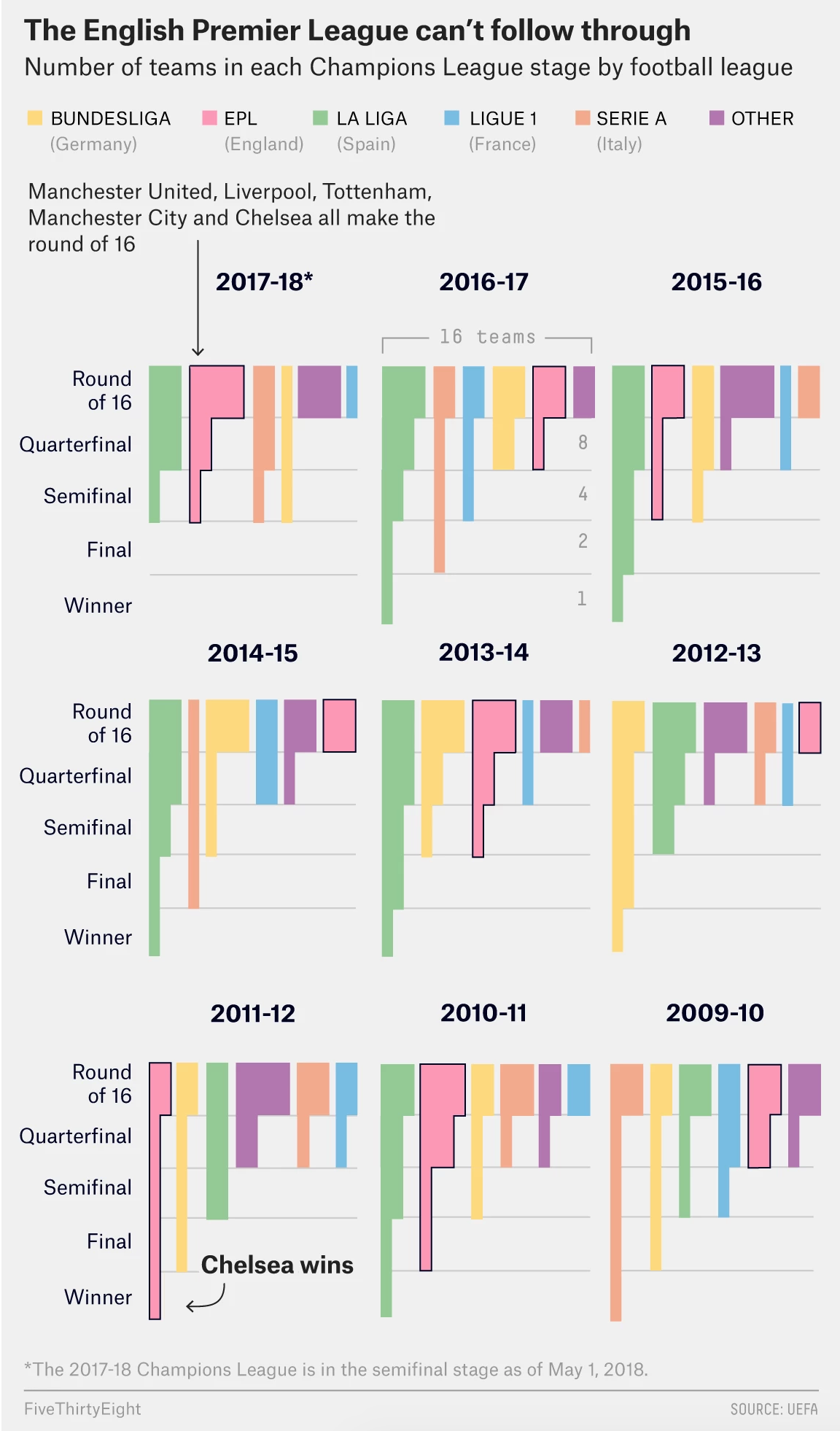
This piece will make a ton of sense to my British and European readers, likely less so to those of you from the States. The English Premier League has been not so great at finishing well let alone winning in the Champions League.
Super briefly, English football—soccer—has a whole bunch of teams that play at different levels. Kind of like the US minor leagues, but without the affiliation of minor league teams to major league teams. That is, every team for itself. The Premier League is the top rung. (Every year, the worst teams in the Premier League are dropped into the minors and the very best from the minors move up into the Premier League.) This league includes the ones even Americans have heard of: Manchester, Arsenal, Chelsea. And maybe even Liverpool. Liverpool is playing today to make it into the Champions League finals.
(Full disclosure: I always say if I had to pick an English team to follow it would be Liverpool. Why? Because they are owned by Fenway Sports Group, the same group that owns the Boston Red Sox.)
The thing is that as well known as many of these teams are, they have been faring not well in the Champions League, which is like the Premier League but of all European football. That is, the best teams from every top league in all of Europe compete for a European trophy. FiveThirtyEight explored some reasons why, but also included a nice graphic to showcase the relative failures of the Premier League teams.
Making it through the Champions League…
The chart makes nice use of grouped bar charts showing the number of teams from each league at each stage of the playoffs. The designers made good use of labelling, especially at the top to indicate to which country each league belongs. My only question would be is whether these make sense from the top down, as they presently are, or if they would work better bottom up, in that the winning team has to climb their way to victory.
To be honest, I am not really sure which approach would work best. I think it might be even odds. Either way, Liverpool plays Roma later today.
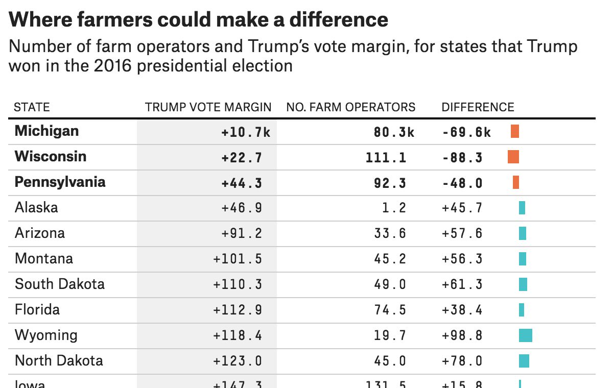
Just a neat little piece today from FiveThirtyEight. They take a look at the potential impact of the Trump administration’s proposed tariffs on the farm vote in the United States. The screenshot of the table shows how the farm population compares to Trump’s margin of victory in 2016.
Farming clearly isn’t big in Alaska…
The three states at the top? The very same Pennsylvania, Wisconsin, and Michigan about which we hear so often. Yes, Pennsylvania does have large cities like Philadelphia and Pittsburgh, but agriculture is an important part of its economy. So if the tariffs or the reprisals to the tariffs have any significant impact on the livelihood of farmers, that could be enough, all things being equal, to flip those states.
About the design, I think the inclusion of the mini-bar chart helps tremendously. Tables are great for organising information, but scanning over and through cell after cell of black text can hide patterns. The visualisation of those patterns at the end of each row helps the user tremendously, by making it very clear why those three states were highlighted.
Credit for the piece goes to Rebecca Shimoni Stoil.