Deaths in America

Yesterday was murders in London and New York. Today, we have a nice article from FiveThirtyEight about deaths more broadly in America. If you recall, my point yesterday was that not all graphics need to be full column width. And this article takes that approach—some graphics are full width whereas others are not.

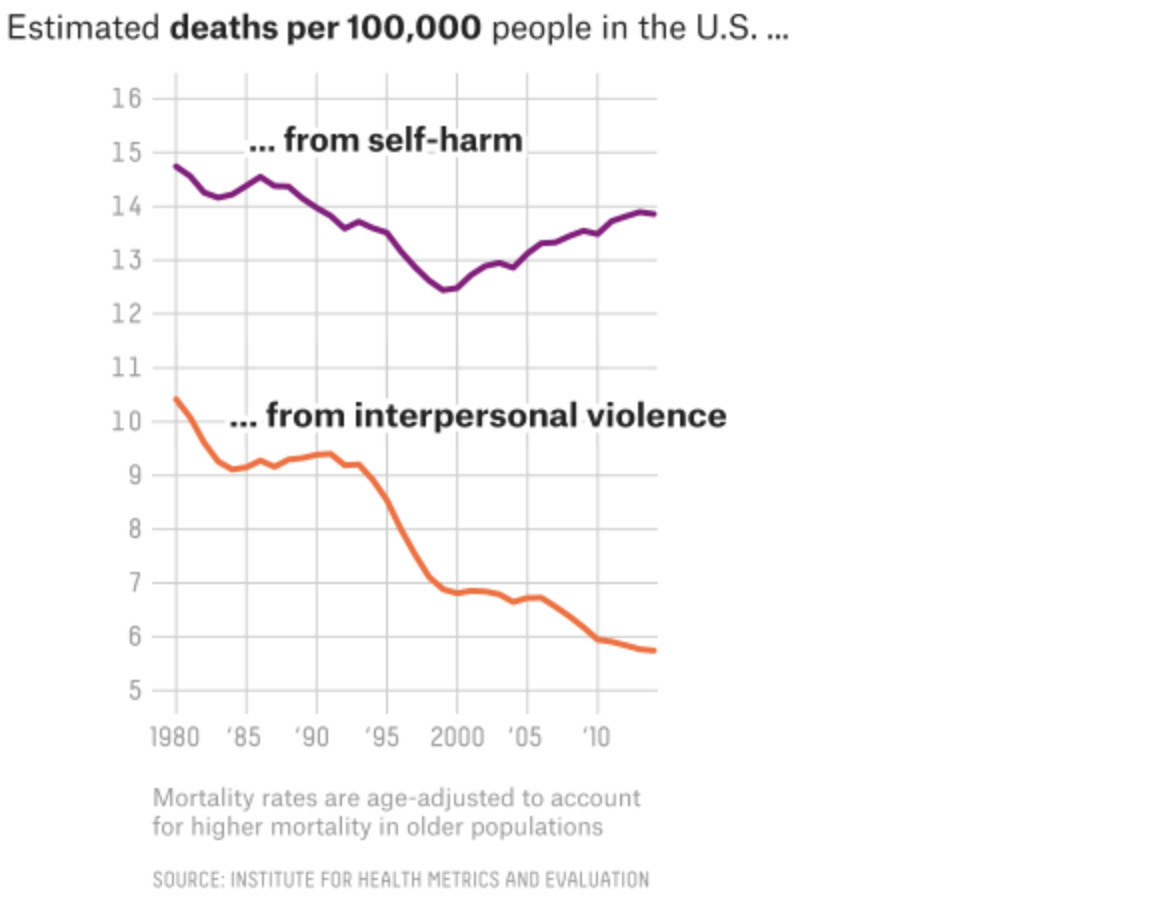
This screenshot shows a nice line chart that, while the graphic sits in the full column, the actual chart is only about half the width of the graphic. I think the only thing that does not sit well with me is the alignment of the chart below the header. I probably would align the two as it creates an odd spacing to the left of the chart. But I applaud the restraint from making the line charts full width, as it would mask the vertical change in the data set.

The screenshot is of the graphic's full width, note the lines only go a little over half the width.
The screenshot is of the graphic’s full width, note the lines only go a little over half the width.

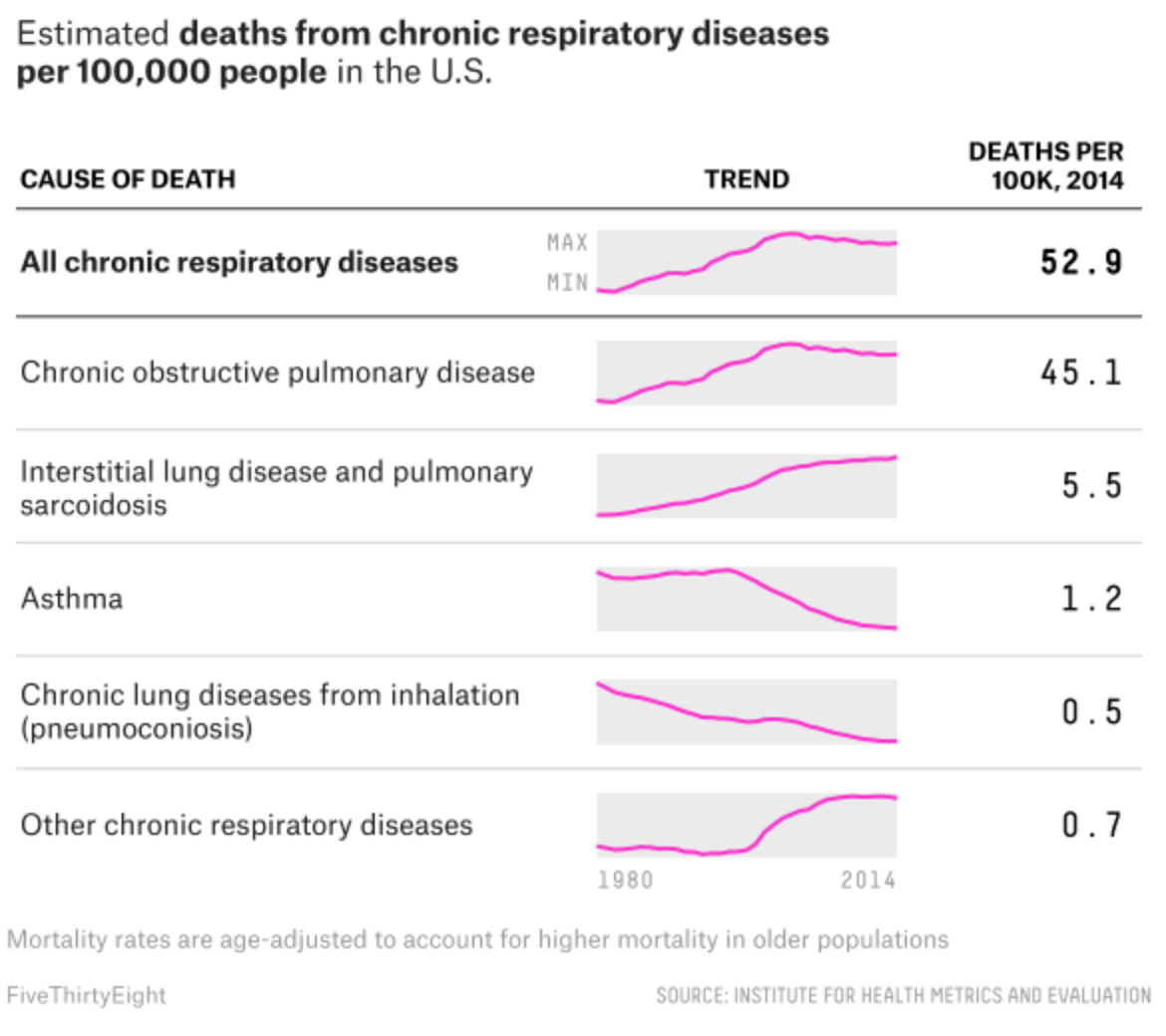
Meanwhile, the article’s maps all sit in the full column. But my favourite graphic of the whole set sits at the very end of the piece. It examines respiratory deaths in a tabular format. But it makes a fantastic use of sparklines to show the trend leading towards the final number in the row.

Loving the sparklines…

Credit for the piece goes to Ella Koeze and Anna Maria Barry-Jester.

Baseball Is Back

Praise the (baseball) gods.

The 2018 season starts today with I think every team playing—the Red Sox open down in St. Petersburg against the Rays. So today’s post is on the light side as I could not find the awesomest baseball graphic. But FiveThirtyEight did at least preview the season and ran some projections. Naturally, I disagree with their projections. But I think finally this year the Yankees will be more of a threat to the Red Sox than they have been in years. The rivalry is back. (Though it never really went away in my mind.)

Switch numbers one and two and I think this might be okay…

The above is the screenshot for the American League East, because Boston. But, the rest of the AL is on that page as well. For those of you from my more National League-following cities like Philadelphia and Chicago, FiveThirtyEight also previewed the NL divisions here.

Credit for the piece goes to Neil Paine.

Basketball Tournament Locations

My apologies to those of you who are big fans of basketball. Since it is not really my sport of choice, I had no idea that March Madness started yesterday. Otherwise, I would have posted this earlier.

FiveThirtyEight analysed the locations of basketball conferences’ tournaments relative to the geographic centres of said conferences. As it turns out many conferences do not play near their centre. The article goes on to suggest cities near their conference centre.

All the locations…
All the locations…

As a geography nerd, I found the whole exercise fascinating. I only have a few peccadillos with this. I would have loved to see a follow-up map with their suggested locations plotted against the centre and the actual tournament location.

Secondly, the first three maps highlight how the tournaments are being played in New York. But in the first they label it as Brooklyn. Then the next two just use NYC. Since Brooklyn is part of New York, why use Brooklyn instead of NYC? Or instead of NYC, use Manhattan.

Again, my apologies for not realising this should have been up earlier this week. So for those of you who do participate in the bracket challenges, hopefully your brackets are still more or less intact. And best of luck with the rest of the tournament.

Credit for the piece goes to Neil Paine and Ella Koeze.

Baseball: The Bouncier Edition

Baseball is finally back as Spring Training continues to push through March, getting us closer to Opening Day. But one lingering question from last year remains: why the increase in power and home runs? While Major League Baseball (MLB) says there has been no change to the baseball, many think otherwise.

FiveThirtyEight published a piece looking at the insides of eight baseballs, four predating the power surge, which began after the 2015 All Star Game, and three balls since in addition to a newly manufactured and unused ball.

The piece uses a few graphics to showcase the differences, including this cutaway diagram highlighting the different layers of a baseball.

What's inside a baseball?
What’s inside a baseball?

But the real gem is the X-ray photography done to examine the balls without cutting into them. Thankfully for those of us unfamiliar with x-rays, the designers provided a legend showing the clearly different core densities in the balls.

Old balls vs. new balls

If you are interested in baseball, and in particular the increase in home runs, the whole article is worth the short read. And if you’re not, well, the x-ray views of baseballs are still pretty neat.

Credit for the piece goes to Rob Arthur and Tim Dix.

US Olympic Performance

I don’t know if you heard, but the Winter Olympics just concluded. I’m admittedly not a huge fan of the Winter Olympics, but that doesn’t mean I didn’t keep my eye on some of the stories coming out of the coverage. One that I liked was this piece from FiveThirtyEight.

US performance was lagging at this point

It was about halfway through the Olympics and the US was not doing terribly well. The chart does a great job of showing how various countries were performing, or over- or under-performing, their expected total medal winnings. It did this through a filled bar chart with a bar-specific benchmark line. It was a nice combination of a couple of different techniques to incorporate not just the usual above or below the trend, but also the actual amounts.

Credit for the piece goes to Gus Wezerek.

Gerrymandering Pennsylvania Part V

Yesterday we looked at the new congressional district map here in Pennsylvania, drawn up by the state supreme court after the Republican legislature and Democratic governor could not come to agreement.

Also yesterday, FiveThirtyEight explored the redrawn map in more detail to see if, as I’ve read in a few places, the new map is a Democratic gerrymander. In short, no. The article does a great job explaining how, basically, it might seem like it because more Democrats are predicted to be elected based on various models. But, that is only because the map was so extremely gerrymandered in the past that any effort to increase competitiveness or fairness would make Republicans more likely to lose seats.

This one table in particular does a nice job showing just how in an average election cycle there are only four seats that you could consider reliably Democratic whereas there are six that are reliably Republican. And keep in mind that Pennsylvania actually exhibits the reverse split—there are more Democrats than Republicans in the state. So even with this new map, the state exhibits a slight Republican bias.

Still favouring the Republicans

Credit for the piece goes to Aaron Bycoffe.

Continuing Resolutions

The Senate reached a compromise on a two-year budget that increases spending by nearly half a trillion dollars on both the military and domestic programmes. This comes after a series of continuing resolutions, which are temporary spending bills that allow the government to function when the fiscal year has begun, but a budget has not been set.

It should pass the Senate, but there are questions about whether House Republicans will pass the budget because of their concerns about adding to the deficit. If it does pass, it could mark a significant step forward in getting the fiscal house in order.

To see just how chaotic the use of continuing resolutions has been, thankfully we have a piece from FiveThirtyEight exploring that issue. Spoiler: we have used it a lot since the late 1990s.

My favourites are when they are used instead of a budget…

Credit for the piece goes to Gus Wezerek.

Gerrymandering Again

The last two weeks we twice looked at gerrymandering as it in particular impacted Pennsylvania, notorious for its extreme gerrymandered districts. And now that the state will have to redraw districts to be less partisan, will Pennsylvania usher in a series of court orders from other state supreme courts, or even the federal Supreme Court, to create less partisan maps?

To that specific question, we do not know. But as we get ever closer to the 2020 Census that will lead to new maps in 2021, you can bet we will discuss gerrymandering as a country. Maybe to jumpstart that dialogue, we have a fantastic work by FiveThirtyEight, the Gerrymandering Project.

Since we focus on the data visualisation side of things, I want to draw your attention to the Atlas of Redistricting. This interactive piece features a map of House districts, by default the current map plan. The user can then toggle between different scenarios to see how those scenarios would adjust the Congressional map.

The setup today
The setup today

If, like me, you live in an area with lots of people in a small space, you might need to see Pennsylvania or New Jersey in detail. And by clicking on the state you can quickly see how the scenarios redraw districts and the probabilities of parties winning those seats. And at the bottom of the map is the set of all House seats colour-coded by the same chance of winning.

But what I really love about this piece is the separate article that goes into the different scenarios and walks the user through them, how they work, how they don’t work, and how difficult they would be to implement. It’s not exactly a quick read, but well worth it, especially with the map open in a separate tab/window.

Overall, a solid set of work from FiveThirtyEight diving deep into gerrymandering.

Credit for the piece goes to Aaron Bycoffe, Ella Koeze, David Wasserman and Julia Wolfe.

Exporting Guns

When I lived in Chicago, people back East would always ask if I was worried about murder and gun crime in Chicago. My reply was always, “no, not really”. Why? Because I lived in generally safe neighbourhoods. But on that topic, the second most numerous question/comment was always, why are the strict gun laws in Chicago not preventing these crimes? More often than not the question had more to do with saying gun control laws were ineffective.

But in Chicago, it seemed to me to be fairly common knowledge that most of the guns people used to commit crimes were, in fact, not purchased in Illinois. Rather, criminals imported them from neighbouring states that had far looser regulations on firearms.

Today’s post from FiveThirtyEight looks at that very topic.

They bring back more than just cheese from Wisconsin…

They bring back more than just cheese from Wisconsin…I am not the biggest fan of the maps that they use, although I understand why. Most Americans would probably not be able to name the states bordering Illinois, California, or Maryland—the two other states examined this way—and this helps ground the readers in that geographically important context. But, thankfully the designers opted for another further down in the article that explores the data set in a more nuanced approach. Surprise, surprise, it’s not that simple of an issue.

Credit for the piece goes to Rachael Dottle.

The Ratio

And I’m not talking about walking into a bar late at night. Instead, I am talking about the ratio of likes to retweets to replies, which, for those of you unfamiliar with the service, refers to engagement with a person’s tweets on Twitter.

The Ratio does not come from FiveThirtyEight—read the article for the full background on the concept, it is well worth the read—but they applied it to President Trump, whom we all know has a penchant for tweeting. The basic premise of the ratio is that you want more retweets and likes than replies. Think of it like customer reviews. Rarely do people bother to put the effort in to complement good service, but they will often write scathing reviews if something does not fit their expectations. Same in Twitter. If I do not care for what you say, I will let you know. But if I do, it is easy for me to like it, or even retweet it.

Anyway, the point is they took this and applied it to the tweets of Donald Trump and received this chart.

The interactivity makes this chart worth checking out

What I truly enjoy is the interactivity. Each dot reflects a tweet, and you can reveal that tweet by hovering over it. (I would be curious to know if the dots move. That is, do they, say, refresh daily with new tabulations on the updated numbers of likes, retweets, and replies?)

But the post goes on using the same chart form, in both other interactive displays and as static, small multiple pieces, to explore the political realm of previous tweeting presidents and current senators.

A solid article with some really nice graphics to boot.

Credit for the piece goes to Oliver Roeder, Dhrumil Mehta, and Gus Wezerek.