Here is a post for all you cooks and bakers out there: spices. Over the weekend I came upon a piece FiveThirtyEight ran earlier this year about American spice consumption. They use spice availability as a proxy for consumption, because no such data exists—and unfortunately the standard for reporting changed in 2012 so data is only available until then. But the piece uses some nice small multiples and a combined line chart to show some changes. Of note is the decision not to include ginger in the first, most likely because its scale would distort the rest of the chart. Anyway, if you are hungry, probably a good idea not to check this out.
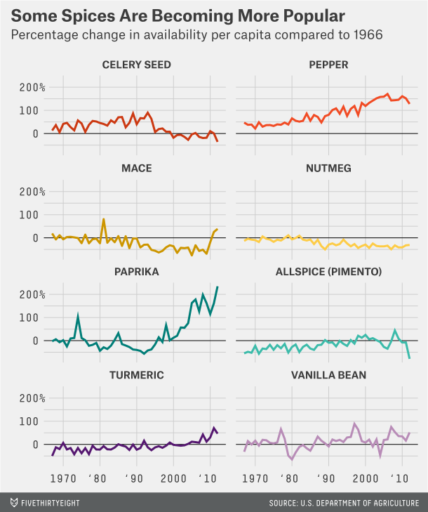
Credit for the piece goes to the FiveThirtyEight graphics department.