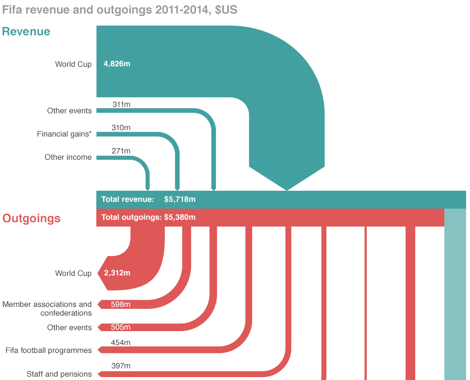
If you did not hear about it the other day, the head of FIFA resigned. That is kind of a big deal because football (in the rest-of-the-world sense of the word) is kind of a big deal. But the organisation that runs it is generally seen as wholly corrupt. So this BBC piece takes a look at the revenue and spending—at least so far as we know about it.
Sort of a Sankey diagram
Credit for the piece goes to the BBC graphics department.
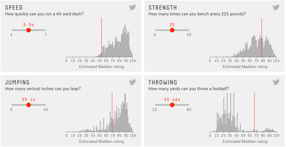
This week we have been looking at baseball (and Leonard Nimoy’s Star Trek). Today, we are going to turn to a sport I know nothing about: American football video games. Okay, so video games are not really a sport, but they are based on a sport. The reason I bring it up? FiveThirtyEIght has a really nice two-article story on how the Madden game franchise uses ratings to build characters for the game.
Rate yourself
The above graphic is an interactive part of the story that lets you compare yourself to the real sports people, as estimated by the video game company. The second article in the story then builds upon that by using a reporter as a basis to test/understand the ratings.
And pay attention to the sidebar content. It’s actually worth heeding for once.
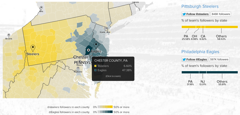
To continue with the sports theme from yesterday, today we have an interactive map from Twitter that looks at NFL team popularity. The methodology is simple, where are the users following the various football teams and map that out by county. The overall blog post features a country-wide map, but then narrows down into a few particular stories. The image below is from the divide in the state of Pennsylvania between Eagles fans and Steelers fans.
Philly vs. Pittsburgh
Credit for the piece goes to Simon Rogers and Krist Wongsuphasawat.
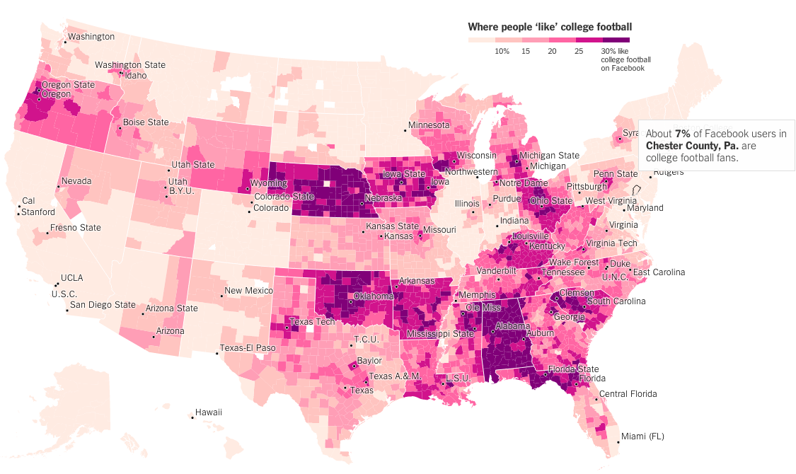
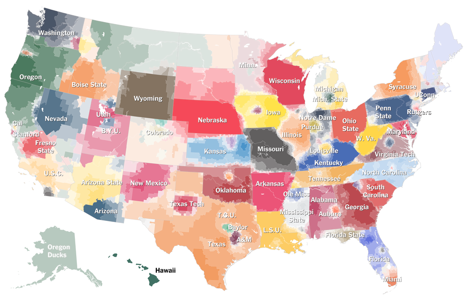
A couple of weeks ago I shared a map from the New York Times that looked at American college football programme loyalty. And I quipped that none of it made sense to me as someone born and raised in the Northeast. The New York Times followed that piece up with another that looks solely at Facebook likes of college football via likes for any team. Not surprisingly the sport does not do too well in the Northeast. But it does appear quite popular in other regions of the country.
Chester County is not big on it…
Credit for the piece goes to Neil Irwin and Kevin Quealy.
American college football. This is not a thing that Northeasters like myself understand. And it is not just because yours truly attended the University of the Arts whose only competitive sporting team was, I believe, fencing. Here in the Midwest, many things are strange and alien. One of them is their affinity for said sports that do not make sense. Thankfully the New York Times has attempted to explain specific programme affinities much like they did with their baseball map. (Which made infinitely more sense.)
Click the big map at the article’s beginning to get to the interactive version
Credit for the piece goes to Tom Giratikanon, Josh Katz, David Leonhardt, Kevin Quealy, and Marc Tracy.
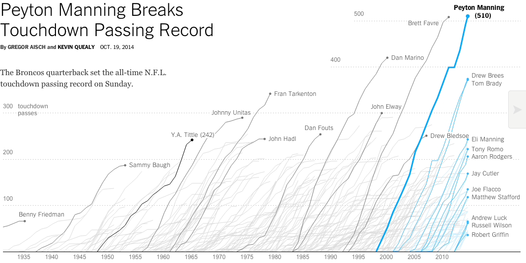
Two weekends ago Eli Manning’s brother accomplished a feat in American football. And it was not in Indianapolis. The New York Times documented the story in an interactive article.
I have no idea who most of these people are…
In fairness, I generally do not follow American football. I am largely a one sport person and that sport is baseball. But since the active baseball season is over—baseball ends when the Red Sox stop playing—I figured the rest of you might enjoy this.
Credit for the piece goes to Gregor Aisch and Kevin Quealy.
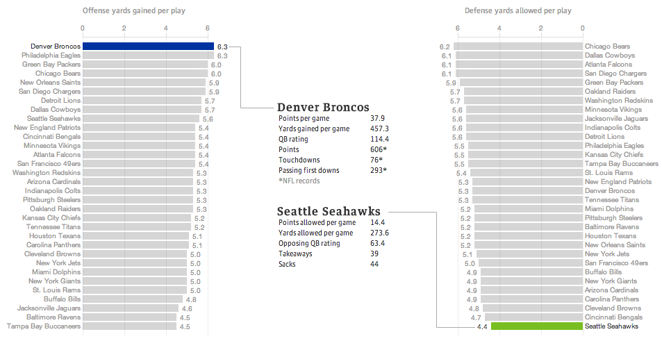
Last night the United States enjoyed a little (American, not rest-of-the-world) football match wherein two squadrons competed upon the pitch for the glory of their squadron colours. Thankfully for those of us who wanted a preview of the match on data’s terms, well, the Guardian put together a fantastic piece breaking down some of the numbers.
The Best Superbowl Match-up
The data is not terribly complicated—I still think baseball makes the most use of advanced metrics, though it helps they play more than 10 times as many games per season. The Guardian looked at yards gained or lost per play by the offence or defence, respectively. Click through the link to explore the other charting forms used, in particular the four quadrant scatter plot and the small multiples that follow. Also, a sophisticated and restrained colour palette allows the user to clearly understand when he or she is viewing the Denver–Seattle matchup or the historic match-ups of the NFL.
Regardless of the quality of the presentation, we shall see Monday morning—I am writing this Sunday afternoon—whether this piece will still hold with its talk of the best match-up ever.
And hey, for all this talk about the best offence, look at which squadron is ranked second. Fly, Eagles, fly.
Credit for the piece goes to the Guardian’s US Interactive Team.
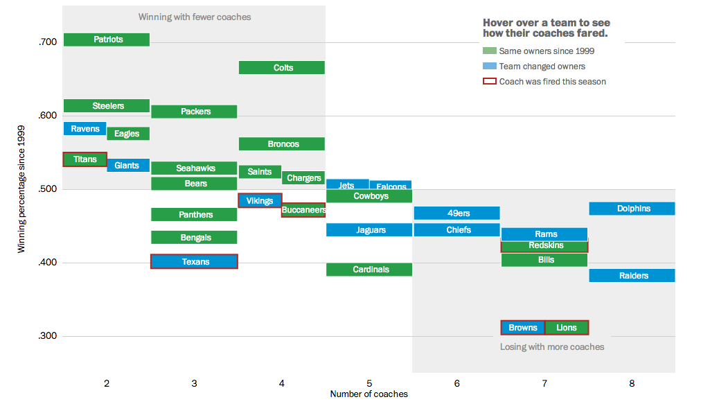
This weekend we will have yet more football. My preferred team, the Philadelphia Eagles, is of course now out of contention. But more than likely, the coach’s job is secure for at least another year. As we have already seen, however, that cannot be said for other coaches. So the Washington Post looked at ownership’s role in the success of their respective team by the hiring and firing of coaches.
Coaches in the NFL
Credit for the piece goes to Bonnie Berkowitz, Darla Cameron, Dan Keating, and Rick Maese.
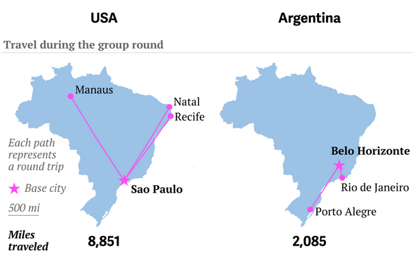
Well, travel for the teams, not you. It’s a big issue in Brazil because unlike the last couple of times, the teams need to travel big distances to reach the cities where they play their matches. Thankfully, to explain just how far some of these distances are for some of these teams, Quartz put together a nice article with quite a few graphics.
This graphic in particular juxtaposes the travels of the US team and the Argentinian team. Who do you think has it easier?
US and Argentinian travels
Credit for the piece goes to Jason Karaian and Ritchie King.
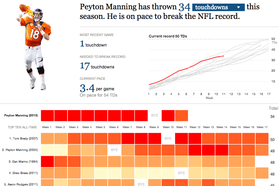
On Sunday night the Denver Broncos played the New England Patriots. The contest sported two of the game’s best quarterbacks: Tom Brady and Peyton Manning. This interactive graphic by the Guardian detailed how, in this season alone, Manning is putting up record numbers.
Comparing Manning’s stats
Credit for the graphic goes to the Guardian US interactive team.