
In science news, we turn to graphics about planets and things. Specifically we are talking about exoplanets, i.e. planets that exist outside our solar system. Keep in mind that we have only been able to detect exoplanets since the 1990s. Prior to then, how rare was our system with all our planets? It could have been very rare. Now we know, probably not so much.
But, in all of that discovery, we are missing entire types of planets. This article published by Forbes does a nice job explaining why. But one of the key types of planets that we have been unable to discover heretofore have been: intermediately distant, giant planets. Think the Jupiters and Saturns of our system. Prior to now we could detect massive Jupiter-like planets orbiting super near to their distant stars. Or, we could detect super massive planets orbiting very far away. The in-betweeners? Not so much.
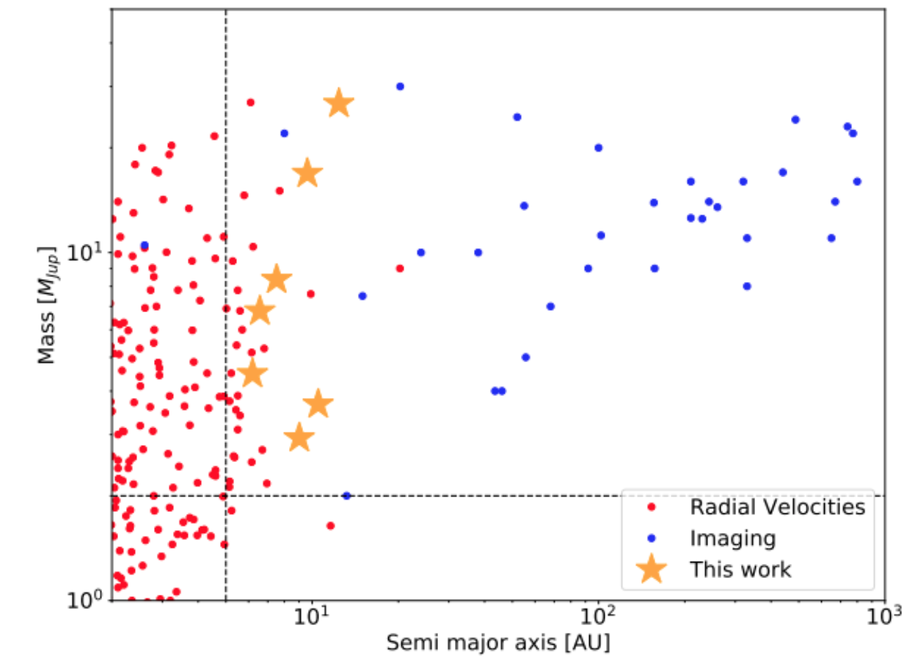
The above screenshot does a good job of showing where new detection methods have allowed scientists to begin to fill in the gaps. It shows how there is an enormous gap between what we have discovered and how they have been discovered. And the article does a nice job explaining how the science works in that only now with our longer periods of observation will help resolve certain issues.
From a design standpoint, this isn’t a super complicated graphic. It does rely upon a logarithmic scale, which isn’t common in non-scientific or academic papers. But this graphic comes from that environment, so it makes a lot of sense. The article is full of graphics from third-party sources, but I found this the most informative because of that very gap it highlights and how the new work (the stars) begin to fill it in.
Credit for the screenshotted piece goes to E. L. Rickman et al.

