The World Grows On

January is the month of forecasts and projections for the year to come. And the Economist is no different. Late last week it published a datagraphic showcasing the GDP growth forecasts of the Economist Intelligence Unit. I used to make this exact type of datagraphic a lot. And I mean a lot. But what I really enjoy is how successfully this piece integrates the map, the bar chart, and the tables to round out the story.

Take a note at how the chart distributes the bins as well

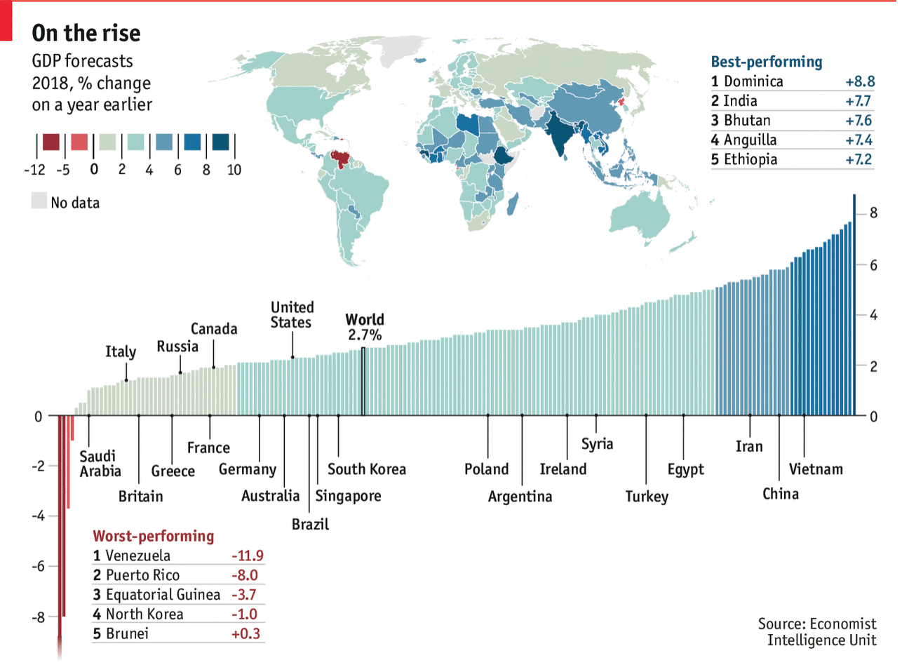
The easy thing to do is always the map, because people like maps. They can be big, and if the data set is robust, full of data and colour. But maps hide and obscure geographically small countries. And then you have to assume that people know all the countries in the world. Problem is, most people do not.

So the bar chart does a good job of showing each country as equals, a slim vertical bar. In such a small space, labelling every country is impossible, but the designers chose a select number of countries that might be of interest and called them out across the entire series.

Lastly, people always like to know who is #winning and who is a #loser. So the tables at the extreme ends of the chart showcast the top and last five.

I may have rearranged some of the elements, and dropped the heavy black rules between the bins on the legend, but overall I consider this piece a success.

Credit for the piece goes to the Economist Data Team.

Hurricane Forecast Maps

In moving back to Philadelphia from Chicago, I have forsaken polar vortices for hurricanes and nor’easters. And this current weekend, it appears increasingly likely that the weather will be impacted by Hurricane Matthew, presently tearing its way through the Caribbean. So of course I am following projections and forecasts of just where this storm will be headed.

Thankfully Mashable has an article that attempts to explain just what the National Hurricane Center (NHC) means when it publishes its cone of uncertainty charts. Because, according to the article, it turns out most people do not entirely understand just what it means.

Clearly light sprinkles are forecast within the cone

Credit for the piece goes to the National Hurricane Center.

US Fed Forecasts

Organisations that forecast things are not often inclined to go back and review their forecasts against the actual results. So that makes today’s post from the Wall Street Journal fascinating. They reviewed the Federal Reserve’s forecasts for US GDP growth against the actual growth. And it turns out the Fed consistently overestimated US growth.

US Federal Reserve Forecasts

From a design standpoint, what makes this piece interesting is how they presented the range of forecasts. After all, it would otherwise become a plot of squiggly spaghetti lines. Instead, they used colour to group each projection set. A smart idea. Plus a nice literary allusion. I mean if you like Dickens.

Credit for the piece goes to the Wall Street Journal graphics department.