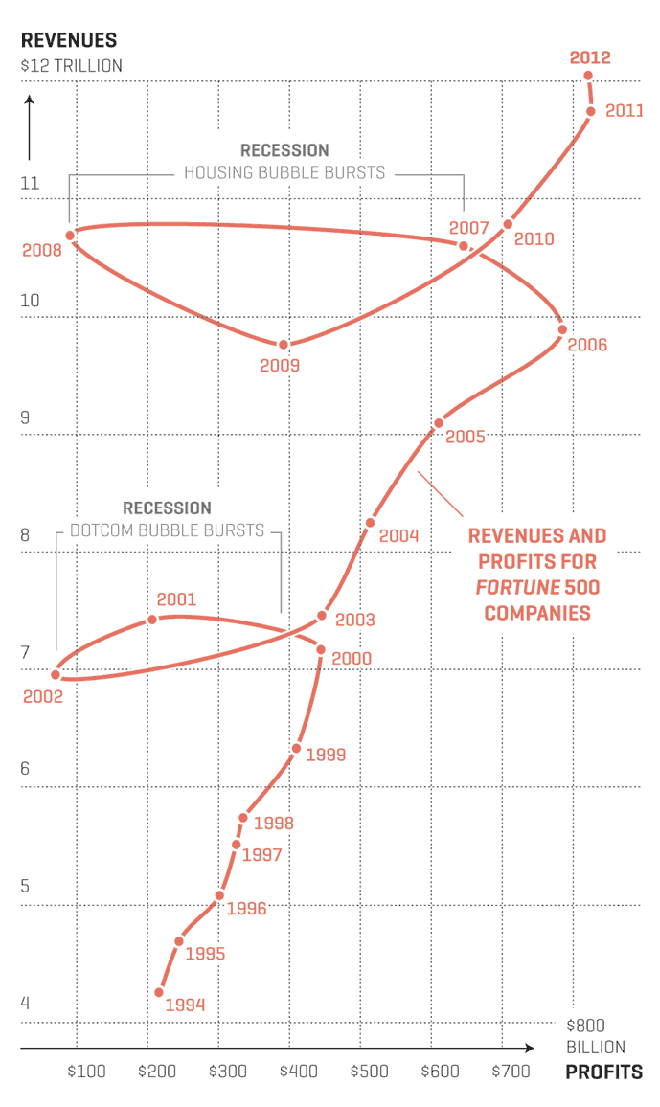
Well maybe not so much the space. Anyway, Nicolas Rapp, who does a lot of work for Fortune Magazine and previously the AP, created his first connected scatter plot. I have been a fan of them for quite some time and have been able to use them from time to time. Rapp’s scatter plot looks at the profits and revenues of the Fortune 500 in the last 20 years. But what I think makes his piece particularly strong are the two annotations he provides to explain the “loops” in the data: the two big recessions.

Credit for the piece goes to Nicolas Rapp.
