The Times Wore It Better

Two weeks ago I posted about the death toll in the latest conflict between Israel and Hamas. As it happened, later that morning when I opened the door, there was this graphic sitting above the fold on the front page of the New York Times.

They added a map.

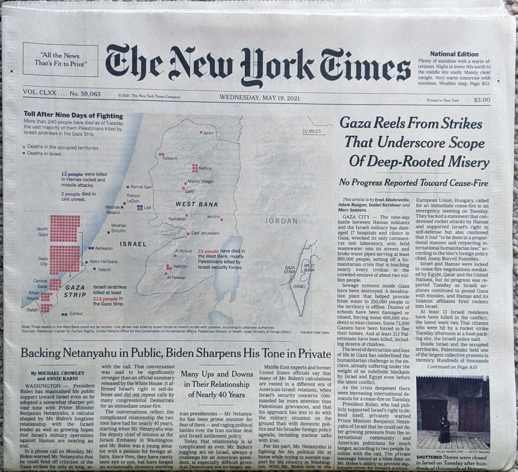
The piece sits prominently on the front page, but tones down the colour and detail on the map to let the graphical elements, the coloured boxes, shine and take their prominent position.

Here’s a detail photo I took in case the above is too small.

Maps make everything cooler.

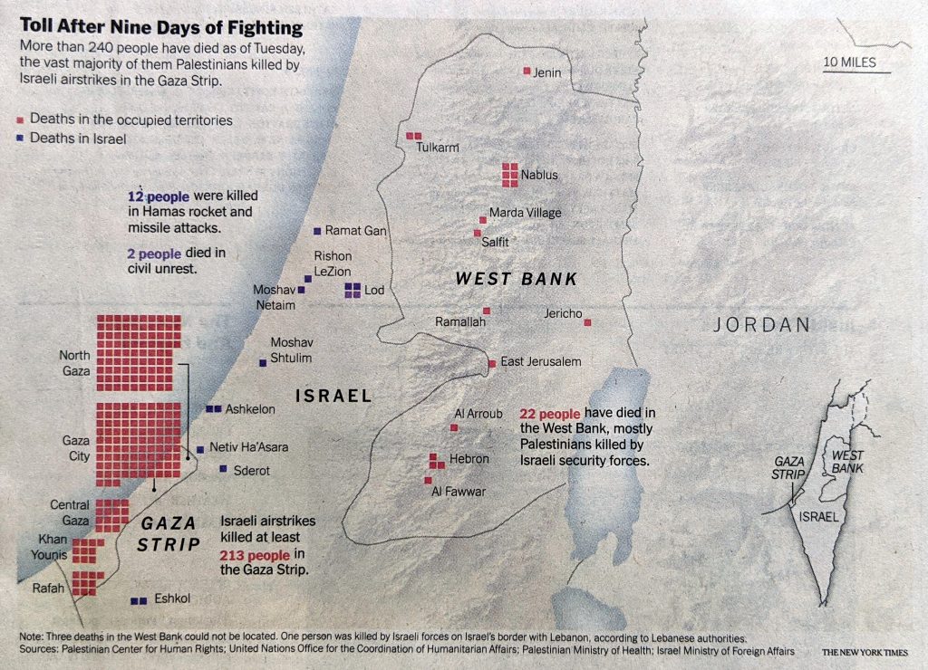
Ultimately, the piece isn’t too complex and isn’t more than what I made. However, the map adds some important geographical context, showing just where the deaths were occurring.

The piece also highlights the deaths in the West Bank and those in Israel from civil unrest. That was data I didn’t have at the time.

redit for the piece goes to the New York Times graphics department..

Hamas’ Rocket Swarms

Last week I wrote about the deaths in Gaza and Israel, where a ceasefire is holding at the time of writing. But I also included a graphic about the size of Hamas’ rocket arsenal. In a social media post I commented about how it appeared Hamas had also changed its tactics given Israel’s Iron Dome missile defence system.

Specifically, in the past Hamas launched rockets at a fairly even pace. However, with Iron Dome, Israel could—and did—defend about 90% of incoming fire. Consequently, Hamas tried to swarm Israel’s defences and some fire did leak through, killing over a dozen Israelis. I was looking for data on that, but couldn’t find what I wanted.

Clearly I didn’t look hard enough. This graphic appeared in the Wall Street Journal last week. It shows the cumulative number of rockets launched at Israel during this most recent surge in violence compared to the 2014 war between Israel and Hamas.

A very different profile for Hamas’ attack

In 2014, you can see even, incremental steps up in the total count of rockets. But from earlier this month, you can see much steeper increases on a daily basis with more time between those swarms.

From a design standpoint, it’s a really nice graphic. I will often say that good graphics don’t need to be crazy or flashy. This is neither. It relies on solid fundamentals and executes well. All the axis lines are labelled and the data series fall within the bounds of the x- and y-axis. The colours chosen contrast nicely.

Credit for the piece goes to the Wall Street Journal graphics department.

Some Data on Deaths in Gaza and Israel

I’ve seen an uptick in traffic to the blog the last few days, specifically my older content on the Middle East. I don’t exactly have the bandwidth to track the conflict between Israel and Gaza in addition to Covid-19 and my other projects. But as we approached the ten-day mark since Hamas first fired rockets into Israel, I wanted to get a sense of the death toll and so here we are.

The biggest thing to note is that we should take all this data with a grain of salt. For example, the Israeli Defence Force will likely talk up the effectiveness of its Iron Dome air defence system and downplay total civilian deaths. Conversely, Hamas will likely talk up civilian deaths while not detailing at all the deaths of its fighters. And when it comes to deaths in Gaza, it’s not clear what share of those reported by civilian authorities, i.e. the hospital systems, are militant fighters vs. civilians.

Not at all covered by any of this is a discussion of the opportunity costs involved, particularly when it comes to Israeli air strikes. For example, if a Gaza household contains a known Hamas fighter, one can certainly regret an Israeli drone strike that kills the fighter and his non-combatant son whilst in a field. But that strike may be a better outcome than striking the fighter’s home and along with killing not just him and his son, but now his wife, daughters, and the rest of his family.

Credit for the piece is mine.

Death Toll in Gaza and Israel

Today’s piece, the first not on Québec, is a small but poignant reminder of the disparity between the number of deaths in Gaza and in Israel during this most recent conflict. According to the article, as of 16 July there has been one death in Israel for 194 in Gaza. This small piece from the New York Times shows the geographic location of the attacks from both sides and tallies the number of strikes. And the number of dead.

Comparing the death toll

Credit for the piece goes to Craig Allen, David Furst, Nilkanth Patel, Archie Tse, and Derek Watkins.