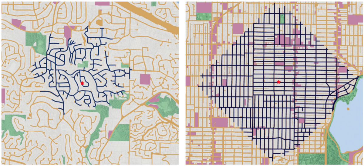
Business Insider posted a neat graphic that compared the walkability of a suburban neighbourhood outside Seattle to a dense urban neighbourhood in Seattle. Turns out you can walk a lot more and further in a gridded mile than in a faux-organic sprawl.
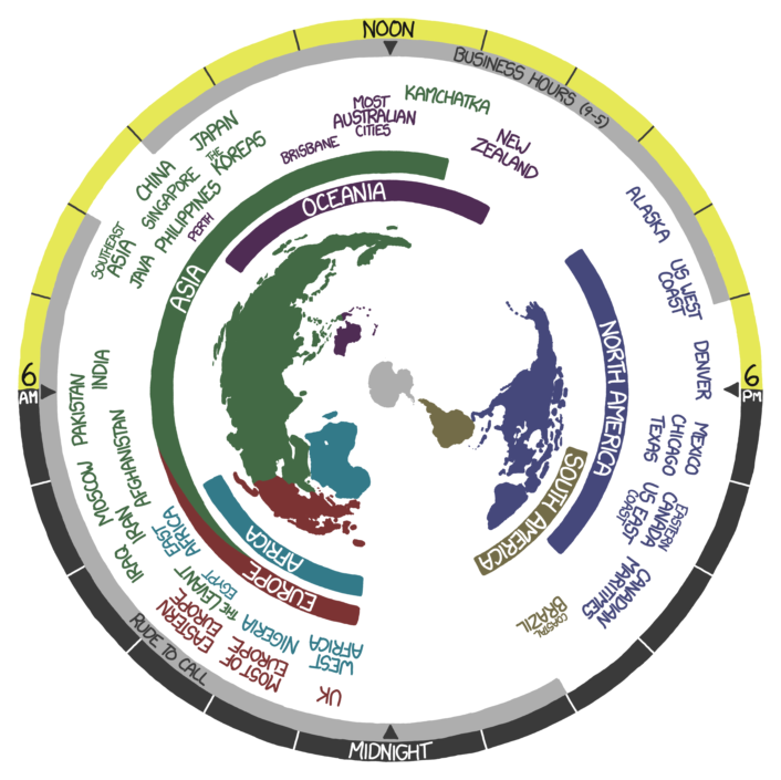
If you’ll allow your humble author a humblebrag, I often complain about having to daily deal with people around the world living in a lot of different time zones. How do I keep track of business hours around the world? I don’t. Well, not easily. But thanks to xkcd, this is no longer a problem.
Clearly, I wrote this in the evening
This is only a screenshot. But the actual image actually generally follows the Earth’s rotation. You know, until it stops. Or until we hit daylight saving time. Whichever comes first.
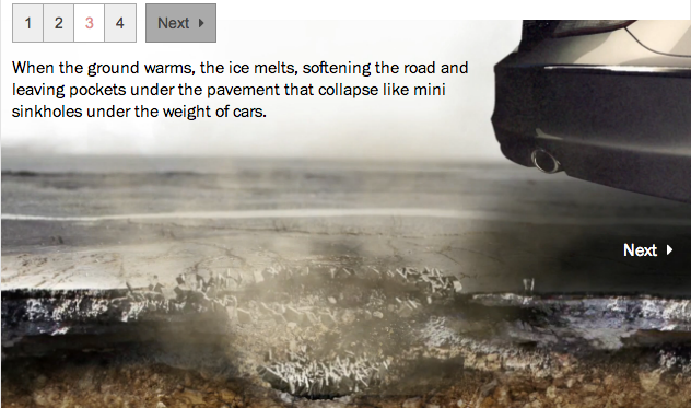
Today’s piece is from the Washington Post. However, it is less data visualisation and more of a neat little motion graphic explaining the formation of pot holes. Since it seems to be about that time of year when roads are destroyed by the things.
Potholes
Credit for the piece goes to Sohail Al-Jamea and Bonnie Berkowitz.
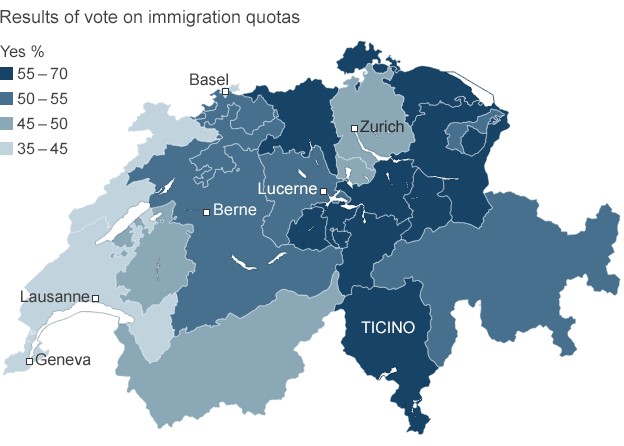
Last week, the Swiss people narrowly rejected the principle of freedom of movement. This principles serves as one of the foundations of the European Union. And while Switzerland does not belong to the EU, its economy benefits from access to the single market via that freedom of movement principle. That may be an oversimplification perhaps, but it provides some context to the consternation in Europe over the Swiss people rejecting the principle.
This graphic is not particularly complex. It is a choropleth of the vote results. However, it does show that the vote was not unanimous. Rather it was contained to the cantons (analogous to states in the US) more rural in character, i.e. less urban places like Geneva.
Swiss immigration vote results
Credit for the piece goes to the BBC graphics department.
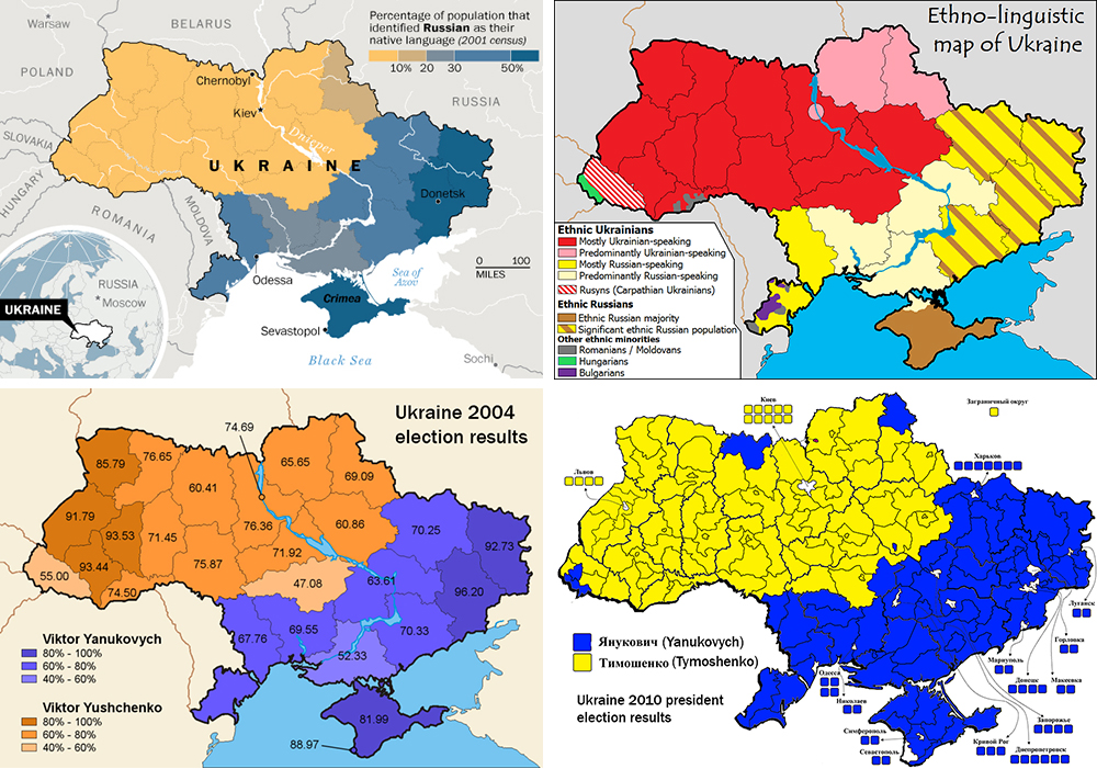
Not “the Ukraine” as it is (admittedly) fun to do in pop-culture references to Seinfeld. This comes from the Washington Post and the article tries to show that the protests in Kiev are not necessarily a vast majority against the government. Certainly the opposition is strong, but there is also a very strong pro-government movement. Why? Because in the broadest of senses, Ukraine is where the West, i.e. the European Union, meets the East, i.e. Russia.
A divided Ukraine
Credit for putting this all together goes to Max Fisher. Credit for each of the original graphics is to their respective designers whom I cannot identify.
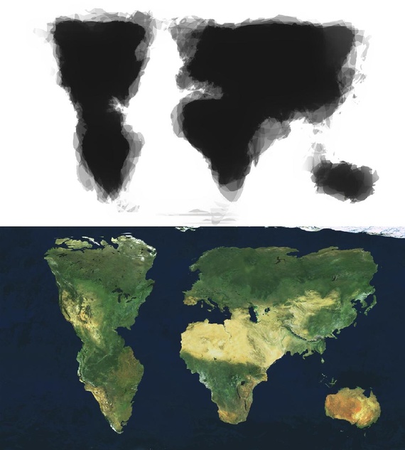
The inability of people to understand geography beyond their own borders is not new. But today’s post uses that to create a new map—albeit from a limited sample. The creator of this map merged 30 different, hand-drawn maps into one to reveal the world as imagined by his sample.
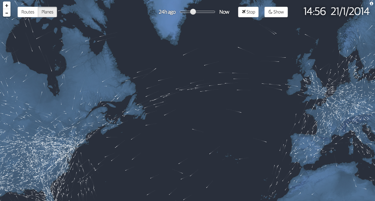
100 years ago we began to fly commercially. We moved beyond daredevil stunts and novelty and created air travel into a business. To commemorate the history, the Guardian commissioned this interactive graphic story to celebrate said history. It includes charts, narration, and near real-time data on actual flights mapped out as in the introductory element captured below.
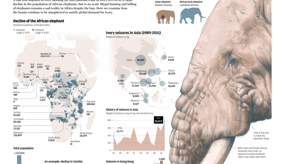
The South China Morning Post had a fantastic infographic detailing the hunting of elephants for their ivory. Despite bans to make such hunting illegal, the problem continues and is worsening because of the Asian trade in ivory.
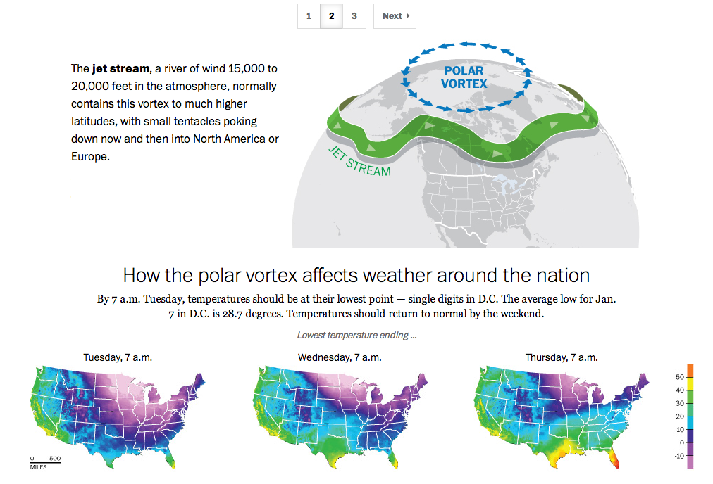
If you live in the United States, you probably have heard the term polar vortex by now. People have been using the term to describe the bitterly cold temperatures affecting the eastern two-thirds of the country. But the term polar vortex is a meteorological term that means a specific phenomenon. In other words, it’s more than a hashtag along the lines of snowmageddon. The Washington Post explains what the polar vortex is.
The Post explains the polar vortex
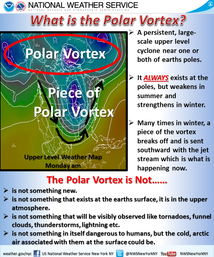
My caveat for this piece is that from my understanding, it’s not entirely correct. Or perhaps not detailed enough. In brief, we turn to the National Weather Service out of New York for a more technically correct, but more poorly designed graphic.
National Weather Service explanation
Poor type, poor colours, poor hierarchy. Those are abundantly clear, but the important part is that the NWS wants to correct many of the popular misconceptions. Somewhere between the well-intended but less-than-entirely-clear Post piece and the accurate-but-also-unclear National Weather Service piece is an opportunity to explain the concept to the public.
Credit for the Washington Post piece goes to Bonnie Berkowitz, Richard Johnson, Katie Park, and Gene Thorp.
Credit for the National Weather Service goes to the graphics team at the National Weather Service of New York.