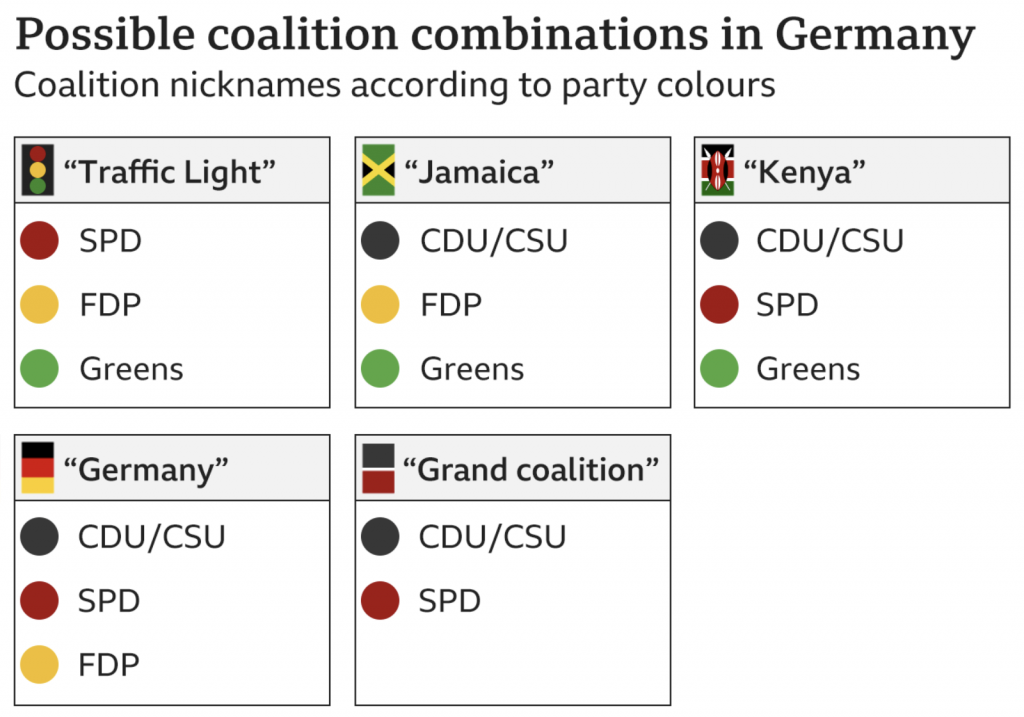
Two weekends ago, Germany went to the polls for their federal election in which they chose their representatives in the Bundestag, or legislature. Germany, however, is not a two-party system and no single party won a majority of seats. Consequently, the parties need to negotiate and form a coalition government. That could take a number of different forms given the number of different parties and their number of seats.
Thankfully the BBC produced a small graphic in an article that detailed how Angela Merkel’s political heir likely won’t take charge of the new government.
Here in the States we can only dream of coalition governments…
It’s a simple graphic, but given the terms Traffic Light coalition, Jamaica coalition, and Kenya coalition I think it’s a necessary graphic to help explain the makeup of these potential coalition arrangements. This falls into the category of small but exceptionally clear graphics. More proof that not all useful graphics need to be flashy.
Credit for the piece goes to the BBC graphics department.
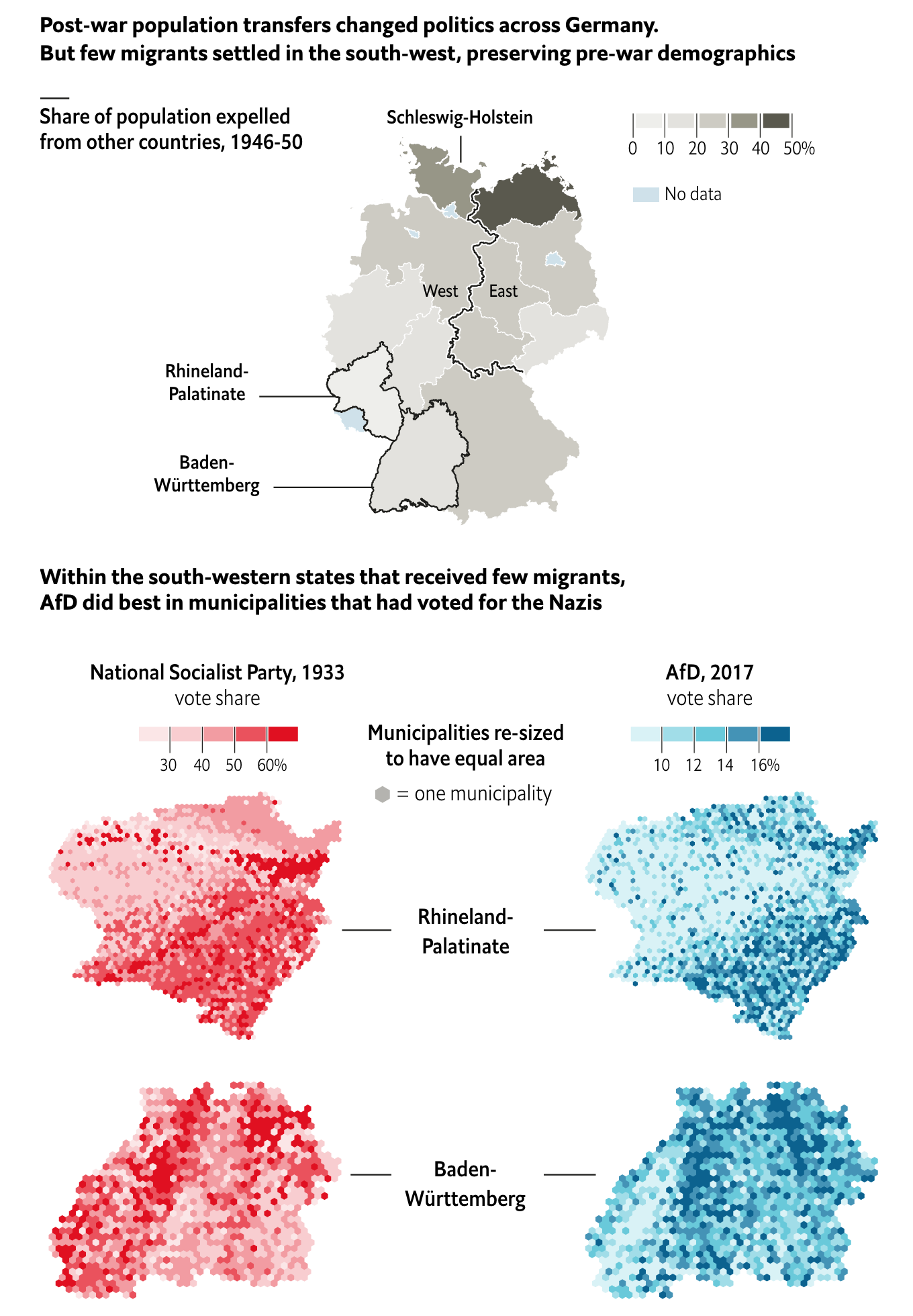
The Economist has an interesting piece looking at the areas of support for the far-right AfD German political party, arguably a neo-fascist nationalist party. It turns out that
Historical analogies are dangerous, but fascinating.
The piece does a great job of setting the case through the demographics map at the top of the piece. It shows how the two areas where the largest AfD support experienced the least changes from prior to the war. And with those demographics in place, the support for hardline nationalism might still be present, as is indicated by the support for the AfD.
In terms of the municipality maps, I would be curious if the hexagon tile map is because those borders have changed. Obviously 84 years can change political boundaries.
But I wonder if a single map could have been done showing the correlation between the 1933 vote and the 2017 vote. Of course, the difficulty could well be in that political boundaries may have changed.
And of course, we should not go so far as to compare the AfD to Nazism.
Credit for the piece goes to the Economist graphics department.
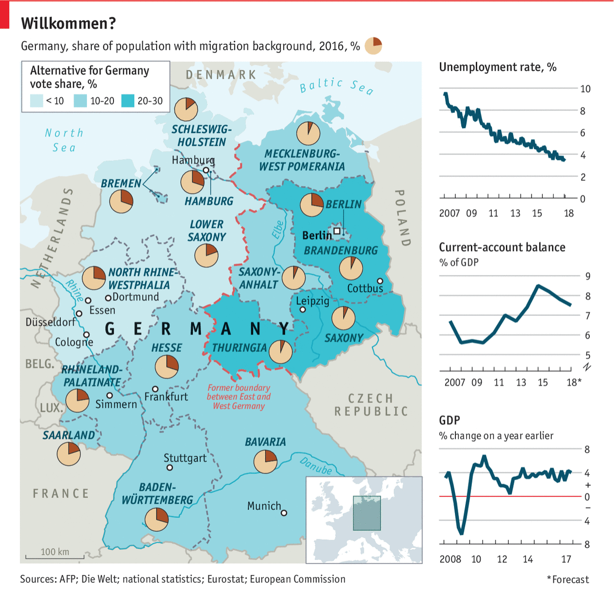
Last week Angela Merkel, the German chancellor, visited President Trump in Washington. This post comes from the Economist and, while not specifically about that trip, describes Germany in a few different metrics. Back in the day it would be what I called a country-specific datagraphic. That is, it shows metrics not necessarily connected to each other, but all centred around a country. In theory, the framework can then be used to examine a number of different countries.
The thin red line…
That sort of works here, except the choropleth is for the Alternative for Germany political party. That only real works as a metric in, you know, Germany.
Overall, I like the piece. The layout works well, but Germany is fortunate in that the geographic shape works here. Try it with Russia and good luck.
First let us dispense with the easy criticism: do we need the box map in the lower right corner to show where in the world Germany is? For Americans, almost certainly yes. But even if you cannot identify where Germany is, I am not certain its location in Europe is terribly important for the data being presented.
But the pie charts. I really wish they had not done that. Despite my well-known hatred of pie charts, they do work in a very few and specific instances. If you want to show a reader 1/4 of something, i.e. a simple fraction, a pie chart works. You could stretch and argue that is the case here: what is the migrant percentage in Bavaria? But the problem is that by having a pie party and throwing pie charts all over the map, the reader will want to compare Bavaria to the Rhineland-Palatinate.
Just try that.
Mentally you have to take out the little red slice from Bavaria and then transpose it to Rhineland-Palatinate. So which slice is larger? Good luck.
Instead, I would have left that little fact out as a separate chart. Basically you need space for 16 lines, presumably ranked, maybe coloured by their location in former East or West Germany, and then set in the graphic. Nudge Germany to the left, and eat up the same portion of Bavaria the box map, cover the Czech Republic, and you can probably fit it.
Or you could place both metrics on a scatter plot and see if there is any correlation. (To the designers’ credit, perhaps they did and found there is none. Although that in and of itself could be a story to tell.)
The point is that I still hate pie charts.
Credit for the piece goes to the Economist’s graphics department.
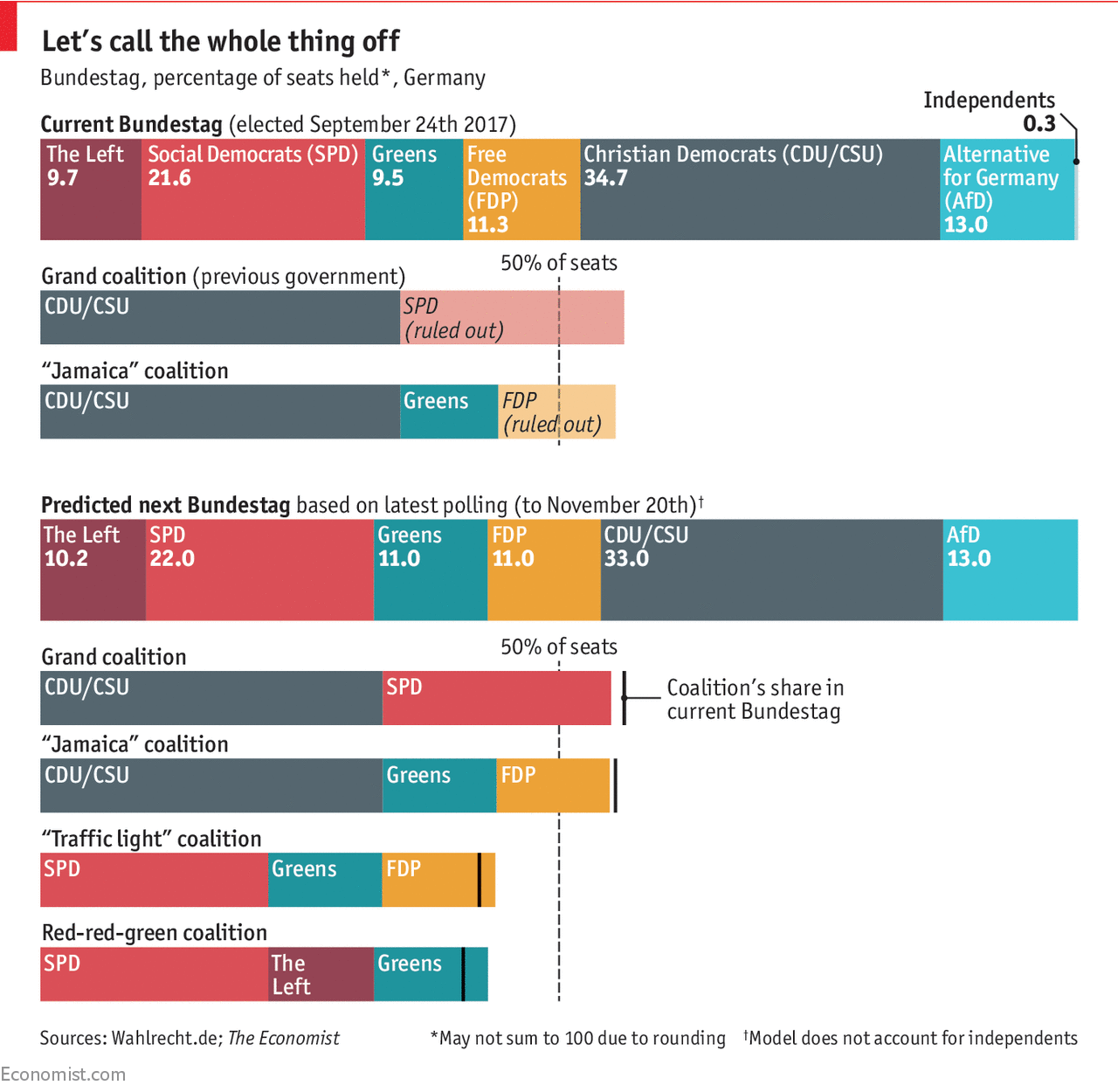
Last week we saw a lot of news break, and then here at Coffeespoons we had the usual American Thanksgiving holiday with which to contend. So now that things are creeping back to a new normal, let us dive back into some of the things we missed.
How about those German coalition government talks?
Remember two months ago when we looked at Die Welt and the German election results? Well it turns out that the FDP, the liberal (in the more classical sense that makes them more centre-right) Free Democrats, have walked away from coalition talks with Chancellor Angela Merkel’s CDU/CSU party (it’s actually two separate parties that have an alliance) and the Green Party. That leaves Merkel with the the Social Democrats as the only other option to form a majority government. (She could attempt to hold a minority government, but from her own statements that appears unlikely.) But the Social Democrats do not appear too keen on joining up in a grand coalition.
So where does Germany stand? Well thankfully the Economist put together a short article with a few graphics to help show just how tricky putting together a new coalition government will be.
Crossing the finish line…
In terms of design, there is not too much to stay here. The colours are determined by the colours used by the political parties. And the 50% vote threshold is a common, but very useful and workable, convention. The only thing I may have done to emphasise the lack of change in the polling data is a line chart to show the percentage point movement or lack thereof.
Credit for the piece goes to the Economist Data Team.
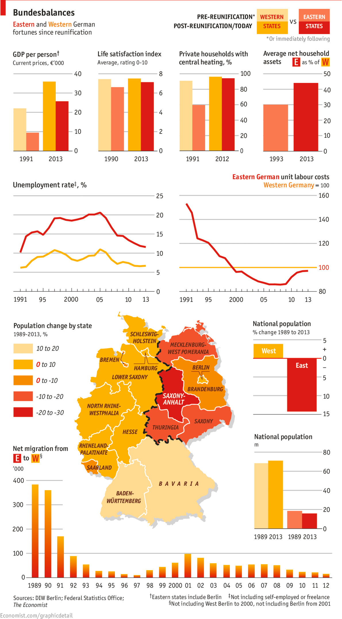
Yesterday marked the 25th anniversary of the fall of the Berlin Wall. But with the reunification of Germany a year later, has the former East Germany been able to catch up to what was West Germany? The Economist looks at the results in this graphic and the answer is yes. And no.
East vs. West. 1989 vs. 2013.
Credit for the piece goes to the Economist’s graphics department.