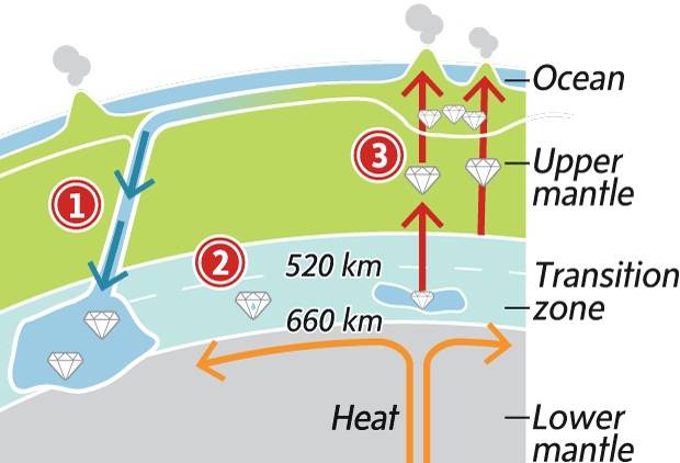
Your author is still in Canada. So here’s a graphic from the Globe and Mail that explains the process by which ringwoodite is formed. Recent research shows that the water contained within the mineral makes the mantle beneath the surface of the Earth contain more water than all the world’s oceans.
Ringwoodite
But mostly, I’m still in Canada.
Credit for the piece goes to the Globe and Mail graphics department.
The Globe and Mail of Canada published an infographic that where I work would probably be called a datagraphic. It presents data in a graphic fashion without a lot of context or conclusions that turn data into information. The piece in question looks at Canada’s balance of trade, i.e. how much it imports from other countries vs how much it exports to other countries.
Canadian trade
While I appreciate the goal of the overall piece and fully understand that it may have in fact first lived in the print edition, the version shown on their website feels too large for the few data points contained within the graphic. The bars on the right and beneath the timeline are far too wide. The sections could likely have been condensed into a smaller, more compact space that would have given more visual weight to the timeline that clearly tells the story of a more volatile trading period for Canada since the global recession of 2008.
I also would probably change the chart type or simply look at a different data set for the trade balance with principal partners because the data for Japan barely registers. And while the other data can be seen, the minor differences are difficult to read. I would probably shift the emphasis from the actual dollar value of exports and imports to the percentage growth (or decline) of each over the last year.
The Globe and Mail has been working on a story about immigration to Canada because apparently not all immigrants come to America. The story has its section headers running down the side column of the page, like many other segmented stories you’ll see posted online these days, but also uses graphics to make and supplement its arguments.
This one chart from the piece is an example of how the simple format of a line chart can clearly express and visualise an interesting trend. Immigrants from the past two decades earn less than immigrants to Canada in the 1970s. Those from the early 90s, however, do appear to have a faster rate of income growth that approaches parity with Canadian-born income-earners.
This piece in the Globe and Mail of Toronto looks at smartphone usage by operating system through a comparison of Canada to both the United States and Japan.
Smartphone use in Canada
While I understand the need for aesthetic distinction from having an entire page of bar charts, these ring or donut charts are a touch misleading. Because of the space between rings, the radius of each circle from the central Android icon is significantly increased. This of course proportionally scales up the length of each segment within the rings. In short, it becomes difficult to compare segments of each ring to the corresponding segments on the other rings without looking at the datapoint. And if you need to look at the datapoint, one could argue that the infographic has failed from the standpoint of communication of the data.
Beneath is the original (with the legend edited to fit into my cropping) with two very simple (and hasty) reproductions of the data as straight pie charts placed next to each other and then as clusters of bar charts grouped beneath each other. I leave it to you the audience to decide which is easiest to decode.
The original ring chart with legend movedAlternate visualisation types
Credit for the Globe and Mail piece goes to Carrie Cockburn.
While not new news, if you have not heard, Canada’s minority government fell and Canada is having an election. And, as we all know, elections mean infographic insanity. Map mania. Graphs galore. You get my drift.
The Globe and Mail, a Toronto-based newspaper, printed an infographic about the 50 ridings to watch. (A riding is, for my mostly US-based readers, similar to a congressional district.) They complemented this with an online, interactive piece. They did all of this a few days ago.
the print version
I have been meaning to write about this for a few days, but am only now sitting down to write it up and an interesting thing has happened. Whereas before, I was able to click the Globe and Mail’s link to their print graphic, now I get directed to their Google map pushpin overlay. Bye-bye, print graphic.
online version
And that is a shame, because, the print graphic is far better than the interactive. Yes, the pushpin can be clicked to read a small snippet of summary about the riding, however, at the same scale of print graphic, good luck finding all the pushpins. And while one can certainly zoom-in to find all the urban ridings, one loses seeing the whole and that riding’s relationship to the rest of Canada. Compare that to the print graphic where equally-sized boxes represent the ridings, and the boxes are spread out across a map of Canada in the background, showing the total apportionment of ridings to the provinces and territories. Whereas the pushpins do not. The arrangement of the boxes also has urban ridings grouped together and delineated from more rural ridings. Whereas the pushpins do not. And the boxes are not tied specifically to a point. Whereas the pushpins are. And that is most helpful, because one can only assume that the Western Arctic riding is located inside Yellowknife’s city hall. Right?
Pushpins are great for locating a specific point. Note the point of the pin. The boxes are great for eliminating the distorting effects of electoral districts in rural vs. urban settings. For comparison, look at the congressional districts in and around cities like New York and compare them to those in places like Montana.
I think the print graphic is better also because it included three charts that summarised and provided context of the 50-key ridings in the context of the whole general election across Canada. Google’s pushpin map overlay thing…does not.
Is the print graphic perfect, no. As I noted above, it does not specifically name the 50, as one can discover by clicking on the pushpins. Nor does it provide the name of the candidates or a very brief summary of the situation, as one can discover by clicking on the pushpins. But I have a better grasp of how the little piece fits into the whole from the print graphic.
Perhaps the best solution would have been to create a unique interactive piece that married the best of both designs. Scrap the Google maps bit and create a set of interactive boxes that mirror the print graphic, and so by clicking on the boxes one can access the same information in the pushpin. And then one would also have a reason to write something in the print article about checking the website for the online version that has even more information. But that is surely crazy talk.
As an additional point of comparison, the two screenshots are both roughly the same size in width—the main concern in showing all of Canada—and just note the amount of data presented in both versions.
A more interesting question, though, is why was the print graphic was removed from the site? (Or at least made so difficult to find that I could not find it.)
Credit for the print graphic image I have is to the Map Room, which is from where I first learned of the map to begin with.