The Freedom of the Press

By now you may have heard that this Thursday media outlets across the United, joined by some international outlets as well, have all published editorials about the importance of the freedom of the press and the dangers of the office of the President of the United States declaring unflattering but demonstrably true coverage “fake news”. And even more so, declaring journalists, especially those that are critical of the government, “enemies of the people”.

I have commented upon this in the past, so I will refrain from digressing too much, but the sort of open hostility towards objective reality from the president threatens the ability of a citizenry to engage in meaningful debates on public policy. Let us take the clearly controversial idea of gun control; it stirs passions on both sides of the debate. But, before we can have a debate on how much or how little to regulate guns we need to know the data on how many guns are out there, how many people own them, how many are used in crimes, in lethal crimes, are owned legally or illegally. That data, that verifiably true data exists. And it is upon those numbers we should be debating the best way to reduce the numbers of children massacred in American schools. But, this president and this administration, and certain elements of the citizenry refuse to acknowledge data and truth and instead invent their own. And in a world where 2+2=5, no longer 4, who is to say next that no, 2+2=6.

There are hundreds of editorials out there.

Read one from the Philadelphia Inquirer, the Chicago Tribune, the Guardian, and/or the New York Times.

But the one editorial board that started it is that of the Boston Globe. I was dreading how to tie this very important issue into my blog, which you all know tries to focus on data and design. As often as I stand upon my soap box, I try to keep this blog a little less soapy. Thankfully, the Globe incorporated data into their argument.

The end of their post concludes with a small interactive piece that presents survey data. It shows favourability and trustworthiness ratings for several media outlets broken out into their political leanings. The screenshot below is for the New York Times.

Clearly Republicans and Democrats view the Times differently

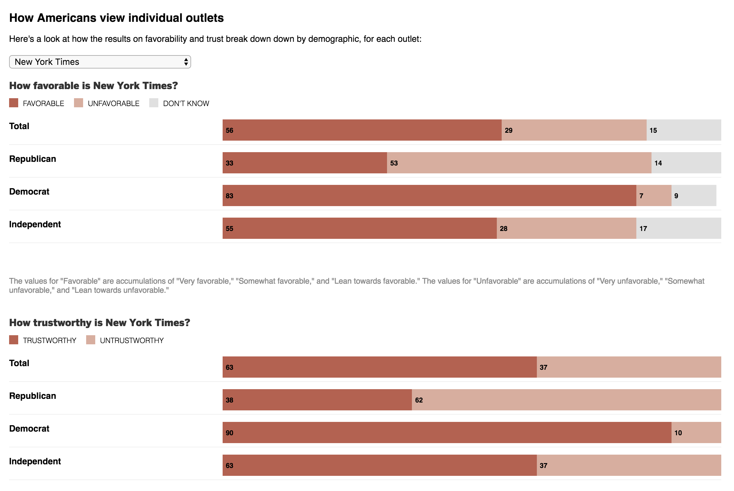
The design is simple and effective. The darker the red, the more people believe an outlet to be trustworthy and how favourably they view it.

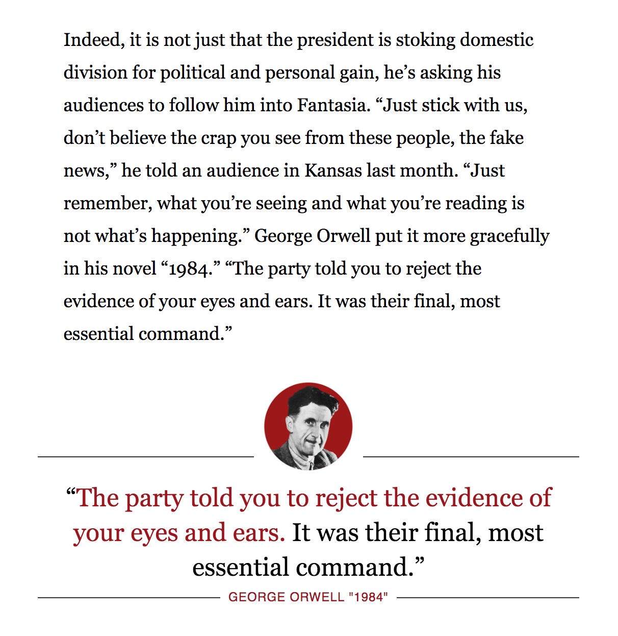
But before wrapping up today’s post, I also want to share another bit from that same Boston Globe editorial. As some of you may know, George Orwell’s 1984 is one of my favourite books of all time. I watched part of a rambling speech by the president a few weeks ago and was struck at how similar his line was to a theme in that novel. I am glad the Globe caught it as well.

Credit for this piece goes to the Boston Globe design staff.

Irish Abortion Referendum

On Saturday Ireland announced the results of a referendum on changing its constitution to remove Article 8, which had made abortion illegal except in the case of risk of death to the mother. And that was it, none of the usual rape or incest clauses. I want to look at a little coverage of the results and we will start with the Irish Times.

I might have toned down the red a wee bit, though

Their presentation is straightforward, a parliamentary-like slider and a small choropleth. All the colours link to each other and you will note that at first glance there is no variation in the colours on the map. Instead they present the binary choice, yes or no. To get the details of the vote, the user needs to select the Yes% or No%. From those we see not a lot of variation—probably not unsurprising given the overwhelmingness of the vote—as the Dublin area had the most yes, the rest of Ireland fairly solidly yes, and only Donegal in the northwest voting no, and even then, barely so.

I'm not quite loving these colours at all…
I’m not quite loving these colours at all…

But then we have the Guardian’s results map. And I am a wee bit lost. The bin definitions offer a bit more granular detail and so the sweeping results from the Irish Times results can here be seen as a bit more simplified. I probably would have shifted the colours and kept the yes on one side of the spectrum and not mixed the yellows and oranges into the positive, or yes, side. The stunning part of the result was, after all, that only Donegal voted no. So I would expect the colour of the choropleth to reflect that sharp break and less the gradation seen here. It’s a curious choice.

But more importantly, I am left wondering about the data, the titles, or the descriptions—I cannot be sure. The key bit is the callout of Roscommon-Galway. The text says the constituency voted 57.2% yes. But the colour would seem to indicate that it voted 65–69% no. A simple mistake? Perhaps. But then I look at the wording of the legend and maybe not. Could percentage of yes vote mean something more like the expected total or the percentage of registered voters? Probably not, but I cannot quite figure out what is going on in Roscommon-Galway. And if it is a data error, it is only made more noticeable because they point out that is one of only two constituencies described in the text.

Post script: After writing this and doing some more investigation over the long holiday weekend, I found a different map that appears to be more in sync with the results. The above was probably a mistake that just didn’t get pulled down and replaced. Below is the correct one. But it goes to show you how an incorrect graphic can cause confusion.

There we go.
There we go.

Credit for the Irish Times piece goes to the Irish Times graphics department.

Credit for the Guardian piece goes to the Guardian graphics department.

Southwest 1380

On Tuesday, Southwest Flight 1380 made an emergency landing here in Philadelphia after the Boeing 737-700’s port engine exploded. One passenger died, reportedly after being partially sucked out of the aircraft after the explosion broke a window. But the pilot managed to land the aircraft with only one engine and without any further deaths.

I wanted to take a look at some of the eventual graphics that would come out to visually explain the story. And as of Thursday, I have seen two: one from the Guardian and another from the New York Times.

The Guardian’s piece is the simpler of the two, but captures the key data. It locates the engine and the location of the window blown out by debris from the engine.

The Guardian's graphic
The Guardian’s graphic

The New York Times’ piece is a bit more complex (and accompanied elsewhere in the article by a route map). It shows the seat of the dead passenger and the approximate locations of other passengers who provided quotes detailing their experiences.

The Times' graphic
The Times’ graphic

So the first thing that struck me was the complexity of the graphic. The Times opted for a three-dimension model whereas the Guardian went with a flat, two-dimensional schematic of the aircraft. Notice, though, that the seating layout is different.

Four rows ahead of the circled window location are two seats, likely an exit row, in the Guardian’s graphic where in the Times’ piece they have a full three-seat configuration. If you check seating charts—seatguru.com was the first site that came up in the Google for me—you can see that neither configuration actually matches what the seating chart says should be the layout for a 737-700. Instead it, the Guardian’s more closely resembles the 737-800 model.

The 737-700 layout from SeatGuru.com
The 737-800 layout from SeatGuru.com

Nerding out on aircraft, I know. But, it is an interesting example of looking at the details in the piece. The Guardian’s piece is far closer to the layout, as least as provided by SeatGuru, and the New York Times’ is more representative of a generic narrow-body aircraft.

Personally, I prefer the Guardian in this case because of its improved accuracy at that level of detail. Though, the New York Times does offer some nice context with the passenger quotes. Unfortunately, the three-dimensional model ultimately provides just a flavour of the story, compared to the drier, but more accurate, schematic depiction of the Guardian.

Credit for the Guardian piece goes to the Guardian’s graphics department.

Credit for the New York Times piece goes to Anjali Singhvi, Sahil Chinoy, and Yuliya Parshina-Kottas.

Knuckle Cracking

I used to work with a designer who was an expert knuckle cracker. So when I saw this article from the Guardian last week, I was hoping that it contained some kind of an illustration. Thankfully it did.

Pop goes the bubble
Pop goes the bubble

What I like about the graphic is its simplicity. The illustration does not add a lot of extraneous details in the hands or fingers. Instead it focuses on a three-step zoom into the joint between the fingers and the hands, showing how the bones connect and just what happens.

So Happy Friday, all. Just relax, lean back, and—made you want to crack those knuckles, didn’t I ?

Credit for the piece goes to the Guardian graphics department.

Cloudy in Europe

During my travels in Europe, I enjoyed very little sunshine. It did not rain often, but the skies were overcast in both Scandinavia and London. Turns out that at least in January, after my trip, Europe was covered in an inordinate amount of sunshine. The Guardian covered the story, with a graphic showing just how little sunshine has been seen in northern Europe.

Cloudy north of the Mediterranean

Credit for the piece goes to the Guardian graphics department.

The NHS Winter Crisis

In the United Kingdom, the month of January has been less than stellar for the National Health Service, the NHS, as surgeries have been cancelled or delayed, patients left waiting in corridors, and a shortage of staff to cope with higher-than-usual demand.

But another problem is the shortage of hospital beds, which compounds problems elsewhere in hospitals and health services. The Guardian did a nice job last week of capturing the state of bed capacity in some hospitals. Overall, the piece uses line charts and scatter plots to tell the story, but this screenshot in particular is a lovely small multiples set that shows how even with surge capacity, the beds in orange, many hospitals are running at near 100% capacity.

Some of the worst hospitals

Credit for the piece goes to the Josh Holder.

Irma’s Impending Arrival

Your author is on holiday today and is actually writing today’s post on a Thursday night train to Boston. But by the time he returns late Sunday night—a Monday morning post is not guaranteed—Hurricane Irma will have likely made landfall somewhere along the Florida coast.

Thursday the Guardian published a nice article looking at the potential tracks for Irma. And while the specific routes will certainly be amended and updated over the weekend, the article is worth looking at prior to Irma’s arrival at Florida. As of my writing the track has shifted ever slightly westward and the current predicted path looks for Irma to land south and west of Miami. Ergo this screenshot is already a little outdated.

The three little wolves will huff and puff…

The remarkable thing about this graphic, which is just a cleaner version of the standard meteorological maps through more a more considered palette, is that there is not just one path of winds, but three. Following quickly on the heels of Irma are Katia and Jose, the latter the one taking the nearly same path as Irma while Katia spins towards Mexico.

But the graphic I really wanted to look at is the one ending the piece.

A very wide range of countries

This looks at the countries in Irma’s path as of Thursday morning. What I do not understand is the vertical axis of the bars. What does the height represent? To simply show the rank of countries able to cope with natural disasters, a more straight-forward table could have been used. A dot plot would also make some sense, but again, it would require an understanding of the underlying metrics driving the chart.

The graphic is saved by the annotations, in particular the more/less vulnerable directional arrows. Because I do not understand why countries are grouped into the particular buckets, I find the coloured bins out of place.

I think the concept of showing the most vulnerable countries is terribly important, however, the graphic itself needed a little more thought to be a little more clear in presenting the concept.

Credit for the piece goes to the Guardian graphics department.

Home Vacancies in Kensington and Chelsea

I added Chelsea to make doubly certain for my Philadelphia audience that you did not think I was referring to Philly’s Kensington. Why? Because today’s piece comes from the Guardian and refers to the neighbourhood where the Grenfell Tower caught fire and the inferno killed dozens of people.

A north–south divide

This is not the most complex piece, but I really like the annotations and notes on the choropleth. They add a great amount of detail and context to a graphic that I imagine many places would be okay leave as is. I can see why the colour palette differs for the two maps, but I wonder if it could have been made to work as a unified palette.

Credit for the piece goes to the Guardian graphics department.

The Disappearing Urban Middle Class

Today we look at income in American cities and in particular the middle class disappearance. The Guardian published the graphics, but they originate with Metrocosm, LTDB at Brown, and IPUMS National Historical Geographic Information System. So what are we looking at? Well, the big one is a set of small multiples of cities and their income breakdowns as percentages of city census tracts. This screenshot is static, but the original is an animated .gif.

The flattening of the curve

I have a few issues with the design of the graphic, the most important of which is the colour palette. If the goal is to focus on the decline of the middle class—and I admit that may be the point of the Guardian’s authors and not the original authors—why are the most visually striking colours at the top of the income distribution. Instead, you would want to draw attention to the middle of each chart, not the right. And if the idea was that the darker colours represent the higher income groups, well the positioning of each bar on the chart and the axis labelling does that already. After all, if anything, the story is that in a number of cities the middle class has shrunk while the lower income groups have grown. And you can barely see that with the lower income groups coloured yellow.

My other issues are more minor design things such as the city labelling. I kept reading the label as being below the bars, not above as it actually is.

And then I wonder if a different chart form would be more effective at showing the decline in the middle class. Perhaps a line chart plotting the beginning and end points for each cohort?

Then the piece gets into some three-dimensional maps that you can spin and rotate.

Just stop
Just stop

Yeah. Shall I count the ways? A more conventional choropleth would have served the purpose far more effectively. The dimensionality hides lower income tracts behind higher ones. The solution? Allow the user to rotate and spin the map? No, get rid of the dimensionality. It offers little to the understanding of the underlying data. Not to mention, are the areas of shadows shadows? Or are they another bin or cohort of income?

And then you have to read the piece to get a fuller understanding of my criticism.

But don’t worry, I can quote it.

Chicago was largely successful transitioning away from manufacturing to a service-based economy. This shift is evident in the bifurcated pattern present in 2015 – a heavy concentration of wealth in the business/financial district and marked decline in the surrounding area.

Those of you who read this blog from Chicago or who have lived in Chicago will pick up on it. The rest of you not so much. The concentration of wealth is not located in the business/financial district. Those dark red skyscrapers are not actual skyscrapers, they are census tracts located not in the financial district, but the areas of River North, Old Town, Gold Coast, &c. Thinking of the issue more logically, yes incomes are up in cities that are doing well. But how many of those very wealthy live on the same block as their office? Not many. Your higher income is going to be concentrated in residential or mixed-residential neighbourhoods near, but not in the business/financial district.

The data behind this work fascinates me. I just wish the final graphics had been designed with a bit more consideration for the data and the stories therein. And a little bit of proper understanding of the cities and their geography would help the text.

Credit for the piece goes to Metrocosm, LTDB at Brown University, and IPUMS National Historical Geographic Information System.

What Does Europe Want from Brexit?

Sorry about last week, everyone. I had some trouble with the database powering the blog here. Great week for things to go down, right? Well, either way, we’re back and it’s not like the news is stopping. This week? Brexit’s back, baby.

I’m never using the word “baby” again on this blog.

I have been saving this piece until the announcement of Article 50 by the UK government. I know the British and Europeans among my audience likely know what that means, but for the rest of you, Article 50 is the formal mechanism by which the United Kingdom starts the two-year process to leave the European Union.

Think of it like signing the divorce papers, except that the divorce isn’t unofficial for two years until after that date. The interim period is figuring out who gets which automobile, the dinnerware, and that ratty-old sofa in the basement. Except that instead of between two people, this divorce is more like a divorce between polygamists with multiples husbands and wives. So yeah, not really like a divorce at all.

What the EU wants from Brexit at a desktop scale

This piece from the Guardian attempts to explain what the various parties want from the United Kingdom and from the eventual settlement between the UK and the EU. It leads off with a nice graphic about the importance of a few key issues in a cartogram. And then several voting blocs run down the remainder of the page with their key issues.

What the EU wants from Brexit at a mobile scale

I really like this piece as the small multiples for each section refer back to the opening graphic. But then on a narrow window, e.g. your mobile phone, the small multiples drop off, because really, the location of the few countries mentioned on a cartogram is not terribly important to that part of the analysis. It shows some great understanding of content prioritisation within an article. In a super ideal world, the opener graphic would be interactive so the user could tap the various squares and see the priorities immediately.

But overall, a very solid piece from the Guardian.

Credit for the piece goes to the Guardian’s graphics department.