Last week I wrote about how our progress in dealing with Covid-19 was stagnating. To put it simply, this past week did not get any better on that front.
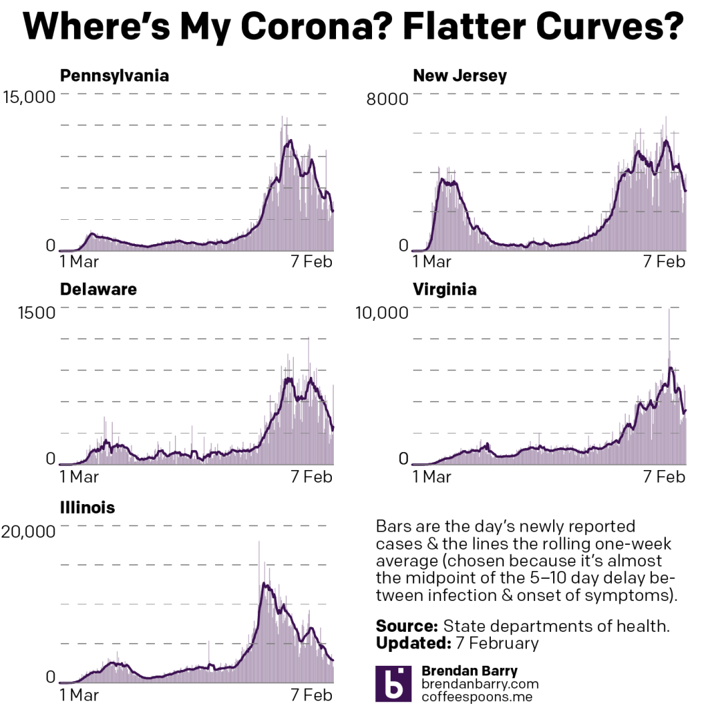
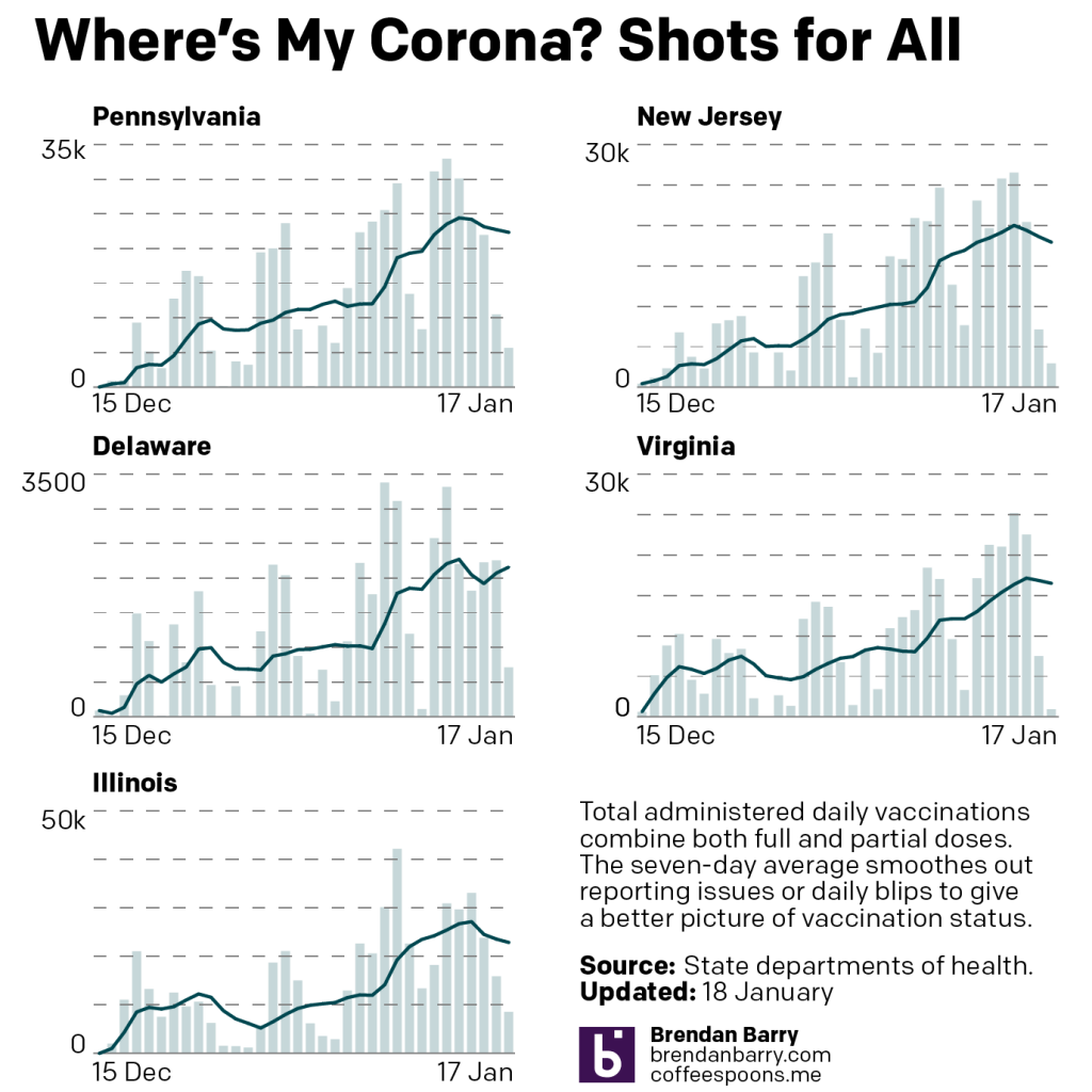
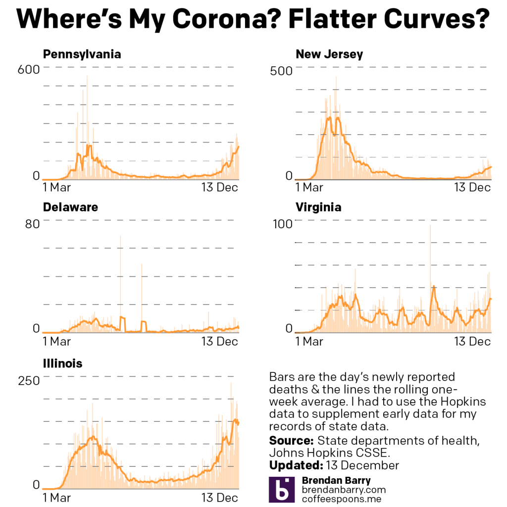
New case curves for PA, NJ, DE, VA, & IL.
In Pennsylvania, Delaware, and Illinois we see that the flattened tail I described last week, well remained a flattened tail. In Delaware, we see more movement, but the average of the average, if you will, is flat over the last two weeks. And in New Jersey, where I mentioned some signs of rising numbers, we see a clearly rising number of new cases over the last week. Only in Virginia are numbers heading down, and those are shallowing out.
The problem here is that in Pennsylvania and Delaware, the new case rate, whilst flat, is well above the summer rate of low transmission. This means that the environment is ripe for a new surge of cases if people stop following social distancing and begin resuming indoor activities with other people. Sadly, both those things appear to be occurring throughout the US.
In Europe we see a cautionary tale. They too saw their holidays peaks decline and the national governments began easing restrictions on their populations. Within the last several days, however, new cases have begun to surge. Italy has gone so far as to announce a new lockdown. Other governments are considering the same.
If the United States cannot resume pushing its numbers of new cases down, it could well follow Europe into a new wave of outbreaks that would threaten lockdowns and push back our eventual return of normalcy.
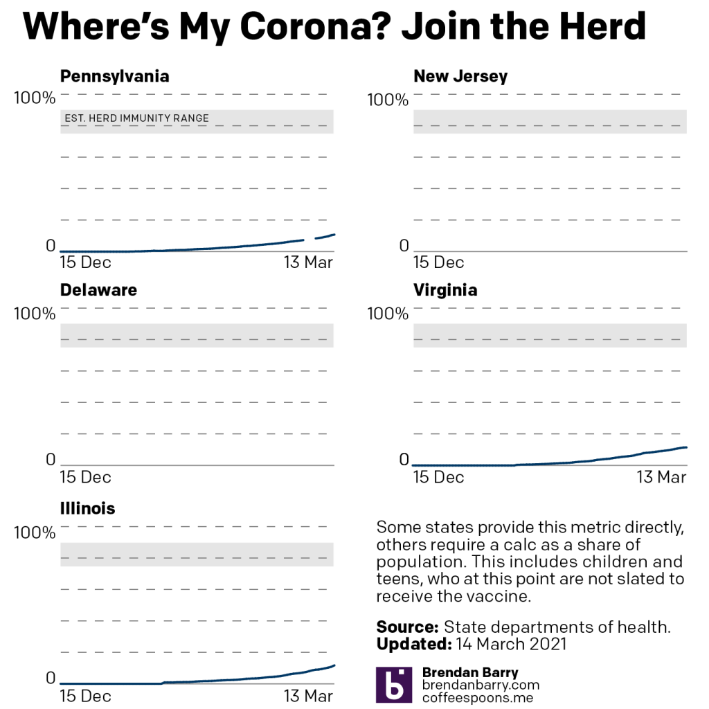
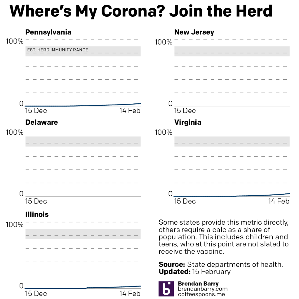
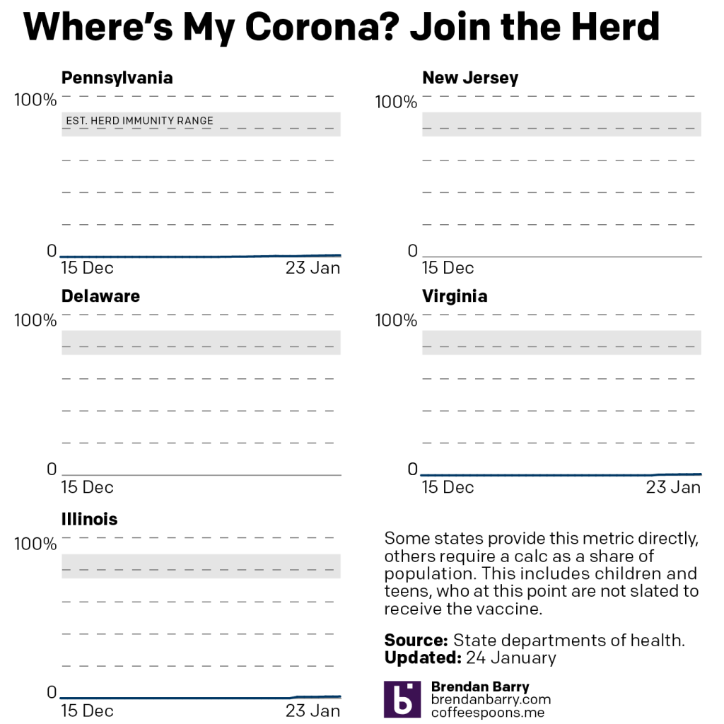
None of this would be an issue if vaccinations were nearing herd immunity levels. However, in the states we cover, nowhere is above 12% fully vaccinated.
Vaccination curves for PA, VA, & IL.
Pennsylvania now lags behind the other two states. But at least the Commonwealth is over 10% fully vaccinated.
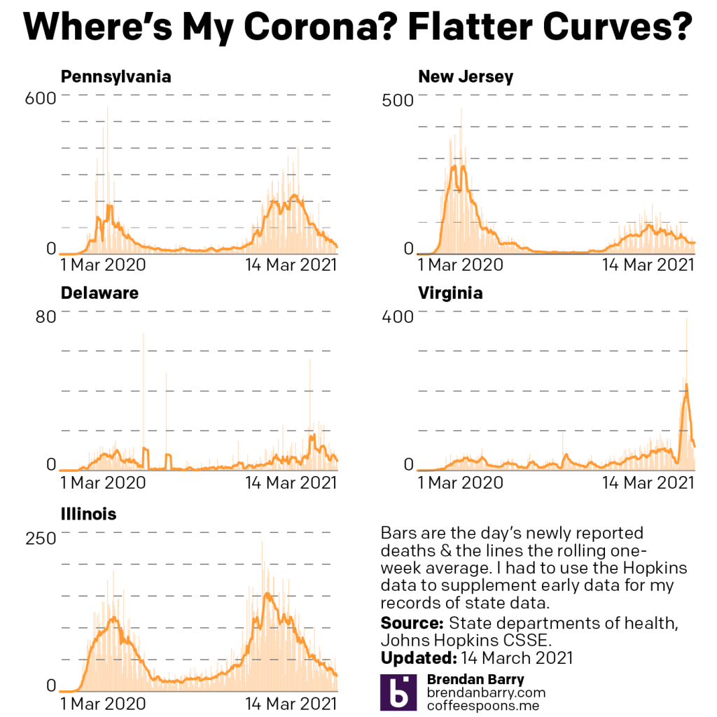
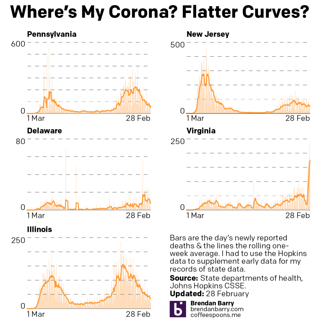
And of course, the problem under this dire scenario is that deaths could rise once again, though at this point the most vulnerable are in the middle of being vaccinated. Indeed, if we look at the last week, we see the good news for the week, that deaths are headed down in all five states.
Death curves for PA, NJ, DE, VA, & IL.
Previously, Virginia had been working through a backlog of death records, but those appear now cleared. We are not quite back to summer-level lows, but we are steadily approaching them.
The big question this week will be what happens to those new cases numbers. Today’s data, Monday, will likely show lower numbers because of lower testing on the weekend. But starting Tuesday, what do we see over the course of the next five days?
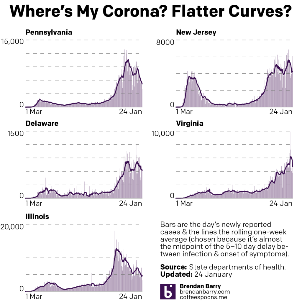
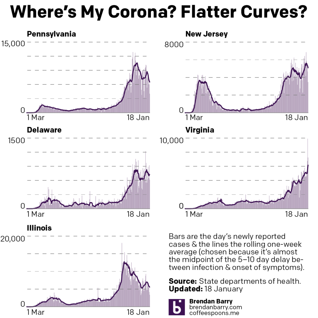
Last week I wrote about some signals indicating a potential stagnation in terms of declining numbers of new cases. I also wrote about some potential signs of reversals, or increasing numbers of new cases.
This week, what we saw signs of came to pass.
New case curves for PA, NJ, DE, VA, & IL.
At the tail ends of each chart, you can see that the last week was broadly stagnant. In Pennsylvania and Illinois the seven-day average was itself remarkably flat. Delaware is now where it was this time last week; a slight rise in new cases was met with an equal magnitude decline.
In reversals, we have New Jersey. New case numbers there increased throughout the week. With lower weekend data, those numbers have fallen slightly.
Only in Virginia did we see good numbers in new cases. Numbers there fell over the last week, though notably at a slower pace than in previous weeks.
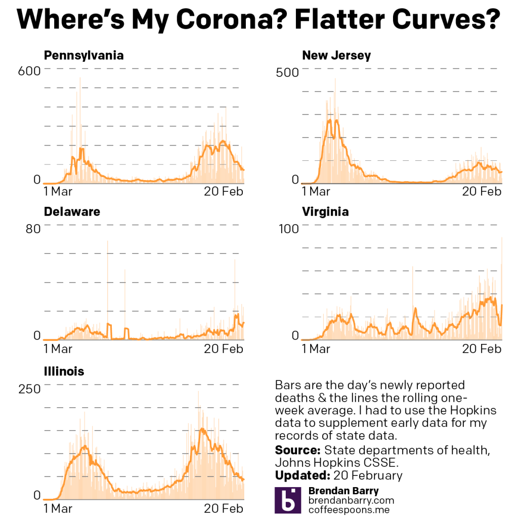
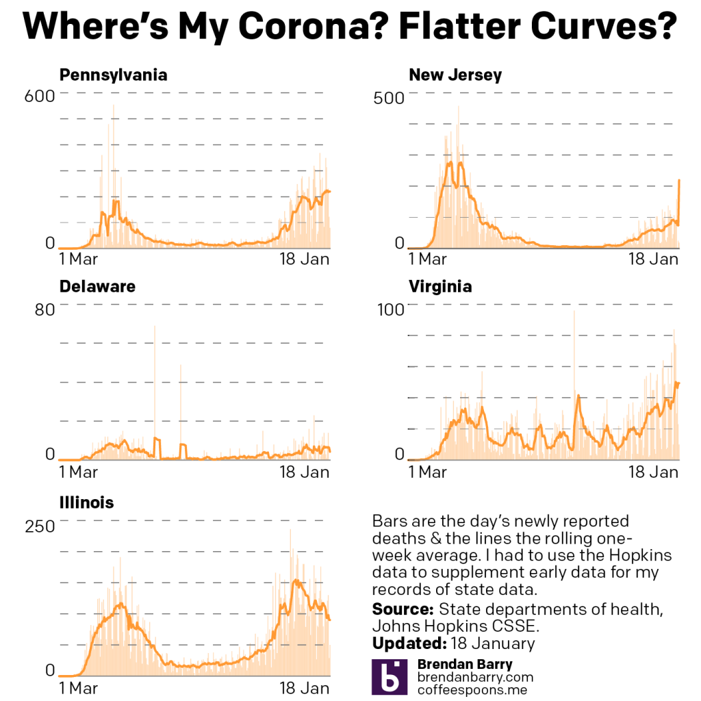
Deaths presented broadly good news. Last week we had mixed signals with increasing numbers in Delaware and Virginia. We knew the increase in Virginia was due to the state processing a backlog of death certificates with Covid.
Death curves for PA, NJ, DE, VA, & IL.
But in the last few days, those numbers have also fallen though the state reports it is still processing the backlog. And in Delaware, the daily number of deaths has also fallen again. I think it’s too early to say this peak has crested, but it could well be.
And in the other states, we continue to see slowly falling numbers of deaths. There are some potential signs of that bottoming or stalling out in Illinois, but we’ll have to see how this week pans out.
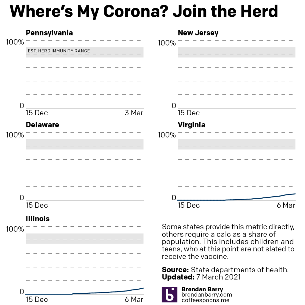
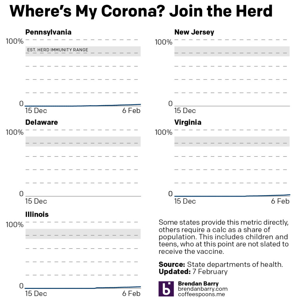
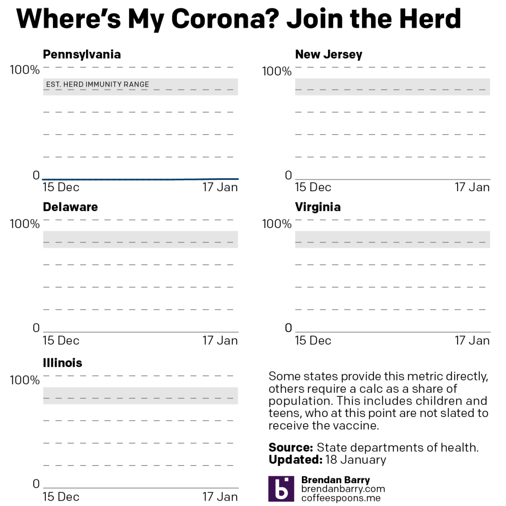
Finally, the best news we had over the course of last week was with vaccinations.
Vaccination curves for VA & IL.
Last week I mentioned that we can see the lines moving upwards as we approach 10% fully vaccinated in Pennsylvania, Virginia, and Illinois.
This week, well let’s start here: as I’ve pointed out in the past, Pennsylvania does not have a centralised reporting system. Most notably the state reports figures for all but Philadelphia county (coterminus with the city). The city reports its own figures. I aggregate the two. But for the last several days, the Philadelphia data site has been broken, so we don’t know the progress of vaccinations in the city. And as the largest city/county in the state, Philadelphia is an enormous part of figuring out the statewide numbers.
So looking only at Virginia and Illinois, the numbers look good. Virginia is at nearly 9.5%. Illinois is on 8.92%.
But we really need Philadelphia to get its act together.
Last week we saw some positive trends with respect to new Covid-19 cases in the Pennsylvania, New Jersey, Delaware, Virginia, and Illinois area. What did we see this week? Curiously, we saw stagnating figures and, in some instances, slight reversals.
New case curves in PA, NJ, DE, VA, & IL.
This stagnation can be seen by the small flattenings at the end of the lines for Pennsylvania, Illinois, and Virginia. And if you look at Delaware and New Jersey, you can see the reversals as little upward hooks.
I do not think this means we will be returning to the levels we saw earlier this winter. In fact, if you look a little ways back in Delaware and a bit further back in both Pennsylvania and Illinois you can see a similar pattern. Slight reversals appear as jagged little outcrops on the slope. New cases do indeed climb for a week or so—probably isolated to specific geographies within those states tied to outbreak clusters, but that’s pure speculation on my part.
These reversals, therefore, are something we should pay attention to this week when the weekday data resumes on Tuesday. But I am not worrying about this breaking the overall trend of falling numbers of new cases.
Deaths, on the other hand, while still a bit mixed, are broadly positive. Last week we were in a similar position as we are with new cases this week. In particular, we were looking at increasing numbers in both Delaware and Virginia while the other three states saw slowly falling numbers.
Death curves for PA, NJ, DE, VA, & IL.
In Delaware we have the numbers down a bit, but the longer term trend remains generally up. I will be watching this closely this week. Virginia, however, is an easier, but maybe better explanation? During the course of this past week, Virginia stated that it’s processing death certificates from the post-holiday surge in deaths.
This means the state under-reported deaths earlier this year and so that the curve should have actually been significantly higher. But the positive news in that is that the deaths we are seeing now happened in the past so that deaths today are far lower than are being reported.
And with vaccinations we continue to have good news. The lines below are clearly off the baseline now as the three states we track move towards 10% fully vaccinated.
Vaccination curves for PA, VA, & IL.
It’s not all perfect, as the rate in Pennsylvania appears to have slowed slightly. This after vaccine administrators mistakenly used second doses for first doses. Now the state has to play catch-up.
But in Virginia and Illinois, we continue to see increasing rates. You can see this as the curve is beginning to gradually slope more and more upward instead of the shallow angle we saw for the last few weeks.
Like with new cases, which, while positive, still have a ways to go before we get to summer-like levels that would allow us to head out and socialise, vaccinations have a long way to go.
And importantly, just because someone is vaccinated doesn’t mean society should reopen just for those lucky to get their doses early. We need to wait—or should wait—for higher levels of vaccination before reopening.
Another week, another snowstorm in the Northeast. This winter has been far busier than last, when Philadelphia saw no snow. Unfortunately, whilst people like me enjoy seeing the snow, it’s hampering with testing and vaccination.
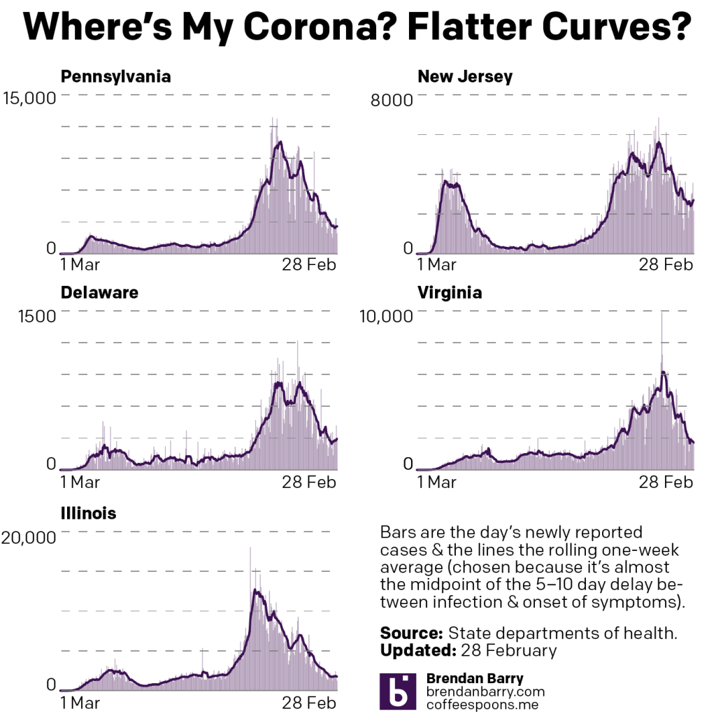
Last week we saw some middling signs of improvement, but perhaps partially exaggerated by the closures caused by the storm. When we look back at the last week, despite the impact of a storm later in the week, it’s been a categorically positive week with respect to new cases.
New case curves for PA, NJ, DE, VA, & IL.
After the plateaus of the week before, most notably in the straight line in Pennsylvania, this week we saw the line for the seven-day average resume a sharp trajectory down. That isn’t to say we are seeing a slowdown in that reduction of new cases. Illinois best fits that, but we can see slight flattening of the downward curve also in Delaware and New Jersey. In Illinois’ case, that is still welcome as the state approaches early autumn levels of new case rates. In the remaining states, we still have a little ways to go before we reach those levels.
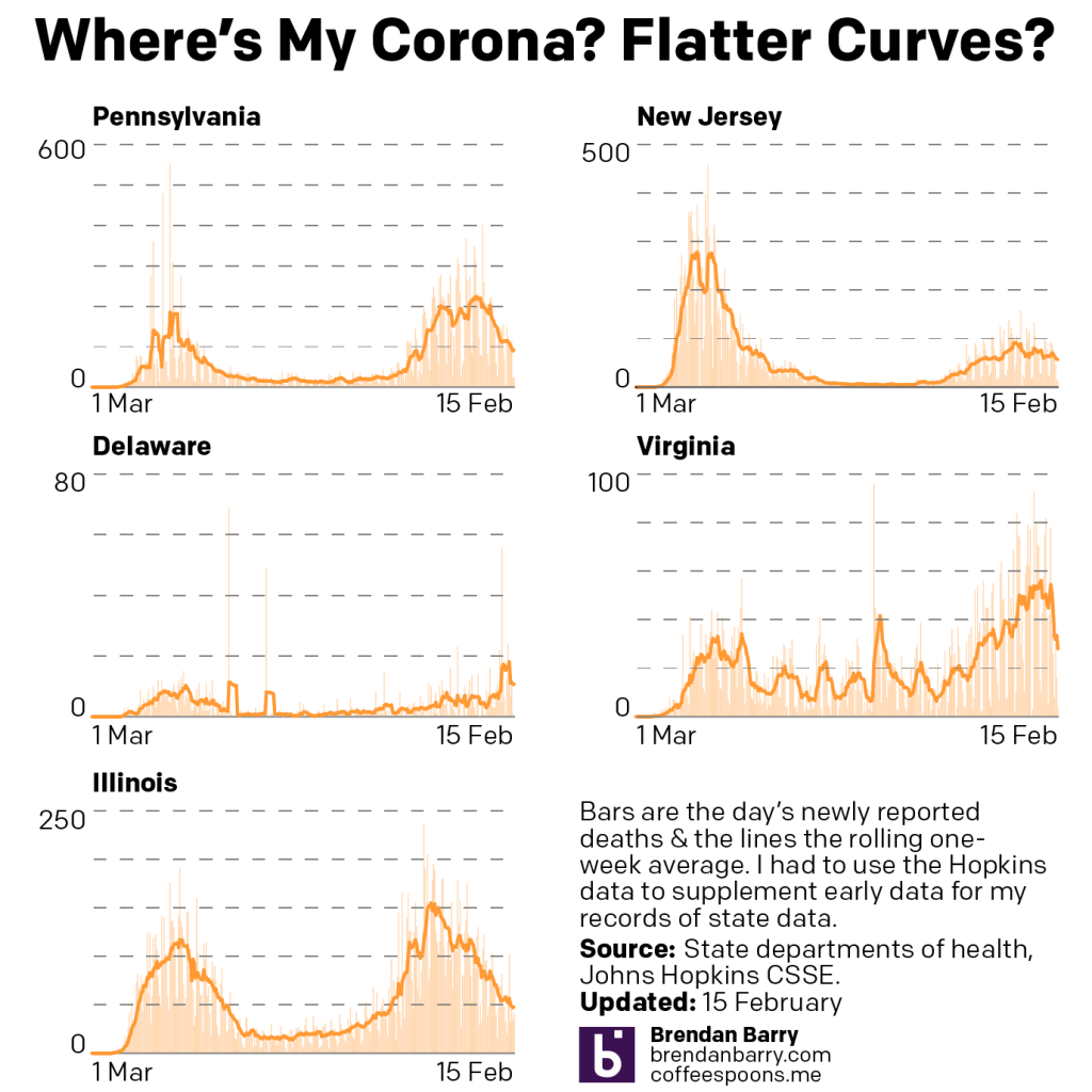
Deaths, on the other hand, remain a mixed bag of results. Last week we talked about a much improved picture from the week before with Delaware and Virginia in particular exhibiting significantly decreased rates.
Death curves for PA, NJ, DE, VA, & IL.
This week we saw some reversal of fortune in those two same states. In Delaware, the numbers of deaths have ticked back upwards and the seven-day average has made up about a third of the gains we saw. In Virginia, the upward swing can be largely—though not entirely—attributed to a one-day spike in numbers.
Whilst the other three states continued to see gradual improvements, the question over the coming week will be what trends emerge within Delaware and Virginia. Do the deaths increase and the situation worsen? Or will the increases prove a temporary aberration followed by a return to decreasing numbers of new deaths.
Finally with vaccines
The vaccination curves for PA, NJ, DE, VA, & IL.
The story to follow in Pennsylvania will be how distribution sites mistakenly administered second doses as first. 60,000 people awaiting their second dose will now have to wait—though still within the recommended window—for their second dose whilst 50,000 people will now have to wait for their first dose.
Otherwise, we continue to see an uptick in vaccinations. Last week we saw states make significant gains in their fully vaccinated populations. Virginia had passed 4% and Pennsylvania was about to hit the same milestone. This week begins with Virginia at nearly 5.5% and Pennsylvania almost at 5%, sitting on 4.77%. We need to keep in mind that this excludes any new vaccinations from the city, which doesn’t report vaccination data at the weekend. Illinois is now the lagging state at 4.29%.
Last week we discussed the potential impact of a major nor’easter that struck the East Coast and interrupted testing and vaccination operations in the states we cover: Pennsylvania, New Jersey, Delaware, Virginia, and Illinois (affected by the storm as one of the components moved east across the Midwest).
The possibility of an exaggerated downward trajectory concerned me and that it could be followed with an uptick in new cases and deaths. So a week later, where are we?
New case curves for PA, NJ, DE, VA, & IL.
We can see something in the middle. With the exception of Illinois, which has continued its downward trend for new cases, we saw a brief interruption last week. In some cases, like Pennsylvania, that emerged as a rolling seven-day average that began and ended the workweek with the same exact number. And without a lot of variation during the week, you can see that pattern as the flat line towards the end of the chart. As numbers resumed heading down, you can see that beginning of a downward direction at the line’s very end.
In the remaining states of New Jersey, Delaware, and Virginia we saw brief upticks in the seven-day averages with daily spikes of new cases. None of these upticks came anywhere close enough to be threatening—though any upward tick should be monitored—but they were all significant enough to be seen as the quick, upward pointing jogs in the lines. But as we entered the weekend, those numbers also began to drop again.
Next we look at deaths. Last week I described a muddled picture. Delaware and Virginia had begun to rebound and reach or approach new peaks whilst Pennsylvania and Illinois continued to see steady but significant declines. New Jersey fell somewhere between the two. What about this week?
Death curves for PA, NJ, DE, VA, & IL.
This week is an improved picture. We did see the potential interruption from the storm—Pennsylvania’s death trend evinces the disruption with the same straight line pattern we saw with new cases. But, overall, numbers continue to trend down. Delaware and Virginia show dramatic improvement with steep drops over the last week. And whilst Illinois continues to show steadily declining numbers, New Jersey now falls somewhere near the top of the pile. Its death rate continues to decline very slowly, relative to the other states. But it is heading down.
Finally, a look at vaccinations for Pennsylvania, Virginia, and Illinois.
Last week we talked about how the states all reached at least 2% over the course of the week. Even better news this week.
Vaccination curves for PA, VA, & IL.
Last week we needed approximately one week to climb one percentage point from 1% to 2%. This week in the same one week time period we saw Virginia climb two percentage points from 2% to 4%. Illinois has slowed its vaccination efforts as it’s still in the mid 3% range. And Pennsylvania is tricky. Because the city of Philadelphia does not report its data on the weekend, we have an incomplete picture until after I post this on Mondays. Even though today is Tuesday, yesterday was a holiday so the same pattern holds true. I would suspect, however, the Commonwealth surpasses 4% later today when the new numbers are released or it comes near to reaching that level.
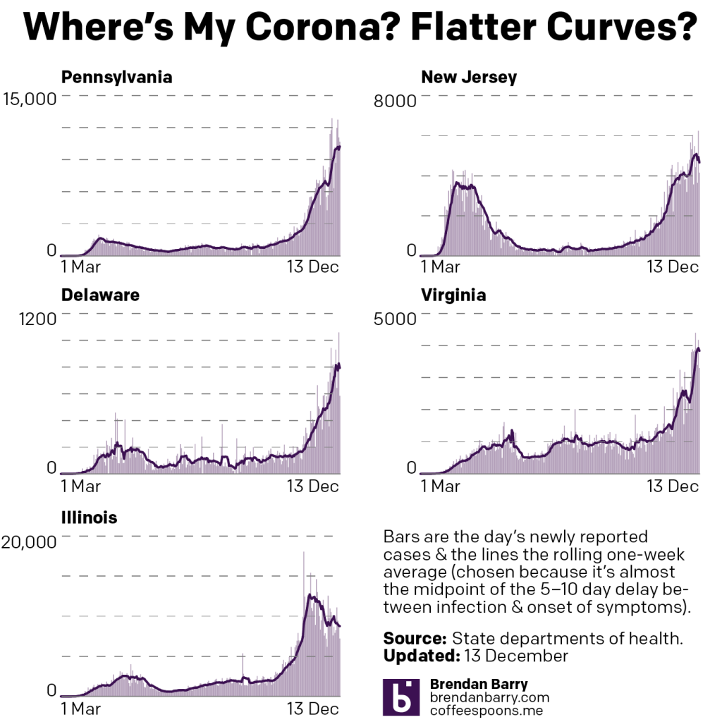
I missed last week’s posting on an update to Covid-19. Two weeks on from the last post, things in the states of Pennsylvania, New Jersey, Delaware, Virginia, and Illinois continue to improve, albeit with a few fits and starts. But the downward trend nonetheless can be seen in the new cases charts.
Consider that in the charts from two weeks ago, we saw downward slopes, but a look at the charts in the two weeks hence shows some blips.
Another thing to keep in mind is that a major snowstorm disrupted testing and vaccinating operations in the northeastern states of Pennsylvania, New Jersey, and Delaware. The storm, which also hit northern Illinois and Virginia, also likely impacted those states but to lesser degrees.
New cases curves for PA, NJ, DE, VA, & IL.
That means the downward trends in new cases could be slightly exaggerated in those states. Consequently, rebounds next week should be taken with a grain of salt. Indeed, Sunday’s data releases from the tri-state area were greater than we might normally see with weekend data.
When we at deaths, however, we see a more muddled picture.
Death curves in PA, NJ, DE, VA, & IL.
In states like Delaware and Virginia, the average death rate is now higher than it was two weeks ago. In New Jersey, the rate is down slightly, but after two weeks of it being largely up and so all in all, largely a wash. Instead, it’s only in Pennsylvania and Illinois where we any real improvements in the average death rate. Both states are down and look to continue heading down.
Finally, we look at vaccinations and the percent of state populations that have been fully vaccinated.
The fully vaccinated percentage of the populations of PA, VA, & IL.
Two weeks ago, Pennsylvania and Illinois had just reached 1%. Neither New Jersey nor Delaware is reporting similar data, so both those states remain outside our consideration set. But, all three remaining states—Pennsylvania, Virginia, and Illinois—are now over 2%. Pennsylvania reports at least 2.5%—the city of Philadelphia reports separately from the statewide Department of Health, but does not update its figures at the weekend and so is likely higher. Both Virginia and Illinois have reached 2.3% full vaccination.
Last week we saw some indications that the recent surge was beginning to ebb in Pennsylvania, Delaware, and Illinois with the same in New Jersey, but to a slight degree less so. Only Virginia presented us with data that showed its surge continuing unabated.
So this week we have some generally good news to look at.
New case curves for PA, NJ, DE, VA, & IL.
The drop in Pennsylvania, New Jersey, and Illinois appears real and sustained. Even in Virginia, we are beginning to see some signs of a decline in new cases—albeit it after a week of record reports of new cases.
Of course we should also mention that even though we are seeing declines in new cases, in no state are we close to approach low levels of community spread. Things are still bad out there, but they have gone from catastrophic spread to merely a disaster. Illinois is probably the closest to reaching summer-like levels of viral spread.
Deaths, however, because they lag behind new cases, are just now beginning to show signs of ebbing.
Death curves in PA, NJ, DE, VA & IL.
If last week’s pattern with new cases was that we were seeing positive trends in four states, we can say this week we are seeing positive trends in deaths for the same four states. Virginia is, again, the outlier.
Though I would be remiss if I noted that the declines in deaths is not nearly as pronounced as in new cases. In Pennsylvania, the seven-day trend for new deaths has appeared to have crested. But in New Jersey, recent days have suggested the decline may not be as steady. Only in Illinois are we really seeing a sustained downward trend in deaths.
And Virginia just Saturday saw its seven-day trend reach another new record, over 50 deaths per day.
But what about vaccinations?
Firstly, we still only have data for the three states of Pennsylvania, Virginia, and Illinois. Secondly, keep in mind that I am looking only at people reported fully vaccinated, i.e. they have had both their shots—both Pfizer’s and Moderna’s vaccines require two shots.
Vaccination curves in PA, VA, & IL.
There’s not a lot to report on yet, other than that both Pennsylvania and Illinois reached the 1% threshold. I think that for most people, however, that you can begin to see their respective lines easing off the 0% baseline. Virginia lags behind those two states, however, with just 0.5% of its population reported as fully vaccinated.
I’m curious to see if I cannot find some additional/alternative data sources for New Jersey and Delaware next weekend. I don’t love the idea of mixing data sources, but after a few weeks, we haven’t really seen any improvements to the data sharing from those states.
That said, I should also note that the new US administration has identified data transparency as an issue—or the lack thereof—in the current vaccination programme and is working to develop national and state-level dashboards to inform the public.
Last week we saw that in the weeks after Christmas, new cases and deaths rebounded in the five states of Pennsylvania, New Jersey, Delaware, Virginia, and Illinois. The question was how bad would things continue to get? Would these rebounds sustain themselves?
A week later we can see a glimmer of good news in that with new cases, these rebounds appear to have crested and are now ebbing back down. At least in four states.
In Virginia, unfortunately, we see that new cases continue to climb with a new record of nearly 10,000 cases reported late last week. More broadly, this is the dilemma that confronts the United States. We have states like Pennsylvania, Delaware, and Illinois where we are bringing the virus back to heel. But in other states like Virginia, things continue to get worse.
New Jersey is somewhere in the middle. It appears to just possibly be cresting with its average actually ticking higher the last few days despite falling daily new cases. We will need to see how the Garden State plays out over the course of this week.
When we look at deaths, we continue to see the grim numbers pile up.
Deaths, of course, lag new cases by 2–4 weeks, sometimes as many as six or longer. In most of our five states, the average rate of deaths appears to be cresting or peaking. In Pennsylvania the curve may have peaked. In Delaware, we have seen a plateau and in Illinois we see the best news of a resumed decline.
In both New Jersey and Virginia, however, we see deaths continuing to climb, and in some cases by significant amounts.
If cases really have peaked in some of these states over the last week, we may expect deaths to continue to rise over the course of this week before beginning to fall again.
I also want to add two new graphics today. I have been trying to figure out how to cover the vaccination programme of the five states. Unfortunately, they do not all report the same data in the same way.
The graphic that perhaps makes the most sense is the one that looks the emptiest at the moment.
In order to resume “normal” lives, we need to achieve herd immunity. When we reach that level, the virus starves of new hosts and dies out. Broadly speaking, we have two ways of achieving herd immunity.
Option 1, let the virus run rampant and takes its course through the population. The benefit is that society remains open and people can return to cafes, pubs, shops, and museums. The cost is that millions get sick and hundreds of thousands die. Sadly, this is the route taken by Sweden and, unofficially, the United States.
Option 2, vaccinate the population. The benefit here is that millions do not get sick and hundreds of thousands do not die. The cost is that in order to wait for a vaccine and vaccination we would need to close cafes, pubs, shops, and museums.
The reality is that we chose something between the two. In the initial months, after we (belatedly) recognised the threat of the virus, we shut down our economies and stayed home. We chose option 2. You can see in the state charts above how that quickly helped us curb the spread of new infections.
Unfortunately, then the Trump administration chose to follow option 1 and encouraged states to “reopen” their economies. And because we never got the virus fully under control, we sowed the seeds for the explosive growth this autumn and winter.
But the vaccines are now here and the best bet is to vaccinate the population. How many people do we need to vaccinate? The exact number depends upon the infectiousness of the virus. Measles, one of the most infectious viruses out there, requires near 100% vaccination rates to achieve herd immunity. Thankfully, this coronavirus is not as infectious as measles. Early estimates placed the range at 60–70%. But lately, some epidemiologists have indicated the true number may be higher. Dr. Fauci of the National Institutes of Health (NIH) has said the true number is likely 70–85%.
This is why the new strains of the coronavirus we have identified in South Africa and the United Kingdom worry folks. Both appear to be more transmissible than earlier strains. Neither strain appears to be more lethal in its own right—although more cases means more people will die—but this increased infectiousness could mean we need an ever higher level of herd immunity, which means more vaccinations. And we’re already seeing the anti-vaccination support rising to somewhere in the range of 15-20%, just the threshold we could perhaps tolerate with the higher herd immunity range.
So what about the chart?
As we begin vaccinations, some states are reporting the numbers of people in their state that have been fully vaccinated against the coronavirus. I plot those numbers here. Pennsylvania, Virginia, and Illinois do so. Unfortunately, neither New Jersey nor Delaware does. I only have one data point recorded for Virginia and Illinois, and so they are not plotted yet, but both fall below the level of Pennsylvania, which has reported 0.50% of its population fully vaccinated. I have added a bar to show the range of estimated herd immunity we need.
And that gets us to the second new chart, the number of total doses administered per day.
Functionally this resembles the usual two charts. We track the number of doses administered daily and then plot their seven-day average to smooth out any day-to-day blips. Of course this means almost the opposite of those two charts as we are tracking the progress of people who will be immune from the virus.
The catch is that with the current vaccines we need two shots for a full course of treatment and not all states break the data down with that level of granularity. Again, we are looking at Delaware and New Jersey as they provide only the total number of doses administered. Now that’s still helpful, but it doesn’t give us the most accurate picture of what is happening with vaccinations.
But in order to make things comparable across five states, I have decided to use that broader, total doses administered metric for Pennsylvania, Virginia, and Illinois. (Virginia and Illinois provide another headache in that it reports the daily number of people fully vaccinated, but does not break down the number of full vaccination doses.)
So what is this second chart showing us?
Well, we are seeing a slow, nearly steady growth in the number of vaccines administered. The problem is that we need to see steep, nearly exponential line charts here if we want to have any hope of returning to “normal” anytime soon. Reporting tells us that the federal government’s approach to the logistics of vaccine distribution has been…not great. (Although at this point, perhaps that should not surprise us.)
Until we see these second charts begin to show more exponential growth, the first charts of the number of people fully vaccinated will be far below that herd immunity threshold we need to see.
Covering the vaccines in addition to the virus is a bit more work, but I’m going to try and cover them both over the next several months as I have with the outbreak itself.
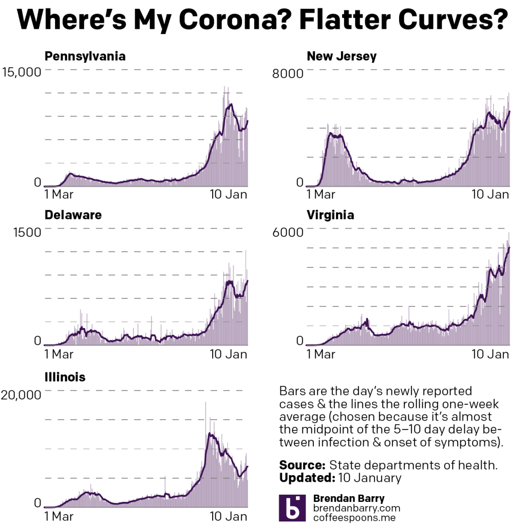
The last time we checked in on Covid-19 in the states of Pennsylvania, New Jersey, Delaware, Virginia, and Illinois, things were peaking across the five states. As I said then:
If you look at the very tippy tip top of the curves in the other four states, we might just be seeing an inflection point.
And in the month since, my highly scientific term of “tippy point” appears to have been correct. New cases did begin to drop and by the start of the Christmas holiday we began to see real improvement. I should point out that deaths continued to rise, however, but we should expect that because deaths lag new cases by sometimes as many as four to six weeks.
So how are things now, a month hence?
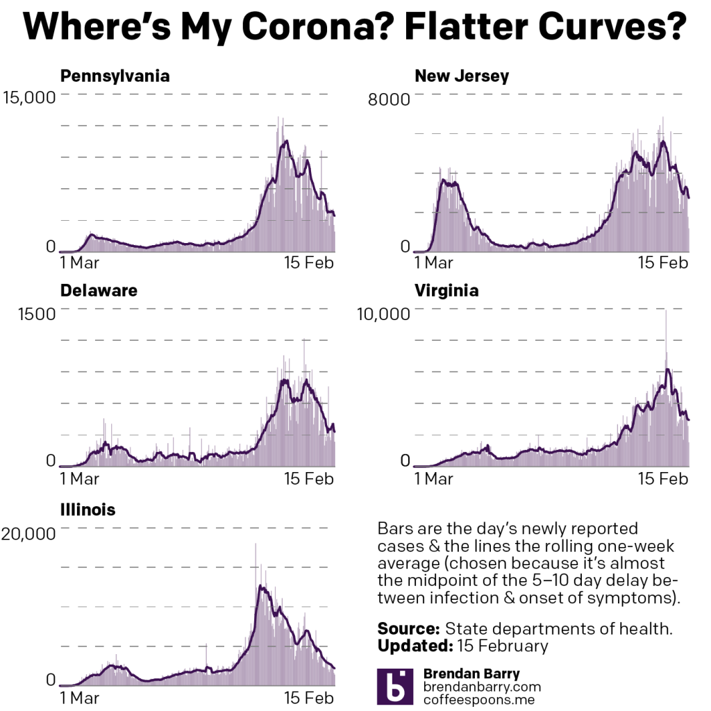
The new case curves for PA, NJ, DE, VA, & IL.
Well as you can see with new cases, not great and getting worse. Pennsylvania, New Jersey, Delaware, and Illinois all bottomed out prior to the holidays, and since then have been rising. It speaks to a surge in new cases likely caused by gatherings centred on the holidays.
The good news—if you can call it that—is that in Pennsylvania and Illinois, whilst cases rebound, they have not yet reached their mid-December peak in Pennsylvania and mid-November peak in Illinois. It’s worth pointing out that Chicago and separately Illinois instituted lockdowns earlier than the other four states prior to the holidays. That may account for the more dramatic reduction in those states.
The bad news is that in New Jersey and Delaware, the rebounds have now surpassed the peaks we saw in mid-December and cases continue to climb with new daily records pointing towards escalation of new cases in those states.
But the really bad news is in Virginia, where the inflection point was there—note the little mini “W” at the top of the chart—but that new cases declined neither significantly long nor in significant numbers such that there was no real holiday decline. Instead, at best we could describe it as numbers paused for two weeks before resuming their upward trends.
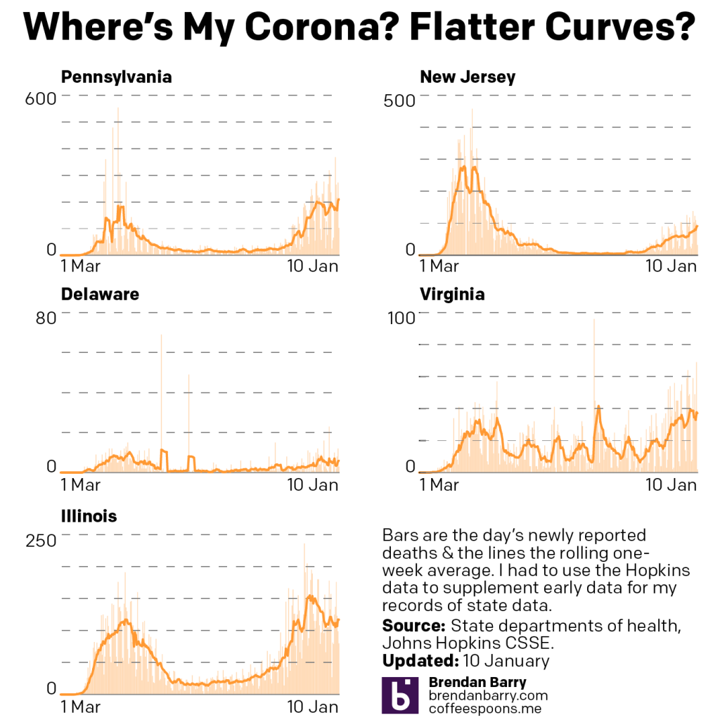
How about deaths?
Death curves in PA, NJ, DE, VA, & IL.
Again, fairly grim news here. A month ago we were talking about rising rates of deaths in all but Illinois. And in fact, Illinois is the only state where the death rate is significantly lower than what it was in mid-December.
In New Jersey and Virginia, we see two states where the rising death rate perhaps slowed, but it never really entered into decline. Pennsylvania and Delaware offer perhaps static death rates. In fact, Pennsylvania just yesterday surpassed its mid-December peak level.
But keep in mind that deaths lag new cases by somewhere between two to four weeks, sometimes longer. What this means is that with new cases now rebounding and in fact surpassing their peaks from a month ago, we can expect that the end of January and beginning of February could be particularly deadly.
The situation is dire in the United States and things are going to get worse before they get better.
So as begin to head into winter, where are we at with the spread of Covid-19 in the five states of Pennsylvania, New Jersey, Delaware, Virginia, and Illinois?
Nowhere good. Let’s take a look.
New cases curves for PA, NJ, DE, VA, & IL.
If you recall where we were at last week, also not great but better, cases had resumed rising post-Thanksgiving across the board. The data from yesterday indicates that cases have continued to rise everywhere but Illinois, which initiated a lockdown earlier than the other states we cover.
But Philadelphia did eventually institute a lockdown and eventually the rest of the Commonwealth followed, and similar measures—none of course as significant as those from the spring—were enacted in other states.
If you look at the very tippy tip top of the curves in the other four states, we might just be seeing an inflection point. That is, the curve of new cases could be slowing from their near exponential rates of increase. The numbers released today we should expect to be lower than average. Consequently we will want to see the numbers beginning Tuesday through the end of the week to see whether this slowdown is real or a blip.
Regardless of whether or not new cases numbers are slowing down, we have to contend with rising numbers of deaths. Deaths of course lag new cases by weeks, sometimes as many as 4–8. So if we hypothetically hit peak new cases today, we would expect the number of deaths to continue rising and then peak perhaps sometime in mid- to late-January.
So where are we with deaths today? Also nowhere good. Let’s take a look.
Death curves for PA, NJ, DE, VA & IL.
In all five states with the potential exception of Illinois, new deaths continue to rise. Pennsylvania, worryingly, will likely surpass the peak death rate it saw in the spring if current trends continue. I would expect that sometime likely this week.
Illinois remains the one state where we might be seeing some good news. As I just mentioned above, deaths lag new cases by several weeks. And several weeks ago we appear to have peaked there in terms of new cases. It’s possible that we are beginning to or have already seen peak deaths in Illinois and that the next several weeks could be a gradual decline as the state gets its outbreak under control.
In the other four states, if we were to hypothetically peak with new cases this week, again, we would likely see these orange lines continue heading upwards for several weeks to come. And in that case, we’d almost certainly pass the peak death rates of the spring in Pennsylvania, Delaware, and Virginia. New Jersey might be the exception to that, however. And that would be largely due to the fact that so many deaths there happened so early in the pandemic before we had identified the best ways to save lives.
I suspect that the data coming out this week will be important to inform us whether or not we have crested or begun to crest this latest wave of infections.