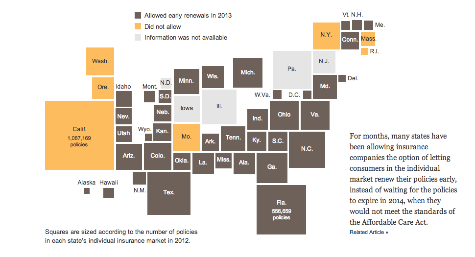
Let’s start this week off with cartograms. Sometimes I like the idea, sometimes not so much. Here is a case where I really do not care for the New York Times’ visualisation of the data. Probably because the two cartograms, a before and after of health policy renewals, do not really allow for a great side-by-side comparison. I imagine there is probably a way of condensing all of that information into a single chart or graphic component.
The before map
Credit for the piece goes to Keith Collins, Josh Katz, Katie Thomas, Archie Tse, and Karen Yourish.
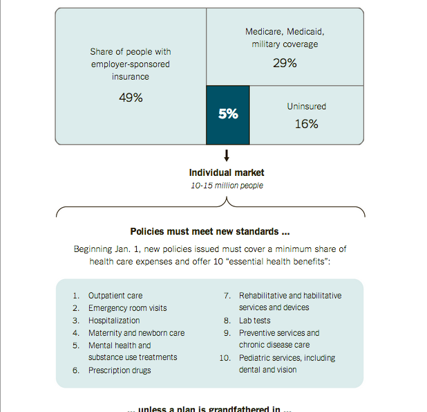
I have received a few questions in the non-blog world about why certain people have been receiving notices in the post that they are about to lose their insurance plans. The short answer for many of those people is that they likely bought individual, private plans and those plans fall short of the new minimum requirements. But, if you are not satisfied with that explanation, the New York Times does a much better job explaining it than I ever could. It is a piece worth a quick read.
The private insurance market
Credit for the piece goes to Larry Buchanan, Alicia Parlapiano, and Karen Yourish.
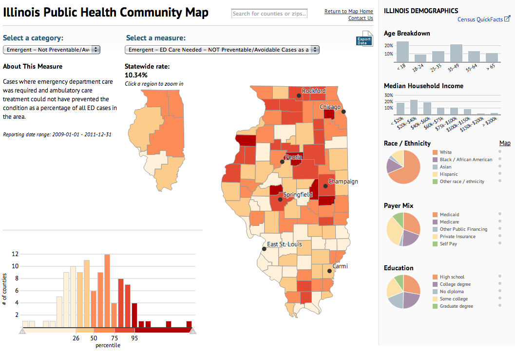
Today’s piece maps and charts comes from the Illinois Department of Public Health. The piece combines maps and charting components to detail preventable hospitalisations and emergency room use in the state of Illinois.
Public health map
Ordinarily I would prefer just one map, however, in this case the designers realised that a regional map—with its larger surface area—need not be as large as the county map. Some additional elements worth noting is the area devoted to the human explanation of the categories, which might otherwise be difficult to understand.
Yesterday both the New York Times and the Washington Post published fascinating pieces looking at the difference in the cost of medical procedures. But each took a different approach.
I want to start with the New York Times, which focused at the hospital level because the data is available at that level of granularity. They created a geo-tagged map where hospitals were colour-coded by whether their bills were below, slightly above, or significantly above the US average.
Hospitals across the United States
The ability to search for a specific town allows people to search for their hometown, state, country and then compare that to everyone else. My hometown of West Chester, Pennsylvania is fortunate—or perhaps not—to have several hospitals in the area that charge at different rates. That makes for an interesting story. But I am from the densely populated East Coast and someone from say rural Montana might not have the same sort of interesting view.
Hospitals near West Chester, Pennsylvania
Regardless of the potential for uninteresting small-area comparisons, once you find your hospital, you can click it to bring up detailed statistics for procedures, costs, and comparisons to the average.
Brandywine Hospital's data
All of this makes for a very granular and very detailed breakdown of hospital versus hospital coverage. But what if you want something broader? What good is comparing Brandywine Hospital to some medical centre in Chicago? Neither is reflective of the healthcare industry in the Philadelphia area or the Chicago area, let alone Pennsylvania or Illinois. The Washington Post tackles this broader comparison.
The Post leads off with a hospital-level example from Miami. Two hospitals on one street have vastly different prices. If we knew about this in Miami we could surely find that in the New York Times map. Instead, the Post guides us to that kind of example.
Comparing two hospitals in Miami
But the broader view is the centre of the piece. Using dot plots and filters, the user can compare the state averages for 10 different medical procedures. Fixed to the plot are the minimum and maximum averages along with the national average. And given the Post’s smaller circulation area—the New York Times is national, the Post is less so—there are quick links to states of particular interest: DC, Maryland, and Virginia.
Pennsylvan's averages
The ability to pick different states from the drop down menu allows the user to quickly see differences between states. What is lacking is perhaps a quick view of where all the states are visible so that the user does not have to click through each individual state.
California's averages
Both pieces are very successful at their narrowly-focused aims. Neither tries to do everything all at once, but nor would their designs allow for it. Plotting and filtering all the hospitals could be done in the Post’s style, but it would be messy. The state averages could all be made to colour state shape files, but you would lose the inter-procedure differences, the minimums, maximums, and the averages. In short the two pieces from the two teams complement each other very well, but a weird and hybrid-y cross of the two would be large, cumbersome, and potentially difficult to use without spending a lot of time to design and develop the solution. (Which I imagine they did not have.)
Credit for the piece from the New York Times goes to Matthew Bloch, Amanda Cox, Jo Craven McGinty, and Matthew Ericson.
Credit for the piece from the Washington Post goes to Wilson Andrews, Darla Cameron, and Dan Keating.
Later this month the Affordable Care Act mandates states decide on how they wish to implement the state healthcare exchanges. The Guardian’s US interactive team has created this interactive application to track the state decisions. Each state is clickable to provide further details on what has been decided.
Healthcare exchanges
Credit for the piece goes to the Guardian’s US Interactive Team.
In a small piece, the New York Times looks at the ramifications of the Supreme Court’s decision to uphold the Affordable Care Act. Fewer people are insured and total cost for the programme falls.
The BBC is letting you see how fat you are. They take inputs of age, weight, gender, and then your country of residence to compute your BMI and compare that across multiple countries for which the data exists. It compares you to your national average and then provides a country whose average best fits your BMI.
BMI comparison
My 300lb., 6’0″ avatar is apparently overweight. And most like someone from Micronesia.
As the Supreme Court is likely to scrap the mandate provision of the health care law—without which sick people are left to pay higher premiums if they can get coverage at all—later today, the New York Times looks at the impact of removing the health care law changes the number of people without health insurance.