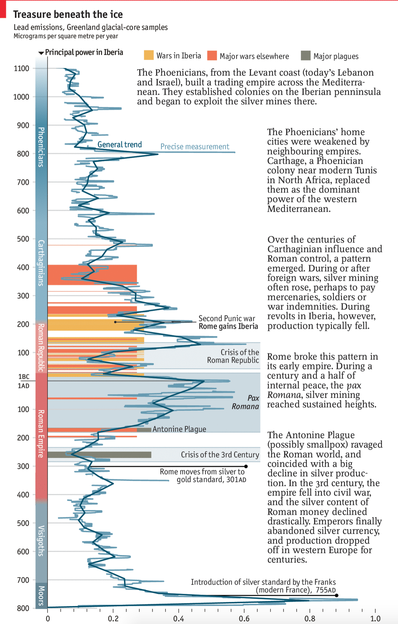
A few weeks back now the Economist posted a graphic about the link between lead, silver, and the rise and fall of the Roman Empire. But not in the way you probably think. Instead, they graph the appearance of lead deposits in the glaciers of Greenland.
I believe that final Iberian power is meant to be the Moops.
For the full explanation you should read the short article. But this piece was right up my alley. We have ancient history, economics, science, and a timeline. And all in one neat little chart.
Credit for the piece goes to the Economist’s Data Team.
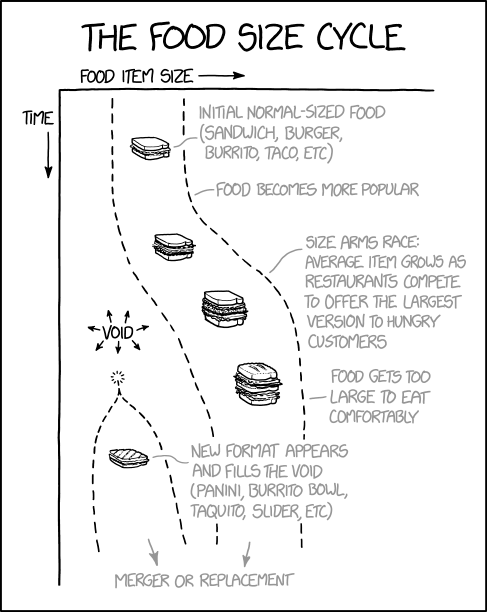
I am working from home today, which likely means finding a little cafe or sandwich shop for lunch. And that is the only reason I am sharing this post from xkcd.
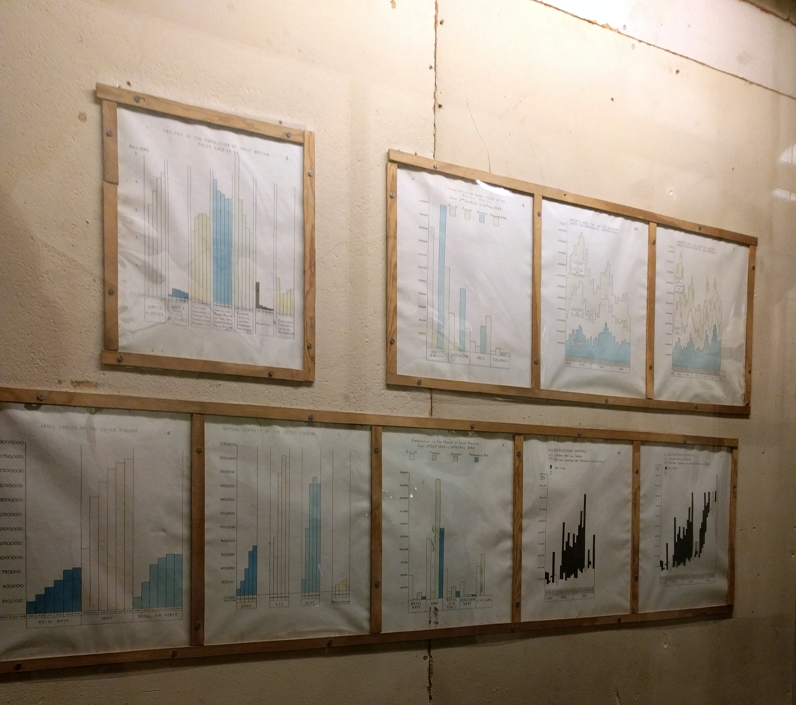
This past weekend I saw the film Darkest Hour with one of my mates. The film focuses on Winston Churchill at the very beginning of his term as prime minister. Coincidentally I was walking through some of the very rooms and corridors depicted in the film—and rather accurately I should say—just one week prior.
One of the things in the real place that caught my eye in particular was the Map Room Annex. Most people know about the Map Room proper, from which the British Empire’s war effort was coordinated, but the annex contained data on wartime casualties, material production, &c. Consequently the walls were lined with displays of that data. But this was also the early 1940s and so none of it was computerised. Instead, we had handmade charts.
Alas, the space is quite narrow and the museum was quite crowded. So I only managed a snapshot or two, but I think this one does some justice to the hardworking folks producing charts about the war.
They were not made to be mobile-friendly or responsive…
Credit for the piece goes to some junior officer/staffer back in the day.
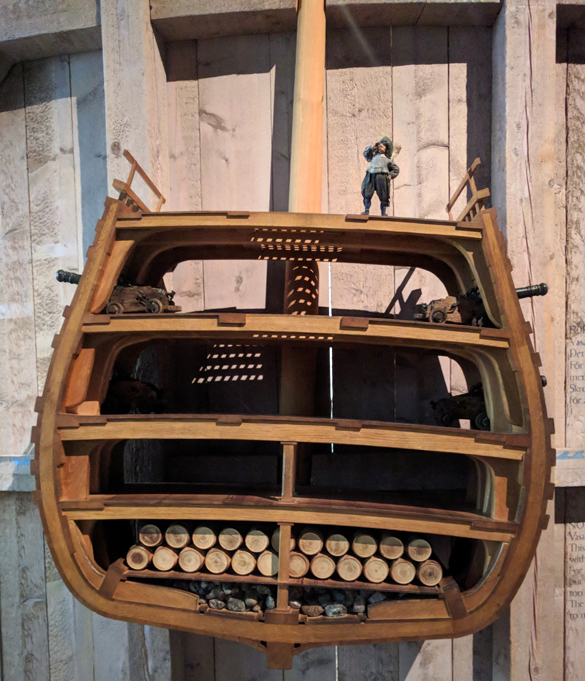
In 1628, Sweden launched one of its largest and most powerful warships not just in Sweden, but in all of Europe. She was to participate in the wars with Poland and Lithuania as Sweden sought to expand her growing empire. After two years of construction in Stockholm’s naval yard she set sail into a calm day with a light breeze.
After a strong gust pushed her hard to port, she righted herself and continued to set sail to a fortress to load 300 troops for the war. But only 20 minutes into her maiden voyage, a second gust of wind pushed her again hard to port so much so that water began to flood in via her open lower gunports. As the continued to rush in, she never righted herself and sank, not to be recovered for 300 years.
The recovery itself is a great story, but the question was why did she sink? This model in the large Vasa museum, built to host the recovered and preserved ship, shows just how dangerously she was designed. Take careful note of the faint blue waves signifying the waterline of the ship and how close they are to the lower gunports.
Note the waterline on the lower crossbeam of the barrel to which the model is connected
The short takeaway is that the ship was top-heavy and she needed to be both wider and deeper to support her displacement. I like the model here, but my one complaint with it is the waterline. Even when I was standing in front of it, I did not notice the waves at first. A little bit more emphasis or paint, perhaps to show the water beneath the ship, would really help to convey just how little of the ship was below the waterline.
Credit for the piece goes to the Vasa Museum design staff.
I survived my holidays and hopefully you did as well. My holiday included a two-week trip to Stockholm, Copenhagen, London, and York. Over the next few weeks, you can expect to see posts with graphics and diagrams that I captured whilst on holiday.
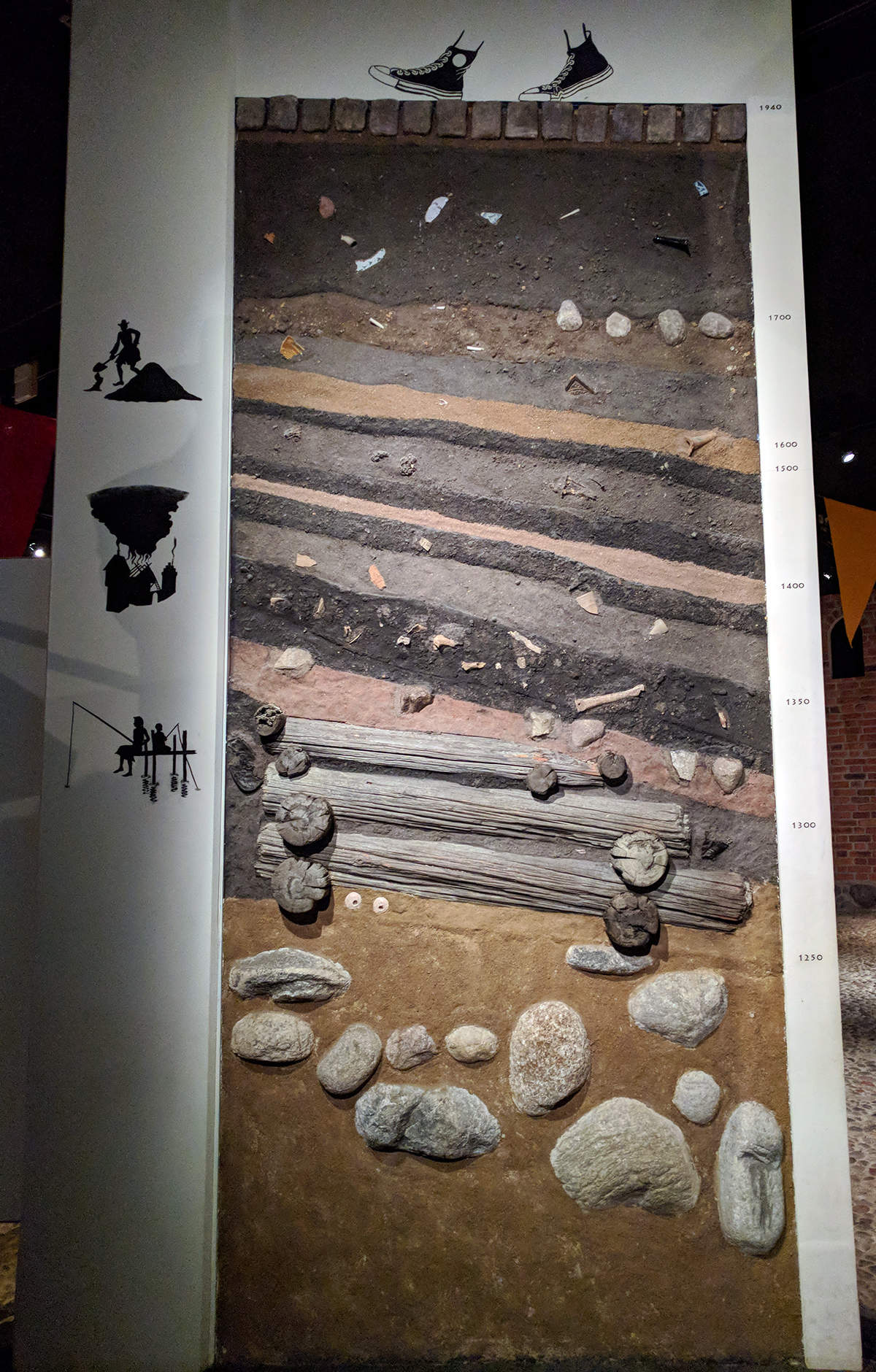
Today’s post is about a rather large piece from the Medieval Museum in Stockholm. The city dates probably from the 13th century, but there is no definite date nor any definite explanation of the origin of the name Stockholm. A lot of work thus has to be done via archaeology and this piece, easily twice as tall as me, shows just how deep those artifacts are buried. The years can be seen to the right for a sense of scale.
Layers of history
But why did I love it? Because Converse trainers. And did I ever see so many black Converse walking around.
Shoutout to my very good friend Jonathan Fairman for passing this one along.
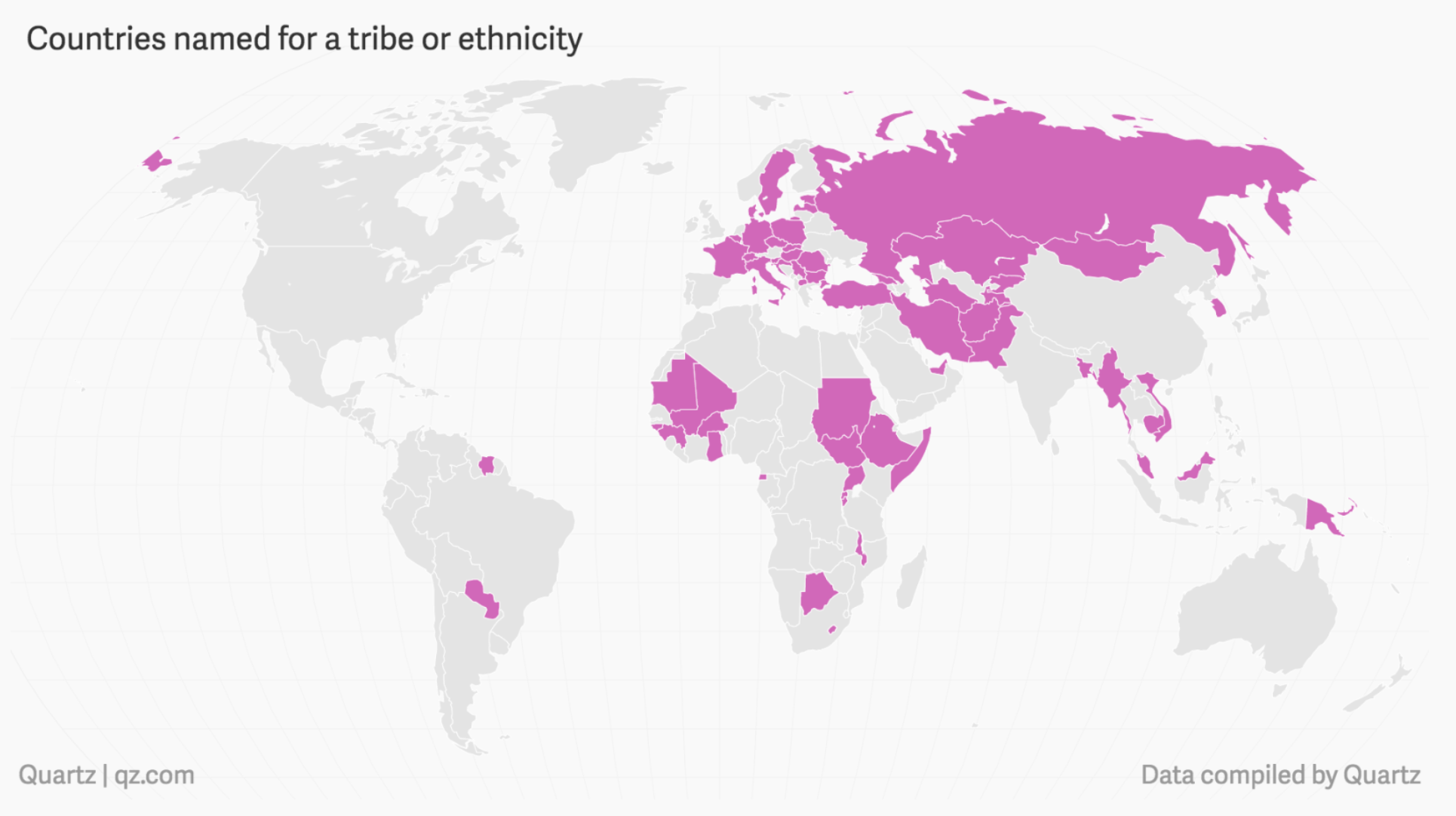
Browsing the internets, I often find these little adverts saying something about “10 Things You Didn’t Know About Your Name” or “10 Things Your Name Says About You”. They grab my attention because, as you all know, genealogy is kind of a thing that I do and I am curious where lots of names in my family come from.
But where do countries names originate? We all probably know America comes from Amerigo Vespucci. But how about Mexico? Thankfully Quartz put together a piece exploring country name origins. And it turns out that most can be grouped into four different types. Being named after a man, like America, well you guessed it, that’s one of the four.
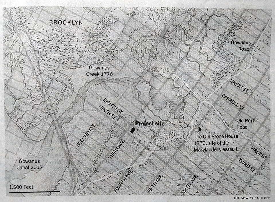
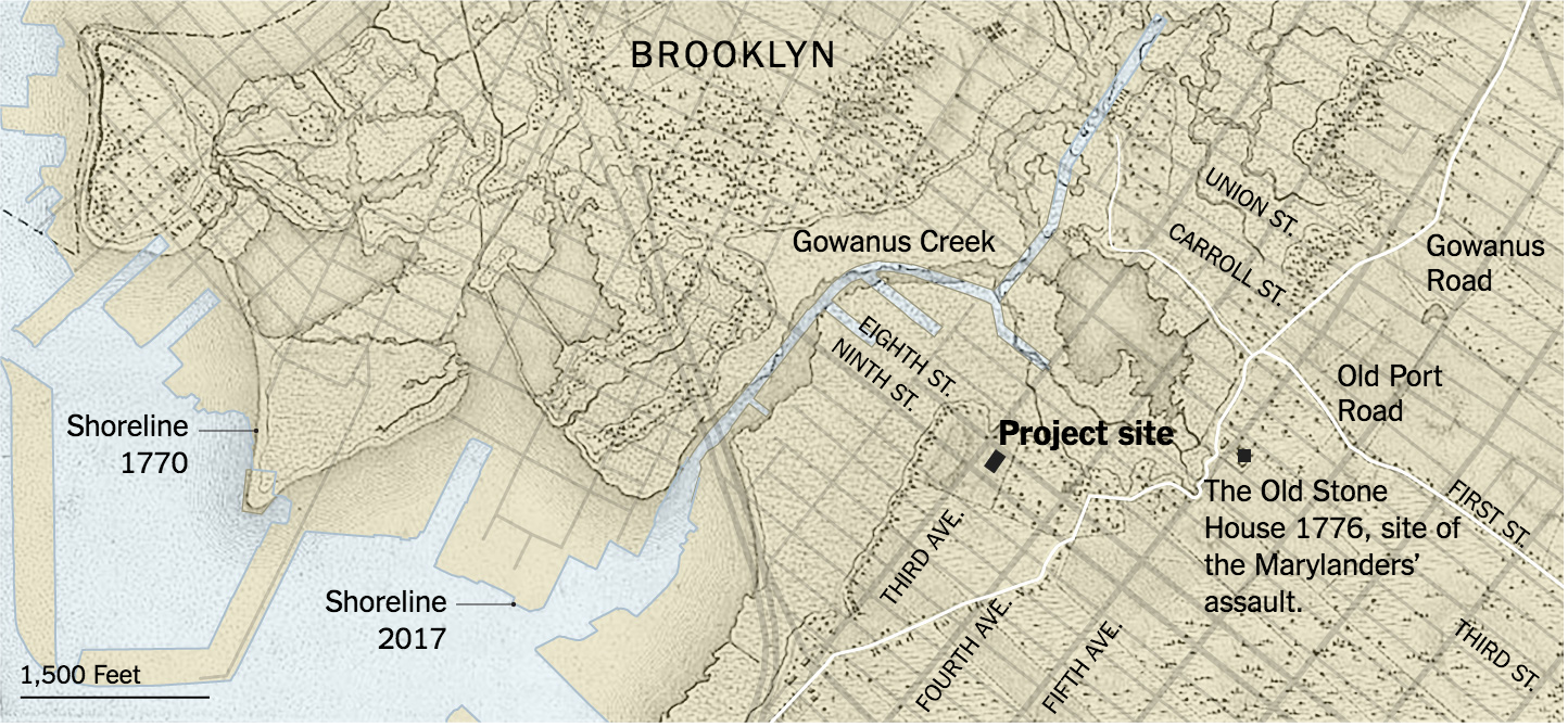
This past weekend I was reading an article in the New York Times about how a diary from the 19th century may indicate a plot in Gowanus Brooklyn destined for development may contain an old slave burial ground. You may recall how this author’s hobbies include genealogy and family history—how I would love to find a 19th century diary. Then, given this interest and the article, it was fantastic to find a map in the article.
Brooklyn in black and white
Suffice it to say the map held my fascination for long enough that I saved the paper to post about it today. I was curious about two things, however, one, did the graphic have a credited author—it did not in the print edition—and two, was there a neat interactive version in the online version? The online version is simply a colour version of the map.
Brooklyn, now in colour
But the colour version does one thing that really helps make the graphic complete. In the print edition, there is no clear idea what the different layers are and it did take me a moment or two to understand the overlay. But the online version calls out specifically the map of the area from two different time periods.
Maps like these are my favourite. They blend history and the present. After all the places we live have often been lived in for centuries and they bear the marks of that inhabitance.
As to the first question, credit for the piece goes to Joe Burgess.
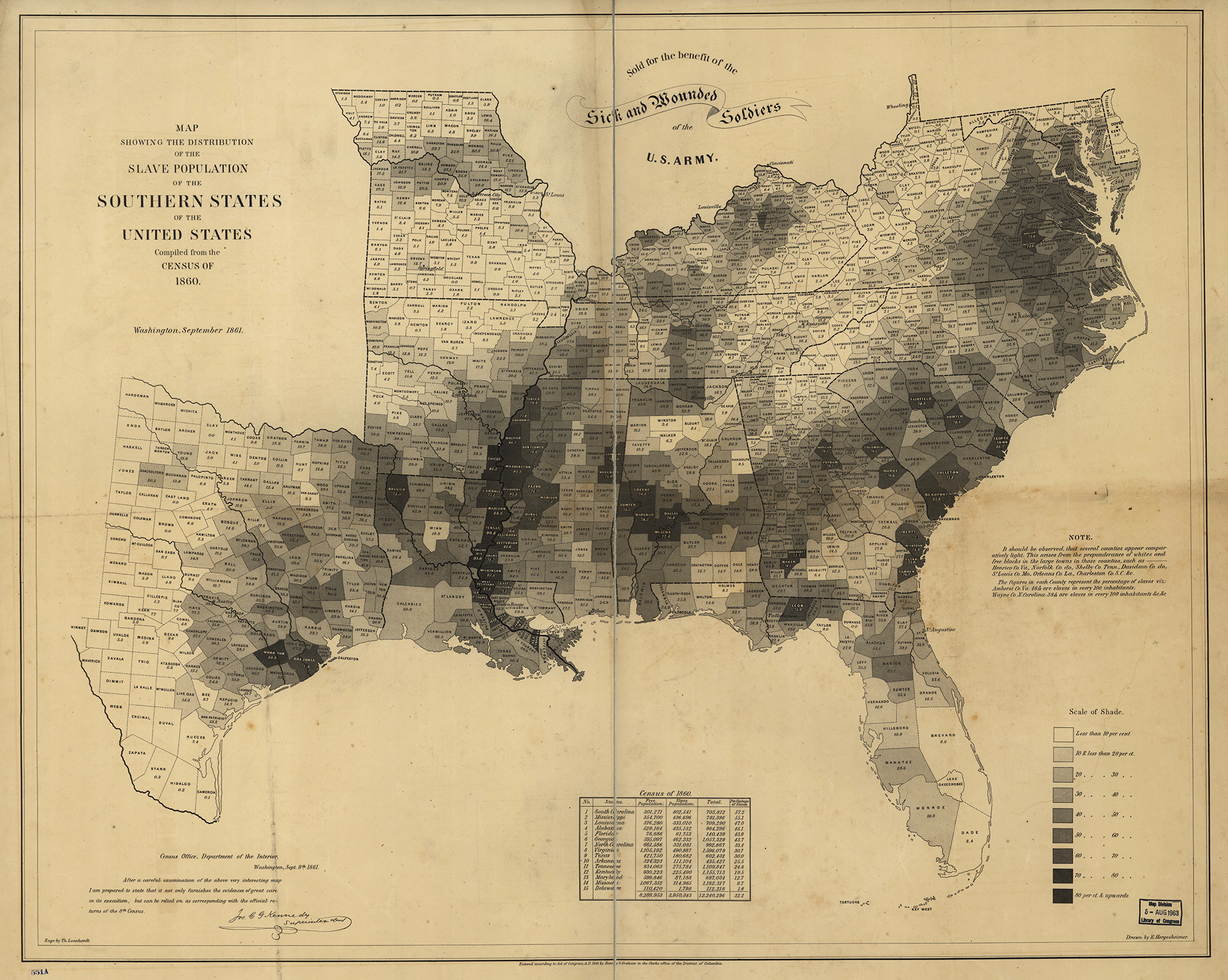
Yesterday, President Trump asked why there had been no discussion about the causes of the Civil War.
No, that is not a joke.
Well, Mr. President, turns out that there has been quite a bit of discussion over the last few years. And the broad consensus?
Do I even have to?
Note the above, with the darker shaded counties representing those with greater percentages of the population held in slavery. What do most of those states have in common with the Confederacy? That they are in the Confederacy.
To be clear, the Union was not perfect. Delaware, Maryland, Kentucky, and Missouri remained part of the Union, but were states where slavery was legal. In fact both Kentucky and Missouri had two governments. Kentucky provides a great example of the fault line with the pro-Union capital of Frankfort situated in the low-slavery east whereas the Confederate capital was located in western, high-slavery Kentucky.
But the point stands. Slavery was the link between Confederate states and Confederate-aligned parallel governments in Union states. So, Mr. President, when you are asked about the cause of the Civil War, now you know the answer.
Credit for the piece goes to E. Hergeshimer of the US Census Bureau.
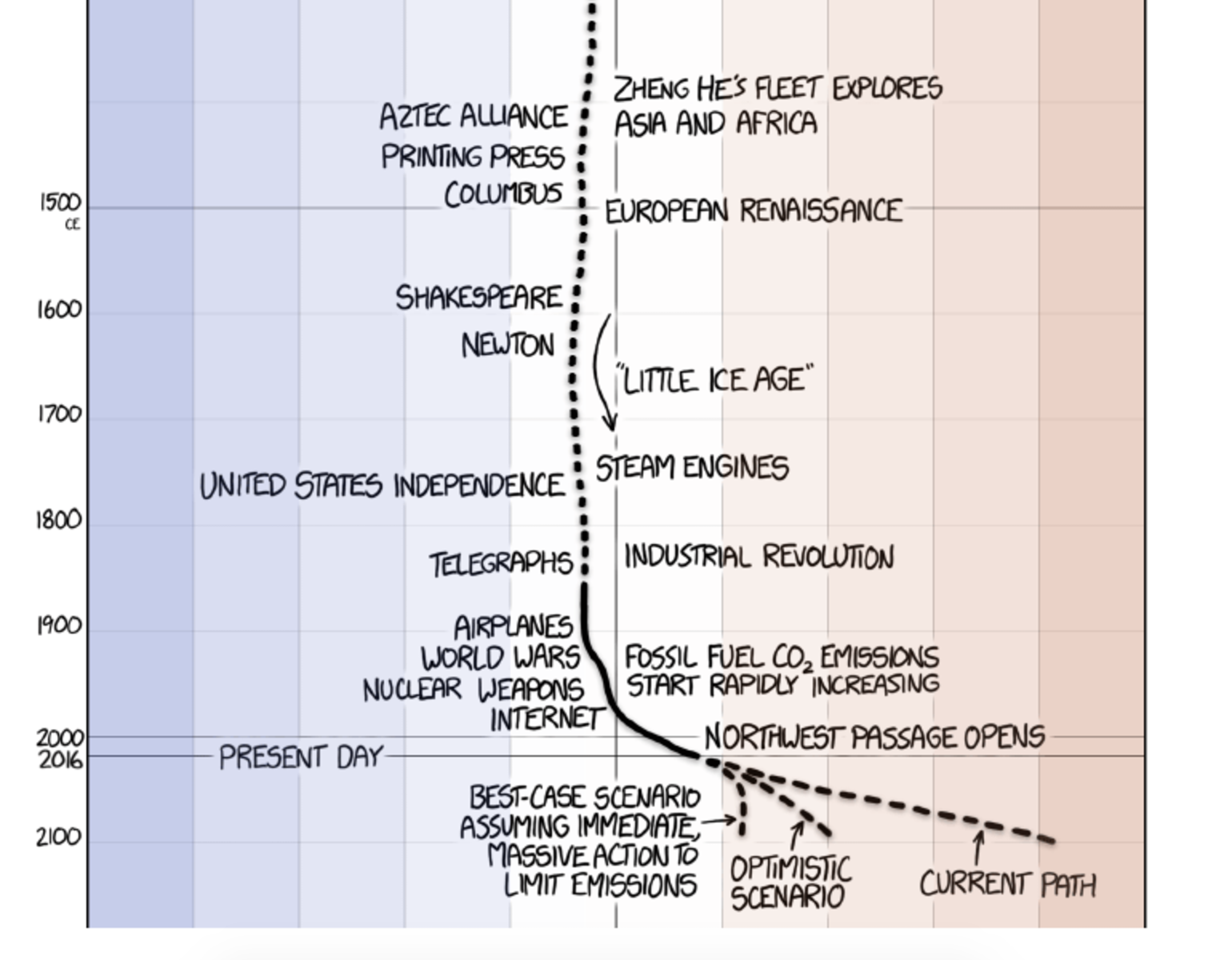
So this is the last Friday before the election next Tuesday. Normally I reserve Fridays for less serious topics. And often xkcd does a great job covering that for me. But because of the election, I want today’s to be a bit more serious. Thankfully, we still have xkcd for that.
Recent temperature history
The screenshot above gets to the point. But the whole piece is worth a scroll-through and so it goes at the end. Credit for the piece goes to Randall Munroe.
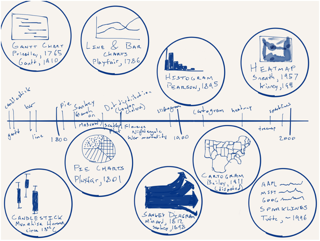
From time to time in my job I hear the desire or want for more different types of charts. But in this piece by Nick Brown over on Medium, we can see that there are really only a few key forms and some are already terrible—here’s looking at you, pie charts. How new are some of these forms? Turns out most are not that new—or very new depending on your history/timeline perspective. Brown illustrated that timeline by hand.
A timeline of chart forms
Worth the read is his thoughts on what is new for data visualisation and what might be next. No spoilers.