Wakey, Wakey

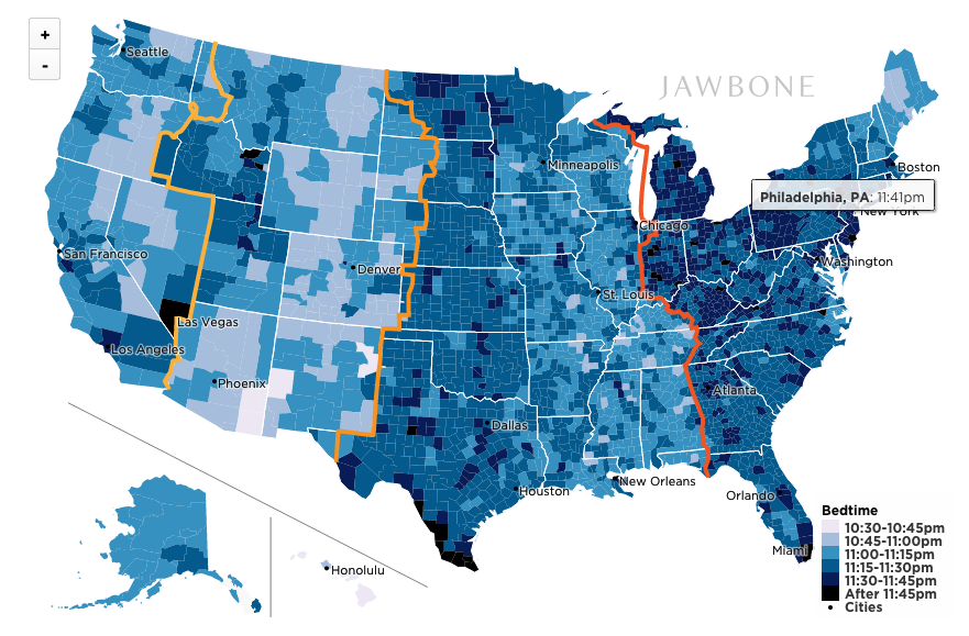
It’s time to get up. Whether or not you hear the explicitly Monday morning or if’s meant by your alarm shouting at you, who really enjoys waking up Monday? A lot of the reluctance to wake up may have to do with when one goes to bed. One of my colleagues sent me a post over on Huffington Post that looks at Jawbone’s data visualisation of bedtimes across America.

Cities stay up late—not surprising. What I do find interesting is that in the rural and suburban, i.e. principally non-major city counties, there seem to be some interesting things going on. In particular, look at the shift in bedtime across the Eastern–Central and Central–Mountain time zones in particular. It’s a pretty clean break. And then within the Central timezone we have another shift. I wonder how much of this has to do with the needs of farming daylight hours. And that because the sun does not really set according to our clocks, the later sunset times in the western portions of timezones shift those bedtimes later. Like I said, interesting.

Then from the data side of things, I wonder if “thousands of users” across the 3000+ counties of the US are distributed sufficiently to achieve meaningful samples in many of those rural/suburban counties. And then what about those who have to work night shifts? How does that impact the data set?
Nighty, night
Nighty, night

Credit for the piece goes to Brian Wilt.

Virginia Election Results

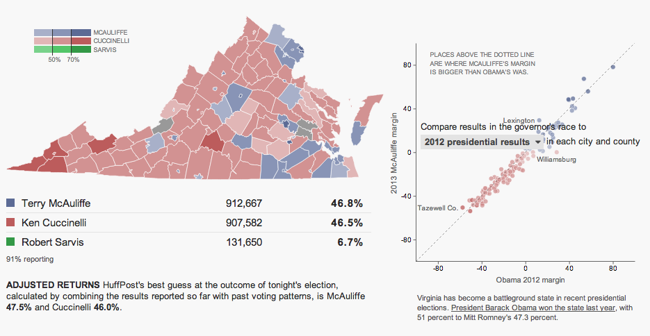
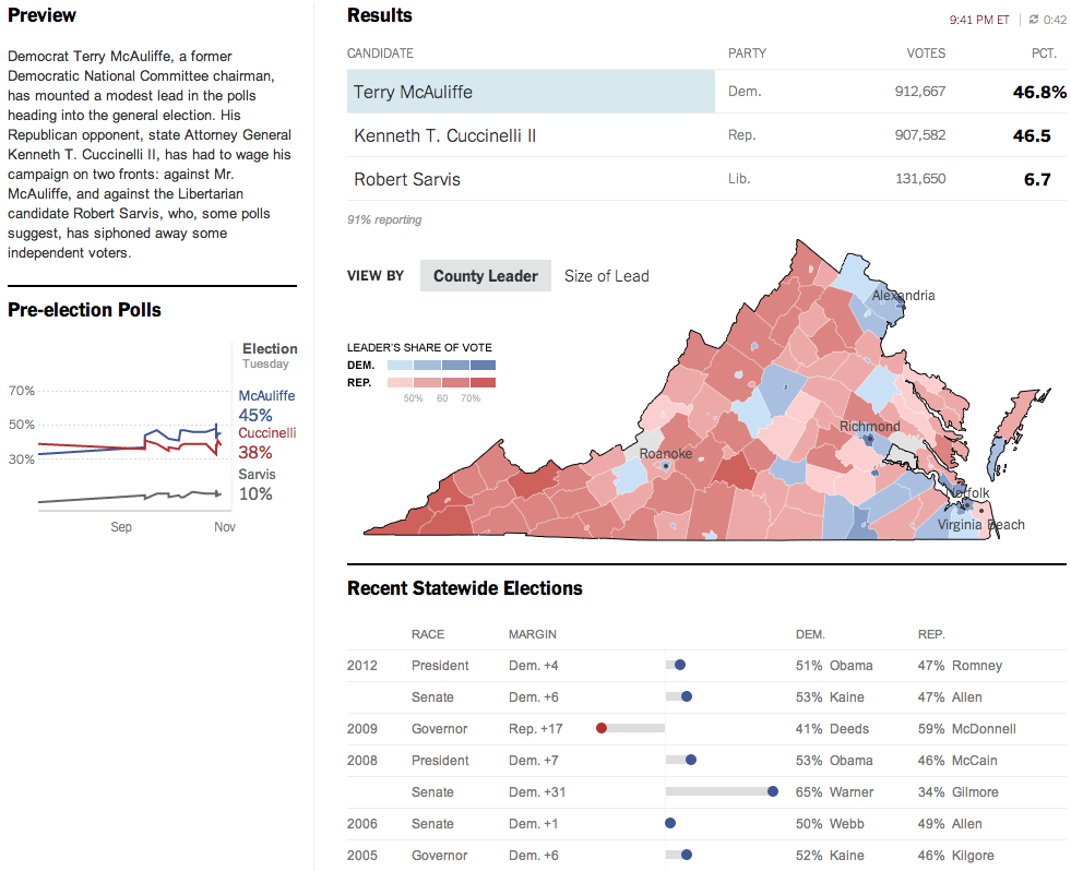
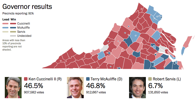
Last night was election night. Okay, maybe not the big midterm, but there were still a few interesting races. The one I want to look at it, however, is the gubernatorial race in Virginia. Maps are pretty much the default in big, statewide races like these and it is no surprise that the three screenshots here are use a map as an anchor component.

The Huffington Post uses a scatterplot to compare the margin of victory for Terry McAuliffe to that of Barack Obama in 2012. A technical flaw places the drop down menu atop the plot, unfortunately, but the component works to show differences in just one year.

Huffington Post results

Over at the New York Times, the Virginia results were given a nice overview. Here they used a text summary to explain the race in short. They used a small amount of space to show polling results over time. And then beneath the map they looked at recent elections across the state.

New York Times results

The Washington Post, which reports to the northern counties of Virginia, had a much simpler piece. They used solely a map to present the data.

Washington Post results

Credit for the Huffington Post piece goes to Aaron Bycoffe, Jay Boice, and Hilary Fung.

Credit for the New York Times piece goes to the New York Times’ graphics department.

Credit for the Washington Post piece goes to the Washington Post’s graphics department.

Covering the New York Mayoral Primaries

Tuesday was election day in New York (among other places) where voters went to the polls for the mayoral primary (among other positions). For those living underneath what I can only presume was a very comfortable rock, this is the whole Anthony Weiner comeback election. Anyway, a bunch of different websites, most tied to the New York area, were covering the election results. So I wanted to share just a few.

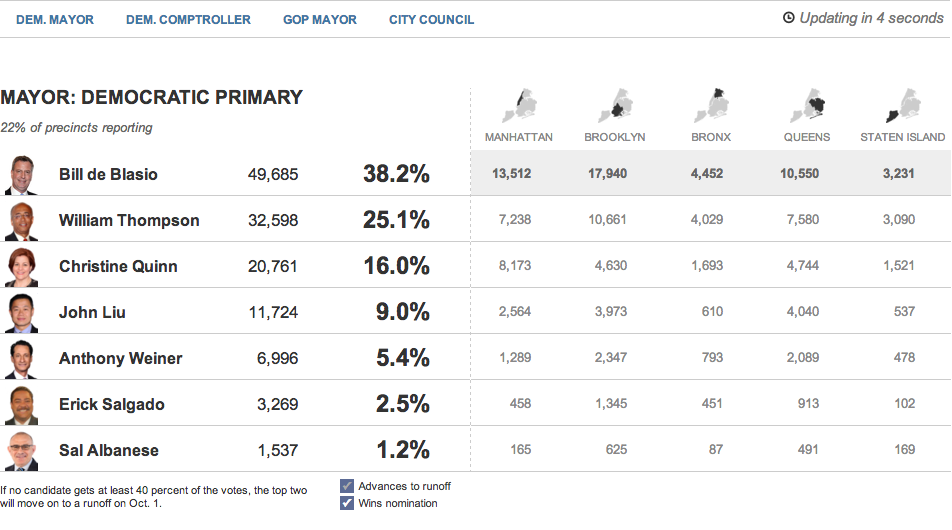
First we have the Huffington Post with the most straightforward presentation. Their table covers the main candidates and their results at a borough level and at a city-wide level.

The Huffington Post's tabular results
The Huffington Post’s tabular results

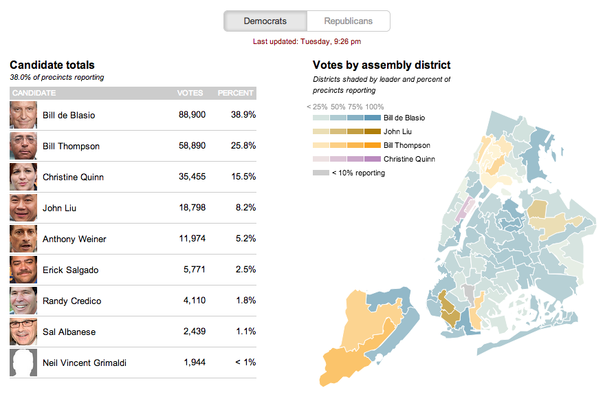
The second is from the Wall Street Journal. This uses a choropleth map with different colours assigned to a select few persons running—also the only ones with a real chance of winning. Tints of these colours in each district indicate how much of the district has voted.

The Wall Street Journal reports at the district level

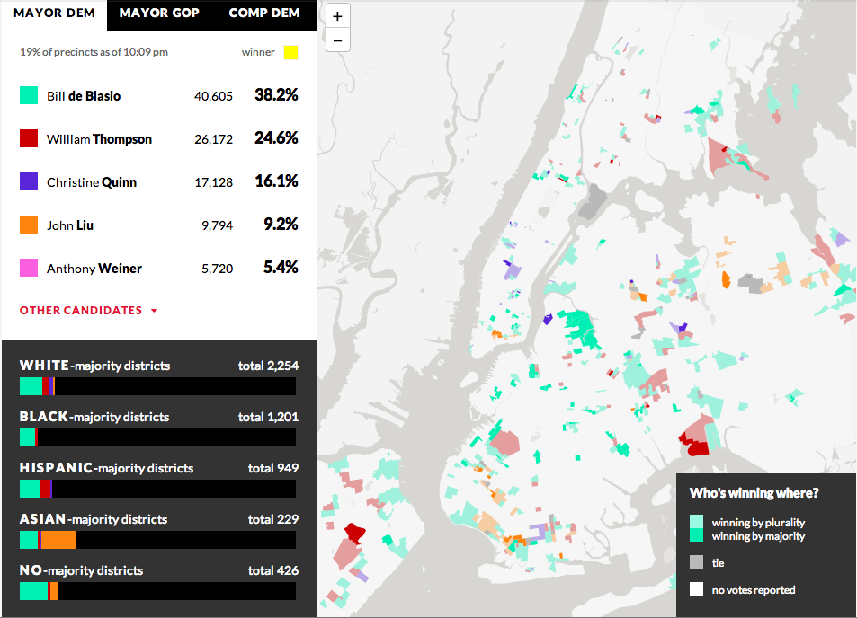
From WNYC we have our third example—another choropleth where different colours represent different candidates. However, unlike the Wall Street Journal, the colours here have only one tint. And instead of showing assembly districts, WNYC provides a further level of data and looks at precinct results. It does not represent the amount of the precinct that has voted, but rather whether the candidate is winning by a plurality or by a majority. Beneath the legend a second charting element is used; this details the breakdown of the vote by districts as separated into racial majority. This is an interesting addition that hints at filtering results by related data.

WNYC looks at who's winning and how
WNYC looks at who’s winning and how

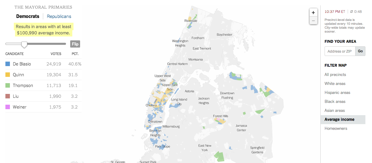
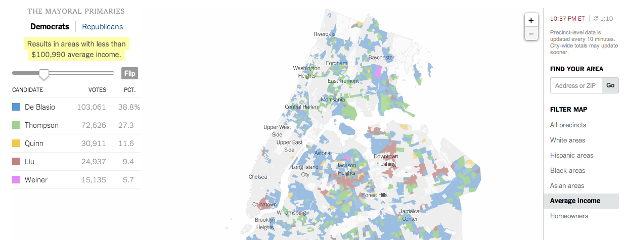
And that filtering brings us to the New York Times’ piece, which does offer filtering. It highlights districts on its maps—also precinct-level and not district aggregates—based upon the metric and the specific properties of said metric. In this case, I have chosen income. And the story of different voting patterns (at this particular point in the evening) based on income is quite clear. Look at Christine Quinn’s support.

Results from people earning more than $100k
Votes from people earning less than $100k


Credit for these:

Huffington Post: Aaron Bycoffe, Jay Boice, Andrei Scheinkman, and Shane Shifflett

Wall Street Journal: the Wall Street Journal’s graphics team

WNYC: Steven Melendez, Louise Ma, Jenny Ye, Marine Boudeau, Schuyler Duveen, Elizabeth Zagroba, and John Keefe

New York Times: New York Times’ graphics department

The Massachusetts Special Election

As I have been blogging the past several days, today the Supreme Court will announce its rulings on the two gay marriage cases. But, I have already looked at that twice now. Today I want to look at the results of the Massachusetts special election for the US Senate, necessitated by John Kerry resigning from the seat to become Secretary of State.

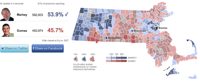
This work comes from the Huffington Post. It offers the usual map fare with towns coloured by the victor and tinted by the share of the vote. Though do note the interesting—is this novel?—means of filling in the town with colour to represent the percent of the town reporting. My screenshot is a bit late, but check out Warren near Springfield or Boston and Cambridge—a bit harder to see because of their size and shape.

Looking across the state for the results

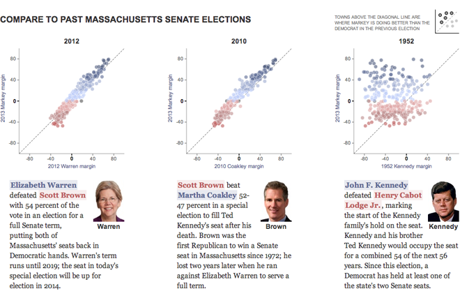
However, the fascinating thing is the use of the small multiples of scatter plots to look at historic elections. The designers included a small key in the upper-right explaining that dots above the line represent towns where Ed Markey, the Democrat who won, outperformed the historic Democrat. I have not seen anybody attempt to portray the data in this fashion before.

Using a scatter plot to chart the results

Credit for the piece goes to Aaron Bycoffe and Jay Boice.

My Electoral College Prediction

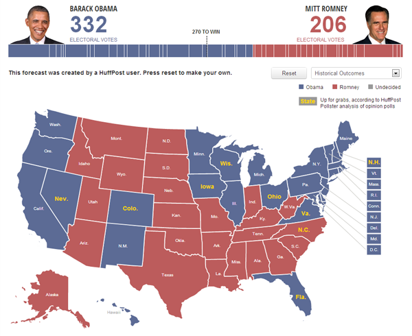
So my airport card still is not working on my laptop. And I am heading back east into the cold embrace of Sandy so who knows if I’ll have access to the internet while on holiday. But because of those two things, this is my official forecast for the election on 6 November. Granted, a big disaster (such as a $1 billion dollar storm) or a big gaffe (anything that Joe Biden says) could change the race, but that’s becoming increasingly less likely as we wrap up the final days of the campaign.

So thanks to the Huffington Post’s election map dashboard (click here or the image to go and make your own):

My Electoral College Prediction

In short, I think Obama holds most of the states he won in 2008, but drops Indiana and North Carolina. He might still lose Florida, but with the better-than-expected economic growth figures out earlier today, I suspect that will halt Romney’s gains and perhaps roll them back just a bit.