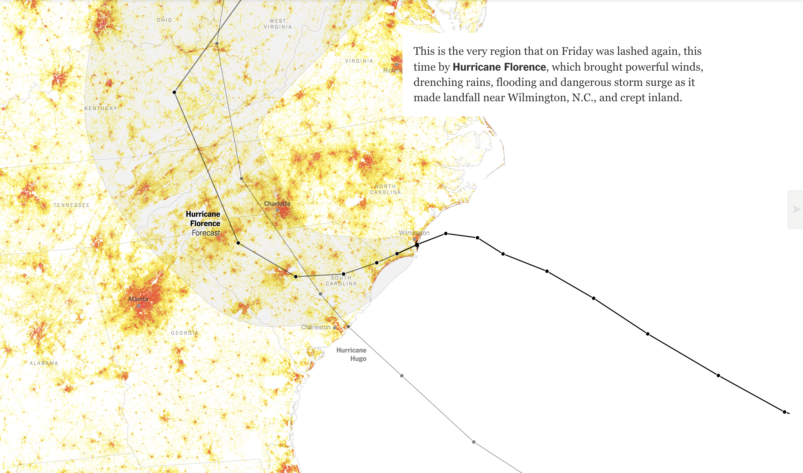
You may recall a few weeks ago there was a hurricane named Florence that slammed into the Carolina before stalling and dumping voluminous amounts of rain that inundated inland communities in addition to the damage by the storm surge in the coastal communities. At the time I wrote about a New York Times piece that explored housing density in coastal areas, specifically around the Florence impact area.
Well today the New York Times has a print graphic about something similar. It uses the same colours and styles, but swaps in a different data set and then uses a small multiple setup to include the Florida Panhandle. Of course the Florida Panhandle was just struck by Hurricane Michael, a Category 4 storm when it made landfall.
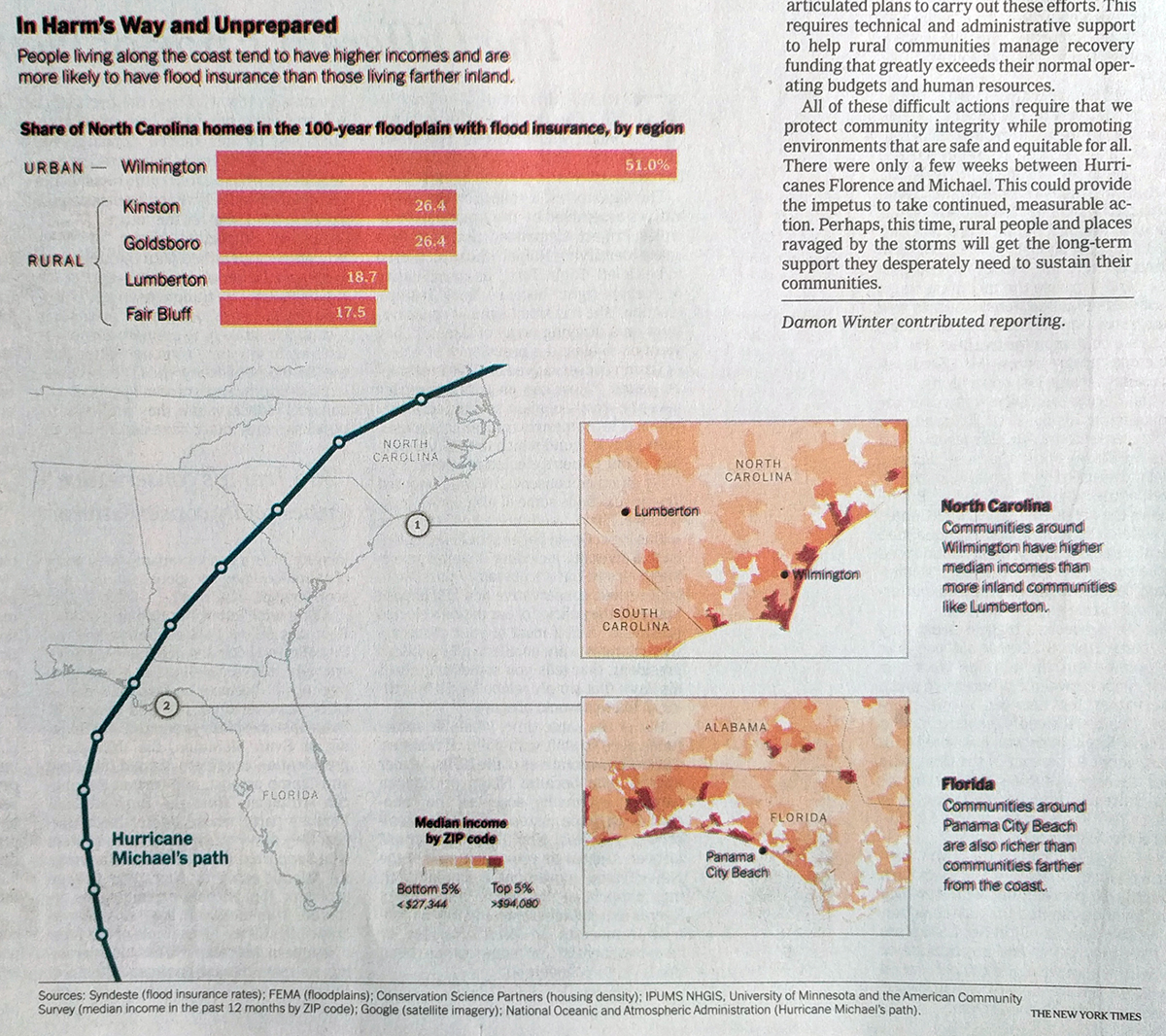
This one instead looks at median income per zip code to highlight the disparity between those living directly on the coast and those inland. In these two most recent landfall areas, the reader can clearly see that the zip codes along the coast have far greater incomes and, by proxy, wealth than those just a few zip codes further inland.
The problem is that rebuilding lives, communities, and infrastructure not only takes time, but also money. And with lower incomes, some of the hardest hit areas over the past several weeks could have a very difficult time recovering.
Regardless, the recoveries on the continental mainlands of the Carolinas and Florida will likely be far quicker and more comprehensive than they have been thus far for Puerto Rico.
The only downside with this graphic is the registration shift, which is why the graphic appears fuzzy as colours are ever so slightly offset whereas the single ink black text in the upper right looks clear and crisp.
Credit for the piece goes to the New York Times graphics department.