50 Years of the Doctor

Doctor Who? Exactly. This weekend, Saturday in fact, is the 50th anniversary of British sci-fi show Doctor Who. That is not to say it has been airing for 50 years. In the 1990s and early 2000s the show was off the air, living on only in audio broadcasts and novelisations. But in 2005, the show was relaunched and it slowly began to acquire a new generation of followers. Some, like your author, have watched it in the States first via SyFy since 2006.

Still 50ish years of television about time travelling through space in a blue police box makes for lots of data. And so back in March Simon Rogers created this infographic to explain some of the history of the show.

The Guide to Doctor Who

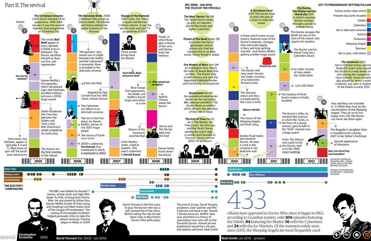
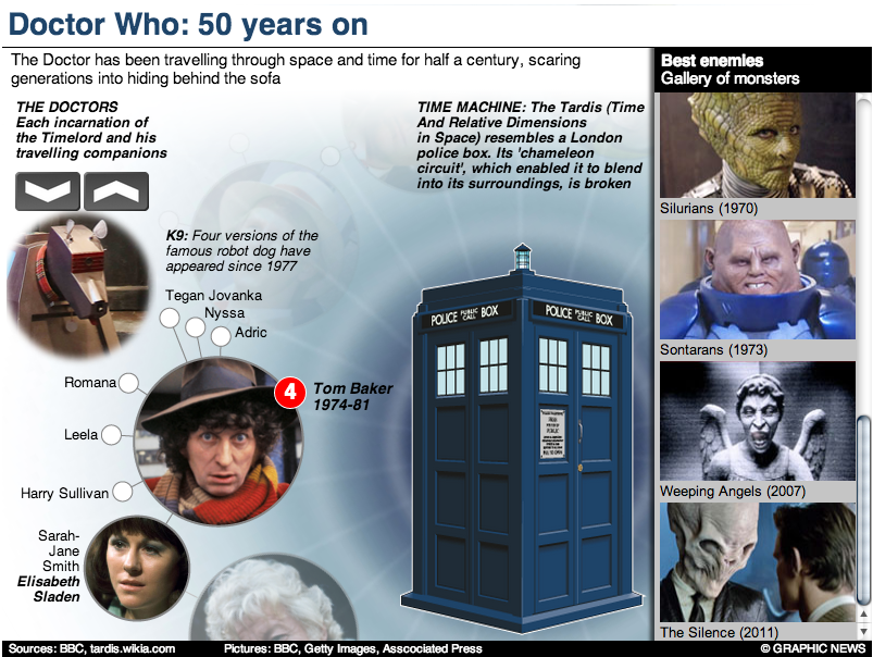
If you intend on watching the 50th special this weekend—or Monday in some movie theatres here in the States—and you want to brush up on the timeline of the Doctor and his travelling companions, the Guardian also has this graphic.

The Guardian's gallery of Doctors
The Guardian’s gallery of Doctors

But of course the BBC, which produces Doctor Who, has a more in-depth site about the history of the character and the show. Did I mention the content is displayed within the TARDIS? I know, it’s bigger on the inside.

The BBC's inside the TARDIS
The BBC’s inside the TARDIS

Have you ever watched the show? Do you have a favourite Doctor? A favourite companion?

Credit for the first Guardian piece goes to Simon Rogers.

Credit for the second Guardian piece goes to the Guardian’s Graphic News team.

Credit for the BBC piece goes to Christopher Ashton, Christine Jeavans, Helene Sears, Tian Yuan, Nick Davey, and Ben Fell.

The Tallest of the Tall (in Los Angeles)

I have always had an interest in architecture. And so this piece from the Los Angeles Times is just because I like to indulge myself every so often, a look at the five tallest buildings in Los Angeles.

Map of the five tallest buildings

Credit for the piece goes to Scott J. Wilson, Matt Moody, and Anthony Pesce.

Explaining Why Some People Are Losing Their Health Insurance Plans

I have received a few questions in the non-blog world about why certain people have been receiving notices in the post that they are about to lose their insurance plans. The short answer for many of those people is that they likely bought individual, private plans and those plans fall short of the new minimum requirements. But, if you are not satisfied with that explanation, the New York Times does a much better job explaining it than I ever could. It is a piece worth a quick read.

The private insurance market

Credit for the piece goes to Larry Buchanan, Alicia Parlapiano, and Karen Yourish.

LAX Shootings

I didn’t see a lot of informative graphics regarding the shooting at LAX. But, here are two pieces. The first is from the Los Angeles TImes. Terminal 3 is rendered in three dimensions. Different buttons add views of the remainder of the airport.

Los Angeles Times' terminal diagram
Los Angeles Times’ terminal diagram

The Washington Post opted for a flat, two-dimension drawing in one graphic with both all of LAX and Terminal 3 in the same graphic.

Washington Post's terminal diagram
Washington Post’s terminal diagram

The thing about the three-dimensional rendering is that it adds too much complexity whereas the two-dimensional schematic strips most of it out. Is it important to know the specific details of a building? Or is it more important to see its general shape and an area inside of it?

Credit for the Los Angeles Times piece goes to Javier Zarracina, Raoul Ranoa, Lorena Iniguez, and Anthony Pesce.

Three Hops From Norway

The thing with the NSA spy scandal is not that it collects data on Americans. But it collects data on the Americans that the Americans that the Americans know. Three degrees of separation can actually be quite a few people whose privacy is violated in the name of security. The Guardian has an excellent piece that shows you as in you yourself—if you grant access to your Facebook profile—how many people could be investigated because you know them.

My personal three hops

Well, I hate to tell you, Norway. But apparently, with me you are far from safe. Or at least a Norway-sized chunk of the American population. More seriously, this is a great piece that personalises an abstract sort of concept. Not just through the use of your own personal data, but by using (potentially) familiar items to contextualise scale. How many people is 190? Almost two Concordes worth. How many is 4,779,123 people? More than the population of Norway. You know, a country. Well done, Guardian.

Credit for the piece goes to the Guardian’s US Interactive Team.

Fixing Fukushima

Two and a half years ago an earthquake and then tsunami devastated Japan. But it was the tsunami that crippled the Fukushima nuclear power station and created the world’s worst nuclear disaster since Chernobyl. Unfortunately things are still not working properly and the plant is still leaking radioactive particles into the local environment. This interactive guide from the Guardian illustrates just what Tepco, the power company responsible for the plant, is trying to do to prevent further radiation from leaking into the ocean.

Location of silt fences

Credit for the piece goes to Paddy Allen and the Graphic News.

Two-stroke Engines

Infographics of the science-y, illustration-y kind have always been my favourite. They show you how the world works. Now, it has been a long time since I have used a leaf blower or lawn mower, but I always took for granted how they worked. But this fantastic graphic from the Washington Post makes sure that I know how they work. In animated .gif form. For an infographic. It’s really nice and worth a look.

The two-stroke engine

Credit for the piece goes to Patterson Clark.

Name Dropping Brands

Happy Friday, everybody. Today’s post is a graphic from Vanity Fair that looks at the rapper Jay Z. (And for all those wondering, no, I have never intentionally listened to any of his music.) Specifically, this kind-of-stacked-bar-but-more-icon chart indicates how many times he name drops specific luxury brands in his albums.

Jay Z Brand Mentions

You can also file this under the graphics to which I cannot relate. Although maybe, just maybe, I once had a pair of Nike trainers. So at least Jay Z and I have that in common.

Credit for the piece goes to Philip Rhie.

Deconstructing the International Space Station

Gravity was released recently. You know, that film about a station in space that gets hit by something and drama ensues. The Washington Post has this fantastic infographic that illustrates how the station was built over the past 15 years. Scroll down the page and watch the station deconstruct itself into its initial Russian power module. Fantastic.

Deconstructing the ISS

Credit for the piece goes to Alberto Cuadra and Katie Park.

Funding the Improbable

This interactive map from the Washington Post is one part of a long-form piece that looks at NASA and the improbable tasks facing the agency. Specifically the piece looks at how NASA wants to get to Mars, but how difficult that is and how an also difficult asteroid mission is as a backup plan.

Funding the improbable

Really fantastic is about all I can say.

Credit for the piece goes to Joel Achenbach, Alberto Cuadra, Kennedy Elliott, Rebecca Rolfe, and Ricky Carioti.