How Cruise Missiles Would Strike Syria

While we are waiting for Russian help to destroy Syrian stockpiles of chemical weapons, we know that the Pentagon is still ready to strike (most likely with cruise missiles) various targets of the Syrian regime. This graphic from the Wall Street Journal explores some of the options. The interesting bit is the range of Syria’s anti-ship missiles. Because for those of you who do not recall the Israel–Lebanon war of 2006, Hezbollah (known to be aiding the Syrian regime) surprised some by scoring a hit on an Israeli warship with a less-advanced missile than in the Syrian arsenal.

Pentagon plans
Pentagon plans

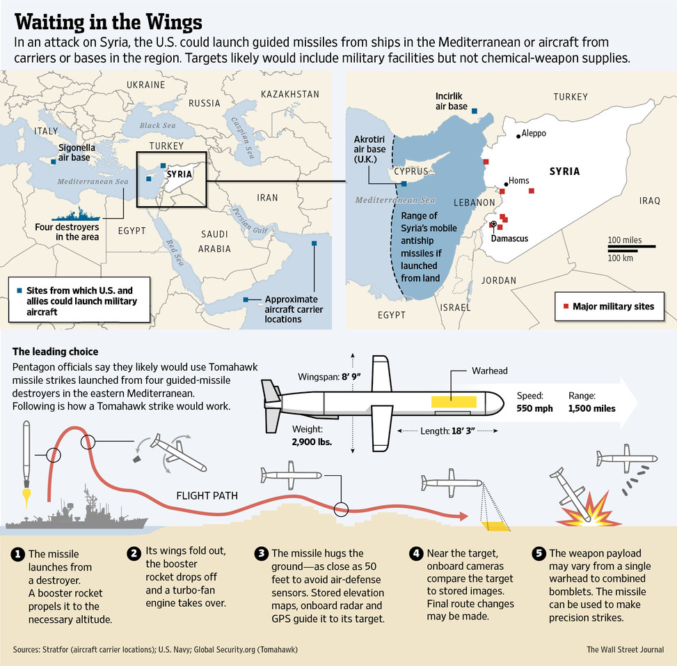
This is only one of several different graphics from that page. Different graphics look at elements of the conflict, including the refugees, timeline of the regime’s actions, &c.

Credit for the piece goes to the Wall Street Journal graphics department.

Hunger Strikes

Guantanamo Bay and the US military prison there almost always spark a debate. For some months now, prisoners have been staging a hunger strike. Increasingly, however, the strike is garnering attention not for itself, but for the US military’s treatment of the prisoners in force feeding them. The National Post looked at just how this is being done in this infographic. Pay particular attention to the illustration of the tube, which is drawn to actual size.

Force feeding Guantanamo's striking prisoners
Force feeding Guantanamo’s striking prisoners

Credit for the piece goes to Andrew Barr, Mike Faille, and Richard Johnson.

Voyager 1 Has Left the Solar System

Last week NASA announced that last year, Voyager 1 left the Solar System about 25 August 2012. A lot of the graphics that were published to support that story chronicled the distance travelled by that probe. However, this excellent graphic by the Los Angeles Times instead looks at how NASA determined through the data returned that Voyager had left the Solar System.

Voyager 1 departs the Solar System

The piece does a really good job of setting up the story in illustrating the instrument packaged used to collect the data. Moving down the piece, it shows locations and the different environments and then how those environments differ in electron density. Lastly it looks at how NASA interpolated the date from the data collected. A really solid piece.

Credit for the piece goes to Monte Morin, Doug Stevens, and Anthony Pesce.

#GetBeard

Normally this would be a Friday post. But, for those of you fellow Red Sox fans who happen to live near enough to Fenway to go catch a game, Wednesday night is Dollar Beard Night. This graphic by the Red Sox details the different types of beards worn by Red Sox players this year. It’s like the bunch of idiots of 2004.

The Red Sox beards
The Red Sox beards

Wednesday night if you show up to Fenway with a beard, you can get a $1 ticket for Dollar Beard Night. Hence why posting this Friday would do you fellow Red Sox fans no good.

Credit for the piece goes to the Red Sox.

Rebuilding Chicago’s Red Line

For those of you who read this blog in Chicago know very well that the Red Line, Chicago’s busiest subway line, is undergoing major construction as the transit authority rebuilds much of the line. But what exactly does that entail?

Earlier this year the Chicago Tribune looked at that and with a series of illustrations, explained the different steps of the process. This first section details the steps taken to rip up the rails.

Dismantling the existing rail lines

Credit for the piece goes to Jemal R. Brinson and Kyle Bentle.

It’s a Zepplin! It’s a Plane! It’s a Chopper! Nope…

…it’s an Aeroscraft! This interactive, diagrammatic infographic from the Los Angeles Times explains just how the aeroscraft is part zeppelin, part plane, and part chopper.

Internal frame of an aeroscraft

Credit for the piece goes to Raoul Ranoa and Anthony Pesce.

Bloomberg’s New York

For those of you who read this blog and are not from New York, Mayor Bloomberg is done later this year; he is not running for reelection. So now is the time for retrospective and plaudits for the long-serving mayor. The New York Times published a piece this weekend examining how all of Bloomberg’s changes for redevelopment have reshaped the city of New York.

Rezoned areas of the city

Credit for the piece goes to Ford Fessenden, Tom Giratikanon, Josh Keller, Archie Tse, Tim Wallace, Derek Watkins, Jeremy White, and Karen Yourish

Space Weather

A few weeks ago the Washington Post published a graphic that explained how space weather can have significant impacts on Earth. This is more of an illustrated diagram and less of a data visualisation piece, but it still worth a read. Why? Because, if scientists are correct, the sun’s magnetic poles should soon finish a polarity reversal. And that creates the potential for some stormy space weather.

Impacts of space weather

Credit for the piece goes to Bonnie Berkowitz and Alberto Cuadra.

Boston’s Rising Tide

Sometimes maps just do not carry the visual weight of the potential impact of climate change, specifically rising tides. Swathes of blue over city maps from high altitude are intellectual exercises. Who works where? Where do I live? But when you can begin to see familiar buildings and sites swallowed up by a modest rise in the sea level, the hope is that people feel the impact.

A flooded Boston
A flooded Boston

My guess is that was the intention of the Boston Globe in this piece, which lets you explore a bit of an underwater Boston waterfront.

Credit for the piece goes to Chiqui Esteban.