The Spellecy’s Wisconsin Land Grant

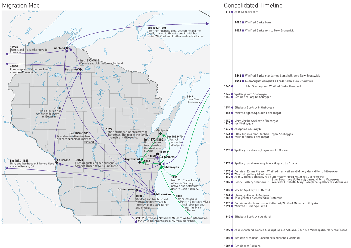
I have returned from my trip up north to Minnesota and Wisconsin. Unfortunately, from the research side it was not the most successful of trips. I did find some records, but none that answered any of the big questions I had. If anything, I now have far more questions. Most of the information I learned deals with the homesteaded land that John Spellecy received in 1888, at the young age of 70. It turns out by the time he was given the land by the US government, he had already made one contract to sell a portion of it. And so to make some semblance of it, I made this animation to show how the land grant disappeared over only a 12 year period.

How the Spellecy plot disappeared

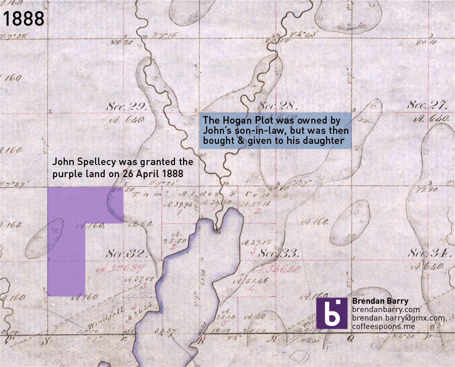
For the curious, the background image is a digitisation of the US government’s original land survey. The A.160 denotes 160 acres, the maximum allowed by a homestead claim.

The Supreme Court’s Recent Liberalism

Last week the Supreme Court ruled in favour of the Affordable Care Act, better known colloquially as Obamacare, and said that the federal tax subsidies are, in fact, constitutional. But, this piece is not so much about that one individual ruling, but rather the surprising trend of the recent Roberts’ court terms to skew liberal instead of the expected conservative. In this Upshot piece from the New York Times, an interactive graphic backs up the article explaining just what has been going on in the Supreme Court.

The court has been conservative for decades

Credit for the piece goes to Alicia Parlapiano, Adam Liptak, and Jeremy Bowers.

Researching the Family History in Ashland, Wisconsin

I’m presently off in the northern reaches of Wisconsin, Ashland in particular, researching part of my family’s history. To aid me in understanding just how this frontier-following family moved over one century, I put together a crude map and a timeline to give me context (and jog my memory) while searching through files in the courthouse.

The movements of the Spellacy family

I am calling the map a migration map. It shows the locations where family members moved to in 1849: Sheboygan (from New Brunswick, Canada). And then how they quickly began to disperse, but slowly head north to Ashland County, before most ultimately headed to the West Coast. (My direct ancestors are that group near the bottom that move back to the in-laws original home of western Massachusetts.)

What I struggle with keeping in mind is that here we are looking at a perfectly rendered and understood map of modern Wisconsin. But in 1849, the state was but one year old and most of the towns to which this family would be going were only a decade or so old and still very much frontier towns without amenities. (Which is why I imagine the women of the family stayed in Milwaukee until the settlements in the north were, well, settled.)

To the right is a timeline. The details are not terribly important and in fact it is poorly designed. But, it was quick to make and will hopefully help me keep the names straight and the places for which I am looking top-of-mind.

Put the two together and you have an example of how I create visualisations for myself just to help me with my own work and research.

New Horizons

So this is generally a more serious post than usual for a Friday. Because, it is about New Horizons, the probe we launched almost a decade ago to explore Pluto, which at that point was still technically a planet. Anyway, the Washington Post has a nice illustration detailing the various sensors and orbits and trajectories. But what gets it a Friday post? Its sense of scale.

You always need a sense of scale

Credit for the piece goes to Richard Johnson.

The Curviest Tracks on the Northeast Corridor

If you remember a little while back, Amtrak No. 188 derailed in North Philadelphia at Frankford Junction. I covered it here and here. Well, the New York Times has analysed the Northeast Corridor to identify the curviest segments of track, excluding entrances and exits from stations. Perhaps as no surprise, Frankford Junction is right among the top segments.

Tracks north of Centre City Philadelphia

Credit for the piece goes to the New York Times graphics department.

Failing to Whack the Mole

The story and data behind today’s graphic are worth telling. But, the execution leaves me feeling a bit empty. The piece kicks off a new series called Data Points from National Geographic. But, here in this piece we are looking for clear communication of data. So what do we get? Circles. Circles within circles within circles. My problem?

The overview view
The overview view

Well you can see from the first screenshot that we are missing the gap space, i.e. the space between the container circle and the data circle. The gap makes the container look larger than it really is. Granted, area is not a great way of comparing data points, but that aside, something like a tree map would probably be more accurate and still allow for the nesting that occurs, see below.

A nested view looking at snakes

The overall display includes nice ancillary data about top importers and exporters along with how the animals in question are used. Some animals even have trade notes that offer more context on how particular animals are used.

On the plus side, the piece’s title is great: Space Monkeys and Tiger Wine. I mean, how can you not read that? While they missed lots of the moles popping out of circles on this one, they did nail the title.

Credit for the piece goes to Katilin Yarnall and Fathom Information Design.

Aquifers Around the World

It has rained quite a bit in the south the last couple of days, thanks to tropical weather systems. But, as some new data from NASA shows us, the world is running out of water. That is largely because we drain large underground water systems called aquifers faster than the natural environment replenishes them. The Washington Post has a small interactive map that looks at the world’s largest aquifers and respective trend towards either being recharged or drained.

Aquifers are being drained around the world

Credit for the piece goes to Todd Frankel.

LeBron James in the NBA Finals

I really do not know much about basketball. I did not realise that the finals had been going on. But, rest assured, they were. The Washington Post looked at whether or not LeBron James had the best finals match performances since 1985. It turns out, not so much. For those of you from the Chicago area, you may instead take solace that one of those guys from that Chicago team represents well.

The top five performances since 1985

Credit for the piece goes to Todd Lindeman and Richard Johnson.

Donald Trump is Running for President

This week saw a few new people officially jump into the 2016 election: Jeb Bush and Donald Trump. Next week I want to at least look at some design-related elements to the forthcoming primaries. But, today is Friday. So let’s get to the important stuff first: Donald Trump’s hair. Thankfully, Time has that covered. (Get it?)

Anchoring the edifice

Credit for the piece goes to Kate Francis.

Rotting Wooden Beams

Earlier this week a balcony collapse in Berkeley, California killed six Irish students. The building had only been finished in 2007 and was barely ten years old. While the investigation is ongoing, the Los Angeles Times reported on what might have been the cause: dry rot.

Dry rot
Dry rot

Credit for the piece goes to Rong Gong-Lin II.