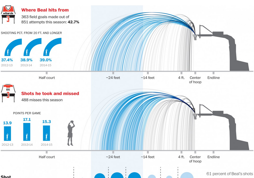
I really am only a one sport kind of guy. Basketball is not that sport. However, similar to baseball, it is a sport that plays many games and has many in-game actions, which allows for data collection and analysis. This Washington Post piece looks at the season for some player named Bradley Beal. Ask me to interpret the data, and that’s a different story. But, I am sure it will make sense to you basketball fans out there.
Whence good and bad shots came
Credit for the piece goes to Todd Lindeman and Lazaro Gamio.
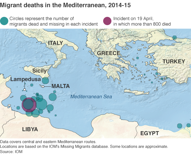
Yesterday we looked at a map of coal plants, with the dots sized by capacity. Today, we have a similar approach in a much smaller graphic about a much different topic. The BBC published this map yesterday in the context of an article about a report of the EU contacting Australia in regards to its migrant interception programme.
Where the migrants have died
Compared to the maps we saw yesterday, I’m not so keen on this. Not the idea, mind you. I think that the story bears telling in a graphical, visual format. Look at how many of those deaths occur in the waters between Libya and Italy. Not between Tunisia and Italy. Not between countries of the eastern Mediterranean and islands like Cyprus or Crete.
But, the blue-green colour used to identify previous incidents is too close to the blue of the Mediterranean for my taste. Though, in fairness, that does make the purplish colour highlighting the most recent incident stand out a bit more. But even the map of the Mediterranean includes details that are not likely necessary. Do we need to show the topography of the surrounding countries? Do we need to see the topography of the sea floor? Probably not, although in a different piece the argument could be made geography determines the migration routes. Compare that to Bloomberg’s piece, where the United States was presented in flat, grey colours that allowed the capacity story to come to the forefront.
Lastly, a pet peeve of mine with maps and charts like this. Please, please, please provide a scale. I understand that humans are poor at comparing differences in area. And that is a reason why bars and dots are so often a clearer form of communication. But, in this piece, I have no idea whatsoever about the magnitude and scale of these incidents. Again, compared this to the Bloomberg piece, where in the bottom corner we do have two circles presented to offer scale of capacity.
Credit for the piece goes to the BBC graphics department.
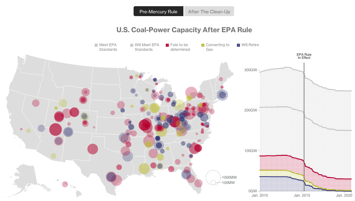
The other day I misread a poster on the road that “The Cool Century” for “The Coal Century”. That is the origin of today’s title. The origin of today’s piece, however, is Bloomberg, which looked at the impact of some new environmental regulations on the coal industry vis-a-vis dozens of coal power plants.
Coal plants
Basically, you have a map with plant size indicated by the dot size, and the type of plant by the colour of the dot. The line chart to the right shows total coal capacity. Overall, it’s a nice, clear, concise graphic. Two buttons give the user immediate access to the story: the pre-regulated environment—see what I did there?—and then then post-regulated one.
Credit for the piece goes to Eric Roston and Blacki Migliozzi.
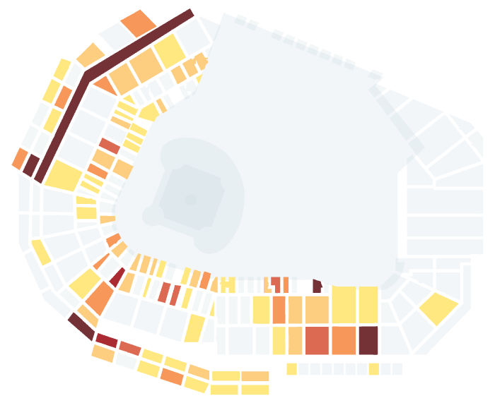
Happy Friday, everyone. Foul balls are the souvenirs of fortune at baseball games. (Home runs as well I suppose.) You can’t buy them, you can only hope to be one of the lucky few who catch one. So the Boston Globe ran an article with an integrated interactive piece that told the story of a select few foul balls caught by fans at ten games at Fenway. But from the data visualisation side, they plotted where each foul ball landed. But, the real gem is that they then had a few small multiples showing where various Boston hitters tended to deposit their fouls.
Ten games’ worth of foul balls
Credit for the piece goes to Stan Grossfeld, Rachel G. Bowers, and Luke Knox.
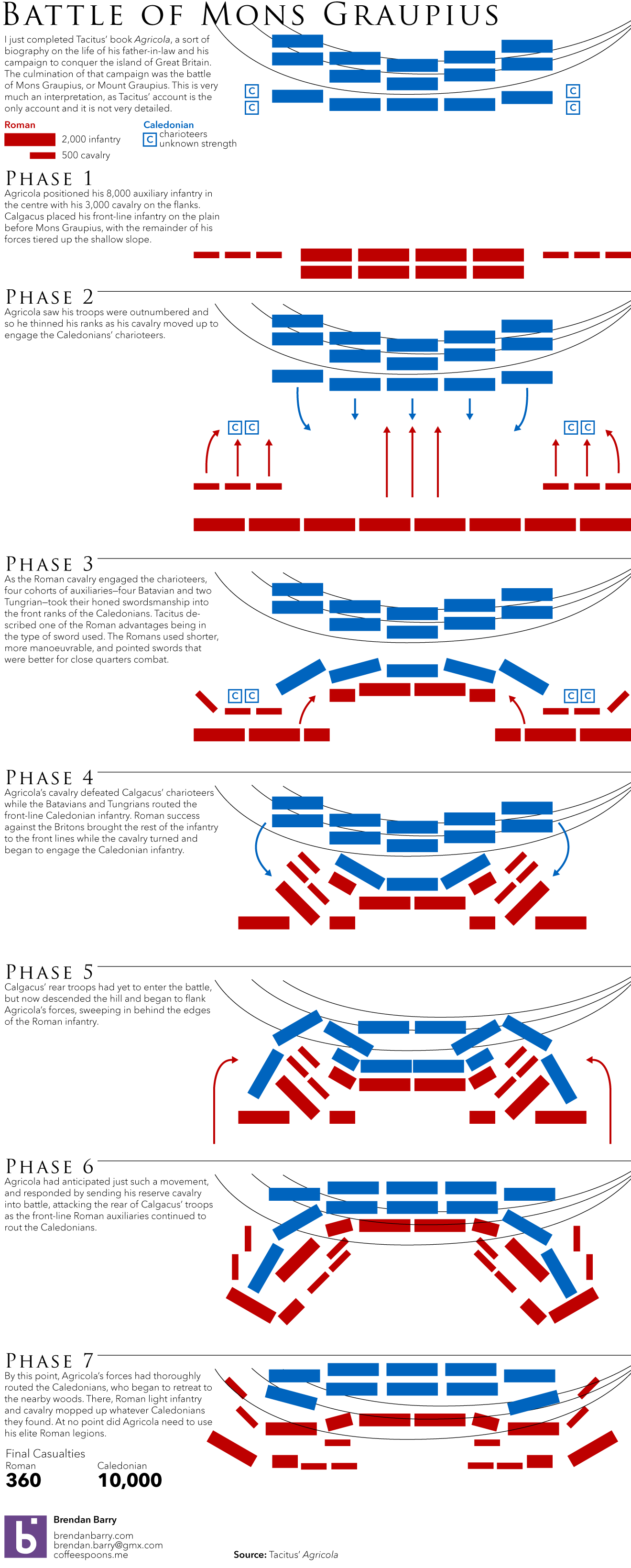
I just finished reading Tacitus’ account of his father-in-law Agricola. Agricola is the Roman—more likely from a family of Romanised Gauls—general who conquered Great Britain for Rome. His crowning victory was the Battle of Mons Graupius. It should all be taken with a grain of salt, because there are no other corroborating sources—to my knowledge. For one thing, nobody knows for sure where this battle occurred—if it did—other than somewhere in what is now Scotland. So, I decided to attempt to illustrate the battle as I couldn’t find a satisfactory one on the internets. Again, with the knowledge that Tacitus’ account is not the most thorough.
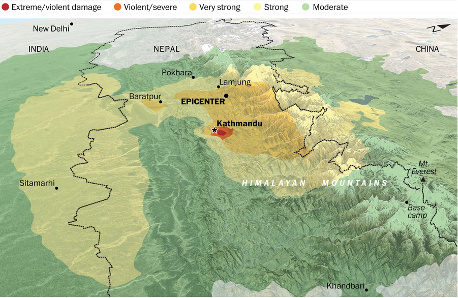
If you missed it this weekend, Nepal suffered both loss of life and significant damage from an earthquake Saturday morning. The Washington Post quickly had a graphic up that explored the story.
Where and how severely the quake was felt
Credit for the piece goes to Bonnie Berkowitz, Darla Cameron, Samuel Granados, Richard Johnson, Laris Karklis, and Gene Thorp.
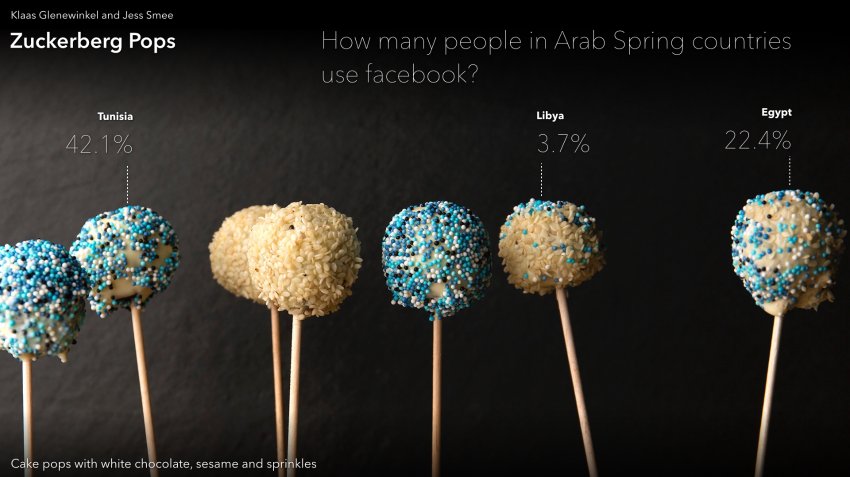
Keeping with the unplanned theme of this week, i.e. things going on in the Middle East and Arab world, let’s take a look at another piece of work from Spiegel. Unfortunately, this one is not so much in English. The graphics, yes, the supporting context, no.
There are seven of them, this looks at what the designers termed Halal Internet. It looks delicious.
Iranian website access
And while this looks delicious, it’s white chocolate, unfortunately. But change that bit, and I would be okay eating it.
Facebook usage
Check out the article for the rest.
Credit for the piece goes to Klaas Glenewinkel and Jess Smee.
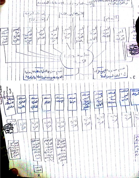
Yesterday we looked at the Russian sale of advanced surface-to-air missiles to Iran. Let’s stay in the Middle East and look at one of the forces that Iran—among many others, the US included—is fighting: ISIS, or Islamic State. We all know it from its ruthless, zealous, brutal application of Islamic law to the territories it controls. But is the organisation itself really that “religious”?
Der Spiegel obtained documents in late 2014 that had been in the possession of Hajj Bakr, who had quietly outlined much of the structure of ISIS and how the group would function. The article is a thrilling read, if you are into these kinds of things, and depicts an ISIS different than what many would possibly suspect.
So why are we talking about it here? Because organisations require diagrams or flow charts of responsibilities. The folder of files that Spiegel obtained included just such things, and below is an example included in the article.
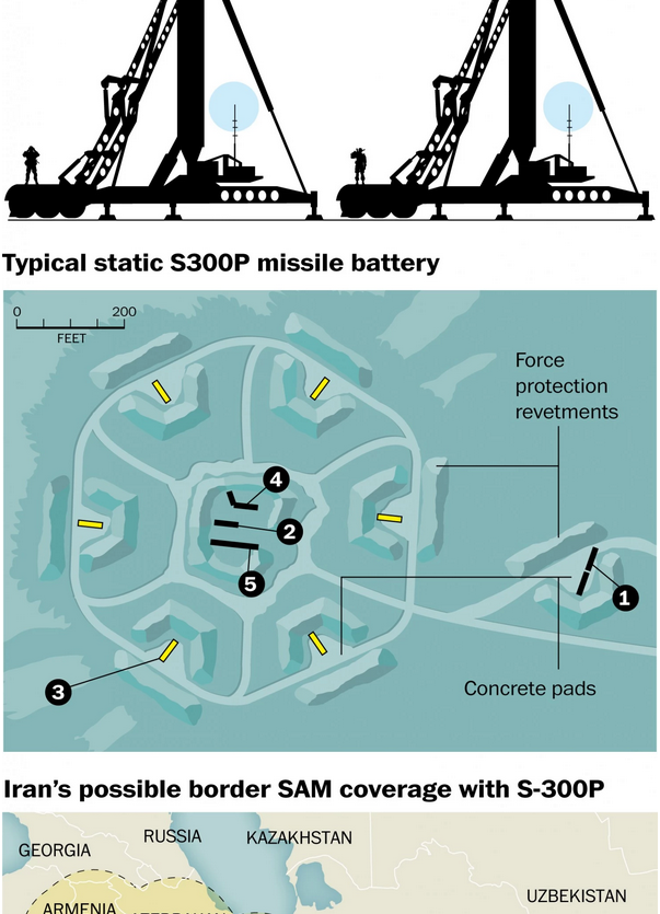
Russia has agreed to complete its years-old sale of advanced S-300 surface-to-air missiles to Iran. What does this mean? Well, it does not make Iran’s airspace invulnerable, but it will be a significant upgrade with the potential to deter Israel from launching an air raid against Iranian nuclear sites. In a nice, illustrated piece the Washington Post explains what the S-300 system is.
S-300 SAM system
Credit for the piece goes to the Washington Post graphics department.
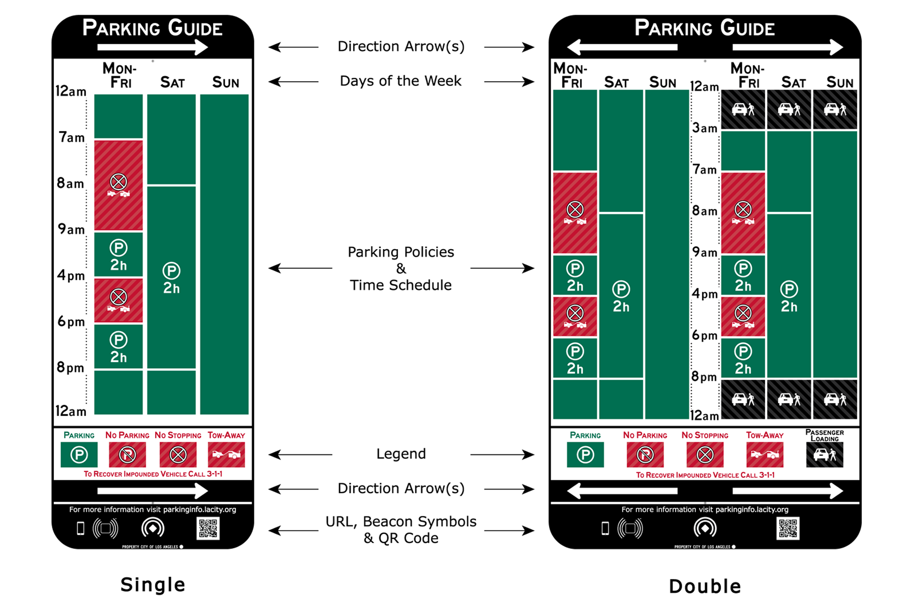
Today’s piece comes via a colleague with the original article appearing in Wired. The article looks at new parking signs that the city of Los Angeles has proposed. The reason? Parking on streets with multiple signs for parking sometimes make no sense. These signs aim to simplify the communication of those parking regulations.
The proposed new LA parking signs
Credit for the piece goes to the Los Angeles Department of Transportation, which was inspired by Nikki Sylianteng.