Who Are the Red Sox?

As Massachusetts and Maine celebrate Patriots’ Day, the Boston Red Sox are set to play their earliest game of the year with an 11.00 start time. (Yes, there is also a marathon today.) So after two weeks or twelve games, the question people want answered is what Red Sox do we get this year? FiveThirtyEight looked at what they called roller-coaster seasons of late, primarily using a box plot graphic to show just how much whiplash Boston fans have endured of late.

Projected vs. actual wins

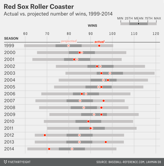
So who are the Red Sox this year? The cellar dwellers of 2012 and 2014? Or world champions like in 2013? Who knows?

Credit for the piece goes to Neil Paine.

The Growth of Urban Walmarts

Today’s piece comes via my co-worker and is about the growth of urban Walmart stores. The article is from NPR and includes a nice series of small multiples of store locations in three select cities: Washington, Chicago, and Atlanta. In full disclosure, I live about two blocks from one of the urban Walmarts in Chicago. So go figure.

The growth of urban Walmarts

Credit for the piece goes to April Fehling, Tyler Fisher, Christopher Groskopf, Alyson Hurt, Livia Labate, and Ariel Zambelich.

Predicting the UK General Election Results

(To be fair, I forgot to schedule to publish this post before I left somehow.)

Your humble author is still on holiday. So, today, you can enjoy a nice interactive piece from FiveThirtyEight that predicts the results of the 7 May general election. Of particular interest, the box part of the plot that shows the 90% confidence range.

Dot plotting the results

The piece also has a choropleth map. My only feature request(s) would be to have a zoom feature for urban constituencies and/or to have a search field that allows the user to see the predicted results for a specific constituency.

Credit for the piece goes to Matthew Conlen and Ritchie King.

Friday Baseball Drinking

Your humble author is out of town today. And unfortunately he is not watching a ball game. But if he were, he would be drinking a beer. And even more unfortunately, his favourite team and favourite ballpark has the most expensive beer. And most unfortunate, the other two teams he is perhaps most likely to watch have the…same most expensive beer. Business Insider charted the prices and the price per ounce. To be fair, I am often too busy scoring a game to get drunk during a game.

It's expensive getting drunk at Fenway. And Citizens Bank. And Wrigley.
It’s expensive getting drunk at Fenway. And Citizens Bank. And Wrigley.

Credit for the piece goes to Business Insider.

Pitch Recognition

Hitting a baseball is hard. Really, really hard. You’re good at it if you fail 7 out of 10 times. Part of the way you get good at hitting baseballs is by recognising the spin or rotation of the red seams on the white outside of the ball. This article from CBS takes a look at five common pitches and what they look like to the batter.

I have certainly never been able to see these

Credit for the original piece goes to an unknown person, I don’t think it was the article’s author.

Baseball’s Pace of Play

So now the baseball season is in full swing, one of the things we will be looking for is shorter duration for games. As I have probably said many times before, I enjoy the long games. But there are none longer than Red Sox–Yankees match-ups so take that with a grain of salt. I am spoiled. Anyway, in time for the season, over at Time they plotted the 2014 winning percentage and average length of game for all Major League teams.

Winning isn't based on pace of play
Winning isn’t based on pace of play

Clearly from this chart we can see that neither playing slowly nor playing quickly has any correlative impact on a team’s winning percentage. Teams are spread out all over. But, in many ways, baseball is all about timing and getting inside the head of the pitcher or the batter. And one way to take the advantage is to mess up the other’s timing. By eliminating that element of the game—or at least attempting to—the game becomes a little bit duller.

Credit for the piece goes to Lon Tweeten.

Baseball in 2015

For most of us, baseball, the 2015 edition, began yesterday. For the Red Sox, it was an 8–0 victory over the Phillies in which Boston’s Clay Buchholz kept the ball down in the strike zone, where it is tougher for batters to make solid contact. Whereas Cole Hamels of the Phillies kept the ball up in the zone and thereby let the Boston lineup hit four home runs in five innings. (Boston added a fifth, a grand slam, in the ninth inning.)

But low strikes are nothing new. In fact, umpires increasingly have been calling low strikes as seen in this chart by FiveThirtyEight in an article looking at 2015’s trends in baseball. (Interestingly they also chart something on Cole Hamels.) It is not the most complicated chart, but it does serve as a reminder that for the next six months, baseball is back.

Pitch height over the last few years

Credit for the piece goes to Rob Arthur.

Cutting into Cables

Today we look at the cross section of a coaxial cable. It fits into a story from the Wall Street Journal about how some media providers want to be classified as a different type of company so they can gain access to different parts—mainly less congested—of your data service.

Cutting into the coaxial cable

Credit for the piece goes to the Wall Street Journal’s graphics department.

Sex, Drugs, and Rock Oil

North Dakota’s economy has been booming because of shale oil. Most of that economic growth has been centred on what was the small city of Williston, North Dakota. Economic growth often leads to population growth, however, and that can at times lead to growth in less than wholesome economic activities. The National Journal took a look at the population growth in the area and what has been happening concurrently in a few metrics of the less wholesome sectors of the economy, i.e. drugs and prostitution. Turns out, they are both up.

Population growth in North Dakota

Credit for the piece goes to Clare Foran and Stephanie Stamm.

It’s Melting! It’s Melting!

Spring has finally arrived. And that means that far to your humble author’s north, the sea ice in the Arctic is beginning to recede from its annual maximum coverage. However, this year’s coverage was the smallest since satellite records began in 1979. The New York Times covers the story in a nice article with two big data pieces. The first is a really nice map—not shown—that looks at this year’s coverage compared to average extents.

The really nice part, however, is a line chart of historical ice coverage from 1979 through to the current date. While the piece is not interactive, the annotations in the graphic do a nice job explaining the different lines and outliers. Overall, a solid piece.

Annual cycle of Arctic ice coverage

Credit for the piece goes to Derek Watkins.