Wars Are Bad, But Not as Bad as They Used To Be

War is bad for the population business—arguably good for business business. A year ago, the Hague Centre for Strategic Studies released a .pdf that looked at peace and conflict and their respective drivers. The designers clumsily pieced everything together so that the sum is less than the constituent parts. But, if you isolate each piece and look at it alone, you can ignore the overall design and focus on the merits of each component. The excerpt below looks at the deaths in wars over time and their share of world population.

You don't see the word Westphalian used very often
You don’t see the word Westphalian used very often

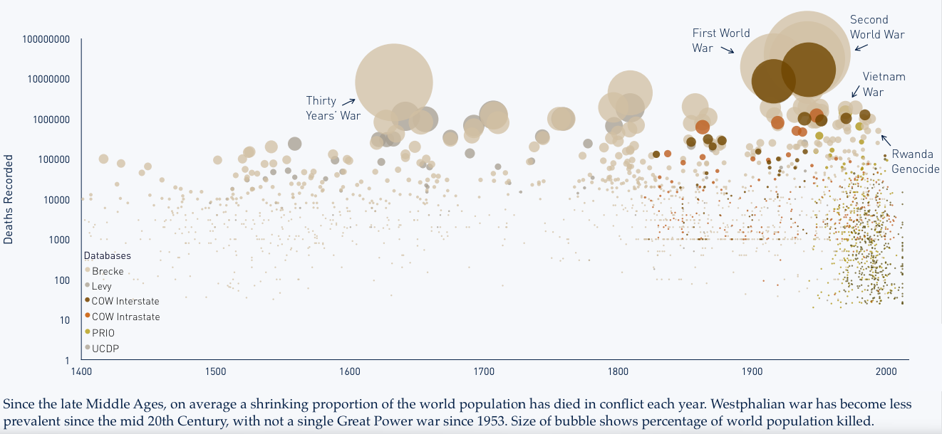
Credit for the piece goes to Tim Sweijs and Joshua Polchar.

Ukraine Retreats from Debaltseve

This is a short piece—it is only really an inline map—but it illustrates fairly well why Ukraine’s loss of Debaltseve in eastern Ukraine last week is kind of a big deal. Basically, the now mostly abandoned city is a transport hub linking the two quasi capitals of the Novorossiya.

Rebel-controlled area

Credit for the piece goes to Gene Thorp.

The American Shopping Mall

This past weekend Al-Shabab, the Al Qaeda affiliate based in Somalia, threatened shopping malls in the United States, Canada, and the United Kingdom. This threat carries a certain amount of weight given the deadly attack Al-Shabab launched against the Westgate Shopping Mall in Nairobi, Kenya a few years ago.

So what to look at today? Well, a few weeks back a colleague sent me a link to a Bloomberg article about the American shopping mall. The article examines the makeup of stores, the people shopping, and the regionalisation in the food court(s). On a personal note, I was glad to see that King of Prussia received a mention.

Auntie Anne's in KoP? I'd rather Philly Pretzel Factory
Auntie Anne’s in KoP? I’d rather Philly Pretzel Factory

Credit for the piece goes to Dorothy Gambrell and Patrick Clark.

Lynchings

Let’s follow up yesterday’s good news story about measles with lynchings. The New York Times mapped and charted historical lynchings from 1877 to 1950 across 12 states in the South.

Locations of lynchings across the South, 1877–1950

Credit for the piece goes to the New York Times graphics department.

The Measles Outbreak

People, science is your friend. Vaccinations are not only for the benefit of yourself, but for others. Anyway, let us take a look at the measles outbreak through some graphics produced by the New York Times. It started in Disneyland. Because we had eliminated the disease about 15 years ago. Science, people.

Where the outbreak had spread as of 6 February

Credit for the piece goes to Jonathan Corum, Josh Keller, Haeyoun Park, and Archie Tse.

Presidents Day Popularity Contests

Yesterday was Presidents Day and I had the day off. So today’s post is a bit late, but it still works. Pew Research Centre pulled together data they had on presidential popularity from Eisenhower to Obama. The data point was job approval.

There has been a widening polarity gap

Credit for the piece goes to the graphics department of the Pew Research Centre.

Squaring Up London

Choropleths are not always a good idea. For example, look at election maps. Highly populated but geographically small cities appear as mere drops of ink on paper or pixels on a screen. Meanwhile, vast deserts appear gigantic empires. Nothing new there. But even within cities, these issues exist. London is one such city and one design studio has been working on a means of changing that. London Squared Map converts the boroughs of London into almost all squares of equal area. Each is placed in the appropriate space to represent geographic location. But to convey actual geography and familiarise the audience, not all squares are equal. Instead, just like the city itself, the squares are divided by a simplified shape of the Thames.

the London Squared Map

Credit for the piece goes to After the Flood.

Income Growth Gap

The Recession was not great for the 99%. It was, however, good for the 1%. How good? Well as data put together by the Economic Policy Institute indicates—and as reported by the Washington Post—it was very good. In only 1 of 49 states did the 99% fare better than the 1%. One state’s data was unavailable. This scatter plot compares the growth over the period of the two income groups. And as the reader can see, the growth was generally speaking not even close to being equal.

Comparing income growth

Credit for the piece goes to Niraj Chokshi and Jeff Guo.

Population Displacement in Ukraine

Ukraine continues to suffer the effects of a Russian invasion. Though we won’t call it that. This piece from Radio Free Europe looks at the displaced persons in the country. Unfortunately, it is not quite the best example of what to do.

Displacement in Ukraine

The line chart looks at the cumulative number of displaced persons. But, a monthly growth or absolute number for that month would tell a different story. See below. Hint, it slowed down, and then got pretty bad again.

Monthly population change

I am also not a fan of labelling every data point on the map. Maybe call out a few interesting ones, the outliers perhaps. But do we need to know to the person how many people are in Ternopil. Probably not.

Credit for the piece goes to the graphics department of Radio Free Europe.