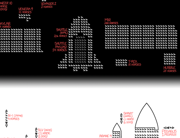
While last week ended with an xkcd post, I want to start this week with an older one I missed about spacecraft. Because spacecraft are awesome every day of the week. In particular it looks at mass and payload capacity of spacecraft and rockets over time.
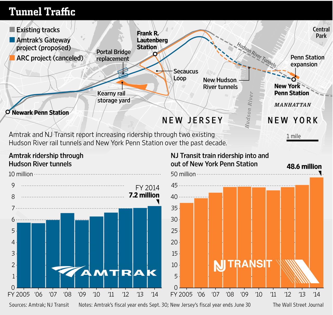
Readers of this blog know that I am a fan of rail travel. And in particular, how the rail system on the East Coast is brilliant when compared to anywhere else in the States. Unfortunately, the railway system on the East Coast is also old and in need of serious capital investment. The tunnels linking New York and New Jersey beneath the Hudson River are a prime example. But a few years ago, Governor Christie of New Jersey killed Amtrak’s plans to build new tunnels to provide a backup to the existing infrastructure and increase overall capacity. The Wall Street Journal takes a look at Amtrak’s new plan to cross the Hudson. Let’s hope this venture is a bit more successful.
The new project
Credit for the piece goes to the Wall Street Journal graphics department.
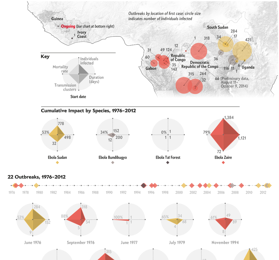
Spoiler alert, it’s big. Thankfully Scientific American has attempted to put the West African outbreak in the context of all other Ebola outbreaks. I think the one thing missing, rather the one thing I would have done differently, is to include some kind of background element to show the difference in scale. A giant circle behind the whole graphic. Or a giant diamond. Of course the designer may not have had the space to do that, because the scale difference is just that extreme.
Putting the ongoing outbreak in context
Credit for the piece goes to Pitch Interactive for Scientific American.
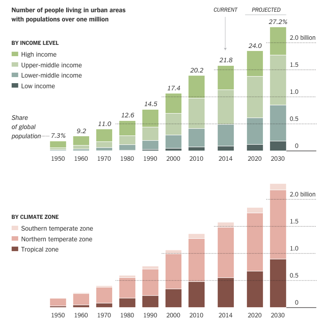
Today’s selection is a little old—dating from July of last year—but is still a nice example of an inline graphic supporting the premise of its accompanying article. The New York Times looks at what was then data published by the United Nations on urban growth out to 2030. The article talks about the growth of megacities in lower income countries and those in the tropical regions. So smack in the middle of the article are two stacked bar charts breaking down urban populations into those two categories.
Urban population makeup
Personally I would have preferred a series of line charts to better compare the growth—the lack of a common baseline makes it very difficult to compare segments of the bars. But below the stacked bar charts we have a nice table. Those are always good to see. They organise information clearly and make it quick to find what is relevant.
Credit for the piece goes to the New York Times graphics department.
As election season begins to heat up, Five Thirty Eight looks at the probability of a Chris Christie candidacy. The scatter plot below examines the favourability and name recognition. The public knows the “brand” of Christie. But they do not have a favourable view of him. I would be curious how much of that is due to his East Coast-iness.
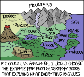
When I was much younger I invented a game where you essentially managed the development of civilisations. xkcd pretty much explains why the idea appealed to me. Minus all the power, obviously. Because that house is by far the best place for a deep water port for the import/export of valuable commodities. This, however, is missing all the tanks and battleships.
Boston and the rest of Massachusetts are attempting to dig out of the blizzard that struck them earlier this week. The Boston Globe has provided its readers with a step by step set of directions for how to best extricate people and cars from snowed in homes.
Shovelling out
Credit for the piece goes to James Abundis and Javier Zarracina.
Alighting an aircraft is a time consuming pain in the arse. Probably number one for me, after security. Anyway, Vox looked at the slow boarding and alighting process and how to improve it. And why, most likely, airlines are not terribly interested in improving it. Hint, follow the money.
Doing it right
Credit for the piece goes to Menkes van den Briel.
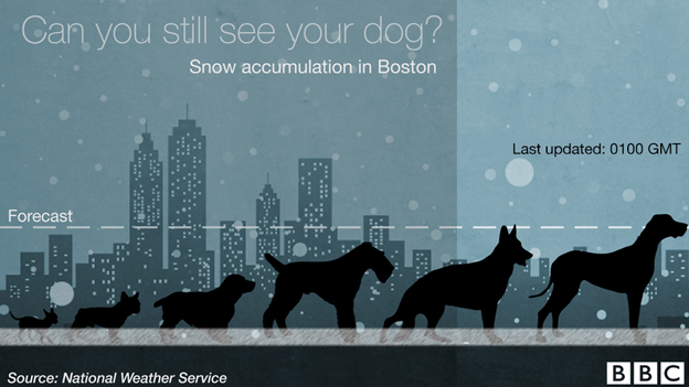
For those of you in the Northeast, you already know you are dealing with a little bit of snow. Thankfully the BBC put the amount received in Boston in context…of dogs.
Snow dogs
Credit for the piece goes to the BBC graphics department.
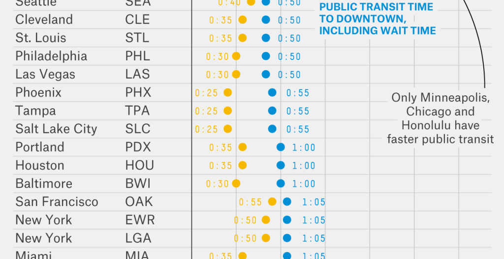
Travelling by plane can often be a hassle because getting from the airport to the destination is not always easy. Suffice it to say your humble author has—on a few occasions—been almost stranded at Philadelphia International because of no way to get where I was going. A lot of that comes down to poor public transit options. In my cases, it mostly stemmed from terrible weather delaying my flight until the wee hours of the morning after which train service stops.
Thankfully, Five Thirty Eight took a look at the public transit vs. car options for various cities/airports and seeing which option is faster. Ultimately Philly is awarded an honourable mention because the R1 (what some people now call the Airport Line) is convenient if your timing is right. Mine, obviously, has never been.