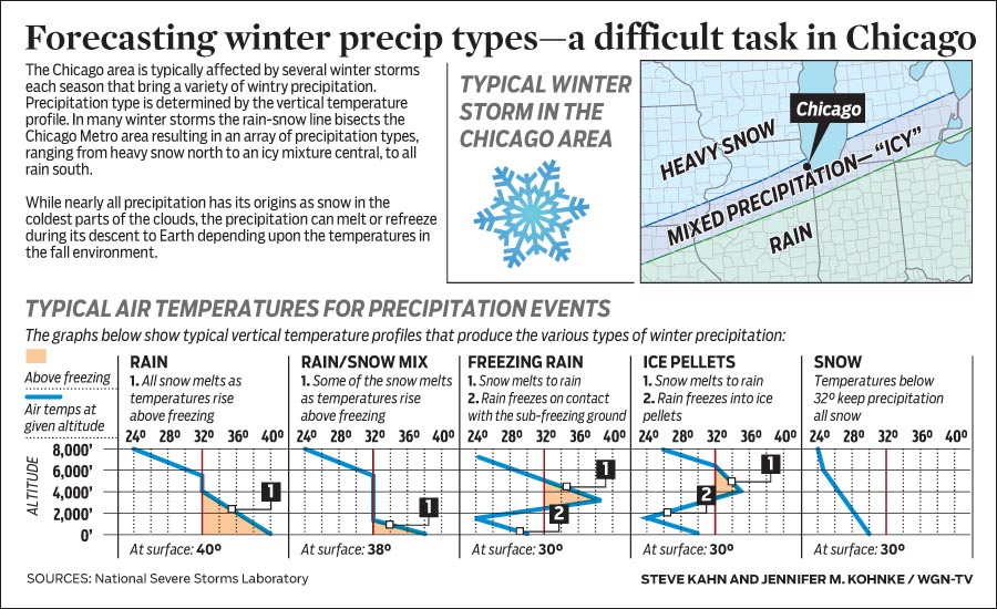
I apologise for the lack of posts over the last two weeks, but I was on holiday. Naturally, I have returned just in time for some snowstorms in the Midwest. But today’s piece comes from WGN and it explains how the type of winter precipitation that falls depends not solely on ground temperatures. Rather, temperature profiles in the upper atmosphere can make all the difference between rain, sleet, and snow.
How temperatures create different precipitation types
Credit for the piece goes to Steve Kahn and Jennifer Kohnke.
The Christmas holidays are known for many things. One of them is the office holiday party. Today’s post looks at a flow chart put together by the company for which I work, Euromonitor International. As it was put together by the design team, you might very well think that I had something to do with it. But I couldn’t possibly comment.
The beginning of the flow chart
Credit for the piece goes to the Euromonitor design team.
Today’s piece is a photo I snapped of the cover of a relatively recent edition of the RedEye, a free, daily tabloid distributed in Chicago. The city of Chicago decided to raise the minimum wage in the city. And this photo of a stack of quarters depicts just how many quarters that increase will be over the next five years.
The minimum wage in Chicago
I find I usually do not enjoy data photos, for want of a better term. But here we have an obviously editorially driven graphic, but one that uses real materials to represent the data. In other words, we are not taking one quarter to represent one dollar per hour. One quarter means one quarter per hour. And the segmentations merely break out how much that will increase over the years. With minimal annotation, the photo is clear and direct.
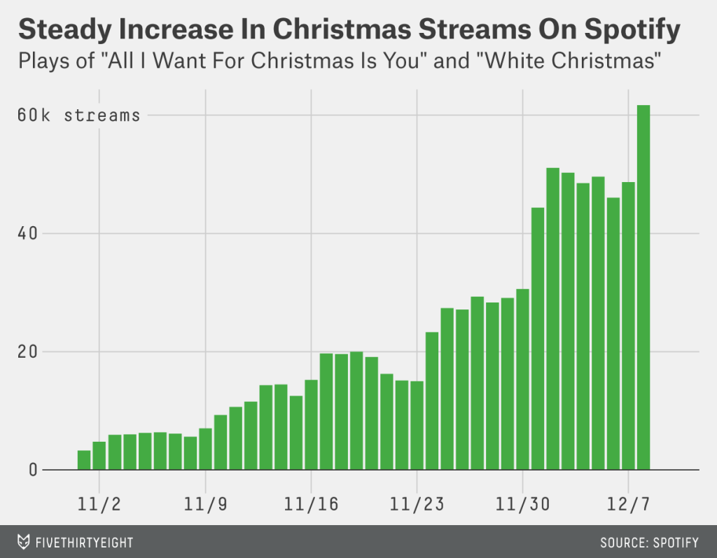
I get that a lot of you like Christmas. That’s great. But for those of not terribly attached to it for more than the days off work, listening to music can switch from being relaxing to aggravating right quick. Thankfully we have FiveThirtyEight to examine just how ridiculous this all-Christmas-all-the-time trend has become.
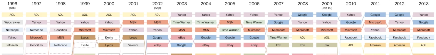
I remember the internet from some of the earlier days. So when the Washington Post published this chart in a piece looking at the history of the popular sites on the Internet, well I felt old. Remember Geocities? Looking at this chart, how many of the old web companies can you recall? Does that make you feel old?
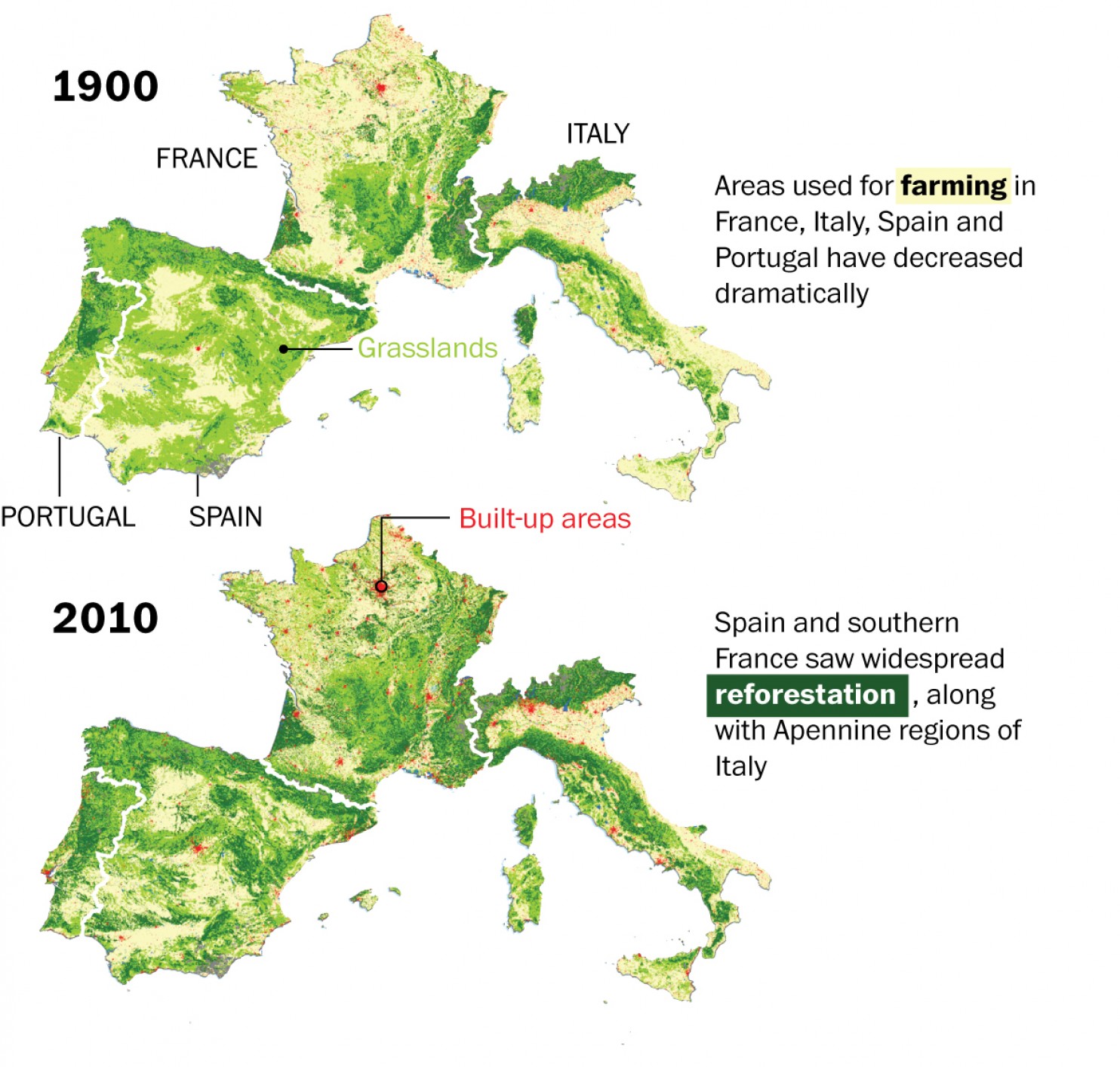
We hear a lot about deforestation around the world. But, in this piece from the Washington Post, we see how over the last century, Europe has actually managed to reverse that trend and reforest parts of the continent.
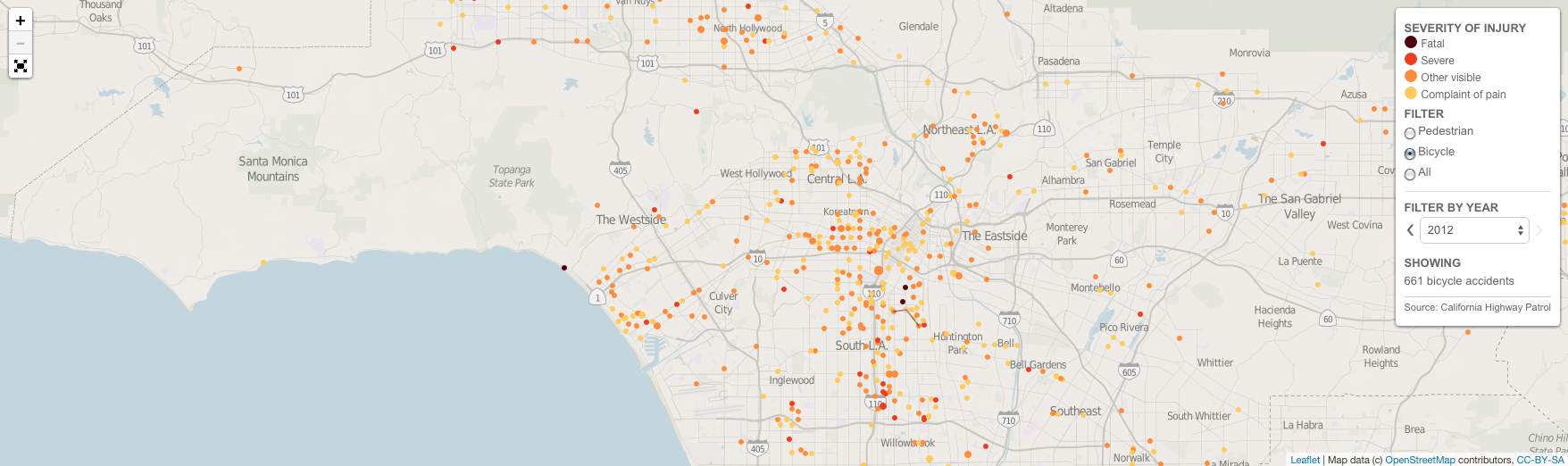
Today’s piece comes via a colleague. It is an article about hit-and-run cycling accidents in and around Los Angeles. The data visualisation in the article is not entirely complex—we are talking only about line charts and bar charts—but they support the arguments and statements in the article. And in that sense they are doing their job.
Locations of hit-and-run accidents in and around LA
Credit for the piece goes to Armand Emamdjomeh, Laura J. Nelson, and Joseph Serna.
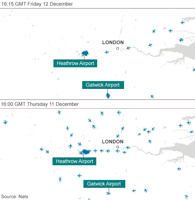
Last week, there was a disruption at the air traffic control centre for the United Kingdom. It caused many travel problems. And the BBC included a graphic showing how the problem was shutting down London air space.
Empty skies over London
Credit for the piece goes to the BBC graphics department.
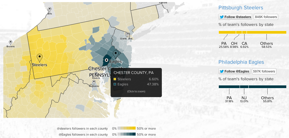
To continue with the sports theme from yesterday, today we have an interactive map from Twitter that looks at NFL team popularity. The methodology is simple, where are the users following the various football teams and map that out by county. The overall blog post features a country-wide map, but then narrows down into a few particular stories. The image below is from the divide in the state of Pennsylvania between Eagles fans and Steelers fans.
Philly vs. Pittsburgh
Credit for the piece goes to Simon Rogers and Krist Wongsuphasawat.
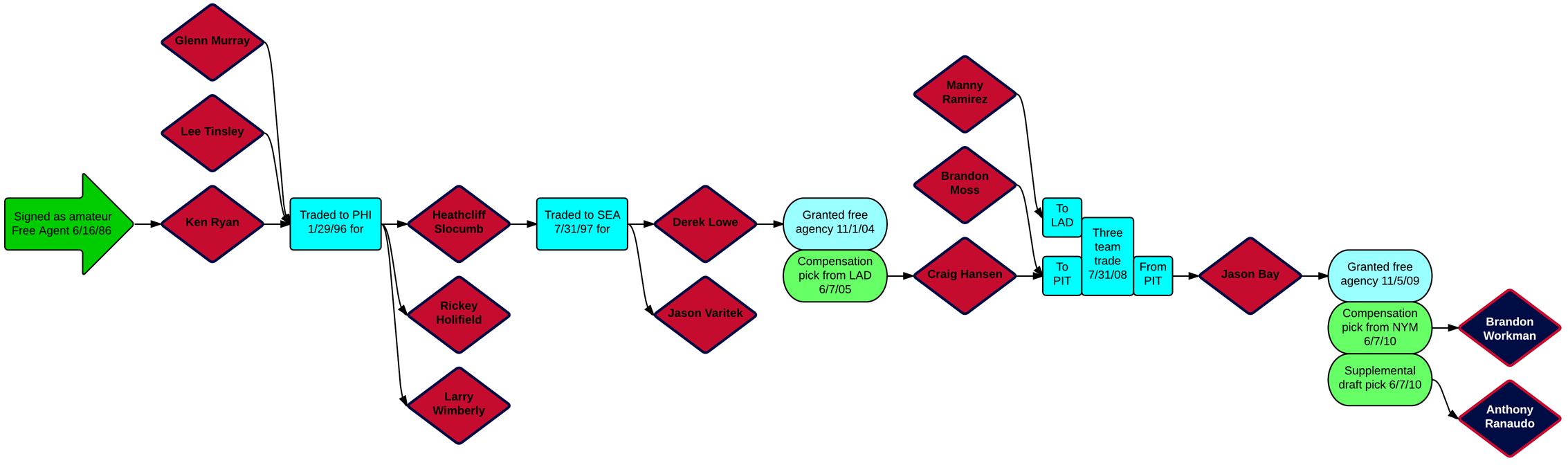
Baseball’s Winter Meetings often provide fans with lots of trade news and free agent signings. As a Red Sox fan, one of the unfortunate signings was the Cubs picking up Jon Lester. For my friends back in Philly, Jimmy Rollins is headed to Los Angeles. But then for Boston, at the time of writing it appears a deal may be imminent for Arizona’s Wade Miley in exchange for Allen Webster and Rubby de la Rosa.
The reason I mention all those names is that they reminded me of a series of graphics from last month that looked at the longest transaction trees for each team. Put simply, how far back can one guy being traded for another guy being signed as compensation for another guy leaving get you back in history. The following graphic tracks a different Red Sox trade, of Anthony Ranaudo and Brandon Workman in 2014 back to the signing of Ken Ryan in 1986.
The transaction tree for Ranaudo and Workman
But what reminded me more specifically was the note that followed the above graphic that had Allen Webster as the longest trade-only tree for Boston. That starts because of the Hanley Ramirez signing in 2000—who returned to Boston only a few weeks in a free agent signing. Similarly, Jimmy Rollins was the longest transaction tree for the Phillies since his signing back in 1996. But that will now change once the players in exchange for Rollins are made clear.