Where the Rebels are in Eastern Ukraine

Today’s piece is far from ground-breaking or even complex. Friday, the Wall Street Journal published this map to supplement an article about the unilateral ceasefire declared by President Poroshenko in Ukraine. The map highlights the areas effectively controlled by the rebels, the most important the unsecured border. Of course this is just a map as stated by Kiev, the reality on the ground might be different. Regardless, it is the first map I have seen that has actually tried to demarcate the territory actually under control rather than claimed.

Rebel-held territory in eastern Ukraine

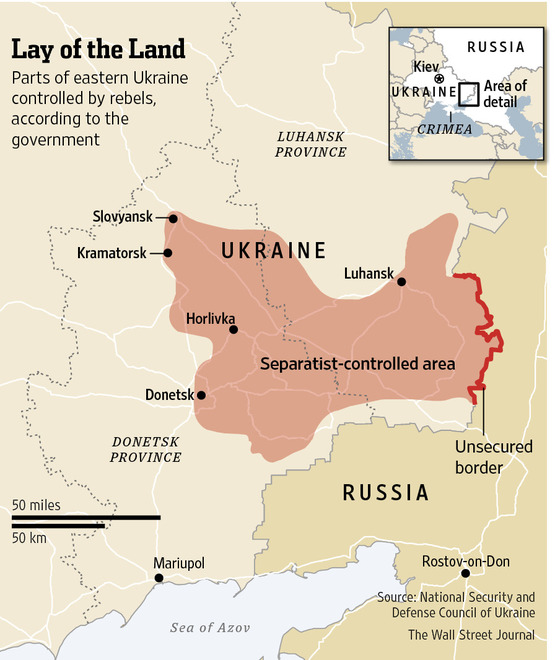
Credit for the piece goes to the Wall Street Journal’s graphics department.

The Cycling Gender Gap

Here in Chicago this week is Bike Week and today Bike to Work Day. So today is a great day for some work from Buzzfeed that highlights the gender gap in cycling (at least in three US cities). To be fair, the data for the statement comes only from urban bike share programmes. But it does hint at a disparity all the same.

Chicago's cycling gender gap
Chicago’s cycling gender gap

Credit for the piece goes to Jeremy Singer-Vine.

Where Guns Are Easier to Find Than Knowledge

I loved the title of this piece from the Washington Post that I had to borrow it myself. Of course all credit goes to that particular copywriter. The Washington Post looked at counties and states where gun stores outnumbered museums and libraries. Thankfully my home county has more knowledge than guns. Sadly, the same cannot be said for large areas of the country.

Guns vs. Museums
Guns vs. Museums

And of note, while Pennsylvania is narrowly more gun than knowledge, the city of Philadelphia ranks second in terms of ratio of libraries/museums to gun stores at 16.93. Only New York City ranked higher.

Credit for the piece goes to Christopher Ingraham.

How ISIS Got This Far

The Washington Post is also helping us understand the spread of ISIS. This time a bit more interactively than we have seen from the Times. This is a step-by-step (ish) explanation. Though, I quibble with the decision to link cities by dotted lines. That can create the illusion that ISIS fighters moved directly from city to city when I highly doubt they took that exact path.

Guide to the spread of ISIS

Credit for the piece goes to Swati Sharma, Laris Karklis, and Gene Thorp.

The Spread of ISIS

ISIS is the main militant group threatening Iraq (and Syria) these days. The New York Times put together a nice graphic showing how in recent years the group has grown ever more violent by launching ever more attacks within Iraq. Of course, the other country of ISIS operations is Syria, where it has been involved in civil war for years now. This creates a battle-hardened group of fighters that is now, thanks to the fall of Mosul and Iraqi banks and military bases, well funded and well equipped.

ISIS attacks in Iraq

Credit for the piece goes to the New York Times graphics department.

The Decline of the Boeing 747

This weekend I flew to and from Philadelphia—that is when my flights were not delayed. So I decided to select an aircraft-related graphic for today’s piece, originally from Quartz. It looks at the phasing out of the iconic Boeing 747. (And as for me, well I was on a 737-900 and a CRJ-700—neither as iconic as the 747.)

Death spiral of the 747?

Credit for the piece goes to David Yanofsky.

Iraq. Again.

Well, Iraq is in the news again. Basically because the Islamist insurgency in Syria has now crossed the border—to be fair, though, that happened awhile back—and taken control over swathes of northern Iraq. Part of that swath includes the city of Mosul, Iraq’s second-largest city with a population of almost 2 million.

The New York Times has been putting together a series of maps to explain the background of why this is happening (hint: that Shia–Sunni divide we talked about years ago, well it’s back) as well as where this is happening.

The Shia–Sunni–Kurdish divide

Credit for the piece goes to Sarah Almukhtar, Jeremy Ashkenas, Bill Marsh, Archie Tse, Tim Wallace, Derek Watkins, and Karen Yourish.

Understanding the Boston Subway System

Today’s post is the graduate work of Michael Barry and Brian Card of Worcester Polytechnic Institute. The two looked at the available public data of the Massachusetts Bay Transportation Authority (MBTA)—the T to those that know—to better understand the Boston area subway system. Here the subway system refers to the heavy rail lines, i.e. the Blue, Orange, and Red lines.

T stations
T stations

In short, the piece has a lot to look at that is worth looking at. This particular screenshot is an analysis of the stations across all times on average weekdays and weekends. You can see how in this particular selection, the size of the station markers pulse depending upon the time of day and the number of turnstile entries. Meanwhile the charts to the right show you the density through time of said entries and then compares the average number of turnstiles entries per day. Text beneath the system map to the left provides a short analysis of the data, highlighting work vs. home stations.

Credit for the piece goes to Michael Barry and Brian Card.

Growth of the Common Core Standard

Today’s piece is a timeline-driven piece from the Washington Post. It looks at the success the Gates Foundation has had in pushing its Common Core standards as an educational standard across the country.

Common Core's Growth
Common Core’s Growth

Credit for the piece goes to Darla Cameron, Ted Mellnik, and Cristina Rivero.