Viewing the Economy All at Once

Normally I try to reserve Fridays for the lighter stuff. But yesterday, the New York Times published a really fantastic piece about how the Great Recession changed the American economy through job growth or loss in each sector of the economy. Naturally this sounds very difficult because the American economy is both very large and very diverse.

Job growth in the American economy

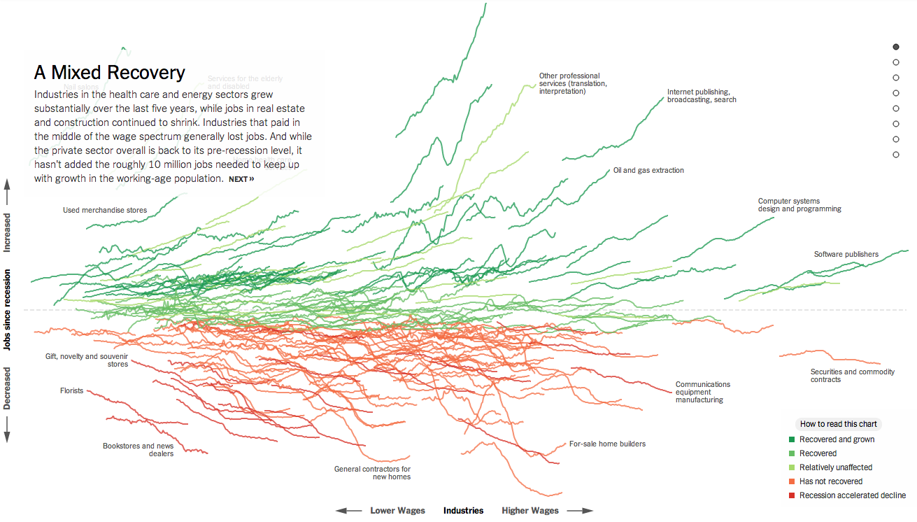
If you check the piece out, however, you will find that you are offered a guided tour with analysis to provide context to an otherwise jumble of coloured lines. As a bonus, highlighted words in the text bring up small charts showing the actual job growth history for the particular sector. The jumble, however, is also organised along the x and y axes by two important metrics: wages and jobs since the Great Recession. This allows you to see whether low wage jobs have performed better than higher paying and whether either has created more jobs than the other. Line colouration denotes whether a particular sector has grown and recovered, recovered, not recovered, or recession accelerated a previous decline.

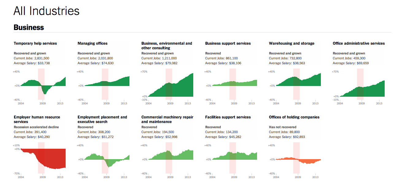
Then at the very end is another really great part of the piece. This is a collection of all the small charts arranged by areas of the economy.

View sectors individually as small multiples

Lastly, for those of you who have to work on smaller screens, don’t worry, they made it responsive. Overall, a great piece.

Credit for the piece goes to Jeremy Ashkenas and Alicia Parlapiano.

More World Cup Predictions

Earlier this week we looked at how Bloomberg was doing predictions and odds for the World Cup. Today we look at the Economist’s go. It uses something called the probability circle. It lacks the depth of Bloomberg’s piece, but from a design angle does play off the shape of the soccer ball and not in the cheesiest of fashions. Here it actually begins to work in lieu of our familiar bracket system (see every other sports final tournament series I have ever seen). To be fair, the Economist does not actually make any predictions in this, rather, it provides the odds that different teams will make different stages.

Economist's odds on each team
Economist’s odds on each team

Credit for the piece goes to A.Y., P.K., D.D.M., J.M.F., and K.N.C.

Mass Shootings in the United States

America loves its gun. The big draw of this piece from the Washington Post is the illustration of the guns used in the mass shootings and whether each was legally or illegally acquired. But more interesting from a data visualisation standpoint are the charts below. They show the numbers of killers, victims, and then the demographics of the killers.

Killers and Victims
Killers and Victims

Credit for the piece goes to Alberto Cuadra, Richard Johnson, Todd Lindeman, Ted Mellnik, and Kennedy Elliott

Carbon Emissions

President Obama announced new regulations to be enforced by the EPA that aim to reduce carbon emissions. Principally, the expected reduction will come through state-by-state measures to meet new federally mandated targets. Each state will have the ability to find different means of achieving the cuts, e.g. building more solar plants or nuclear plants or implementing cap-and-trade schemes.

Consequently, the New York Times published this interactive graphic that examines the carbon emissions and energy prices of states. The charts default to a highlight of several Northeast states already participating in a cap-and-trade scheme. The top component charts emissions on a per unit of energy over time while the bottom charts the price of energy.

Carbon emissions over time

Credit for the piece goes to Hannah Fairfield and Derek Watkins.

Europe Votes

Sunday (and a few days preceding it) was election day in the European Union for the European Parliament. Unfortunately it was also a banner day for the far-right parties. In France the National Front (FN) took the top slot and in the United Kingdom that went to the UK Independence Party (UKIP). This graphic from the Economist looks at the results, highlighting the right-wing or eurosceptic parties.

Europe Tilts Right
Europe Tilts Right

Credit for the piece goes to K.N.C. and P.K.

Which Countries Do You Drink Like?

Happy Friday. Happy Memorial Day Weekend. Happy Summer. Just about all of those things mean a drink of some kind. And thanks to Time, we can look at ourselves and find out what drinking culture each of us best reflects. The data comes from the WHO and looks at both total consumption and then share of consumption.

The countries which I drink like

So last week I drank like a Moldovan and most nearly like an Antiniguan. Of course, they meant Antiguan. It just so happens I caught the spelling error. But since most of last week can be chalked up to a house party, I did the week before too. Then I drank like a Belarusian in the style of Guyanese person.

And for those of you who know me, yes, things like this are exactly why I record all the drinks I consumer in my little black book.

Credit for the piece goes to Pratheek Rebala.

The South China Sea

Over the last few weeks, tensions have been rising in the South China Sea. While most of the world has been focused on violence in Ukraine and Nigeria, fishing boats and other maritime vessels in the South China Sea have been clashing—thankfully without the use of guns or missiles. These clashes contribute to a growing fear that one day, one clash will spiral out of control and lead to something more than required paint jobs for fishing trawlers.

Thankfully, for those of you unfamiliar with who exactly owns what and what they think they own versus what they think others own—in short a mapped out version of the conflict—the New York Times has put together a nice map.

The South China Sea
The South China Sea

Credit for the piece goes to Derek Watkins.

White Racism in America

Racism is a long-standing problem for humanity. But in the wake of the Donald Sterling scandal in the NBA, the New York Times put together a graphic looking at white attitudes towards blacks in the United States. The data reveals that while racist views are down from highs decades past, there is still a substantial amount.

Racism in America
Racism in America

From a design standpoint, I would have probably added some sort of axis label. Additionally, I would have removed that topmost segment and used the space for the labelling.

Credit for the piece goes to Amanda Cox.