
After shootings in Kansas City, the Washington Post looked at hate crimes versus poverty. It turns out there is a somewhat positive correlation.

Credit for the piece goes to the Washington Post graphics department.
After shootings in Kansas City, the Washington Post looked at hate crimes versus poverty. It turns out there is a somewhat positive correlation.
Credit for the piece goes to the Washington Post graphics department.
Tax Day for Americans seems like a great time to talk about income inequality. The article from which this chart comes talks about a recent book exploring the parallels of the 19th century’s inequality—as the article reminds us, the time of “Please, sir, may I have another?”—and the forecast for the 21st. Anyway, the graphic is a nice use of small multiples and highlights that despite the damage done to capital wealth by Great Depressions and two world wars, it is well on its way back to unequal levels.
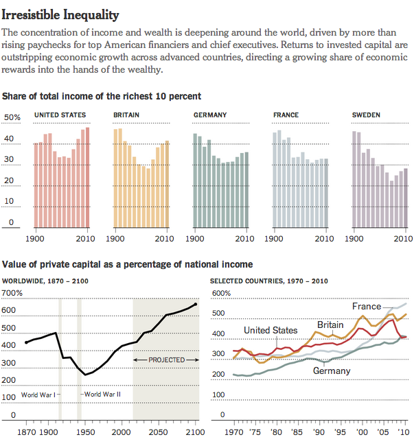
Credit for the piece goes to the New York Times graphics department.
Good news and bad news, folks. The good news is that this chart does not apply to people living in Chicago, Philadelphia, or elsewhere. Unless—here’s the bad news—you live in Washington, D.C. In that case, well, prepare to die. You know, if you have allergies. The Washington Post has a nice graphic that outlines the arrival and peak seasons for different pollen allergens.
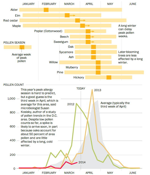
Credit for the piece goes to Bonnie Berkowitz and Patterson Clark.
Happy Friday. Credit for this goes to Randall Munroe, who helps you understand how often things happen.

Sometimes when you are considering moving, you want to look at some broad statistics on the area in which you want to move. In Boston, the Boston Globe has put together a neat little application that does just that. Type in two settlements in the metro area and then get a quick comparison of the two.

Credit for the piece goes to Catherine Cloutier, Andrew Tran, Russell Goldenberg, Corinne Winthrop.
President Obama has made a big deal recently about income inequality. The story in short is that the rich in the country are getting rich; the poor are getting poorer; and the people in the middle are fewer in number. Here in Chicago, this has meant that over the last few decades, many of the former middle-class neighbourhoods have been gutted of, well, the middle class. Daniel Kay Hertz has created a series of maps to show just how drastic the change has been since 1970.
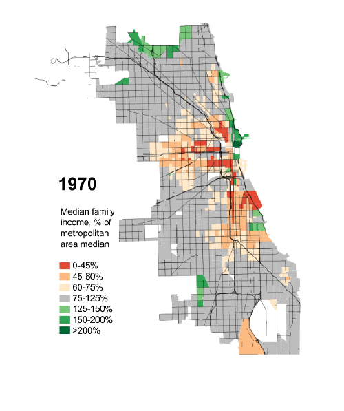
Credit for the piece goes to Daniel Kay Hertz.
Today’s piece does not involve any particularly crazy graphics or forms of data visualisation. Instead, the piece is a novel way of telling a story. People are increasingly familiar with what we might call here scrolling stories. Scroll down the page and suddenly you have glossy photos or high-definition videos. The New York Times, however, has taken this idea in a different direction for a story about motorcycle helmet laws.
Instead of glossy photos, we have clear and concise charts. Instead of lots of text blocks, we have just a few sentences. The story is told by the charts and the text offers the necessary context or background. Not all stories will have the data behind them to allow the story to be told—or shown—in such dramatic fashion. But, I can hope they do.
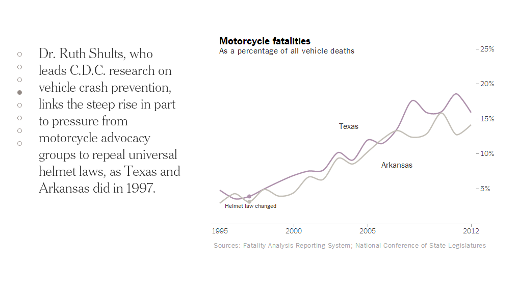
Credit for the piece goes to Alastair Dant and Hannah Fairfield.
Here’s a piece from the New York Times where I have to quibble with some minor design decisions. The story behind the graphic is various state actions on the minimum wage compared to where President Obama wants the minimum wage raised. This is a good story and broadly I like the execution. But these arrows, these arrows pierce my design heart. (Too much of a metaphor?) Instead, I think a simple dot plot would have sufficed. But as I noted above, this is more of a quibble than a shame-on-you.
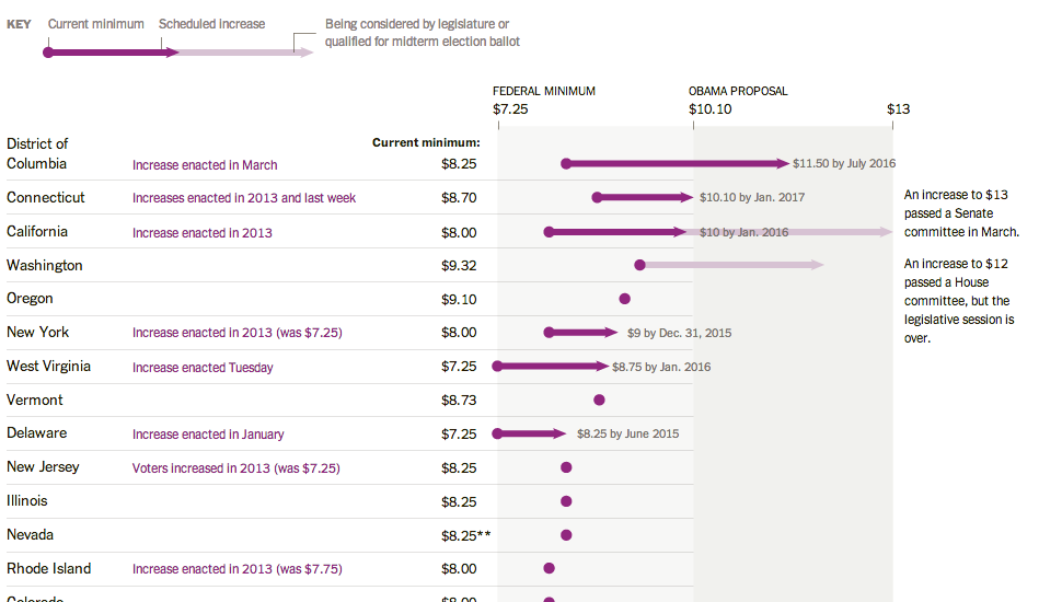
Credit for the piece goes to Alicia Parlapiano.
Today’s post is hosted on Brain Pickings. It’s diagrams made by Kurt Vonnegut that describe how basic plot lines work along two axes. There is a short video you can watch that goes over a few of them. But my favourite is, of course, not there. You have to read a bit further along to find it. Or just look below. But if you don’t read it, you’ll miss the written context.
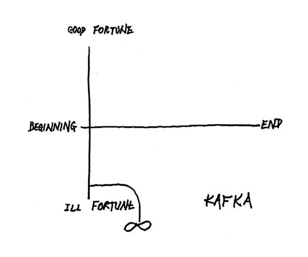
Credit for the piece goes to Kurt Vonnegut.
A little while back, the Economist posted an interesting slideshow piece that showcased the intricacies of London’s skyscraper problem and how many areas are restricted to preserve lines of sight. The user can click through each view and see just where on the map the view falls.
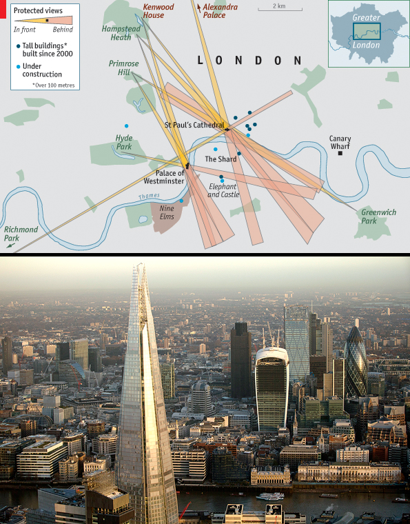
Credit for the piece goes to D.K., L.P., G.D., P.K. and R.L.J.