Follow the State’s Money

In politics, it is really easy and often popular to bash the federal government. Especially when it comes to its penchant for collecting taxes to pay for things. And sometimes those things are in other states than your own. But do you know how much federal money goes back to your own state? Well now you can thank the Pew Charitable Trusts for putting together this piece that explores what percentage of state budgets is comprised of federal grant money.

Federal money for state budgets

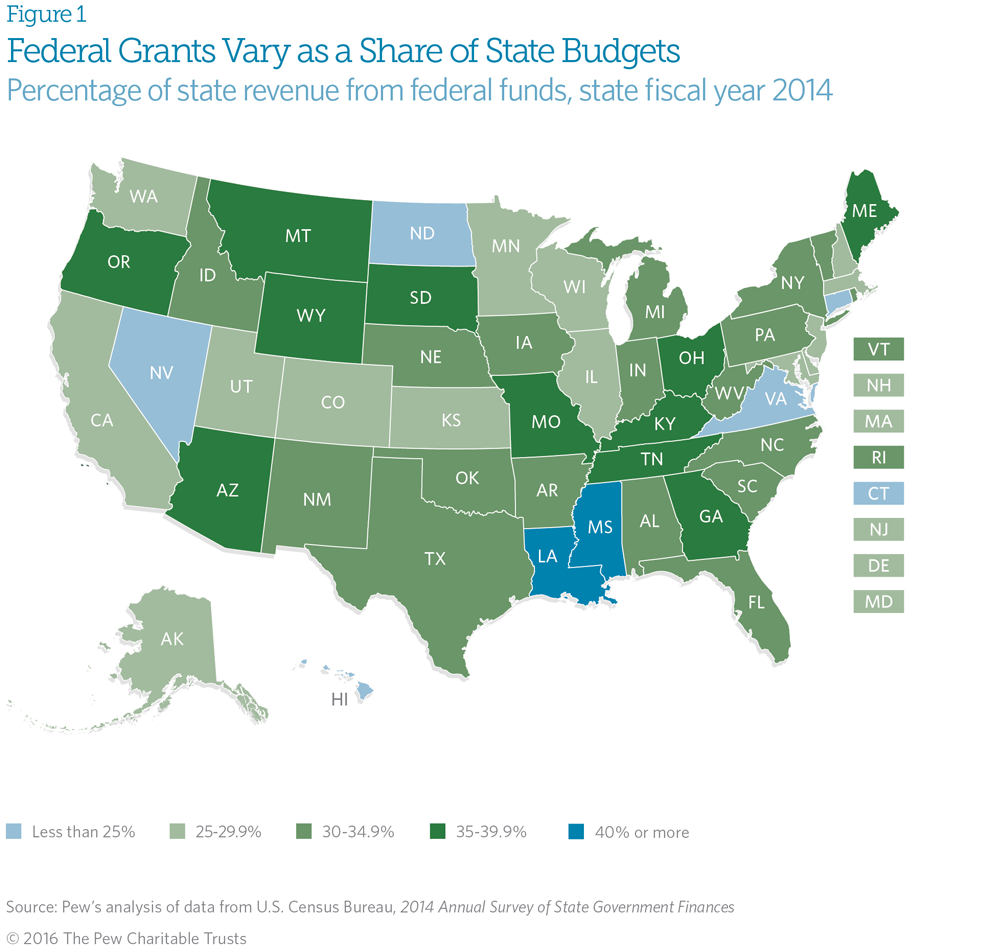
While the piece also includes a donut chart—because why not?—my biggest gripe is with the choropleth and the choice of colour for the bins. If you look carefully at the legend, you will see how both the lowest and highest bins use a shade of blue. That means blue represents states that receive less than 25% of their budget from federal grants and also states that receive more than 40% of their budget from the same federal grants. But if your state is between 25% and 40%, your state suddenly turns a shade of green. It really makes no sense. I think the same colour, either blue or green, could be used for the entire spectrum. Or, if the designers really wanted a divergent scheme, they could have used the national average and used that as the breakpoint to show which states are above and which are below said average.

Credit for the piece goes to the Pew Charitable Trusts graphics department.

The Price of Petrol

How much does a gallon of milk cost? That, of course, is one of the classic election questions asked of candidates to see how in touch they are with the common man. But the same can be understood by enquiring whether or not they know how much a gallon of petrol or gasoline costs. And Bloomberg asked that very same question of the United States relative to the rest of the world. And as it turns out, here in the States, fueling our automobiles is, broadly speaking, not as painful as it would be in other countries.

The piece includes the below dot plot, where different countries are plotted on the three different metrics and the dots are colour coded by the country’s geographic region. But as is usually the case with data on geographies, the question of geographic pattern arises. And so the same three metrics presented in the dot plot are also presented on a geographic map. Those three maps are toggled on/off by buttons above the map.

How the US ranks compared to the rest of the world

A really nice touch that makes the piece applicable to an audience broader than the United States is the three controls in the upper-right of the dot plot. They allow you to control the date, but more importantly the currency and the volume. For most of the world, petrol is priced in litres in local currencies. And the piece allows the user to switch between gallons and litres and from US dollars to the koruna of the Czech Republic.

Credit for the piece goes to Tom Randall, Alex McIntyre, and Jeremy Scott Diamond.

Trump’s Support

The debate was Sunday and here we are on Wednesday. The infamous video is, well, still infamous, but not garnering as much attention half-a-week later. On Monday, the Economist published this piece taking a look at how Trump’s support shifted in the hours and days following the video’s release.

Trump's support fell off really the following day
Trump’s support fell off really the following day

Credit for the piece goes to the Economist’s Data Team.

The Shrinking Extent of ISIS

Yes, ISIS does receive a lot of attention in the media and during the presidential debates. But you might be surprised to learn that actually the organisation has lost a significant amount of territory lately. This BBC article details the territorial changes through a nice interactive map slider.

Use the scroller to see the changes over time

You could create a single map showing the losses/gains instead of using this light-duty interactive piece. And to the BBC’s credit they did. However, between the image quality and territorial changes, I think in this instance the interactive piece does add clarity to the story.

All in one map
All in one map

Credit for the piece goes to the BBC graphics department.

Gerrymandered Districts

Well last night was the debate and it was a doozy. But while I was looking for some graphics capturing the debate itself, I came upon an article over on the Washington Post about gerrymandering. For those that do not know, gerrymandering is when state-level politicians draw the maps for congressional districts to preserve or diminish support for various representatives. And Pennsylvania is one of those states with a lot of oddly shaped districts.

Comparing a gerrymandered Pennsylvania to a not-so-much option

Credit for the piece goes to the Washington Post graphics department.

How Similar Are Pennsylvania and Ohio?

At least politically.

According to this piece from FiveThirtyEight, maybe not as much as they used to be. From a data visualisation standpoint, what stuck out at me was this plot of correlations of how similar various states are. Basically, the closer to the number 1, the more similar, the closer to 0, the less.

Turns out they're not so close
Turns out they’re not so close

I might question the value of placing the numbers within the squares—see what I did there?—because the colours could be used with a legend to indicate the range of similarity. But if this were an interactive piece, it certainly could be done to reveal the number on tap or mouseover.

Anyway, it was interesting to see that among swing states, Pennsylvania is least like Georgia but most like Minnesota. The former, certainly. The latter, who would have guessed, don’t ya know.

Credit for the piece goes to the FiveThirtyEight graphics department.

Hurricane Forecast Maps

In moving back to Philadelphia from Chicago, I have forsaken polar vortices for hurricanes and nor’easters. And this current weekend, it appears increasingly likely that the weather will be impacted by Hurricane Matthew, presently tearing its way through the Caribbean. So of course I am following projections and forecasts of just where this storm will be headed.

Thankfully Mashable has an article that attempts to explain just what the National Hurricane Center (NHC) means when it publishes its cone of uncertainty charts. Because, according to the article, it turns out most people do not entirely understand just what it means.

Clearly light sprinkles are forecast within the cone

Credit for the piece goes to the National Hurricane Center.

Road to Victory

Among my recent life changes, I have moved back to Philadelphia from Chicago. That means Sundays the bars and streets are full of people wearing the jerseys of their favourite Eagles (American) football players. And apparently this year, they are off to a good start. FiveThirtyEight took a look at other 3-0 teams to compare the 2016 Eagles and examine their chances for the playoffs.

Comparing the Eagles offense and defence

Credit for the piece goes to Chase Stuart.