Where do Philly’s Cops Live?

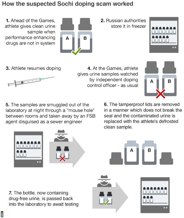
I am on holiday for a few days and am visiting Philadelphia. So what better time to cover some Philadelphia-made content? This interactive piece came out last year from Philly.com alongside coverage of the Philadelphia mayoral contest.

Where the cops live
Where the cops live

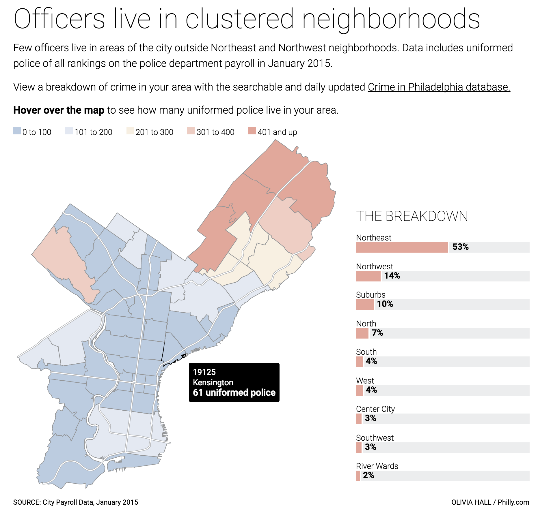
I want to call out the colour palette for the choropleth in particular. We can see a blue to red system with a stop at yellow in the middle—a divergent palette. With this kind of a setup, I would expect that yellow or the light blue to be zero or otherwise straddle the point of divergence. Instead we have dark blue meaning 0 and dark red meaning 401+. The palette confuses me. It could be that the point of divergence—something around the 200 number—could be significant. It could be the city average, an agreed upon number for good neighbourhood relations, or something. But there is no indication of that in the graphic.

Secondly the colour choice itself. I often hesitate using red (and green) because of the often-made Western connotation with bad. Blue here, it works very well with the concept of the thin blue line, NYPD blue, blue-shirted police. If we assume that there is a rationale for the divergent palette, I would probably place the blue on the high-end of the spectrum and a different colour at the negative end.

Lastly, from the perspective of the layout, Philly has a weird shape. And so that means between the bar chart to the right and the city map on the left the piece contains an awkward negative space. The map could be adjusted to make better use of the space by pointing north somewhere other than up.—why is north up?—to align the Delaware River with the bars. Or, the bars could abut West Philly.

The interactions, however, are very smooth. And a nice subtle touch that orients the reader without distracting them is the inclusion of the main roads, e.g. Broad Street. The white lines are sufficiently thin to not distract from the overall piece.

Credit for the piece goes to Olivia Hall.

President Bloomberg?

I am not watching the conventions for the first time I can recall, because no cable television. But, I am occasionally dipping into live feed coverage. And while Michael Bloomberg spoke FiveThirtyEight linked to a few pieces of content they published earlier. I covered one about candidates abandoning the middle ground earlier. But this one I had skipped. It looked at the possibility of Michael Bloomberg stepping into the White House as president.

If Bloomberg ran, Election Night 2016

Credit for the piece goes to the FiveThirtyEight graphics department.

Timeline of Recent French Terrorism Attacks

Yesterday the French Catholic community of Rouen was attacked by an alleged IS terror group. In the aftermath the BBC put together a graphic published inside a broader piece. The graphic documented the recent history of terror attacks in France.

When you read or scroll through the overall piece, a bit more symmetry could be added by aligning dates to the central column. That would make the dates more easily comparable. Though it should be noted the important point is made by the rapid clustering of events in the most recent time period.

And for a personal quibble, I believe that timelines are more effective when the most recent date is at the top. Presume the timeline starts in the 1950s during the middle of the Algerian War fought between France and Algeria, which at the time was an integral part of France. Would we want to read all those incidents from the 1950s and 60s? Likely no. Instead, we could scroll down the entirety of the piece. Here, however, we start in the relative calm of 2012, 2013, and early 2014.

Timeline of terror attacks in France

Credit for the piece goes to the BBC graphics department.

National Heights

And by this title I am not referencing McKinleys, K2s, or Everests. No, the BBC published this piece on the changing average heights of citizens of various countries. This was the graphic they used from the report’s author.

National heights of people

Personally speaking, I do not care for the graphic. It is unclear and puts undue emphasis on the 1914 figure by placing the illustration in the foreground as well as in the darkest colour. I took a thirty-minute stab at re-designing the graphic and have this to offer.

A comparison of the six heights

While I admit that it is far from the sexiest graphic, I think it does a better job of showing the growth than decline of national heights by each sex in each of these three select countries. Plus, we have the advantage of not needing to account for the flag emblems. Note how the black bars of Egypt disappear into the black illustration of the person.

Credit for the piece goes to the eLife graphics department.

Bye Bye, Yahoo

Happy Monday, all. Some big news stories going on today, but I wanted to take a look at this piece from the New York Times. They report on the sale of Yahoo to Verizon for almost $5 billion via a piece that takes short written analysis and blends it with clear and concise charting. The effect is a quickly digestible, but data-driven content piece.

The shares are falling, the shares are falling

Credit for the piece goes to Karl Russell.

Hillary Clinton’s E-mail Problem

Today Donald Trump should take the stage at the Republican National Convention as he accepts the party’s nomination to run for president. I suspect he will mention Crooked Hillary and quite possibly her e-mails. Thankfully, we have this Washington Post piece from earlier this month that examines the severity of her lapses in security.

Fractions of fractions of e-mails

Credit for the piece goes to Lazaro Gamio.

Covering Terrorism

Last week we witnessed the lorry attack in Nice, France. This week we have the axeman attack on a German train. Does anybody note, however, the recent terror attacks in Dhaka, Bangladesh? Probably not, according to this insightful piece from FiveThirtyEight. They took a look at journalism’s coverage of terror attacks and whether there are discrepancies based on geography. Turns out that yes, there are. But, the article does make a point to note some reasons why that might be. One, we have covered it a lot more often since 11 September 2001. Anyway, the whole piece is worth a read.

All countries are equal, but some are more equal than others

Credit for the piece goes to the FiveThirtyEight graphics department.

In Putin’s Russia Steroids Dope You

I mean really, given the rampant and pervasive nature of the Russian state-aided doping programme, how could I not use the Russian reversal? Yesterday WADA, the international anti-doping agency, released its findings on Russian doping at the Olympics. And, suffice it to say, the report is rather damning. The BBC published this graphic in an article to help demonstrate the scheme.

How it all worked
How it all worked

Unlike the evidence of doping, I find the graphic itself lacking. More could have been done to create more consistent type. Text justification ranges (pun intended) from left to right, without any clear system. Why do some stages, e.g. four, align to the right and then others, e.g. seven, align to the left?

Also, I believe more could have been done with the illustrations, in particular the bottles labelled A and B, to better differentiate between a clean sample and a contaminated sample. Why, for instance, does Step 1 include both an A and a B when it mentions only one sample?

In short, the story certainly warrants explanatory graphics, especially as to how the sealed lids were removed, but this piece is not the solution (pun also intended).

Credit for the piece goes to the BBC graphics department.

Septa’s Silverliner Service Shutdown

Two weeks ago Philadelphia regional rail commuters, a large group to which I belonged for a number of years, experienced a week from hell. On 2 July a yard inspector for Septa, the Philadelphia region’s transit agency, discovered a Silverliner V railcar tilting. For those not familiar with Septa, the Silverliner Vs have been in service for only three years and have been long touted as the future of the Philadelphia commuter rail service. After inspection Septa discovered the tilting railcar suffered from a fatigue crack on the equaliser beam, specifically where it was welded to connect to the wheel bearings. The beam forms part of the truck, which is what connects the railcar to the rails, and any failure at speed could have resulted in an accident, possibly a derailment. The transit agency then quickly inspected the remainder of its fleet of 120 Silverliner Vs. It found the same fatigue crack in a total of 115 cars. By 4 July, Septa pulled all 120 Silverliner Vs from service.

The equaliser beam connects the wheels to the passenger car

So what happened? At this point, we do not know. Septa continues tests to discover just what happened and just what can be done to repair the cars. Because, with a fleet of approximately 400 cars, the Silverliner Vs represent 1/3 of the fleet. And with fewer seats and fewer trains, commuters attempting to ride into the city, particularly from nearer-in suburbs, find trains bypassing stations because they quickly reach capacity.

The additional passenger railcars from other regional transit agencies will make little difference

Consequently, Septa has instituted a reduced service—a modification of the Saturday service—with additional service on subways and other high-speed lines. Additionally, Septa has agreed to lease additional trainsets, i.e. locomotives with passenger cars, from other regional transit agencies: Amtrak, New Jersey Transit (NJ Transit), and the Maryland Area Regional Commuter Train Service (MARC).