Analysing the World’s Flags

Flags are cool. And I will openly admit I may have designed several of my own over the years. So thanks to my good friend for pointing me in the direction of this project from ferdio that breaks down flags across the world. If you are at all curious about how many flags use particular colours, shapes, sizes, you need not go any further.

The representative flag of the world

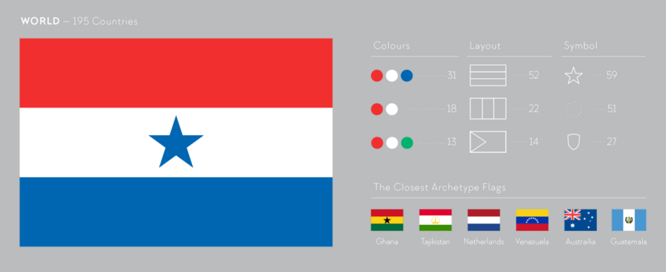
Credit for the piece goes to ferdio.

Nova Beats the Buzzer

As you may know, while I presently live in Chicago, I hail from Philadelphia. I grew up there and most of my best mates did too. And some of them attended a small school called Villanova. And as you may know, their men’s basketball programme just won the national championship in dramatic fashion. So today’s post shares with you a graphic from the Wall Street Journal that explains how Villanova won the game in the final few seconds.

The final shot won it all

Credit for the piece goes to the Wall Street Journal graphics department.

Merging Alaska Airlines and Virgin America

Alaska Airlines and Virgin America made some news the past few days when they announced Alaska would purchase Virgin America for $2.6 billion. I mapped out the flight routes of the two carriers to see where they overlapped. You can see the results in my piece for the blog today below.

A brief look at the merger of Alaska Airlines and Virgin America

Credit for the work is mine, except the underlying map, which I sourced from Brigham Young University Geography Department.

China’s New Islands

Okay, so the title might be a bit hyperbolic, but the point that China has spent the last few years expanding minor reefs into major military installations still stands. This New York Times piece is a few months old at this point, but through a combination of maps, photography, and diagrams, it illustrates what has been going on in the South China Sea.

Fiery Cross Reef
Fiery Cross Reef

The screenshot above is of the first still in a short time lapse video introducing the article If you do not have the time to read the entirety of the piece, just watch the video. A lot can happen in one year.

Credit for the piece goes to Derek Watkins.

The Cherry Blossoms Are Coming

It’s cherry blossom time in Washington. So the Washington Post has a nice piece—appropriately coloured—looking at where the different varietals are within and near the Tidal Basin.

Where the cherry trees are

Credit for the piece goes to Emily Chow and Dakota Fine.

The Franco–Belgian Terror Network

The terror attacks in Paris and Brussels were bad. But even worse? The two attacks exposed a network of IS terrorists living within the Schengen Area. Are there cells or even other networks? One way of uncovering them would be to examine the links between the known terrorists and see if additional nodes appear at the network’s fringes. Given Friday’s piece from the New York times examining the links between the known terrorists, investigators in Europe are likely doing just that.

Looking at the terrorists' network
Looking at the terrorists’ network

Credit for the piece goes to Larry Buchanan, Haeyoun Park, Sarah Almukhtar, Josh Keller, Sergio Peçanha, and Tim Wallace.

The Middle Class is Getting Poorer

At least relatively speaking. Today’s post is a Bloomberg article comprised primarily of charts with pithy titles summarising the data story. If listicle is a word for articles consisting of the Top-10 things about [whatever], do we start embracing charticle as the word for chart-driven stories? Even if we do, we should take note that this piece was not the work of one person, but four.

The Middle Class' share of wealth
The Middle Class’ share of wealth

The story captures my attention to and dovetails nicely into yesterday’s piece about a possible electoral path for Donald Trump to take the White House later this autumn.

Bonus points for the responsive nature of the post.

Credit for the piece goes to Andre Tartar, Mira Rojanasakul, Jeremy Diamond, and John Fraher.

Brussels Airport

I have only ever been to Brussels once and that was only to the airport for a brief layover whilst en route to Vilnius for work. I flew Brussels Airlines for the European segment of the trip and I snagged these photos from the in-flight magazine. Felt appropriate today.

The types of aircraft Brussels Airlines flew at the time
The seating options on Brussels Airlines flights
The layout of Brussels Airport

Unfortunately it was a short layover and I was exhausted from the flight, so I never had the opportunity to take photographs of the interior wayfinding and graphics.

Credit for the pieces goes to the Brussels Airlines graphics department.

Party Demographics

Alas, these are not the fun type of parties, but the two main US political ones. But overall, before some more primary and caucus votes tomorrow, I think this Wall Street Journal piece nicely captures and illustrates the changes in and the differences between the bases of the two parties.

The makeup of the two large US political parties

Credit for the piece goes to the Wall Street Journal graphics department.