A Royal Nation

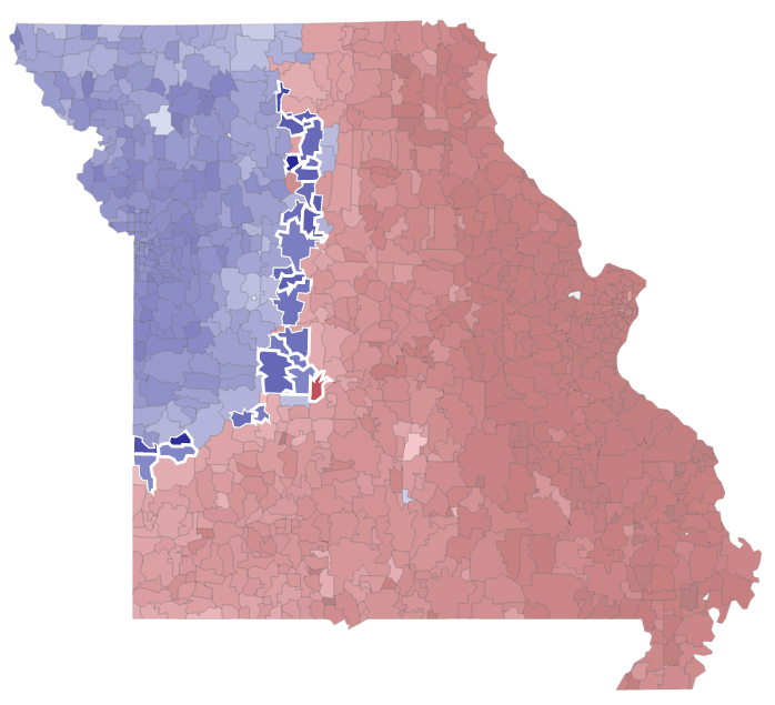
You may recall a year and a half ago a post I wrote up about a New York Times piece looking at the fandoms of baseball in the United States. Well fresh off their hometown Royals’ World Series victory, the folks at the Kansas City Star revisited the graphic—driven by Facebook likes—to see if there had been any change. Sure enough, Royals Nation—or whatever they call it—has made inroads into what was before St. Louis Cardinals territory.

Missouri is a little more blue these days

The only sad part about the article is that they talk of changes in adjacent states, e.g. Kansas, but have no maps for those.

Credit for the piece goes to Jay Pilgreen.

Friday Night in Paris

So Paris happened. But the question is how exactly? Thankfully the New York Times are on it as they try to explain Friday night.

A diagram of the events inside Bataclan theatre

Worth pointing out the list of credits below. Clearly the piece was a team effort.

Credit for the piece goes to Gregor Aisch, Wilson Andrews, Larry Buchanan, Jennifer Daniel, Ford Fessenden, Evan Grothjan, K.K. Rebecca Lai, Haeyoun Park, Yuliya Parshina-Kottas, Graham Roberts, Julie Shaver, Patrick J. Smith, Tim Wallace, Derek Watkins, Jeremy White, and Karen Yourish.

Making Sense of the Syrian Civil War

Well, I mean trying to is this piece by the Washington Post. Included are several diagrams at key phases of the conflict that attempt to show how the various parties interacted with each other.

Look at all the actors on stage…

Ultimately the key takeaway is that Syria is a mess and it is not getting any better. So let’s just add some more lines in there, am I right?

Credit for the piece goes to Denise Lu and Gene Thorp.

Job Gains

You should all know by now I am sucker for small multiples. So it should come as no surprise to you that I liked this piece from Friday from the Wall Street Journal. It looks at payroll and wage growth across various sectors in the American economy. And what I really like is that they took a space at the beginning to explain how to read the charts.

Mining, not so good
Mining, not so good

Credit for the piece goes to the Wall Street Journal graphics department.

The Future of Climate Change

At the end of the month the world will gather in Paris, France for the next round of climate change talks. In advance of the talks, the Financial Times put together this model of how emissions reductions will help—or not—get climate change under control. The piece is two-fold. The first is a ten-step narrative that showcases the tool’s split of the time series into short-, medium-, and long-term impacts and how those work in the best and worst case scenarios. But it then allows the user to jump right on in and create their own scenarios.

Is it getting hot out there?

Credit for the piece goes to John Burn-Murdoch and Pilita Clark.

Redesigning the Turkish Election Results

Turkey held its elections over the weekend. And so on the way to work this morning I decided to check the results on the BBC. And I saw this graphic—screenshot from my phone.

The BBC results
The BBC results

So I decided to scrap today’s blog post and instead spend all of five minutes tweaking this to make it a bit clearer. Or, a lot clearer. Simple little tweaks can make all the difference in data clarity. Now you can visually see the scale of difference in the votes. You also don’t need to refer to a legend off to the side with tints of the same colour.

My results with their data

Credit for the original piece goes to the BBC graphics department.

Paul Ryan is Your New Speaker

Paul Ryan is about to takeover for John Boehner as Speaker of the House. So the Washington Post put together a nice graphic-featuring article about how Ryan compares to previous speakers—turns out he is fairly young. But the end of the piece uses this graphic to look at the number of days, i.e. experience, each speaker had prior to taking the role.

But try comparing him to someone other than Boehner…

By putting the dots around a circle, the Post has created an interesting graphic. But the format makes it difficult to compare individuals who are not close together.

Credit for the piece goes to Philip Bump.

English Votes for English Laws

Last week the British government announced plans to solve the West Lothian Question that centres on devolution parity for England. Many legislative powers have been devolved from London and given to the regional parliaments in Scotland, Wales, and Northern Ireland. And on the one hand that is great as the national parliament no longer tells Scottish schools what to do, which is important because of England’s clout in London because England is by far the largest part of the Union. But the on the other hand, Scottish, Welsh, and Northern Irish MPs still get to vote on schools in England. You can begin to see how the English feel that is unfair.

So the BBC put together this graphic trying to explain what was announced, because it is far more complicated than just giving England its own parliament. It’s a tricky and complicated issue that is worth a read. If only because the government apparently did not realise that its plan can be acronymised to EVEL.

It's EVEL I tell you. Pure EVEL.
It’s EVEL I tell you. Pure EVEL.

Credit for the piece goes to the BBC graphics department.