If you guys have not yet figured out, I am a baseball guy. But that is pretty much my only sport. And so maybe you can help explain to me just what is going on in today’s piece from the Boston Globe. I think it is attempting to explain hockey formations for the Boston Bruins.
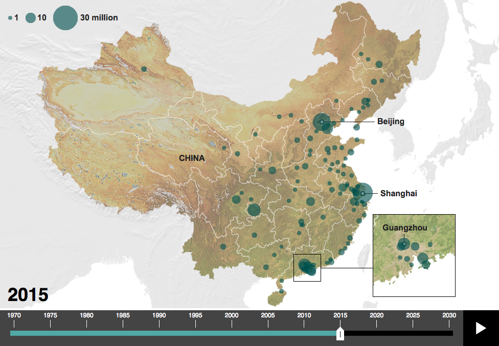
With Xi Jinping visiting the United States the BBC published an article looking at China’s changes over the years. In general, I don’t like the article—why are they using pigs to look at pork consumption? My general dislike aside, they do have a map that plots urban centres with more than one million people and how that map has changed since 1970 and will change out to 2030.
Urban centres with more than a million people
I probably would not have used that terrain map as the background as blue-green circles on the green coast are a bit difficult to read. A lost opportunity of a sort—assuming it is possible at all—is to use a satellite image of China for each year and overlay the circles on that. One can only imagine that China’s urbanisation has gone together with drastic changes to the landscape.
Credit for the piece goes to the BBC graphics department.
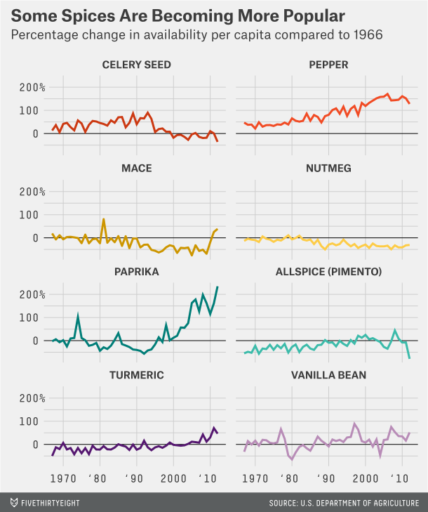
Here is a post for all you cooks and bakers out there: spices. Over the weekend I came upon a piece FiveThirtyEight ran earlier this year about American spice consumption. They use spice availability as a proxy for consumption, because no such data exists—and unfortunately the standard for reporting changed in 2012 so data is only available until then. But the piece uses some nice small multiples and a combined line chart to show some changes. Of note is the decision not to include ginger in the first, most likely because its scale would distort the rest of the chart. Anyway, if you are hungry, probably a good idea not to check this out.
How some spices have changed
Credit for the piece goes to the FiveThirtyEight graphics department.
11 candidates. 9 authors. (That would be the sub-title if my blog had sub-titles.)
I do not have cable and so watching the debate live was not an option. Instead, I rely upon post-debate coverage to understand who said what and to whom. Usually that means an article with some video clips. But this piece from the Washington Post looks at the debate by the numbers.
The Wheel of Trump
What is worth pointing out is not Trump’s hair, but the credit list below. That is nine people who had to contribute to one article, which relies both on reporting and data, on text and images, and none of it is interactive. That list is not all reporters, you have a mixture of reporters, designers, and illustrators working together to produce some quality content. And while the piece was planned—how could it not have been—it still went live within probably hours of the debate as its publish date was the same date as the debate. Sometimes people think that smart, clear graphics are simple and easy to produce. Well, not always.
The graphic itself has two nice features worth mentioning specifically. One, the use of HTML text in the graphic. That makes the text searchable and more importantly rendered by the browser on the page instead of relying upon image export quality. The second is that this piece relies on two colours: black and red. Tints of both allow the entirety of the story to be told. Each candidate is represented by the same red without need for ROYGBIV+.
Credit for the piece goes to Bonnie Berkowitz, Kat Downs, Samuel Granados, Richard Johnson, Ted Mellnik, Katie Park, Kevin Schaul, Shelly Tan, and Kevin Uhrmacher.
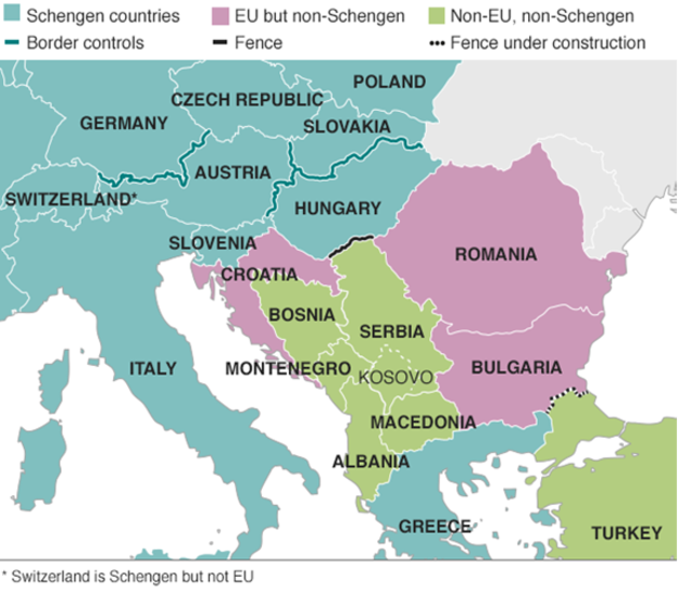
Last week we looked at a map produced by the Washington Post, which detailed the routes chosen by migrants and refugees desiring to reach the European Union. This week, I want to compare that to one from the BBC—there are others, even from the BBC, but we will examine them later—that details the differences in countries along the route.
EU border map
The previous map simply highlighted countries in the Schengen Area, which allows for Passport-free travel between participating EU members. This map uses colour to denote which countries participate and whether they belong in the EU. But it also uses white lines to indicate border, so that Schengen Area countries seem more contiguous. This allows them to use colour to add the layer of recent news: recently imposed border controls and newly constructed fences. My concern in this particular piece is that those pink and green countries should probably have some sort of line indicating that they do have border controls.
Credit for the piece goes to the BBC graphics department.
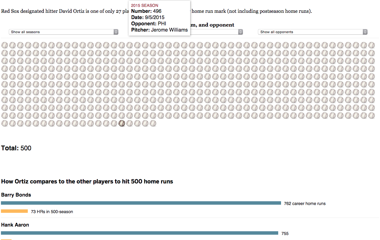
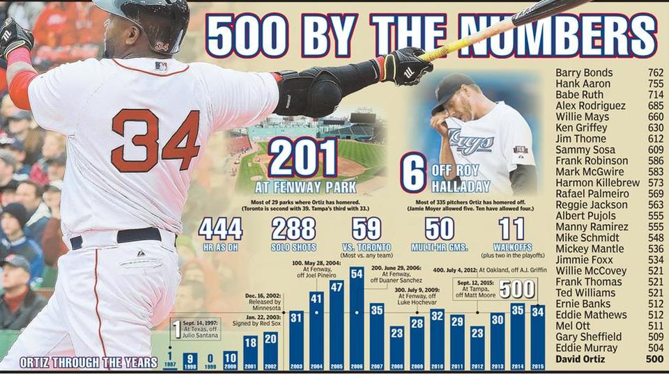
So what I was saying yesterday about there not being a new Boston Globe piece about David Ortiz’s 500 home runs. I was wrong. I missed it. But, here you go, in its semi-splendour (not digging the illustration of the baseballs /quibble). There are some merits to the piece in terms of the filtering—you can by season, opponent, or the teams for which Ortiz played (only 58 for the Twins)—but let us not lose fact of the fact that this is all about No. 500.
I have seen a few in my years, including that one.
This past weekend, David Ortiz hit his 500th home run, a significant milestone in Major League Baseball attained only by a handful of players. This piece from the Boston Herald commemorates the feat—with too many photographs and embellishment for my liking—by putting his season totals on a timeline while putting Ortiz at the bottom of the 500+ home run club.
The timeline of the home runs
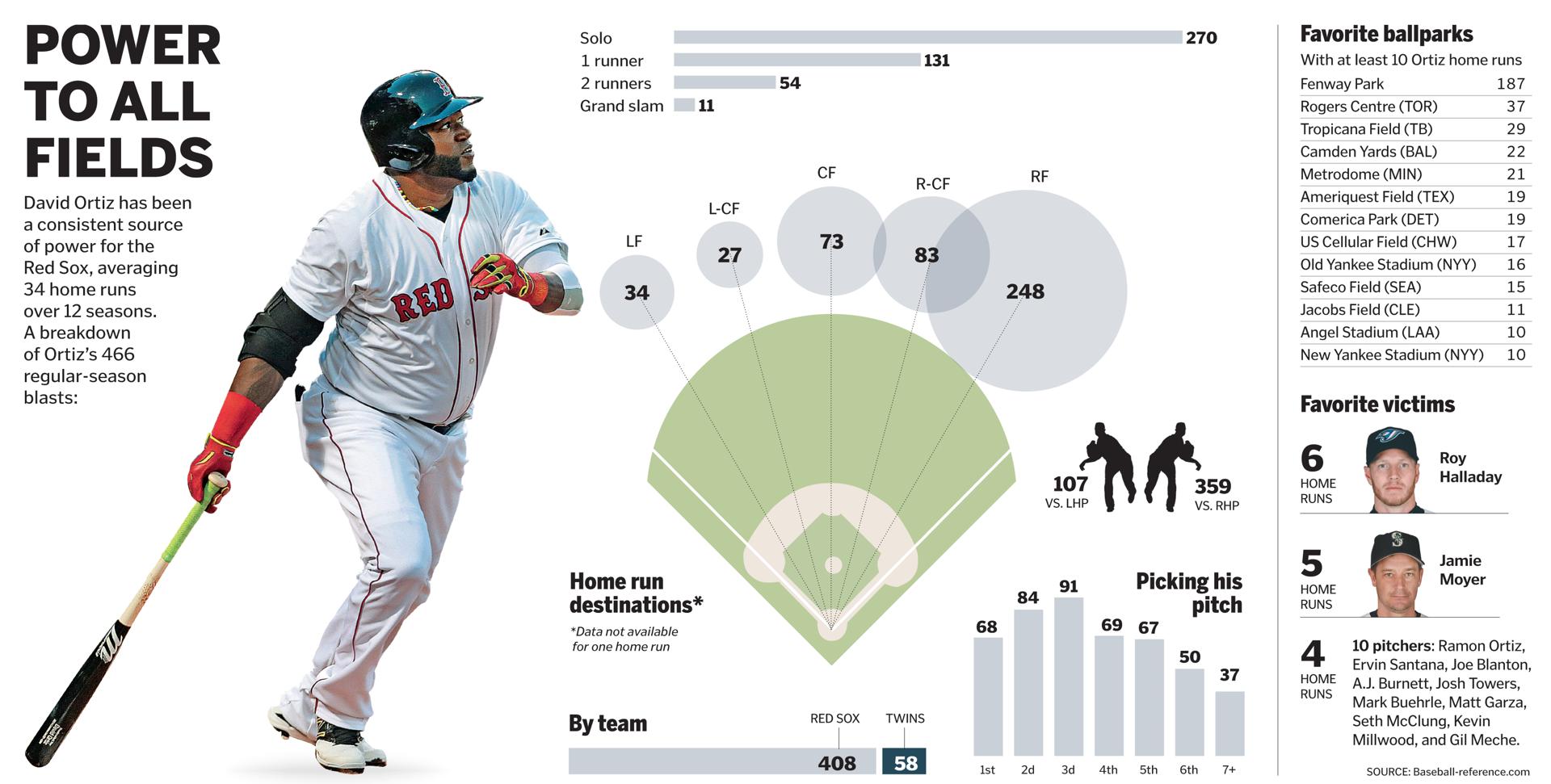
The following piece dates from April 2015 and was about the impact of defensive shifting on Ortiz, but it has a nice graphic on his home run output. It’s just outdated by most of this season. But, from a data viusalisation standpoint, I find it a far more useful and telling graphic.
A look at Ortiz’s home runs
Credit for the Boston Herald piece goes to Jon Couture.
Credit for the Boston Globe piece goes to the Boston Globe graphics department.
I’m Irish—my ancestors were from the southern part—and so I grew up Catholic and I went to Catholic schools. So I know some of my Jesus stories. There’s that one story about how at the end of some guy’s life he looks back at a beach—I have no idea what life means being on a beach—where he walked. He sees two sets of footprints and asks Jesus, “Bro, why are there two sets?”
“Dude bro, that’s me.”
“Whoa, then why are there sometimes only one set?”
“That’s when I carried you.”
My interpretation of Jesus speech notwithstanding, it’s one of those stories that is supposed to teach you that you are not alone. Probably because the thought of being a random event in the entire series of random events in the universe(s?) frightens people. Anyway, Randall Munroe over at xkcd took a look at the footprints story. Happy Friday, all. (And you too, bro. That’s right, I’m looking at you, Jesus.)
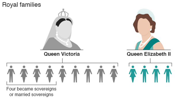
Following on from yesterday’s post about Queen Elizabeth’s timeline as she passed Queen Victoria, today we have another selection from the BBC that compares the reigns of the two queens. Unfortunately, while the screenshot below is okay, the overall graphics and illustrations strike me as a bit too simple and not terribly useful in making comparisons.
The royal families
Credit for the piece goes to the BBC graphics department.
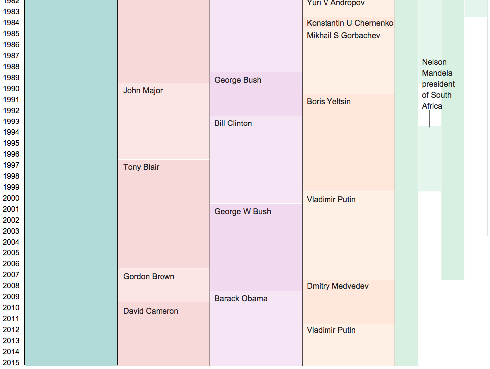
As of today, Queen Elizabeth is the longest reigning British monarch. She has surpassed the record of the famous Queen Victoria, Elizabeth’s great-great-grandmother at 63 years and seven months. Obviously a lot of things have changed over those 63 years, and in this article the BBC uses a graphic to look at how the world stage has changed.
Queen Elizabeth II’s reign
Credit for the piece goes to the BBC graphics department.