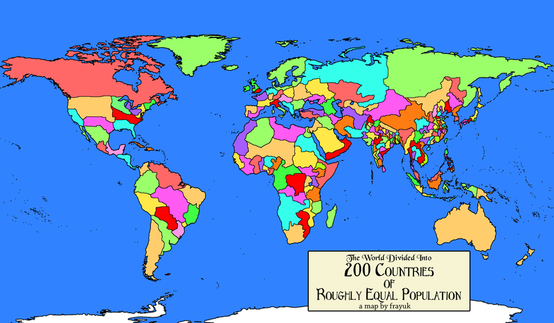
Well, thanks to a reddit editor frayuk, via a nice post on Vox, we now can look at what that world would look like. It’s a bit difficult to see some of the details, but click through to the Vox piece to see just those.
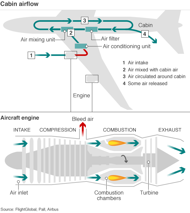
Today’s post looks at an illustration from the BBC about aircraft cabin flow. As I have flown on four aircraft in the last month—quite a lot for me—I do recall thinking during one particular flight just where the air intakes were on the aircraft. It never dawned on me that they were in the actual engines themselves.
Air flow diagram for an aircraft
I think from a design side the only thing I would change is the width of the line for the airflow. That would show how while some is released, replacement air comes from the air mixing unit.
Credit for the piece goes to the BBC graphics department.
I read this piece quite some time ago. But, the other night at the bar, I ended up drawing it to explain the concept to people. So, I figured I would share the original. The whole post is worth the read.
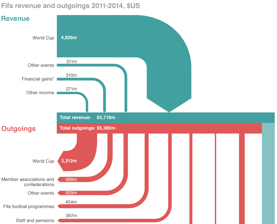
If you did not hear about it the other day, the head of FIFA resigned. That is kind of a big deal because football (in the rest-of-the-world sense of the word) is kind of a big deal. But the organisation that runs it is generally seen as wholly corrupt. So this BBC piece takes a look at the revenue and spending—at least so far as we know about it.
Sort of a Sankey diagram
Credit for the piece goes to the BBC graphics department.
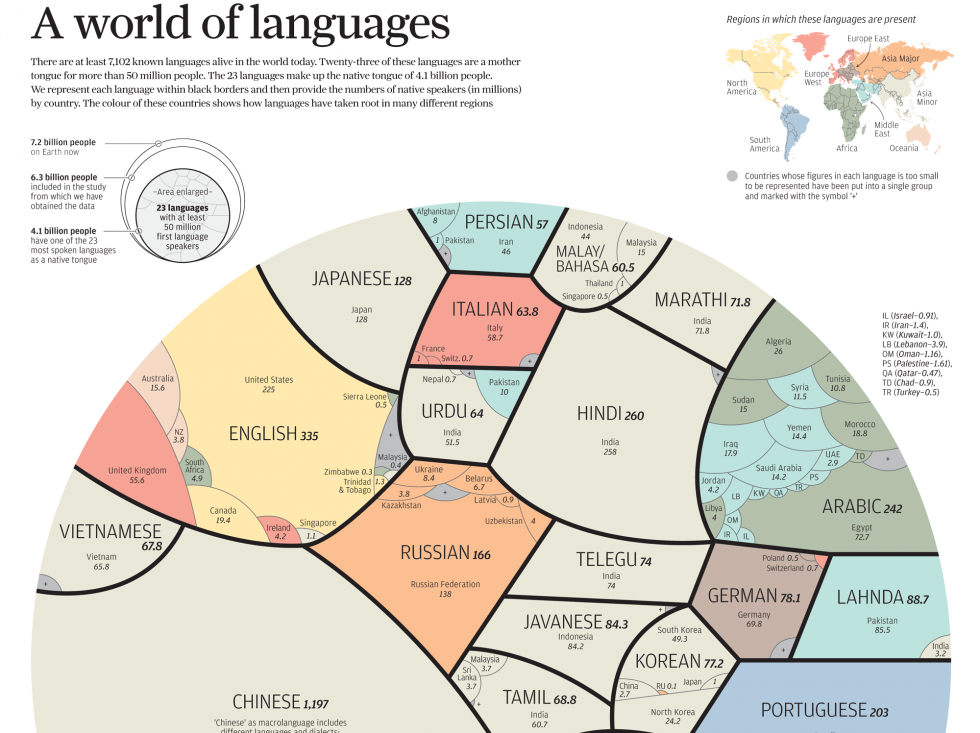
Today’s post looks at an infographic from the South China Morning Post. The graphic in question looks at languages and how many speak them. Specifically, the graphic narrows the focus down to those native languages spoken by 50+ million people, of which there are 23 spoken by a combined 4.1 billion people out of the world’s 7.2 billion inhabitants.
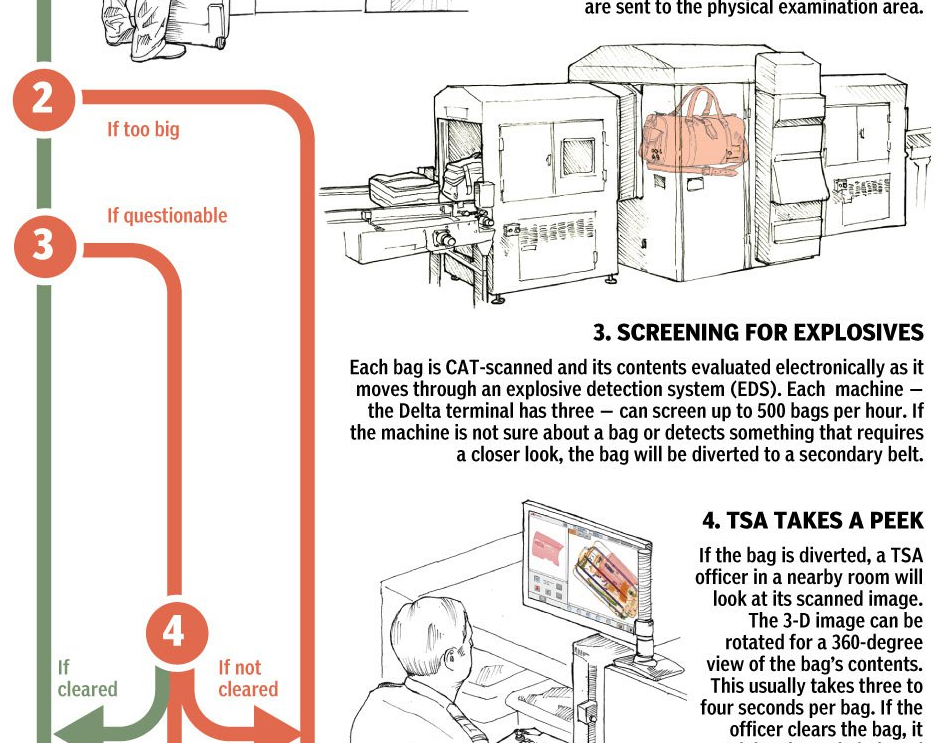
Another weekend, another weekend trip. This time I’m flying to Philadelphia for a quick trip back home. Naturally, I’m going to pack a suitcase so I can bring some things back to Chicago from civilisation. But what happens to my luggage between my checking it and it being loaded onto the aircraft? Thanks to the National Post, we have a graphic to explain just that.
Flow chart for your luggage
Credit for the piece goes to Bonnie Berkowitz and Alberto Cuadra.
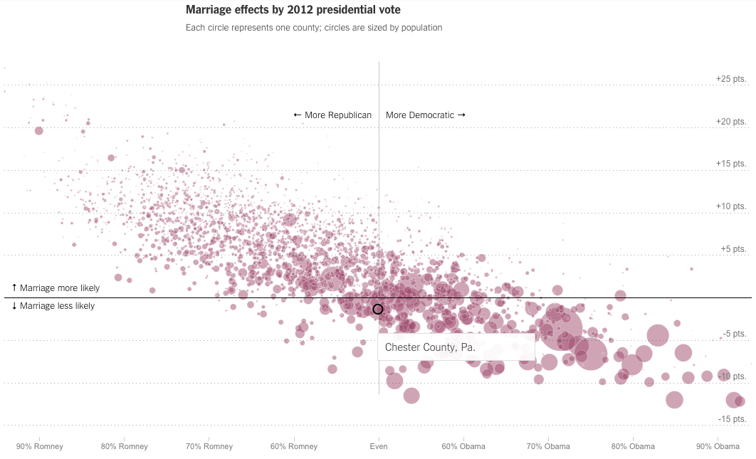
Last week we looked at the New York Times piece on where you grew up’s impact on future income. This week, we look at their follow-on piece, how your hometown impacts your odds of getting married. The piece includes some nice interactive choropleth maps, but my favourite part is the scatter plot correlating politics (as determined by 2012 election votes) to marriage. My hometown (‘s county) is highlighted in the screenshot below.
Chester Co., PA is almost even politically, but slightly less likely to marry
Credit for the piece goes to David Leonhardt and Kevin Quealy.
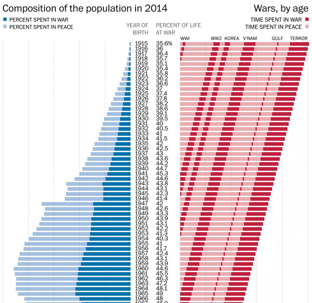
Monday was Memorial Day here in the States. As a millennial, that means I have spent nearly most of my life in wartime. Today’s post looks at a graphic from the Washington Post that explains how anybody born after 2001 has spent the entirety of their life in wartime. Before then, however, and the numbers get fuzzier, because of the subjective nature of when the United States has been at war. But, given the undercounting in the article—as it notes—it is safe to say that the percentages visualised are low.
Lifetimes at war
Credit for the piece goes to the Washington Post graphics department.
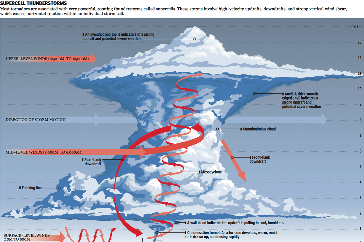
I just returned from my trip to Kansas City last night. Kansas, if you did not know it, exists within what people call Tornado Alley. That means they receive a lot of tornadoes. But what are tornadoes beyond the plot points of mid-90s action films? Basically complicated micro-weather systems. So complicated we still don’t entirely understand them. But the National Post looks at explaining what we do know.
Inside a tornado
Credit for the piece goes to Andrew Barr and Mike Faille.
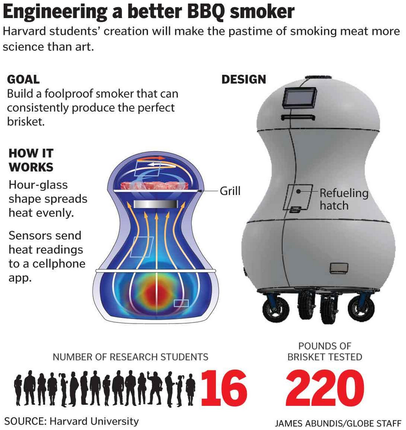
I’m off to Kansas City this evening for Memorial Day Weekend. There, I fully intend to at least try some legitimate Kansas City barbecue. But how does this relate to a blog on information design and data visualisation? Well, some folks at Harvard endeavoured to design a better smoker for barbecue. Thanks, science.