It’s Melting! It’s Melting!

Spring has finally arrived. And that means that far to your humble author’s north, the sea ice in the Arctic is beginning to recede from its annual maximum coverage. However, this year’s coverage was the smallest since satellite records began in 1979. The New York Times covers the story in a nice article with two big data pieces. The first is a really nice map—not shown—that looks at this year’s coverage compared to average extents.

The really nice part, however, is a line chart of historical ice coverage from 1979 through to the current date. While the piece is not interactive, the annotations in the graphic do a nice job explaining the different lines and outliers. Overall, a solid piece.

Annual cycle of Arctic ice coverage

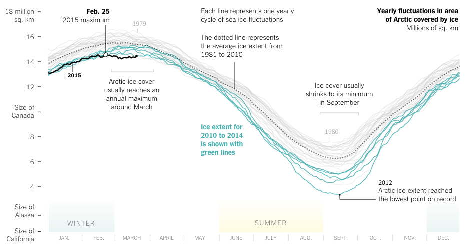
Credit for the piece goes to Derek Watkins.

British Parliament Timeline

For those of you who don’t know, the British Parliament was dissolved today ahead of the 7 May elections. In other words, it is now election time. Last week the Economist published a small interactive piece that allows you to look at the composition of the British Parliament from 1870 through today.

Parliament over the years

While many (some?) of us would remember times from recent history, e.g. the 1997 electoral victory of Tony Blair, the memory might be a bit foggier one hundred years in the past. But to help you, if you click on a particular year, the view changes from an overview to a focus on Parliament in that particular year.

Parliament in 1915
Parliament in 1915

Credit for the piece goes to the Economist’s Data Team.

Yemen’s Tangled Web

Did you see the news about Saudi Arabia bombing Yemen. Are you confused about what is going on in Yemen? And how that relates to what is going on in Iraq? And the rest of the Middle East? Well, so am I. But, I also only had time to research and work on one graphic last night. So, today we look at Yemen. And as my graphic attempts to explain, it is a bit of mess.

Yemen's tangled web
Yemen’s tangled web

Germanwings Flight 4U 9525

Yesterday an Airbus A320 operated by Germanwings, a subsidiary of Lufthansa, crashed in the French Alps with no survivors. This morning, I am showing the two best graphics I have come across thus far attempting to explain just what happened.

The first is from the New York Times. In a series of maps, it points out through satellite photography the roughness of the terrain and therefore the difficulty likely to be experienced by recovery crews. The final line chart plots the altitude of the flight, which fell from a cruising altitude of 38,000 feet to just over 6,000 feet in eight minutes. Overall, especially given the limited amount of information that we currently possess, not a bad piece.

The New York Times' explainer map
The New York Times’ explainer map

The second comes to us from the Washington Post. What I enjoy about this piece is that it combines the altitude chart with the map. This gives a bit context to the fact that despite being still 6,000 feet above sea level, the aircraft was in fact flying into the high mountains of the Alps.

The Washington Post's explainer map
The Washington Post’s explainer map

Credit for the New York Times piece goes to the New York Times graphics department. And credit for the Washington Post piece goes to Gene Thorp and Richard Johnson.

Lee Kuan Yew Built Modern Singapore

Lee Kuan Yew died this weekend. He is lately responsible for designing and implementing the policies that transformed Singapore from a poor fishing village to a commercial hub. The transformation came at a price of course. Singapore enjoys limited free speech and the country is effectively a one-party state, with the one party now controlled by Lee Kuan Yew’s son. Regardless of the faults, the transformation itself is remarkable. And the Economist put together a timeline to showcase that.

The Life of Lee Kuan Yew and Singapore's development
The Life of Lee Kuan Yew and Singapore’s development

Credit for the piece goes to the Economist’s graphics department.

The UK’s Genetic Clusters

I always enjoy the combination of two of my interests: data visualisation and genealogy. So this BBC article that references a Nature article piqued my interest. It looks at the distribution of DNA across the United Kingdom and identifies different cluster areas. The most important finding is that the Celts, i.e. the people of Scotland, Northern Ireland, Wales, and Cornwall are not a single genetic group. Another finding of interest to me is that the people of Devon are distinct from both Cornwall and Dorset, Devon’s bordering regions. That interest is because my New England ancestors largely hailed from Devon and Dorset.

The colours don't imply relationships, for what it's worth
The colours don’t imply relationships, for what it’s worth

Credit for the piece goes to the Nature article authors.

Tree Maps

Spring is the time for the blossoming of cherry trees. Philadelphia has its own cherry blossom festival, but Washington’s is even bigger. The Washington Post put together a small infographic about the the trees, the symbolism, and the reason behind the presence of Japanese trees in the capital of the United States.

But, mostly I get to say we have a good example of a tree map.

Tree map
Tree map

Credit for the piece goes to Samuel Granados.

Happy St. Patrick’s Day

I am unabashedly Irish-American. So, Happy St. Patrick’s Day. But, I am not the only Irish-American in America. In 2013, Trulia put together a post about the Irish in America using US Census Bureau’s American Community Survey data. The post also links to an interactive map looking at US counties by their self-reporting Irish-ness. Not surprisingly, the Northeast is the most Irish, Philadelphia is the 8th largest metro area at 14.2%.

Chester County
Chester County

Credit for the piece goes to Trulia.

Boston’s Snowy 2015

Boston has finally had it. And by it I mean the snowfall that broke the record. And by record I mean the record for the most snowfall in a year. Well, at least since they started recording it in 1872. The Washington Post has a nice chart placing the season not just in context, but also showing how quickly the snow fell. Most of the snow has fallen only from 25 January onward. And winter is not yet over.

DC is puny compared to  Boston

Credit for the piece goes to Kevin Uhrmacher.

Rainbowship Enterprise

You can rightly file this one under what the fuck, which is how I found it on WTF Visualizations. The piece appears to be some sort of comprehensive guide to minerals, nutrients, and in which foods you can find them. But, as the critique title declares, this is more like Rainbowship Enterprise. How this is supposed to be remotely useful, I cannot even begin to fathom. But, hey, the title references Star Trek, so that’s a redeeming characteristic, right? Oh wait, that was in the criticism…

Set your phasers to stun(ningly bad)

Credit for the original piece goes to Nuique and datadial.