America’s Most Popular Beers—And Almost All Are Crappy

Or so says Adweek. I would heartily disagree about their inclusion of Yuengling in their group of crappy. Though the other nineteen, yeah, I would tend to agree. Regardless, the infographic that sparked the Adweek post is quite blah. I do enjoy the illustrations of the bottles and labels, but the data visualisation below is weak.

The 20 best in table form

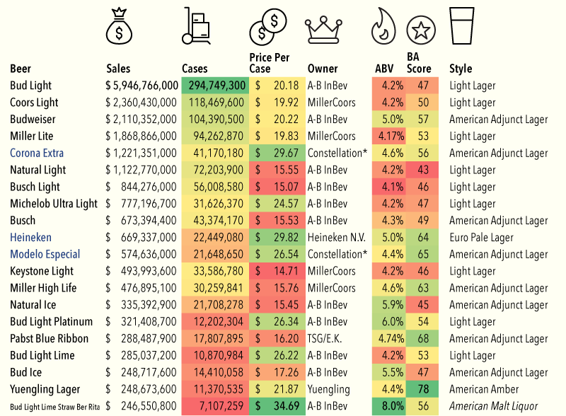
So because of Yuengling, I decided to take a quick stab at ways to improve it. My first finding in the data was that the different brands were assigned a Beer Advocate rating, and Yuengling rated the highest—though not terribly high overall. Still, unless you are looking to get drunk, it does offer a good taste/cost value among the consideration set.

Visualising some of the data

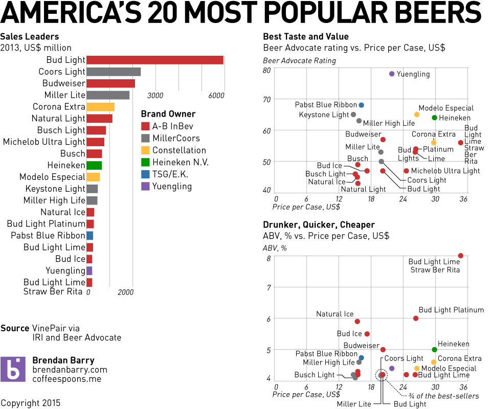
Credit for the infographic goes to VinePair.

The Disappearing Polish S

Today’s piece is not a chart, nor is it some complicated piece of data visualisation. Instead, we are looking at a piece from Medium that attempts to explain the disappearing Polish S. Basically, it is a roundabout way of saying that it is very difficult to type in foreign languages on American keyboards because of the additional letters and/or diacritics. If you are at all interested in typography, the article makes nice use of comparative photographs and highlighted colours in the alphabet to illustrate its case.

English vs. Polish alphabets

Credit for the piece goes to Marcin Wichary.

Chipotle and Calories

In my office, Chipotle is a popular fast-casual lunch choice. I am not sure, however, whether people would want to see today’s piece, an article from the New York Times about the nutritional value of a Chipotle meal. The piece makes good use of a few bar charts and nice photographs and table to explain how calorific a burrito there can be. Maybe I should be having a salad for lunch today…

Chipotle calories
Chipotle calories

Credit for the piece goes to Kevin Quealy, Amanda Cox, and Josh Katz.

A Year on Pluto

Last week, NASA’s Dawn probe entered orbit above Ceres, a dwarf planet in the asteroid belt. But later this summer, the New Horizons spacecraft is set to race past Pluto, formerly a planet but now a dwarf planet. New Horizons launched in 2006 and will have taken nine years to reach Pluto. But how long is a year on Pluto? Thanks to the New Horizons team, we can see how one year on Pluto is 248 Earth years, or longer than the history of the independent United States.

A year on Pluto
A year on Pluto

Credit for the piece goes to the NASA/New Horizon team graphics department.

American Football Videogames

This week we have been looking at baseball (and Leonard Nimoy’s Star Trek). Today, we are going to turn to a sport I know nothing about: American football video games. Okay, so video games are not really a sport, but they are based on a sport. The reason I bring it up? FiveThirtyEIght has a really nice two-article story on how the Madden game franchise uses ratings to build characters for the game.

Rate yourself
Rate yourself

The above graphic is an interactive part of the story that lets you compare yourself to the real sports people, as estimated by the video game company. The second article in the story then builds upon that by using a reporter as a basis to test/understand the ratings.

And pay attention to the sidebar content. It’s actually worth heeding for once.

Credit for the piece goes to Reuben Fischer-Baum.

Where to Catch Foul Balls

As we established yesterday, baseball is rumbling back to life with Spring Training. That means it is time to start buying tickets for games. But if, like me, you have never caught a foul ball or home run, you may want to sit in a location where you can optimise your chances. Where is that? Well, now we have an app for that, Ideal Seat, as covered by Time. It uses interactive maps of stadiums and data on where hit balls land to generate an average number of balls per game—an average of about 30 foul balls per game.

Safeco Field as a sample

Credit for the piece goes to Ideal Seat.

Baseball Is (Almost) Back

As the title says, baseball is almost back. Red Sox spring training games begin as the Red Sox take on Northeastern today. The off-season is perhaps the hardest part of the year for a fan, because unless you take super interest in trades, there is no baseball. But what about on Twitter? Well, today’s piece is an article from Fangraphs that looks at team-by-team off-season Twitter use.

Twitter engagement
Twitter engagement

Personally, I am not really a fan of the graphic. As a static image, it does not allow me to easily compare the different retweets or favourites. But, in the aggregate, you can see that the Seattle Mariners are perhaps the most active Twitter account.

Credit for the piece goes to Sean Dolinar.

He’s dead, Jim.

For those of you living beneath a Taurusan boulder, Leonard Nimoy died last week. He is perhaps best known—at least to me—for his role of Spock in Star Trek. Clearly your author is too young to have ever watched Star Trek during its original run. Instead, I belong to the next generation of Star Trek fans—the domain of Picard not Kirk. But, as I grew older, I could rent the original series films. And in the age of the Internet, I could watch the original series. And so I learned to appreciate the green-blooded, pointy-eared hobgoblin Spock. And through the new movie series, another generation can now enjoy Star Trek. But even then, we had Leonard Nimoy cameos to enjoy.

Well, as you can imagine, today’s piece is an infographic I found that looks at Star Trek the Original Series.

Star Trek
Star Trek

Credit for the piece goes to Olka Kirsanova and Natalya Platonova.

Understanding Genealogy

I came upon this piece a little while ago and realised that it in some ways paralleled my own interest in genealogy. Basically the story comes down to realising that you probably only know a mere fraction of the stories behind all the people who led up to you. To put in another context: “you’re the product of 127 romances, just in the last 200 years alone”. Anyway, the article is a nice read and explains the math with illustrations.

How the story starts

Credit for the piece goes to Tim Urban.

Military Hardware

Earlier this week we looked at Ukraine’s loss of Debaltseve. Today we look at a piece from the Economist that compares the military hardware of the United States, Russia, and China. These are the mere datapoints on quantity, not quality. But it still illustrates fairly well why we should not fight a land war in Asia.

Comparing the numbers

Credit for the piece goes to the Economist’s Data Team.