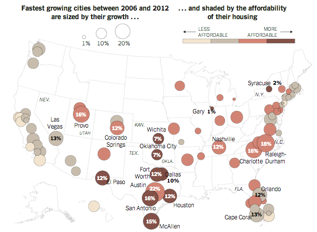
Some of the nation’s fastest growing cities are inland, away from the coast where housing prices are high. To support an article about the demographic shift, the New York Times created this map. Circle size represents growth over a six-year period while the colour of the bubble represents housing prices.
Fastest growing cities
Credit for the piece goes to the New York Times graphics department.
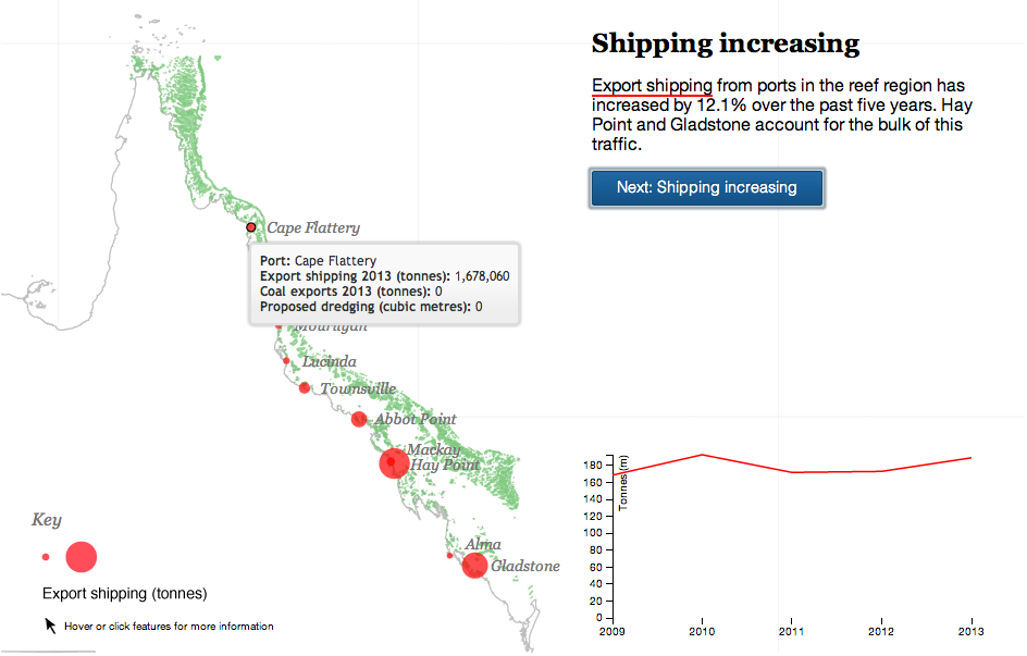
Your humble author is away this week. But the Great Barrier Reef in Australia is still here. For now. The Guardian takes a look at the growing threat to the World Heritage site from the coal industry in Queensland, Australia. The author takes you through the narrative in a chapter format, using charts and maps to illustrate the points in the brief bit of text. A really nice job altogether.
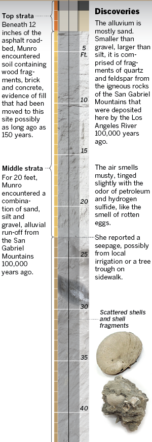
Long articles often mean lots of vertical space. But it is only every so often when an item can complement itself with a narrow, vertical graphic. The Los Angeles Times has just that in today’s piece, looking at the layers of sedimentation from a borehole.
What’s in the borehole?
Credit for the piece goes to Thomas Curwen, Lorena Elebee, and Javier Zarracina.
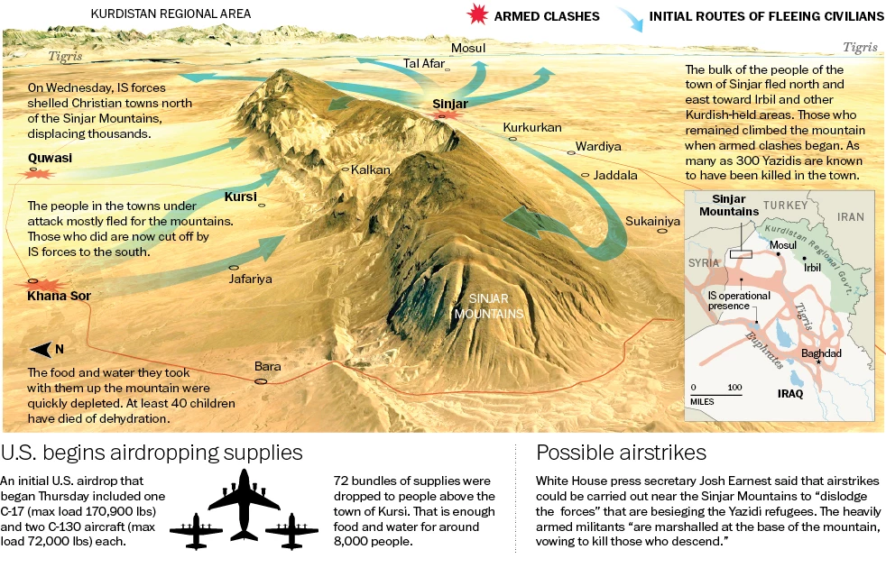
For those of you unaware, the United States became involved yet again in Iraq. This time, air dropping humanitarian supplies to Yazidi refugees near Mount Sinjar in northern Iraq. (Also, we have started bombing ISIS positions near Irbil, a large city in Kurdish-controlled Iraq.) In today’s post we have the Washington Post and its look at just what is going on around Sinjar.
Credit for the piece goes to Loveday Morris and Richard Johnson.
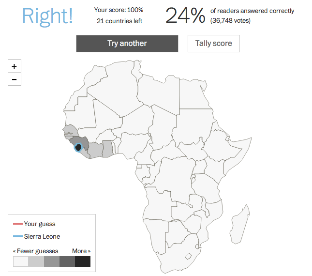
Beyond the fact that it isn’t a country? This week the White House hosted the US–Africa Summit. The Washington Post took the opportunity to quiz readers on their knowledge of African countries’ locations on a blank map. So this Friday, you get to take the quiz and post your results if you dare. A nice touch is that the map colours the countries by the number of guesses and then provides different colour outlines for your selection and the correct one—should you err.
Sierra Leone
I messed up Burundi—I always confuse it and Rwanda—and only got a 98%. /humblebrag
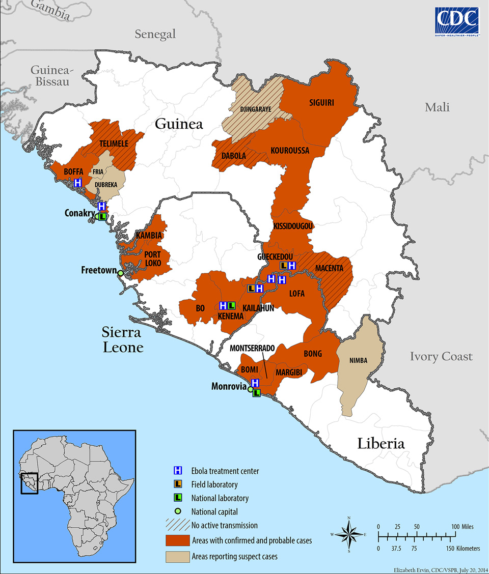
If you haven’t heard, there is a fairly significant outbreak of Ebola occurring in western Africa these days. The most attention has been drawn since the death of an American national in Nigeria. He had been working for the Liberian government and collapsed at the Lagos airport and died shortly thereafter. So the Centers for Disease Control has been reporting and advising on the outbreak and they have at least two graphics.
This first is good. It looks at the spread of the disease through different areas of several countries. It also identifies sites of interest for treating/containing the outbreak.
Outbreak map as of 3 August
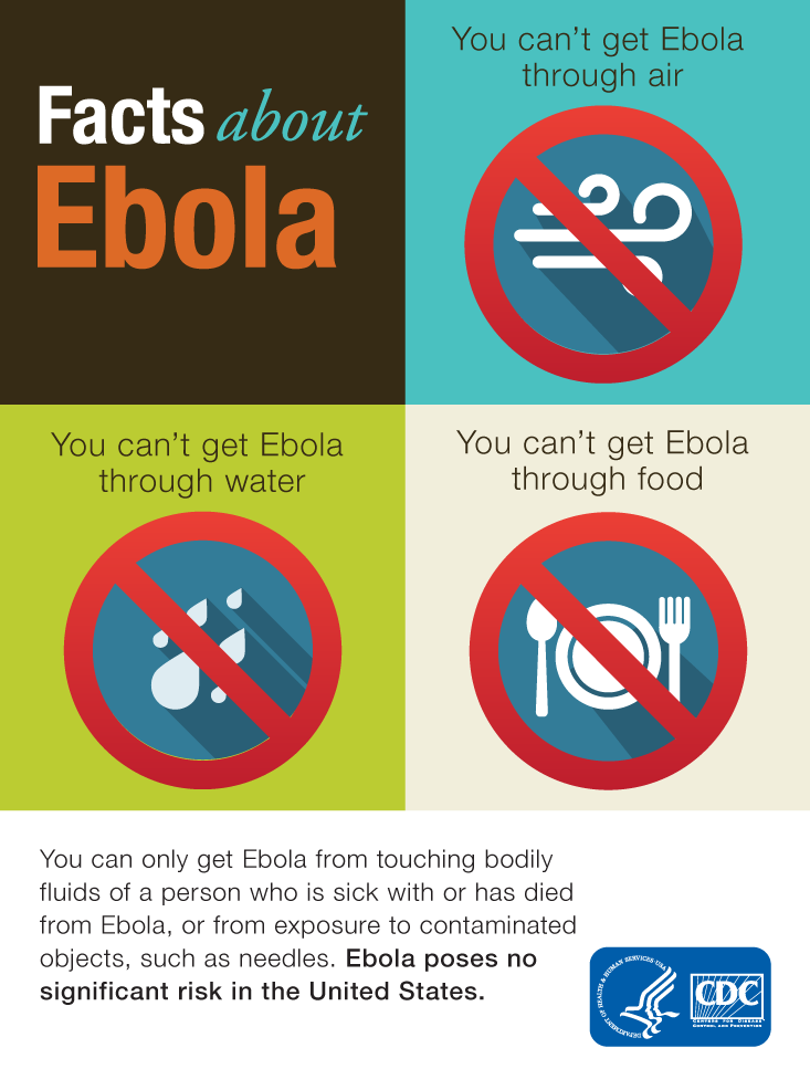
The second, however, takes prominence as an “infographic” on the CDC homepage. How this qualifies as an infographic I have no idea. It is…just sad. I mean I get it, too many people do not understand how Ebola is transmitted. But to call this an infographic does disservice to other, real infographics.
The infographic
Credit for the map goes to Elizabeth Ervin. For the “infographic”, no idea.
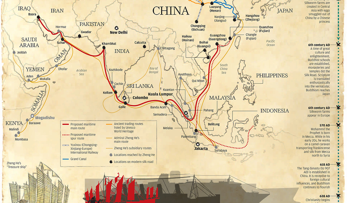
Today’s piece comes from the South China Morning Post. It looks at the Chinese government’s efforts to connect China to trade partners via a maritime route. This is conjunction with efforts to build a railway intended to connect Europe and China via Russia.
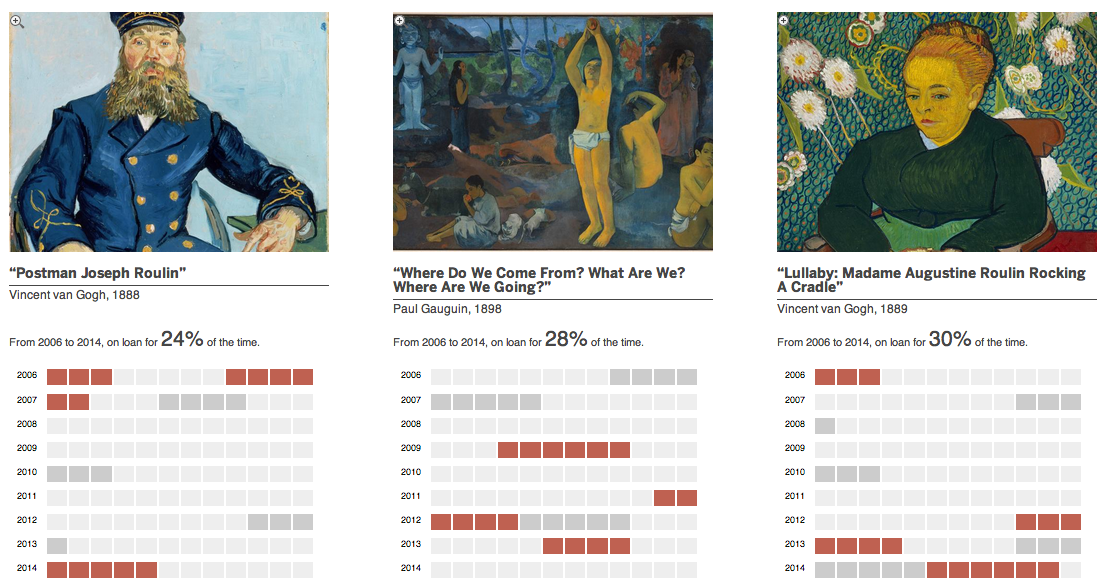
Two weekends ago I visited the Magritte exhibit currently showing here in Chicago. While I would love to share photographs of some of my favourite works, I cannot. The museum staff was clear that part of the rules for exhibiting loaned work was the prohibition of photography. So that prompted me to wonder how often is artwork loaned?
Thankfully, the Boston Globe (sort of) answered my question this past weekend with a graphic detailing some of the major loans from Boston’s Museum of Fine Arts.
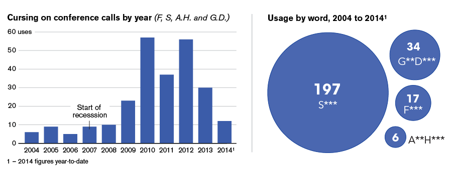
It’s Friday, so we should try to take things a bit lighter. For me that usually means knocking back a drink or two and a swear-y exultation about it being the end of the work week. But, it turns out, I’m just trying to emulate our captains of industry. Bloomberg has gone through company conference calls and tabulated the number of swear words used and charted the results. And for fun, you can read some of the excerpts.
They’ll swear by it
Credit for the piece goes to David Ingold, Keith Collins, and Jeff Green.