Chicago’s Disappearing Middle Class

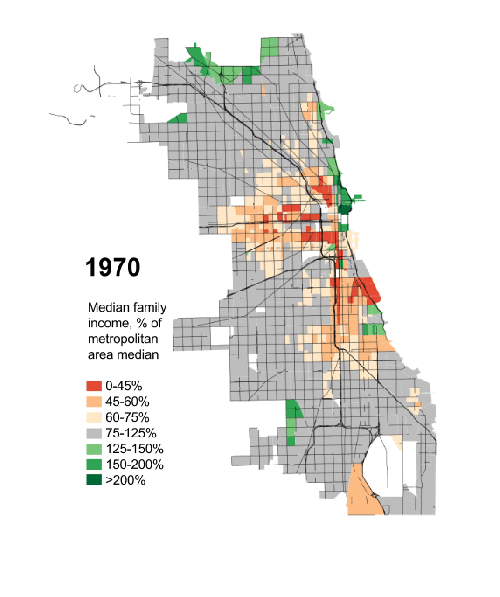
President Obama has made a big deal recently about income inequality. The story in short is that the rich in the country are getting rich; the poor are getting poorer; and the people in the middle are fewer in number. Here in Chicago, this has meant that over the last few decades, many of the former middle-class neighbourhoods have been gutted of, well, the middle class. Daniel Kay Hertz has created a series of maps to show just how drastic the change has been since 1970.

Chicago's disappearing middle class
Chicago’s disappearing middle class

Credit for the piece goes to Daniel Kay Hertz.

Motorcycle Helmet Laws

Today’s piece does not involve any particularly crazy graphics or forms of data visualisation. Instead, the piece is a novel way of telling a story. People are increasingly familiar with what we might call here scrolling stories. Scroll down the page and suddenly you have glossy photos or high-definition videos. The New York Times, however, has taken this idea in a different direction for a story about motorcycle helmet laws.

Instead of glossy photos, we have clear and concise charts. Instead of lots of text blocks, we have just a few sentences. The story is told by the charts and the text offers the necessary context or background. Not all stories will have the data behind them to allow the story to be told—or shown—in such dramatic fashion. But, I can hope they do.

Motorcycle helmet laws

Credit for the piece goes to Alastair Dant and Hannah Fairfield.

Changing the Minimum Wage

Here’s a piece from the New York Times where I have to quibble with some minor design decisions. The story behind the graphic is various state actions on the minimum wage compared to where President Obama wants the minimum wage raised. This is a good story and broadly I like the execution. But these arrows, these arrows pierce my design heart. (Too much of a metaphor?) Instead, I think a simple dot plot would have sufficed. But as I noted above, this is more of a quibble than a shame-on-you.

Changes to minimum wages at the state level

Credit for the piece goes to Alicia Parlapiano.

How to Write a Story

Today’s post is hosted on Brain Pickings. It’s diagrams made by Kurt Vonnegut that describe how basic plot lines work along two axes. There is a short video you can watch that goes over a few of them. But my favourite is, of course, not there. You have to read a bit further along to find it. Or just look below. But if you don’t read it, you’ll miss the written context.

Sucks to be a cockroach

Credit for the piece goes to Kurt Vonnegut.

Building to View London

A little while back, the Economist posted an interesting slideshow piece that showcased the intricacies of London’s skyscraper problem and how many areas are restricted to preserve lines of sight. The user can click through each view and see just where on the map the view falls.

Viewing London
Viewing London

Credit for the piece goes to D.K., L.P., G.D., P.K. and R.L.J.

Acquiring Technology via Purchases

Last week Facebook acquired a company specialising in virtual reality. The Wall Street Post put together a timeline of technology company acquisitions over the last several years. Each line is a different company and sizes of dots represent the value of the different purchases.

Technology company acquisitions

Credit for the piece goes to the Wall Street Journal’s graphics department.

Recent Military Expenditure

The Crimean situation has highlight how much not just Ukraine is not ready to fight Russia, but also how much less Western Europe is prepared to fight. This piece from the Washington Post examines actual defence expenditure and then defence expenditure as a share of GDP. While Europe has remained steady or in decline, Russia has been ramping up its defence spending since the beginning of the 21st century.

Defence spending
Defence spending

Credit for the pieces goes to Patterson Clark.

Spilling the Oil

A few weeks ago, Bloomberg Businessweek published a nice graphic that summarised the last 25 years of oil spills. I’m finally getting around to posting it. But what it does really well is show just how bad the Deepwater Horizon spill was compared to the other big name disaster: Exxon Valdez. Of particular note is the bar chart at the bottom right comparing the millions of gallons of oil spilled.

Oil spills
Oil spills

Credit for the piece goes to Evan Applegate.

New Transit Map for Springfield

Springfield from the Simpsons, of course. Happy Friday, and have fun visiting the Ethnictown station. The article comes from Atlantic Cities.

Springfield's transit map
Springfield’s transit map

Credit for the piece goes to the designers of the Simpsons.

Maps for the Search of MH 370

Yesterday we looked at the USA Today’s piece on the search for MH 370. Today we look at the New York Times, which has been running a series of maps that offer increasing amounts of detail on the context for the search.

Movement of buoys
Movement of buoys

Credit for the piece goes to Josh Keller, Sergio PeÇanha, Shreeya Sinha, Archie Tse, Matthew L. Wald, Tim Wallace, Derek Watkins, and Karen Yourish.