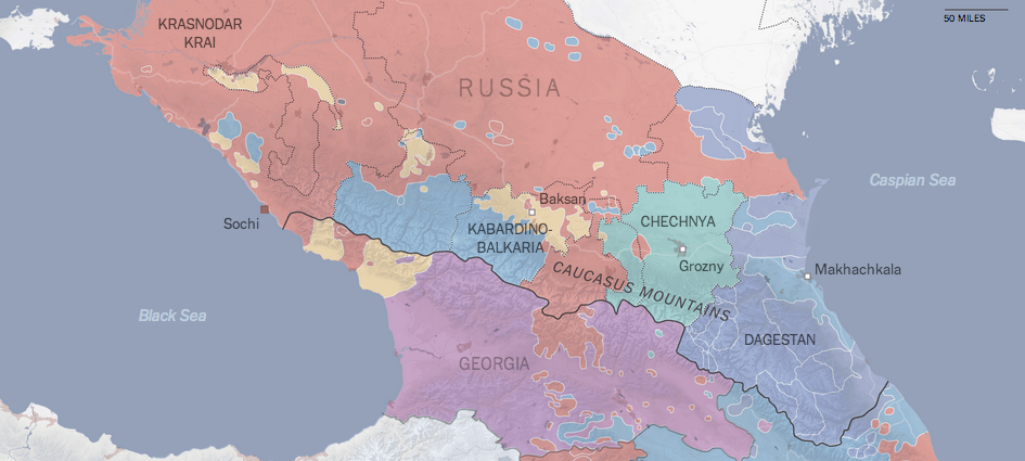
The Olympics opened in Sochi this past weekend. Many of us may well be familiar with photographs of urinals without piping, or unfinished hotel rooms, or many other infrastructure problems, but there is a bigger issue facing Sochi. It exists on what the New York Times terms the edge of a war zone. Their overall piece is more text-heavy than graphic-heavy, but several maps lend context to this complicated region of the Russian Federation. If you’re curious to better understand the region, this is a good primer.
The linguistics of the Caucasus
Credit for the piece goes to the New York Times graphics department.
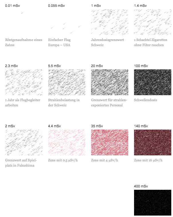
Today’s post is more about a means of illustrating radiation, less about quantifying it. Unfortunately the article is in German and I speak none of it. But, the context is that of the Fukushima Disaster. Make sure you click through to see the illustrations in action.
Radiation
Credit (I think) goes to Interactive Things and Neue Zürcher Zeitung.
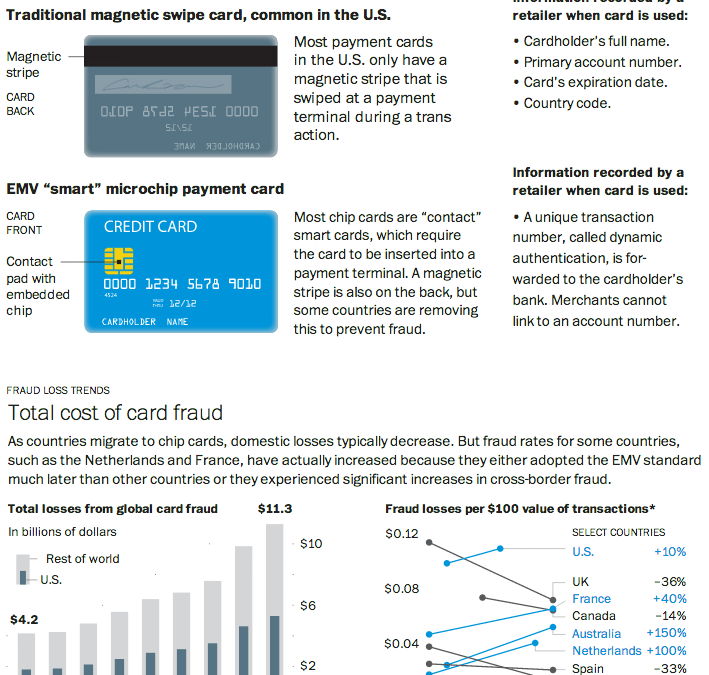
As I noted in my Friday post, I spent last week in Lithuania for work. That same Friday night, I had a conversation with a few coworkers over dinner and a beer about credit cards. They teased me that for all of America’s technological advances and advantages, even in Lithuania they were using more secure forms of bank card payment: chipped cards. And that story seems a perfect segue into today’s post from the Washington Post.
Through a combination of charts, maps, and illustrations—a cropping of which is shown below—the Post details the advantages of using microchipped cards in preventing certain types of fraud. Additionally, because of the integration of the visuals with the written explanations, text can be used to provide longer anecdotes to explain exceptions and outliers when and where necessary.
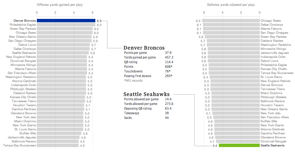
Last night the United States enjoyed a little (American, not rest-of-the-world) football match wherein two squadrons competed upon the pitch for the glory of their squadron colours. Thankfully for those of us who wanted a preview of the match on data’s terms, well, the Guardian put together a fantastic piece breaking down some of the numbers.
The Best Superbowl Match-up
The data is not terribly complicated—I still think baseball makes the most use of advanced metrics, though it helps they play more than 10 times as many games per season. The Guardian looked at yards gained or lost per play by the offence or defence, respectively. Click through the link to explore the other charting forms used, in particular the four quadrant scatter plot and the small multiples that follow. Also, a sophisticated and restrained colour palette allows the user to clearly understand when he or she is viewing the Denver–Seattle matchup or the historic match-ups of the NFL.
Regardless of the quality of the presentation, we shall see Monday morning—I am writing this Sunday afternoon—whether this piece will still hold with its talk of the best match-up ever.
And hey, for all this talk about the best offence, look at which squadron is ranked second. Fly, Eagles, fly.
Credit for the piece goes to the Guardian’s US Interactive Team.
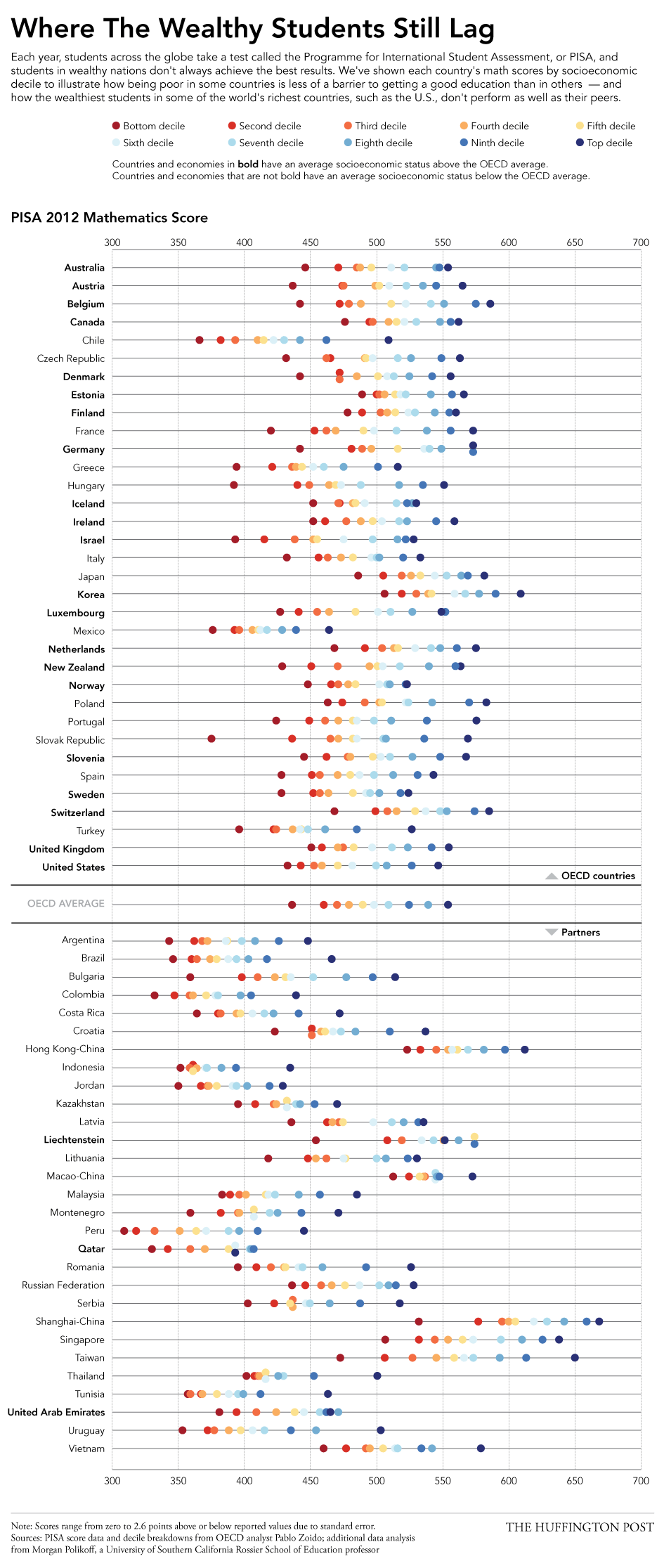
Today’s post looks at education across a set of 65 countries from a standardised test backed by the OECD, basically a group of wealthy countries. The test results found that some poor countries have surprisingly good education systems whereas some of the world’s wealthiest countries—here’s looking at you, United States—perform poorly. The Huffington Post created this graphic to plot the data.
Education scores
I really enjoy this piece. It plots each income decile’s results, blocks the countries into OECD members versus their partners, and then each country’s average socioeconomic status is shown as being above or below the OECD average. This is the type of piece I see as a static image that I would want to see made interactively—though I fully understand how difficult and time-consuming that can be—so that I could begin to filter and re-arrange the data. Could discoveries be made by organising countries by geographic regions? Could one just look at the top or bottom deciles?
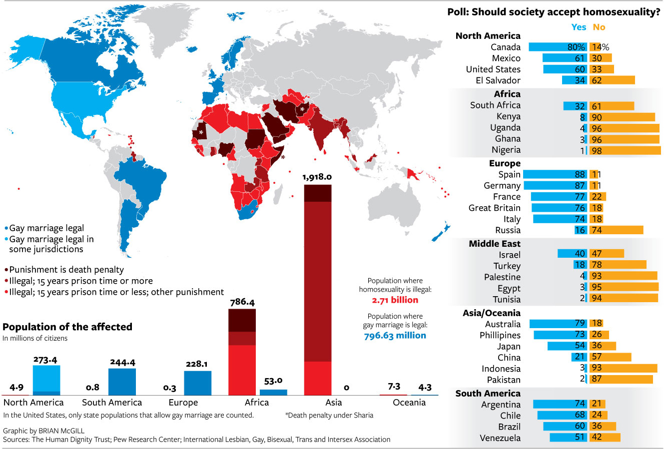
If you have been living under a rock, Sochi, Russia is hosting the winter Olympics this year. A year in which the Russian government passed legislation banning not same-sex relationships but advocacy for said relationships. Several countries, including the United States, take issue with the legislation. But this graphic from the National Journal hints that in order to reverse such barriers to same-sex marriages, the United States and like-minded societies have a long way to go to convince not just Russians, but many other societies across the world.
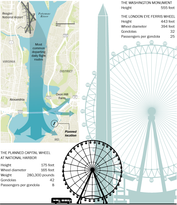
This past weekend I was having a discussion with some friends about the height of various Ferris wheels. Specifically we were wondering the height difference between the London Eye and the wheel at Chicago’s Navy Pier. Well, it turns out that Washington, D.C. is preparing to begin construction on its own wheel. Naturally, the Washington Post covered the story with a graphic to compare the Capital Wheel to the London Eye.
The Capital Wheel
And for those wondering about Chicago’s wheel at Navy Pier, well it clocks in at 150 feet. That makes it 25 feet shorter than the Capital Wheel in D.C.
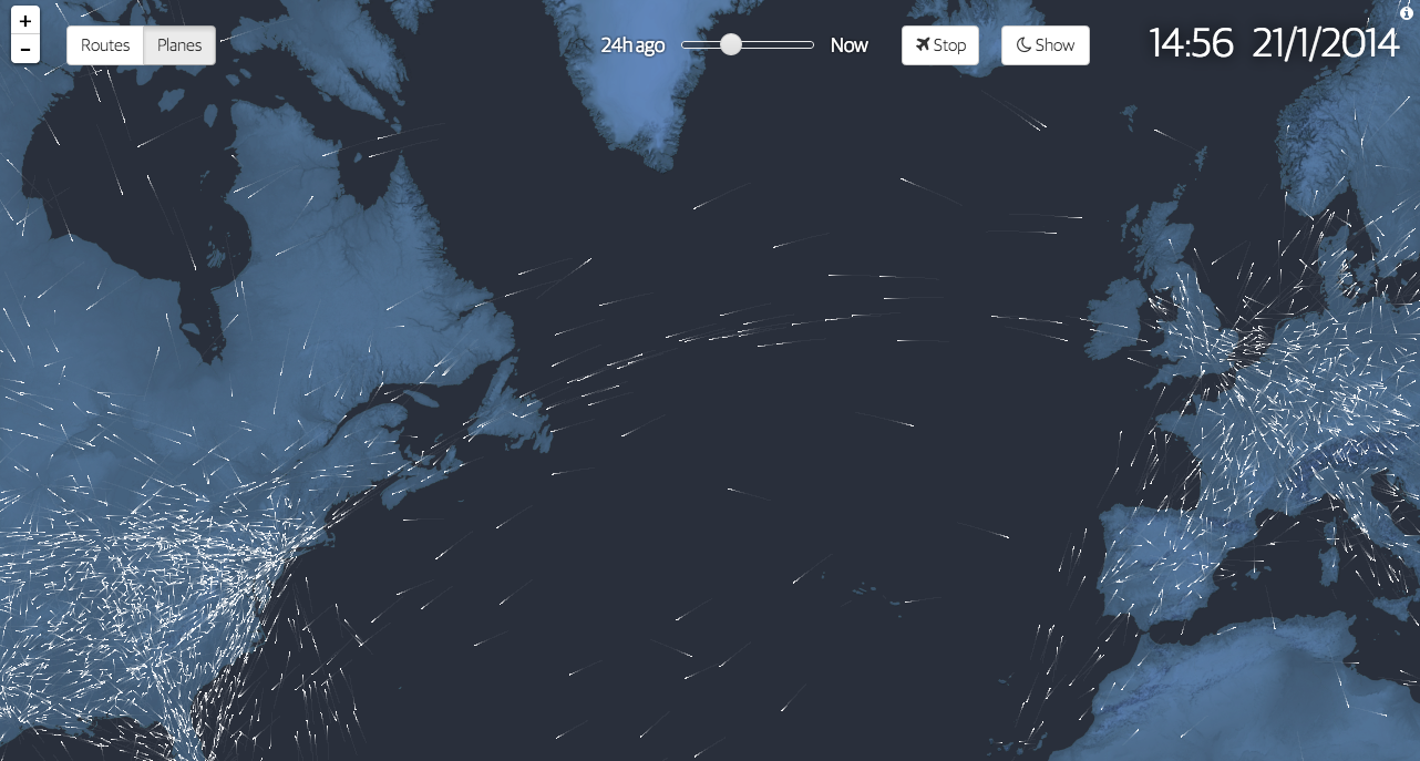
100 years ago we began to fly commercially. We moved beyond daredevil stunts and novelty and created air travel into a business. To commemorate the history, the Guardian commissioned this interactive graphic story to celebrate said history. It includes charts, narration, and near real-time data on actual flights mapped out as in the introductory element captured below.
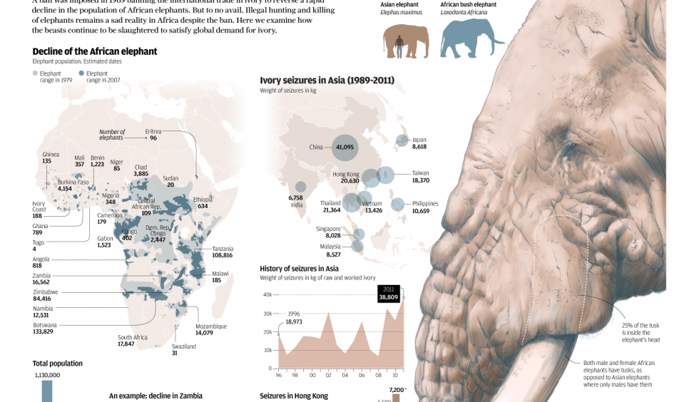
The South China Morning Post had a fantastic infographic detailing the hunting of elephants for their ivory. Despite bans to make such hunting illegal, the problem continues and is worsening because of the Asian trade in ivory.