Charting Literary Greatness

This is an interesting piece from Brain Pickings that looks at the literary careers of some of the 20th century’s greatest authors. Naturally, much debate will centre upon what is exactly a masterpiece, but if you take the subjectivity out of the graphic, you are left with an interesting piece. And I say interesting because in this case, I am not quite clear how I feel about this particular piece. But if I had the time I would love to be able to take a stab at it.

Literary careers
Literary careers

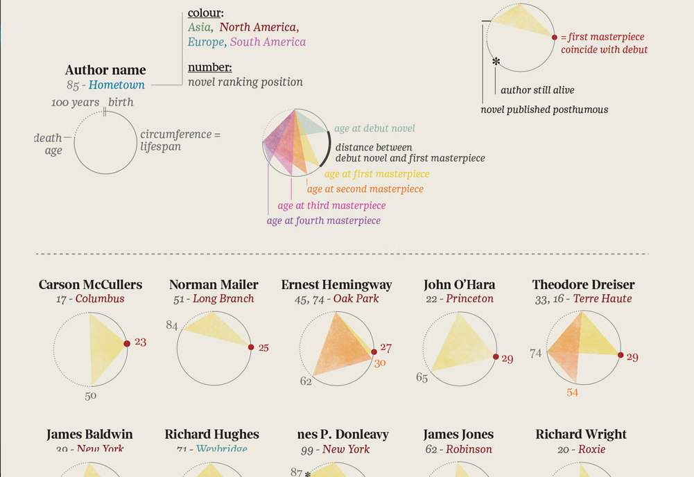
Credit for the original piece goes to La Lettura, I am unclear on who deserves the credit for translation.

Tracking You While You Text

Today’s post comes from the Washington Post, which looks at further revelations about the NSA surveillance programme. Specifically, the Post details how the NSA tracks Americans by what is called co-traveler analytics. The piece does a really nice job of explaining how the tracking works through illustrative examples.

Tracking via co-traveler analytics

Credit for the piece goes to the Washington Post graphics department.

The Long and Winding Cotton Production Path

Today’s piece is straightforward, but I felt very good at detailing its story. The Wall Street Journal mapped out the path cotton takes on its way from the fields to the denim in your jeans.

Cotton's path to market
Cotton’s path to market

Credit for the piece goes to the Wall Street Journal graphics department.

The Next Cold War?

The New York Times has a nice piece about the Arctic, which is increasingly fought over by the nations north of the Arctic Circle. Maps like these are always opportunities I enjoy to see the world in an infographic that is not a standard projection, e.g. Mercator or Robinson. The slight change in fill or opacity also serves to highlight the focus of the piece on the area north of the Arctic Circle while areas even more distant slowly fade to white.

Map of the Arctic
Map of the Arctic

Credit for the piece goes to Baden Copeland and Derek Watkins.

Old Healthcare Policy Renewal

Let’s start this week off with cartograms. Sometimes I like the idea, sometimes not so much. Here is a case where I really do not care for the New York Times’ visualisation of the data. Probably because the two cartograms, a before and after of health policy renewals, do not really allow for a great side-by-side comparison. I imagine there is probably a way of condensing all of that information into a single chart or graphic component.

The before map
The before map

Credit for the piece goes to Keith Collins, Josh Katz, Katie Thomas, Archie Tse, and Karen Yourish.

Cancelling the Cincinnati Streetcar Project

So Cincinnati was going to have a streetcar. Now it won’t because the recently elected mayor, John Cranley, campaigned on killing the streetcar. I won’t get into the whys and the why nots mostly because I’m not from Cincinnati and others can do it better. Suffice it to say that costs and budget battles played a part. Yesterday the city council opted to pause the project. This will likely suspend federal grant payments, meaning contractors don’t get paid, which means the city faces lawsuits for being in breach of contract, which potentially means the city spends almost as much money cancelling the project as they would completing it.

Ordinarily I would post something from a local newspaper or media outlet covering the story. But today I have the pleasure of sharing some work that my former professor made. His infographic explores the fiscal details of the streetcar project and how much Cincinnati owes if they opt to cancel it in the end.

Funding the Cincinnati Streetcar project

Credit for the piece goes to Giacomo Ciminello. You can download the original here. And you can visit his site here.

College Football Conference History

Your author graduated from art school. That means my college sports consisted of…a fencing team. And dancers. And some of them were cheerleaders for the Eagles I heard. Does that count? I did, however, attend Penn State for a year. So in this interactive graphic from the New York Times that tracks conference membership for various college football teams, I clicked Penn State.

Penn State football history

Colour is effective in this piece. The use of purple to highlight key stories off the grey background becomes even more important when they are offset from the selected schools in orange. If you cannot find your particular line of interest, a drop-down menu makes for an easy selection.

Bonus points—not shown here—for using spark lines in the introductory paragraph. A solid piece overall.

Credit for the piece goes to Mike Bostock, Shan Carter, and Kevin Quealy.