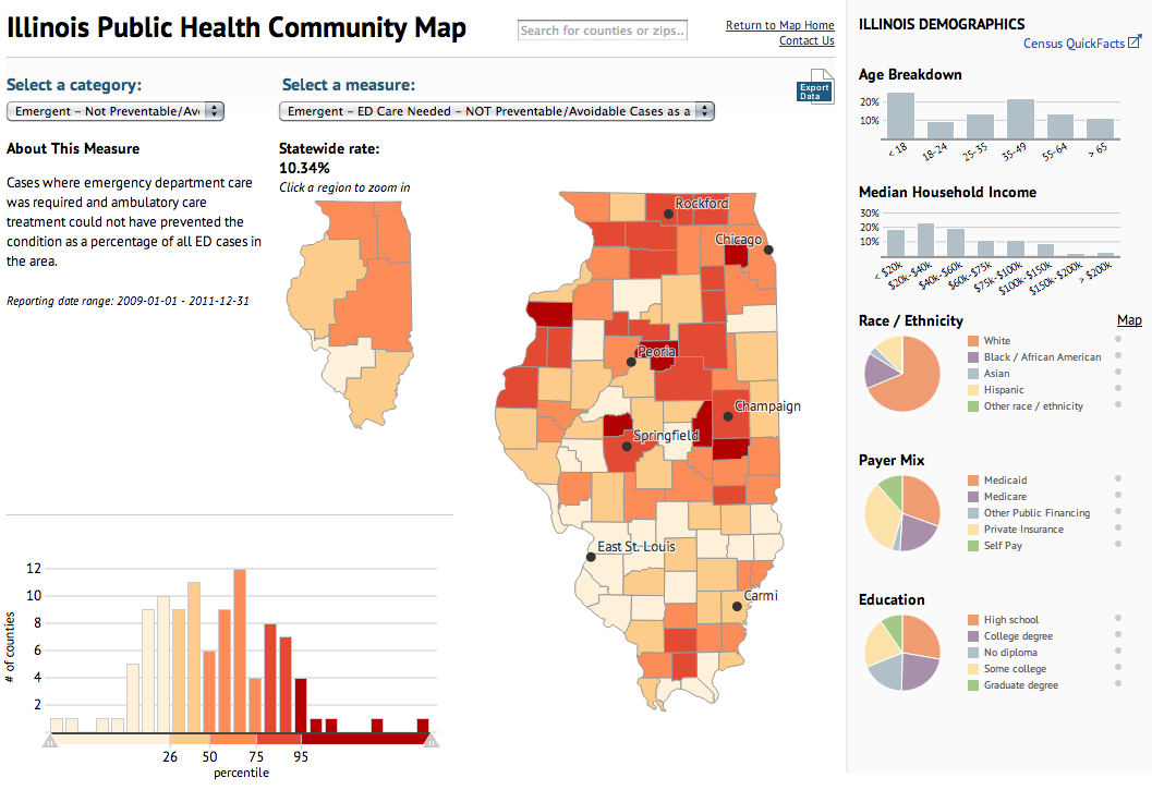
Today’s piece maps and charts comes from the Illinois Department of Public Health. The piece combines maps and charting components to detail preventable hospitalisations and emergency room use in the state of Illinois.
Public health map
Ordinarily I would prefer just one map, however, in this case the designers realised that a regional map—with its larger surface area—need not be as large as the county map. Some additional elements worth noting is the area devoted to the human explanation of the categories, which might otherwise be difficult to understand.
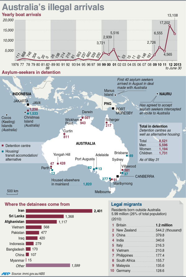
This article on Yahoo by the AFP has an interesting graphic on the problem facing Australia of illegal arrivals via boat that, in part, probably cost Kevin Rudd and the Labor Party of Australia the recent election.
Illegal arrivals to Australia
I like the overall graphic, but I feel that the data labels are unnecessary on the line chart and the bar chart. They distract from the overall shape of the data and are anyways hinted at by the axes labels within the charts themselves. Also, I am a bit unclear as to the meaning of the grey bars in the line chart.
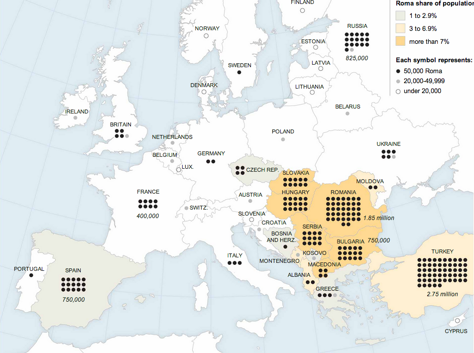
The Roma, or the Gypsies, are a displaced population living throughout Europe. They have been in the news recently. In France, a family was deported to Kosovo after their asylum appeal was rejected after a few years. However, the deportation removed a girl from a French school and the outcry was sufficient that President Hollande intervened. The girl—but not her family—is being allowed to return to France to complete her education. Also last week, Greek police picked up a fair-skinned, blonde-haired, green-eyed girl from a Roma camp because she did not look like her family. They performed a genetic test and found she was of no relation and fear the child was kidnapped. A bit earlier than last week, the French interior minister said that most Roma were not capable of integrating into French society and that they should leave France. And so the New York Times put together a piece supporting an article about the Roma population in Europe that is worth a quick look if you want to better understand the Roma diaspora.
The Roma diaspora
Credit for the piece goes to the New York Times graphics department.
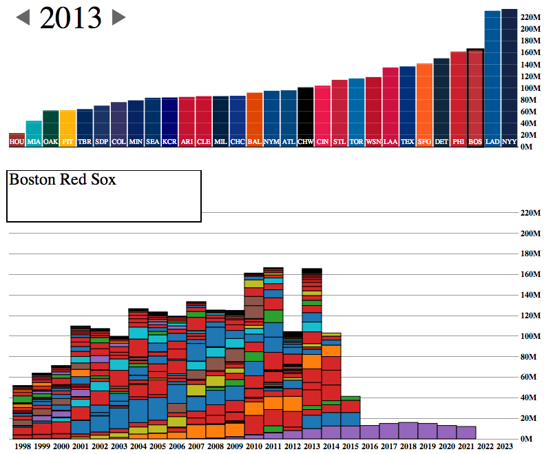
The World Series starts tomorrow night and for all but two teams, that means focusing on the upcoming 2014 roster. And rosters are often defined by payroll flexibility. A co-worker of mine forwarded along today’s interactive graphic that looks at team payrolls through stacked bar charts.
The Red Sox payroll
The design is certainly a bit clunky with heavy black outlines and garish colours. But the story told is clear, especially if you begin to look at different teams. Which teams have players locked up for the long-term and thereby have little flexibility?
The Red Sox, of course, sent most of that bar from 2011 to the Los Angeles Dodgers near the end of 2012. That allowed them to pick up the free agents like Mike Napoli, Johnny Gomes, Shane Victorino, and Koji Uehara. You know, the guys without whom the Red Sox would not have advanced to the World Series.
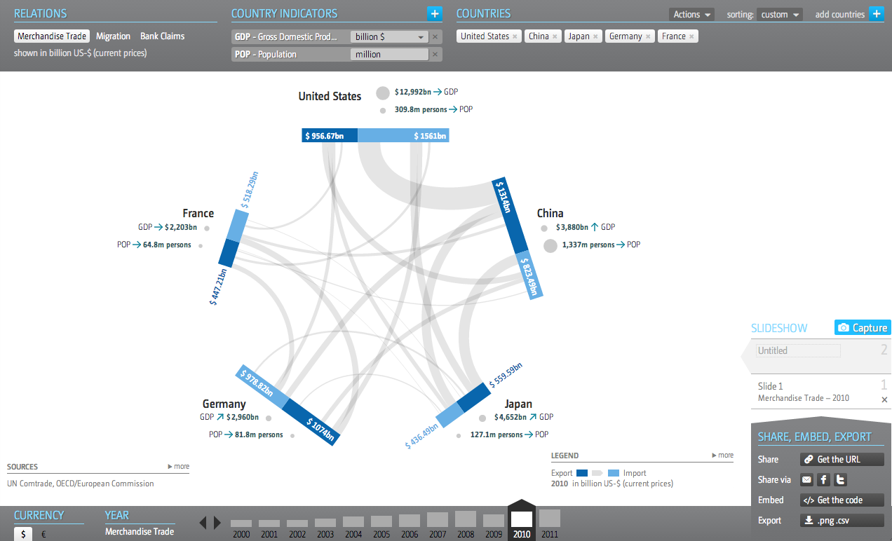
In the interests of transparency and full disclosure, for my employer I design interactive web-based applications that display significant amounts of data on various countries and industries—along with other design things. So I am always curious to see how others handle similar types and quantities of data. This interactive application—I hesitate to call something like this an interactive infographic because of its scale and scope—comes from the Global Economic Dynamics project.
The GED application
I commend the designers for opting not to use a map despite the nature of a dataset that focuses on countries. Especially in this application, where the full pattern of trade or migration would only be visible through multiple clicks to load maps of export/import markets of a particular country.
The user can add multiple countries, switch to a different dataset, change the year of the displayed data, currency, metrics, &c. There is quite a bit going on in this application and the controls are carefully placed in the margins of the piece.
And while I could probably write a lot more about this piece, I will end up the ability to share any insights made while using this application. Because what is the value of a kernel of knowledge if you cannot share it? Consequently, this piece offers a multitude of options. The usual social media options are present. You can also download a .png for use in a presentation, e.g. PowerPoint, or you can download the data. But fascinatingly, the application allows you to embed the piece into your own site.
Unfortunately, I cannot find any specific designers attached to the project. So credit goes to the Global Economic Dynamics project.
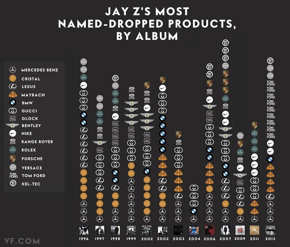
Happy Friday, everybody. Today’s post is a graphic from Vanity Fair that looks at the rapper Jay Z. (And for all those wondering, no, I have never intentionally listened to any of his music.) Specifically, this kind-of-stacked-bar-but-more-icon chart indicates how many times he name drops specific luxury brands in his albums.
Jay Z Brand Mentions
You can also file this under the graphics to which I cannot relate. Although maybe, just maybe, I once had a pair of Nike trainers. So at least Jay Z and I have that in common.
This small graphic is one of several from a very smart piece on redesigning the traffic map. Have you ever looked at a Google or an Apple traffic map to find the quickest route home or to get an idea of how long it will take you to get to the ballpark? According to Josh Stevens, your traffic map is lying to you.
Potential solutions
The article is a summary or overview of a research paper not-yet-published. When you have a few moments, the whole thing is worth the read for its analysis of popular transit map designs and the five big lies.
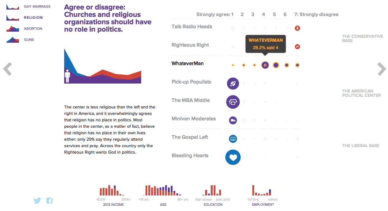
NBC News and Esquire magazine published results from their August survey of some 2000+ respondents that attempted to define the New American Center, i.e. the political persuasions of the majority of the country excepting the radical right and the loony left. For the purposes of Coffee Spoons, I am most interested in looking at the data visualisation and the infographics that result.
Both NBC News and Esquire visualised the results. While I could write two long blog posts looking at both of them, for today, it is more important to look more at the fundamental design difference between the two.
NBC News opted for a design direction emphasising data first. Perhaps because NBC is a news platform, their focus was on the clean communication of the data. Looking
NBC News results
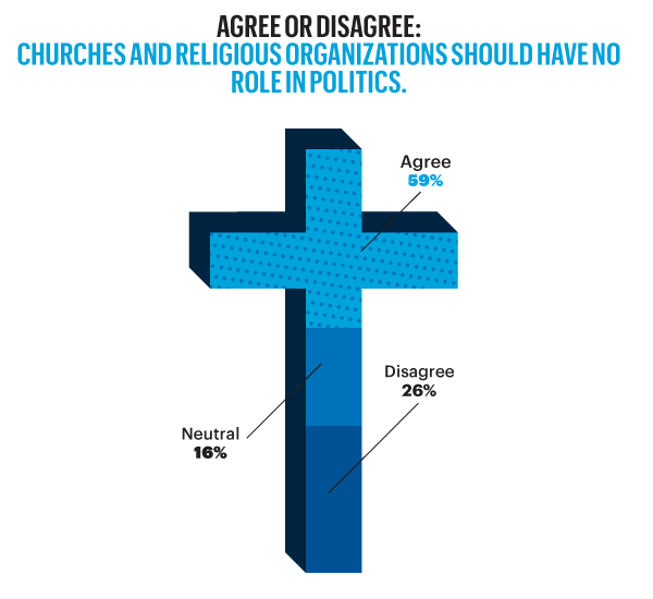
On the other hand, Esquire opted for a more sensationalised direction. The same data points used for the screenshot above creates this graphic below. Not only is less data is contained, less context given, less subtlety and nuance captured, it also is just difficult to read. Is the 59% supposed to be the area of the cross filled in? Its length? Why is it three-dimensional? Where are the Snowdens of yesteryear? At first glance, I ignore the horizontal wings and focus solely on the vertical length of the main bar.
Esquire results
For a useful representation of data, I think NBC News clearly wins. But that both organisations used the same data to craft their separate results, this story on the New American Center is useful for comparing two different design directions and the results thereof.
No designers are specifically mentioned, at least not that I could find, so credit for each piece goes to its respective owner, i.e. NBC News or Esquire.
Gravity was released recently. You know, that film about a station in space that gets hit by something and drama ensues. The Washington Post has this fantastic infographic that illustrates how the station was built over the past 15 years. Scroll down the page and watch the station deconstruct itself into its initial Russian power module. Fantastic.
Deconstructing the ISS
Credit for the piece goes to Alberto Cuadra and Katie Park.
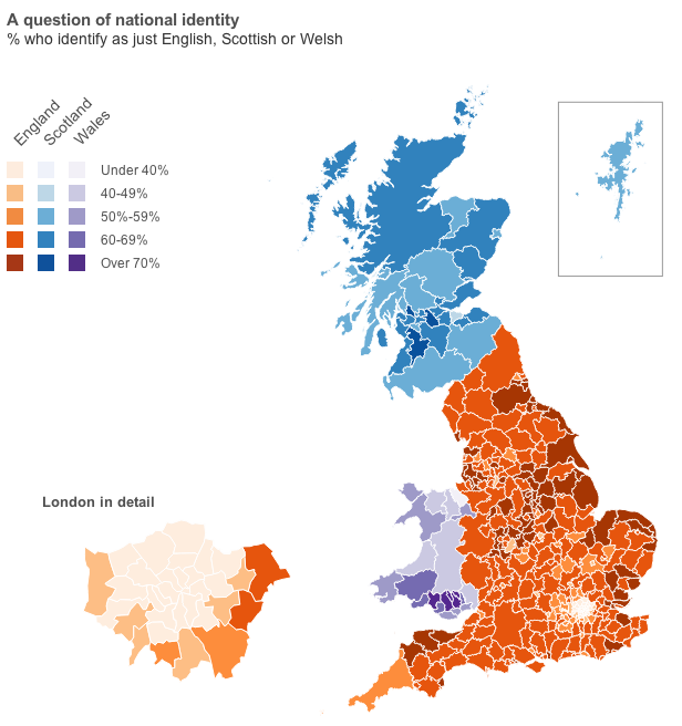
Well, you will have to click through to the article for that data visualisation. But, I will provide you with the choropleth map of national identities. That is, how English do citizens in English authorities consider themselves? Scottish in Scotland? Welsh in Wales?