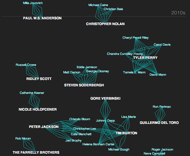
Of the acting and directing world over time. This interactive piece from the New York Times charts the networks between actors and directors. The networks on the right while examples and stories are located to the left. When you scroll to an example, the network to the right is highlighted in yellow. If you click a link, you are taken to the IMDb page for that particular film. A really nice piece.
Networks of actors and directors
Credit for the piece goes to Mike Bostock, Jennifer Daniel, Alicia DeSantis, and Nicolas Rapold.
It’s Friday. And that means you will likely be contorting on the dance floor this weekend. But if you tried to bend to conform to any of these congressional districts, you would likely break your back. Gerrymandering is an old practice that basically allows state governments to decide what area (and therefore populations) belong to which congressional district. If you carve up your opposition well enough, you can consolidate them into far fewer districts than they might otherwise win. Pennsylvania is just one such example of an unbalanced state. This interactive infographic game from Slate forces you to solve the jigsaw puzzle of congressional districts.
…and not just any bankers but central bankers (the ones who establish policies at a national level), are rather under represented as this graphic from the Economist details. It is a nice use of small multiples with bar charts over time. Each bar is a 0–50% of the total membership of a central bank board and the share that is dark represents the number of women. Clearly for the countries selected not a single one has had a board of more than 50% women. Sweden and South Africa are the only two countries shown that have had 50% participation from women central bankers—though Norway and Denmark (for a period of time) have been consistently close.
Women central bankers
Credit for the piece goes to C.W., P.A.W., L.P., and P.K.
A little while ago the Washington Post published this graphic on Metro ridership. But not just anybody’s ridership, that of the individuals who sit on the DC transit agency’s board. After all, should not those overseeing Washington’s transit agency be intimately familiar with the conditions faced by DC commuters?
How agency board members ride their transit agency…
The graphic is a really nice use of small multiples and shading and tinting to indicate which lines are travelled by specific persons. An icon of a bus denotes bus ridership. This is a very good piece.
Credit for the piece goes to Wilson Andrews, Dana Hedgpeth, Mark Berman, and Luz Lazo.
I was catching up on some news tonight and I came upon an unhelpful graphic that was supposed to be helping me understand the whip count (who is voting yes or no) for authorising the use of force in Syria. Below is the original graphic from Think Progress.
The whip count as of 15.30 on 3 September
I struggled, however, to directly compare the yes and no votes. While I certainly understand that the splits within both parties are a fascinating subplot to the greater issue of will we bomb Syria, the traditional congressional arc visualisation is not helpful here. So using the same numbers, I simply plotted what is essentially a stacked bar chart. In truly heretical, i.e. independent, fashion I mixed the two parties together and placed them at either ends of the chart. The first to reach 50% wins. (If I were updating this live of course.)
My visualisation of the whip count…
Credit for the original goes to Igor Volsky and Judd Legum.
Admittedly I am a one-sport kind of guy; baseball is my thing. But I am at least aware that as Labour Day demarcates the border between summer and fall, it simultaneously signifies the beginning of the seasonal transition from baseball to football. (Though I am still pulling to see the Red Sox in October.)
This graphic comes from the New York Times from an article looking at the sports network ESPN. Specifically, the article focuses on the network’s strategy of working with smaller schools desiring national attention to fill in open spaces on their weekly broadcast calendar. In short, weekday nights are not big nights for college football; usually people watch their alma maters on Saturday. But, if your school is willing to make schedule adjustments, ESPN is apparently willing to throw you some money. This interactive bar chart looks at whether your alma mater (or in my case the only university I attended that had sports—yay art school) has begun to play weekday games.
Weekday football by conference and compared to Penn State
Credit for the piece goes to the New York Times graphics department.
Today’s interactive piece comes from Axis Philly and it looks at the total amount of rainfall in Philadelphia (1990–2013) to find both which months and what time of day receive the most rainfall.
When it rains…
As it turns out, evenings in the summer months receive the most rainfall. And since 1990, the most rain has fallen between 19.00 and 20.00 in July. A nice complementary piece would have been a small graphic showing total distribution of rain over the months, without segregating the data into hourly chunks. But again, that would have been a nice complement to the piece as it is far from necessary.
Credit for the piece goes to Jeff Frankl, Casey Thomas, and Julia Bergman.
I did not have quite enough time to develop this piece to what I wanted, but for now it will have to suffice. I wanted to look at the situation in Syria, but I only had time to outline who has what near Syria. Click the image for the larger version.
Recently my hobby of my family’s history has focused on my Rusyn (or Ruthenian) roots. However, this recent work out of Stanford University piques my interest in my English heritage, even though much of it is very far back in time. Using my 23 × great-grandfather Reynold de Mohun you can begin to see how it links persons within families, how those lives intersected over time, and the geographical areas where that person lived. In Reynold’s case, it was the 12th–13th centuries in Somerset, England.
Reynold de Mohun
But as the title kindred implies, this piece is not just about direct family connections, but also the marriages and close cultural links between certainly the elite of British society. Below is how Reynold is connected to King William I, better known as William the Conqueror.
Connecting Reynold de Mohun to William I
Family history or genealogy is a topic ripe for data visualisation and information design because it is all about connections. But I have found beyond the common family tree diagram little interesting has been created. This work is a solid start in the right direction.
Credit for the piece goes to Nicholas Jenkins, Elijah Meeks, and Scott Murray.
We have all heard talk about cutting cable, i.e. unsubscribing from cable television. But the question is what is replacing it if anything? Fortunately, this really nice graphic produced by Quartz shows the market over the course of the last five years.
Cutting the cable
It is a really nice use of small multiples and the power of not overlapping size and growth charts, or combo-charts, just because you can. Different metrics deserve different charts. The important part is placement, and that’s where a good designer can make sure to place relevant data near its partner.