Basketball Finals

So the basketball finals begin tonight with the Cleveland Cavaliers taking on the Golden State Warriors. This is also the part of the post where I fully admit I know almost nothing about basketball. I did, however, catch this so-labelled infographic from ESPN contrasting the two teams.

Point differential
Point differential

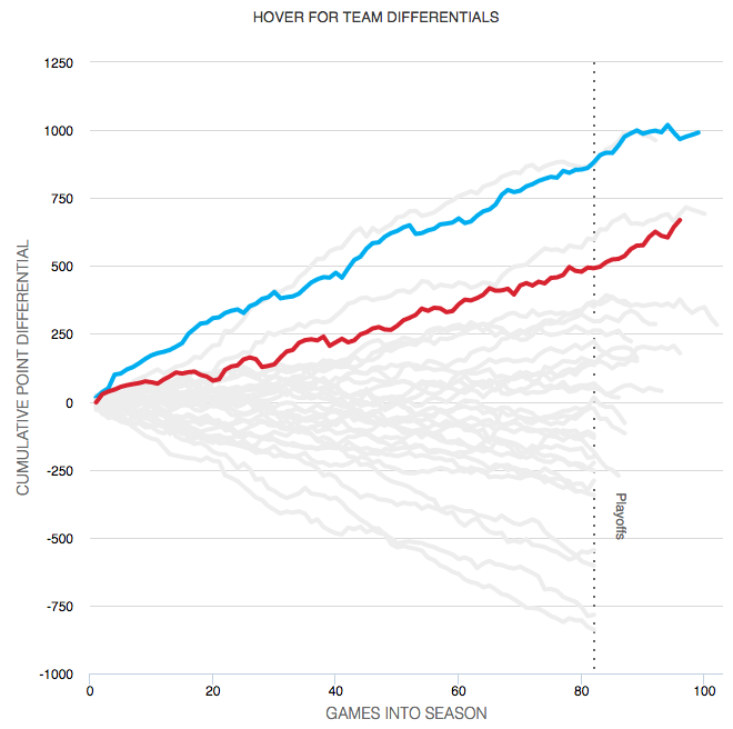
What I appreciate at this piece is that ESPN labelled it an infographics. And while the data might be at times light, this is more a data-rich experience than most infographics these days. Additionally the design degrades fairly nicely as your browser reduces in size.

The chart formats themselves are not too over-the-top (that seemed like a decent basketball pun when I typed it out) with bars, line, and scatter plots. Player illustrations accent the piece, but do not convey information as data-encoded variables. I quibble with the rounded bar charts for the section on each team’s construction, but the section itself is fascinating.

I might not know most of the metrics’ definitions, but I did not mind reading through the piece.

Go Red Sox.

Credit for the piece goes to Luke Knox and Cun Shi.

World Income

Over the weekend I found myself curious about the notion of a growing global middle class. So I dug up some data from the Pew Research Center and did some analysis. The linked piece here details that analysis.

The growth in middle income populations

I go into more detail than just a map. Hopefully you enjoy the piece and find the analysis informative if not useful.

Credit goes to myself on this one.

Why All the Nationalism?

Brexit is coming, Brexit is coming. Something about red coats? I couldn’t resist. But, the prospect of the United Kingdom leaving the European Union is real, though still not likely according to the latest polling data. What drives the sentiment to get out, kick out the illegal immigrants, and restrict new immigrants from arriving—where have I heard that before—? Well, the Washington Post takes a look at a plausible economic cause.

Comparing British recessions

And because I am pretty sure I have heard something similar, the article makes a case for countries beyond the British Isles.

Credit for the piece goes to Matt O’Brien.

Fruits and Vegetables

Friday is finally here and so for many that means it is time for the desserts and the drinks. But before you get that far, we all need to eat our fruits and vegetables. Thankfully the Washington Post has an article that examines changes in the appearance of our fruits and veggies over time.

Portrait of a man made in fruit and veggies

Credit for the piece goes to Giuseppe Arcimboldo. It’s not everyday I credit a Renaissance artist on the blog.

Long-distance Amtrak

Today’s post is not super complex, but we all know I am a sucker for transit. Especially Amtrak. Back home on the East Coast, it runs both quickly and reliably along the Northeast Corridor and the Keystone Corridor. But as this graphic from the Wall Street Journal shows, that does not quite hold up for the longer distance Amtrak routes. Why? Freight trains.

Long distance is always difficult

Credit for the piece goes to the Wall Street Journal graphics department.

Europe’s Far-right Parties

On Sunday, Austria narrowly elected a former Green Party leader as president over the leader of the Freedom Party, a far-right party that surged in part because of the impact of Europe’s migrant and refugee crisis. The New York Times took a look at just how often and by how much far-right parties have succeeded in European countries in recent years.

There's more red than there used to be
There’s more red than there used to be

What I really like about this piece is that while they could have stopped at the above graphic, they opted to not. Some of the graphics above then introduce a section specific to the politics of the particular country, e.g. France and the rise of the National Front and Marine Le Pen.

France in detail
France in detail

Credit for the piece goes to Gregor Aisch, Adam Pearce, and Bryant Rousseau.

Where Is Pennsyltucky?

So last week I mentioned Pennsyltucky in my blog post about Pennsylvania’s forthcoming importance in the election. And then on Friday I shared a humourous illustrated map of Pennsylvania that led into an article on Pennsyltucky. But where exactly is it?

Luckily for you, I spent a good chunk of my weekend trying to find some data on Pennsylvania and taking a look at it. You can see and read the results over on a separate page of mine.

Where is Pennsyltucky?

Pennsyltucky

You may remember my post from Wednesday talking about the likely importance of Pennsylvania in the forthcoming election. I referenced an article from Philadelphia Magazine, which opened with a great map of Pennsylvania. I find the map very much worth sharing, especially on a Friday. I love the island life.

Take note of the other island off to the east, it is another good one on which I have spent many a years of my life. But, yes, anything generally west of the straits is a very, very different experience.

Pennsyltucky
Pennsyltucky

Credit for the piece goes to Mario Zucca.

The Decline of the Middle Class in America

Last week the New York Times published a great piece on the shrinking middle class and they used a series of small multiples to tell the story. They broke the story up into several sections, based on the trends in the data, e.g. in the screenshot below the designer sorted by areas where the middle class fell but upper class rose.

A wide view of the graphic

From the responsive design side of things, the piece works well on narrower screens too, because the design choice of small multiple tiles permits the piece to stack and rearrange tiles.

A narrow view of the graphic

Credit for the piece goes to Quoctrung Bui.

Is Pennsylvania the Tipping Point?

Today we look at a piece that focuses on my native (and favourite) state: the Commonwealth of Pennsylvania. (Along with Virginia, Massachusetts, and Kentucky, we self-identify as a commonwealth and not a state.) FiveThirtyEight examines how Pennsylvania and its shifting political preferences might just be the key (get it? keystone) to the election for both candidates. The crux of the article can be seen in the map, but the whole piece is worth the read. If only because it mentions Pennsyltucky by name.

Shifting states
Shifting states

Credit for the piece goes to David Wasserman.