We’ve had a lot of the rough and gritty politics of late. So now for some bright and starry-eyed idealism. Well, maybe less idealism and more stars. Lots of them. Courtesy a Google Chrome experiment.

We’ve had a lot of the rough and gritty politics of late. So now for some bright and starry-eyed idealism. Well, maybe less idealism and more stars. Lots of them. Courtesy a Google Chrome experiment.

The United States is not the only country in the world to have an election this November. It isn’t even the only big country. China is/had elections to replace the top leadership in Beijing. That’s right, it’s that about that time once every ten years when the Chinese political leadership is replaced.
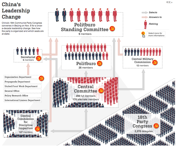
The Wall Street Journal had a nice interactive piece introduced with an animated video explaining just how the Chinese political system works. Or at least how we think it works. It’s not an entirely transparent system. Though as Americans have discovered lately, the transparency in seeing how large pieces of legislation are conceived, written, and passed is not necessarily a good thing.
Along with the diagram of the system, the piece offers photos and brief biographies for the presumed front runners. The “winners” of the elections should be announced sometime Thursday. Along with the new leaders, the Communist Party may also reduce the Politburo Standing Committee from nine members to seven members for more efficient governing. But nobody knows. We’ll see Thursday.
There is one day to go until the presidential of 2012. But despite what many say and a fewer number want, the United States is not a democracy. It was never meant to be. Instead it is a democratic republic. We elect people who make decisions for us. Perhaps one of the most misunderstood ways in which this happens is through the election for the president.
The popular vote does not matter. If the popular vote did matter, Al Gore would have been elected president in 2000, not George Bush. Instead, your state’s electors matter because they belong to something called the electoral college. Different states have different numbers of electors (loosely based on their political representation in Congress). Given which states are certain to vote for President Obama (Illinois) and Governor Romney (Georgia), there are only a few states that are available for either to win (Ohio).
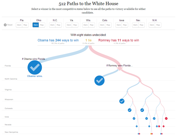
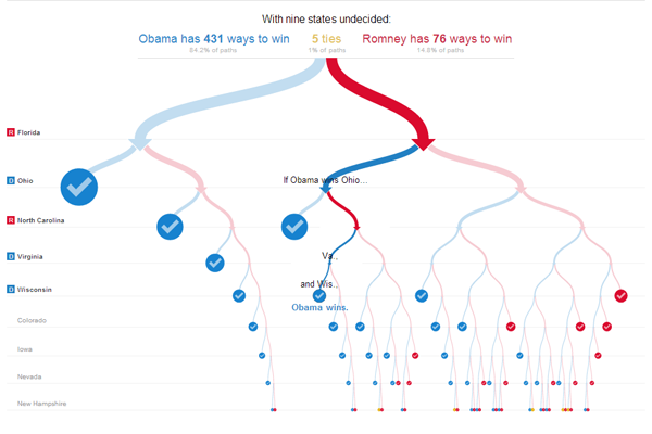
Different combinations of states can be had to reach 270 electoral college votes, which is the number necessary to become president. While Governor Romney might be able to make 50.1% of the national vote, as this interactive piece from the New York Times shows, his path to 270 votes is very narrow and he cannot stray too far and still hope to win. And it is because of this fact (generally speaking) that many, e.g. Nate Silver of the New York Times, are saying that a re-election of President Obama is far more likely than a Governor Romney victory.
There are two ways to really play with it. First, select different states and see how many different routes are left open to Governor Romney. The second is to leave the selections blank and then follow the flow chart given by the New York Times.
Credit for the piece goes to Mike Bostock and Shan Carter.
Hurricane Sandy also brought quite a lot of wind. Before the storm landed just south of Atlantic City I was travelling east on the Pennsylvania Turnpike. And as the map below from the New York Times illustrates, I was driving through not insignificant winds (with quite a few more powerful gusts). In the first few hours after landfall, the winds within 100 miles of Sandy’s centre—which was due to pass within miles of my hometown—continued to whip everything exposed to the environment. Thankfully after those first few hours, things began to calm very quickly.
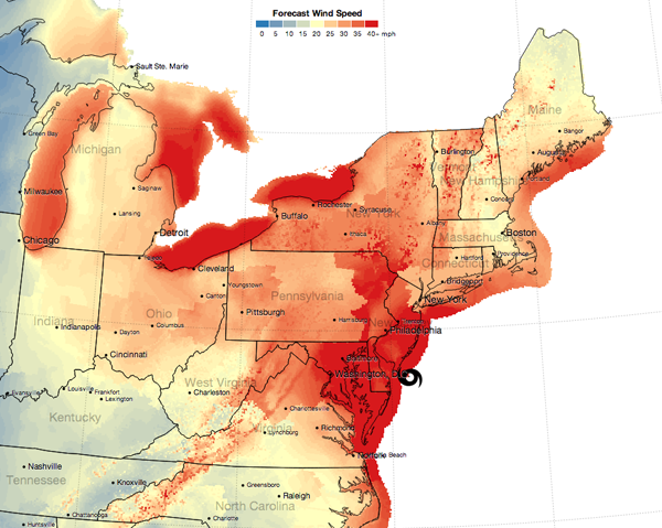
The link through the image above is an animation of sorts of the timeline of wind forecasts.
Credit for the piece goes to Mike Bostock and Shan Carter.
Hurricane Sandy hit the Jersey shore before moving northwest through southeastern Pennsylvania. These were two maps from two different electric utility companies providing information on the number of outages. This first and smaller graphic is from PECO. The second and larger is from FirstEnergy. The graphic from FirstEnergy breaks into the township level when zoomed in sufficiently. Clearly from being able to post this, I am among the fortunate with my electricity still up and running.
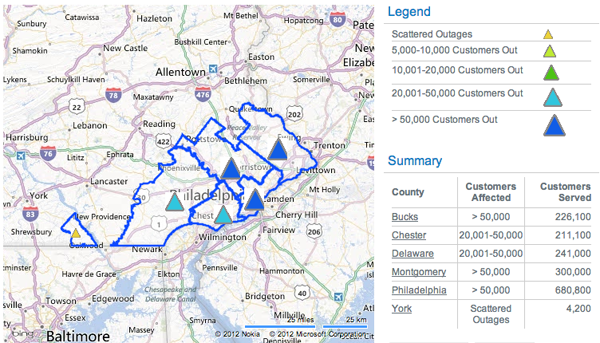
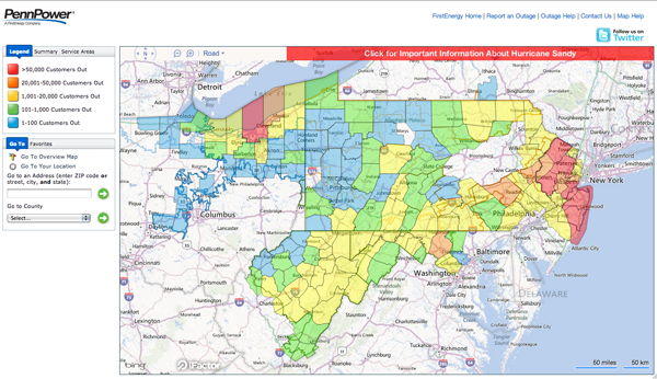
Clearly these are not all outages, only the outages reported by these two electrical utilities. At the time of writing some 1.3 million people were without electricity in Pennsylvania and over 7 million in the Northeast while Sandy—now an extra-tropical low pressure system—continues to dump rain and snow on the interior reaches of the area.
This is a small interactive piece by the Washington Post that looks at the drone wars being waged by the United States specifically in Pakistan and then Yemen/Somalia. Clicking on a specific date in the timeline brings that date into focus with articles about the attacks in question.
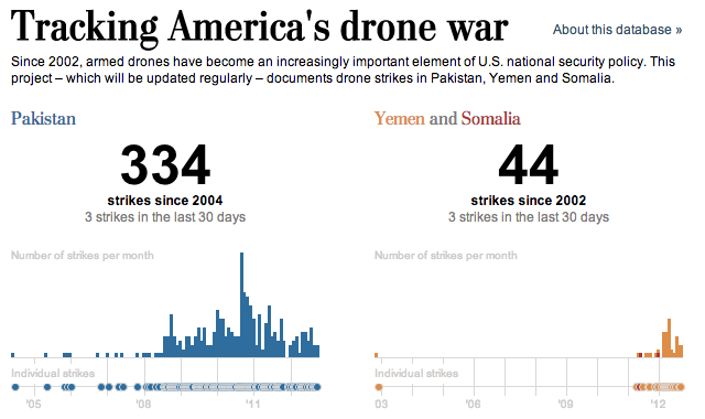
What would have perhaps been interesting is a comparison of the number and location of drone strikes between the Bush administration and the Obama administration. Regardless, it illuminates a dark front of our ongoing wars.
Credit for the piece goes to Julie Tate, Emily Chow, Jason Bartz, Jeremy Bowers, Anup Kaphle and Olga Khazan.
So my airport card still is not working on my laptop. And I am heading back east into the cold embrace of Sandy so who knows if I’ll have access to the internet while on holiday. But because of those two things, this is my official forecast for the election on 6 November. Granted, a big disaster (such as a $1 billion dollar storm) or a big gaffe (anything that Joe Biden says) could change the race, but that’s becoming increasingly less likely as we wrap up the final days of the campaign.
So thanks to the Huffington Post’s election map dashboard (click here or the image to go and make your own):
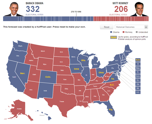
In short, I think Obama holds most of the states he won in 2008, but drops Indiana and North Carolina. He might still lose Florida, but with the better-than-expected economic growth figures out earlier today, I suspect that will halt Romney’s gains and perhaps roll them back just a bit.
The 2012 elections are now less than two weeks away and so let the sporting analogies begin. We’re in the home stretch now. Homeruns, field goals, and running out the clock. Et cetera et cetera ad nauseam.
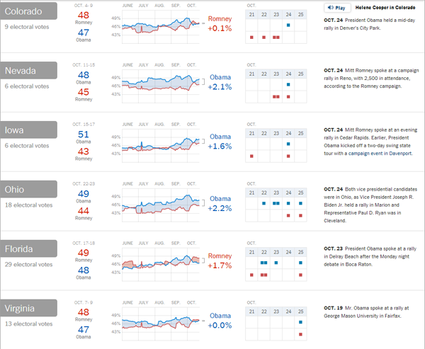
But over at the New York Times we have an interactive piece that looks at what they call the state of play of the swing states in terms of the latest tracking polls at a state level along with campaign stops and commentary from the paper. It’s a concise way to look at those few states that will largely determine the outcome of the election.
Problems with my access to the tubes of the internets prevented me from posting this piece last week. But it’s still good and still relevant, especially in the wake of last night’s presidential debate. The New York Times and the FiveThirtyEight forecast came together to create this interactive flow chart, if you will, of the ebb and flow of electoral politics.
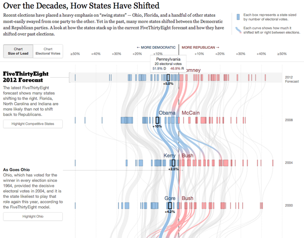
Two different views, one based on electoral votes and the other on the margin of victory, determine the basic chart type. But both let you watch swings states vacillate between Republican and Democratic support. Context is provided to the side of the main graphic to explain just what was going on in particular elections.
Credit for the piece goes to Mike Bostock, Shan Carter, and Amanda Cox.
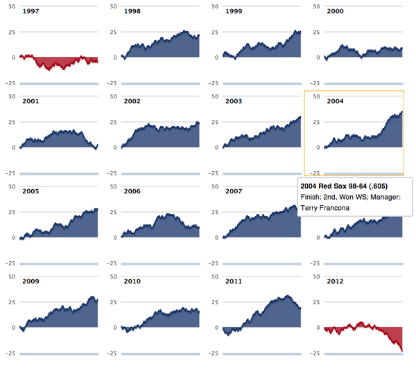
The Boston Red Sox hired John Farrell this weekend to be their manager just one season after hiring Bobby Valentine for the role. There is a lot to be said about just who is to blame about the Red Sox’ awful season. But it was pretty awful. How awful? The Boston Globe shows us in this interactive piece.
It’s a series of small multiples of line charts. However, one of the big problems with the infographic is that the labels are entirely absent. As best I can tell the line is the number of games over .500, i.e. an even split between wins and losses. But, it could be more clearly called out if not in the legend or on the axes than in the title.
But over all it does put this past season into a sober perspective.
Credit for the piece goes to Daigo Fujiwara.